Landscape Painting - Brush Technique
Everything I write and teach on this blog is strictly my opinion. I hope that it is evident by the blog's title "M Francis McCarthy" but just for the record. Everything I write here is just my opinion. Other professional artists may have contradictory advice that works for them. I can only speak and teach from my own experience.
I was once guilty of making the same error but after constant reappraisal of the work I was doing I gradually ceased using those tiny brushes. I think it's far better to imply detail with glancing indicative strokes rather than try to impersonate a camera with a dinky little brush. Every stroke needs to have it's own beauty and also serve to build a whole image at the same time
I'm no fan of precious, over detailed brush strokes in landscape paintings. There is a landscape painting show currently running in my town by a decent painter. While her color and composition are good, I feel she's only decent because of her tendency to use lots of tiny strokes made with a small round brush. This to me is a sure sign of a beginning or amateur painter.
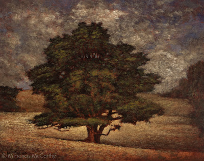 |
| A Welcome Friend by M Francis McCarthy |
I was once guilty of making the same error but after constant reappraisal of the work I was doing I gradually ceased using those tiny brushes. I think it's far better to imply detail with glancing indicative strokes rather than try to impersonate a camera with a dinky little brush. Every stroke needs to have it's own beauty and also serve to build a whole image at the same time
This piece "A Welcome Friend is a good example of my technique. There are many small strokes. In fact maybe more than I would have preferred. My approach to painting is to always use a slightly larger brush than is comfortable to execute a given passage. This is one way to combat tiny brush syndrome.
Another way is to paint with your glasses off so you concentrate on the overall more than the specific. Note: if you have great vision you can semi close your eyes so that your vision becomes blurred and periodicity paint that way for the same result.
With a larger brush, the painter is forced to produce bolder, more painterly strokes. This is a good thing. The smallest brush I ever use even for my 5x7s is a #2 flat and more often than not I use that only for certain shadow passages.
Brush technique is a vast topic and I'm going to touch on it again in a future post. For now though just remember to use the biggest brush you possibly can. Your work will benefit immensely, immediately.
Dinosaurs
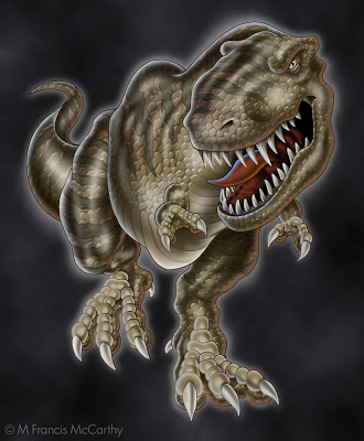
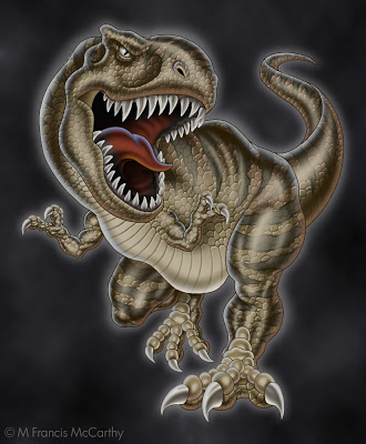
I executed a lot of dinosaurs while I was at Jack Nightingale Artworks. Most of them in collaboration with the other illustrator there who I'll call Rico out of respect for his privacy. Rico was a good artist and we we're buds for most of the time we worked together. We both worked on the dinos, passing them back and forth in an effort to make them better and better.
Quite often we'd base our dinosaurs on reference from Jacks extensive morgue files and later on we'd use images from good ol' Google. Unlike animal illustrations that you can find photo reference for, dino photos we're not available. There we're no cameras back when they ruled the earth.
Rico did the preliminary sketch for these dinos and I did all the rendering. Every year we'd have to try and top the last. We'd add features like scales that were printed in puff ink or we'd do special glow in the dark plates.
These guys pictured here we're done near the end of the dino days at Jack's. The new technique that was added to them was the reflected highlights. White on one side and taupe on the other in this case.
Doing dinos every year was fun for a while. I must say though that the printing of our designs often fell way short of the comps we produced. The reps that worked the dino account would often make "creative" contributions to the designs before the actually got printed. The additions or subtractions could be nightmarishly bad.
Another case of non artists expressing themselves at the expense of the artwork and the final product. I cannot say I miss viewing some of the train wreck tees produced from our painstaking renderings.
As a side note, these illustrations are copyrighted by Jack Nightingale Artworks and I show them strictly for review and portfolio purposes. BTW Jack didn't draw any dinos. He had a pretty good gig for many years adding type and background squiggles to the designs while taking credit and getting paid for the entire enterprise. Rico and I got a paycheck.
Hopefully, Jack is still receiving income from these dinos as I have seen reworked versions used on items like swim trunks and tees as recently as last year.
Inspiration
I enjoy talking with the many artists that visit my studio at the Quarry Arts Center here in Whangarei. Today I was chatting with someone about Inspiration. Actually the topic of artist blocks came up but I prefer to couch this phenomenon in the positive context of Inspiration vs the negative attribute of "artists block".
There are many causes of artists block. Here's list off the top of my head:
- Not enough work being created
- Not enough time spent doing art
- Too much comparison with past work or the work of others
- Lack of desire to create art
- A bad attitude about one's art or abilities
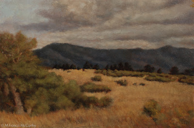 |
| California Hills (6x9) by M Francis McCarthy |
Now lets start reworking the bad attitude by rewording "artists block" to "seeking inspiration". One simple change like that can completely re-frame the issue. There is a lot more positive changes that can and will eliminate any artists block.
Here's some great ways to find inspiration:
- Work more, talk less. Inspiration shows up for those who are working and avoids those who prefer talking about working or work they've done in the past.
- Pick a style and master it before moving on. This is all about focus which I'll talk more about in a future post.
- Emulate the work of artists you admire. By this I mean teach yourself whats good about their work that touches you as an artist. I am not saying that you should ever try to assume the style and working methods of another artist as your own. What I am saying is that the best way to learn how to do something is to try to recreate that which moves you.
- Give yourself a break. If you're truly working hard at your art, your stuff cannot stay bad for long. Hard work always pays off. Always. So don't be too self critical while you're developing as an artist. That's not to say you shouldn't be critical of your work. You should be creating enough of a flow of art that no one piece is all that important anyway.
- Destroy you worst work. You don't need it around if it sucks. If you are really working as hard as you should be, you'd have so much art sitting around that you won't mind getting rid of the crap.
- Do more pieces that take less time. If you have to, work smaller. Smaller works take less time generally speaking and this allows you to cover more ground while mastering your craft.
A bit about today's painting California Hills. I painted this back in 2009. It's maybe my third or forth painting in a Tonalist vein.
I was working on textured panels at the time and I still do my 5x7s oil sketches on textured boards. These days I prefer to do my final paintings on a regular wood surface. The type of wood does matter and I really like hard woods. Here in New Zealand I use kauri which has a nice tight even wood grain.
Drawings 3
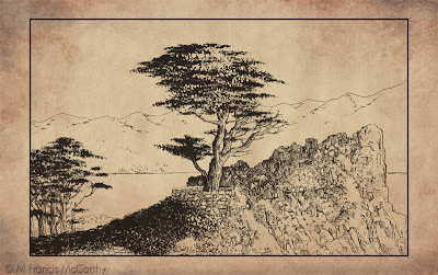
This image was illustrated by me for a company I worked for in the eighties and nineties I will call Jab Art Enterprises. I worked for a guy I'll call Jude. I started there in 1984 and worked for Jude till 1997. For a long while I thought I would never be able to leave that job. More on that in some other post, some another time.
Jude marketed this drawing and others to places like Montgomery Wards and J. C. Penney as part of a "California"series. The ink drawings were photocopied and then hand water colored. The Series featured points of interest in California
At Jab Art Enterprises we primarily did contract framing on a large scale. We also produced "graphics" for the hospitality industry. At the time I drew this we we're more into department stores. I'm not sure if any of them bought this.
The painter in me was coming out for the first time back then. You can see it for example in the way I knocked out the highlights from the cypress tree with white paint.
At that time I was taking painting lessons from Smitty, a customer of Jab Art Enterprises. Smitty taught oil painting to stressed out corporate types as a regular gig. He had a few companies that he would set up in after hours and their employees would come and learn how to paint. Smitty provided everything that was needed including frames that he purchased from Jab Art.
He practiced a form of the Bob Ross style, quick landscape painting that was easy to learn. For my part I always preferred to use actual landscape photos rather than copy the formula paintings from a book that Smitty provided as reference for his students.
I owe Smitty a lot as he not only taught me for free but he also provided the art materials and picked me up for class. A wonderful man I'll always remember with gratitude. He is one of the reasons I write this blog and share what I've learned about art freely.
Cheers, Smitty wherever you are now.
Cheers, Smitty wherever you are now.
Old Drawings 2
Putting up a an old drawings today. For years all I did was draw stuff in pencil and pen and ink. As I've stated in the past I believe good drawing to be the one irreplaceable element of any decent representational painting.
In this era of extreme photo manipulation, drawing could seem passe or even unnecessary. Ultimately those who can draw will produce stronger designs, illustrations or paintings. While those who cannot will spend a lot of their time finding ways around their lack of skill in this area.
In this era of extreme photo manipulation, drawing could seem passe or even unnecessary. Ultimately those who can draw will produce stronger designs, illustrations or paintings. While those who cannot will spend a lot of their time finding ways around their lack of skill in this area.
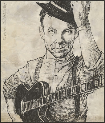 |
| Robert Fripp by M Francis McCarthy |
This is a pencil drawing of Robert Fripp, illustrated circa 1985.The drawing exhibits a hatching technique I had devised of alternating horizontal and vertical cross hatches or "jits" as I some times refer to them.
I think that style is super important to young artists but as you get older becomes much more an internalized part of how you draw. I definitely appropriated quite a lot of technique from my illustration heroes. People like Bernie Wrightson Neal Adams and John Byrne influenced me tremendously. Not to mention the king of them all Frank Frazetta.
The photo reference for this was a nice image already. Music and other popular magazines were a favorite source of drawing reference for me. My philosophy about drawing people at the time was to draw every type of person. I would often go though issues of TV guide and draw the various differnt people pictured in an effort to improve my drawing.
Illustration - Hired gun
Let's go back in time to Jack Nightingale Artworks in 2000. Actually a really great time for me there. Jack Nightingale Artworks was a division of a company I will call Sales Today. Sales Today mostly sold tee shirts.
All the art was done by myself and the other artists at Jack Nightingale Artworks. While the actual printing was contracted out to local screen printers. In 2000 things were doing well there. We were selling lots of tees at the national parks, the San Diego Zoo and also money was flowing in from our newest account Starbucks.
I had started as art director after my friend David had left the position to work in New York and I was busy but nowhere near the crushing kind of busy that was in my future. I'd recently bought a home and life was good. I was happy to be making a good living as an artist and I'm still thankful to the universe for granting my desire.
I was however a hired gun. In 2000 I was pretty content to just be that hired gun and shoot the hell out of whatever came up. I really put all my creativity and passion into my work and I always endeavored to make each illustration the best I was able.
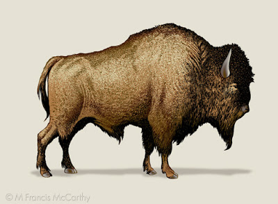
This bison was done for a Yellowstone tee shirt design. Yellowstone was a frustrating account as they always bought only a few designs but we did tons of art for those few.
This guy was never actually used in this format on a tee but was recycled for many designs over the years. I am proud of the hand stippling on this bison. I used to love to stipple the different colors on animal designs because it always printed well.
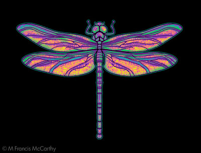
I'm happy with this dragonfly. I created it at my home studio. It was printed on a tee for The Nature Company. A now defunct chain of stores that sold scientific stuff, Cd's and Tees. I was so happy they choose it but unfortunately it was printed super tiny on the tee shirts.
A "creative" decision made by the buyer. Many buyers loved to put their stamp on others work. My theory is that many of them were frustrated artists. That said I've known some awesome buyers that were a joy to work with.
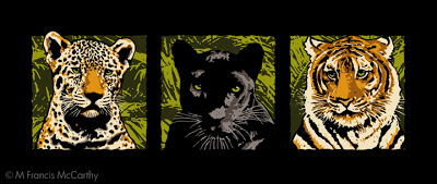
These cats represented a break through for me at Jack Nightingale Artworks back in 1998. The cats were never used with these colors on a tee. I did these illustrations while Jack was on a golfing trip in Hawaii. Something he did often in those days when Sales Today's business was good.
I had only been at Jacks for about 5 months and was still getting used to the compromises a professional hired gun has to put up with. By this I mean my art getting changed and quite often just so Jack could put his stamp on it.
He came back from his trip and loved my cats but decided to have me rework them in muted grays and tonal browns. The end result looked pretty good and sold great but I still feel these brighter cats have more appeal. Being the hired help though I could only cooperate in the dilution of my originally stronger idea.
Making a living with your art is great but it comes with a cost. Sometimes the cost is minimal, other times it's devastation to one's core passion as an artist. If this price is paid to frequently an artist runs the risk of losing their creative spark altogether. Like a horse thats been rode too hard for too long.
Landscape - Tone
Tonight I thought it would be nice to expand upon tone. I like the word tone as is is a open word with interesting connotations. Quite an ambiguous term when you ponder it, as we are going to now.
I use Tone to mean resonance/value. Also implied in the word tone is color harmony. I will often tilt the colors in a painting towards a unified tone. Yellows of all stripes are a favorite but I will use just about any hue as a unifying tone with the general exception of green as greens are such a present color already in most landscapes.
The unifying hue here in "Tranquil Field" is a warm yellow tone. There is also a strong resonance of sienna from the paintings foundation. If you read yesterdays post about Tonalist limitation of values, you can see that the whitest parts of the clouds are far short of an actual white.
I use Tone to mean resonance/value. Also implied in the word tone is color harmony. I will often tilt the colors in a painting towards a unified tone. Yellows of all stripes are a favorite but I will use just about any hue as a unifying tone with the general exception of green as greens are such a present color already in most landscapes.
 |
| Tranquil Field (11x15) by M Francis McCarthy |
The unifying hue here in "Tranquil Field" is a warm yellow tone. There is also a strong resonance of sienna from the paintings foundation. If you read yesterdays post about Tonalist limitation of values, you can see that the whitest parts of the clouds are far short of an actual white.
The lightest parts of a painting reveal it's unifying tone the most because it's harder to perceive color in shadow areas. The dark's can definitely be tilted towards warm or cool in any painting though.
There are times that I will glaze a very light wash of color over an entire painting but more often I set up my colors in advance to harmonize. Glazing an entire painting tends to darken it and you've got to be really restrained if you try it or there's a good chance of ruining your painting.
Here's the oil sketch for "Tranquil Field". I've been posting my oil sketches with there larger brothers regularly because I feel it's illuminating. Also, I like to give my little paintings some attention. There have been times that I liked my small 5x7 better than it's larger brother but usually I think they're both good for different reasons.
 |
| Tranquil Field (5x7) by M Francis McCarthy |
Here's the oil sketch for "Tranquil Field". I've been posting my oil sketches with there larger brothers regularly because I feel it's illuminating. Also, I like to give my little paintings some attention. There have been times that I liked my small 5x7 better than it's larger brother but usually I think they're both good for different reasons.
My approach to the small paintings is very direct and immediate. At the same time I'm looking towards the harmonies that will resonate through the larger version of the scene.
Today's picture "Tranquil Field" can currently be viewed in my studio at the Quarry arts center, Whangarei.
Using just some of the notes...
A gentleman came into my studio today and we we're discussing painting and art in general. He remarked that he liked my work and that it had a pleasant "old time" feel.
I responded that my art was greatly influenced by a painting movement called Tonalism. Tonalism ran concurrent with Impressionism and was popular from the late 1800's to early 20th century. I believe most landscape painters these days to be of an impressionist bent whether they are aware of it or not.
One distinction between the two styles is that Tonalism uses fewer notes than impressionism. By that I mean that if you look at the value scale here below:
Today's picture "Country Road" is good example of the ideas in today's post. The 12x12 can be viewed at my studio at the Quarry arts centre in Whangarei. the 5x5 oil sketch is in a private collection now.
I responded that my art was greatly influenced by a painting movement called Tonalism. Tonalism ran concurrent with Impressionism and was popular from the late 1800's to early 20th century. I believe most landscape painters these days to be of an impressionist bent whether they are aware of it or not.
 |
| Country Road (12x12) by M Francis McCarthy |
You see the entire range of values from white to black as 10 divisions. You could also see these as notes, like piano keys on a piano.
Many paintings done in an impressionist way utilize the entire value scale from brightest to darkest values. A Tonalist approach usually holds way back. In my paintings I generally eliminate the brightest values from the ten step scale. and I often use even less of the available values.
This is what I mean by "using just some of the notes". The benefit in doing this is a more cohesive and harmonic painting that creates a unified "tone". There are drawbacks too, and the greatest one is creating paintings that are too dark for brighter spaces. The benefit though is a greater conveyance of feeling and a generally more meditative quality
 |
| Country Road (5x5) by M Francis McCarthy |
Today's picture "Country Road" is good example of the ideas in today's post. The 12x12 can be viewed at my studio at the Quarry arts centre in Whangarei. the 5x5 oil sketch is in a private collection now.
Be Passionate
In my last post I mentioned that you should create beauty even if no one cares. This is the attitude that any artist worth his salt must have.
Art is all about passion. Passion in regards to art is a decision that's made by the artist to fully engage with the imagination. Imagination is the energy that creates and sustains our personal and collective realities.
Everyday we are immersed in the creative imagination of our fellow human beings in a mostly unconscious way. Passion allows us to also become a creator in this world, not just a spectator.
 |
| Evening Shadows by M Francis McCarthy |
Passion is required to sustain any artist through the effort of attaining mastery. I heard a quote once that went "a plague on easy masterpieces" unfortunately I cannot locate the source but it's meaning has resonated with me my whole life. That which comes easy in not usually worth attaining.
To paint well for example requires years of study and practice. There is no easy way to do it other than just rolling up your sleeves and getting to work. I've heard another artist say that it was the equivalent of learning to play concert violin and I agree.
Without passion there is no way you could spend the time required to get good at anything. If you're following this blog and want to paint well, my advise is to get passionate, right now! Get those paints out and paint as much as you can whenever you can. results will come rapidly.
Today's picture Evenings Shadows was painted last year and can be viewed at the Yvonne Rust Gallery in the Quarry arts center, Whangarei.
Drawing - Landscape
The drawing I'm featuring today was done way back in 1984.I can see much of what attracts me to landscape today in this drawing. At the time I was really into detail. A habit that persisted for quite a few years.
It was rare for me to do landscape art at the time. I was really more into drawing people. I think I had a snapshot I'd taken that I used as reference for this.
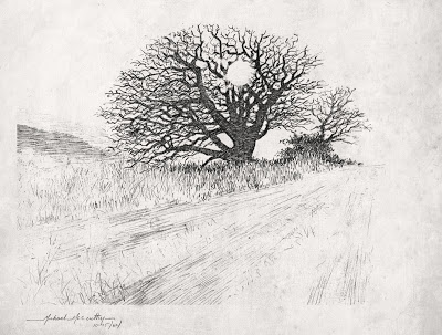 |
| Winter Oak by M Francis McCarthy |
It was rare for me to do landscape art at the time. I was really more into drawing people. I think I had a snapshot I'd taken that I used as reference for this.
This scene was rendered in pencil. One of my favorite mediums. Many artists love pencil because of it's subtle forgiving nature. Unlike a pen or brush pencils leave a faint trace yet can also produce strong black darks.
It's good to use both and many pen drawings start out in pencil. I advise students to jump in to ink along with their pencil work. The definiteness of an ink line is difficult to erase and for that reason has it's own type of integrity.
I feel it is good as an artist to be able to commit and move on. I've known a few that never really got past pencil because of their fear of "messing it up". Better to try and fail than never attempt your best inner vision.
Learn to Draw
I read that today. Learn to draw and create beauty even if no one cares. The quote is from a guy named Sal Bass. I still need to learn who he is and what he did. Regardless the quote stands on it's own as the best art advice I've heard and I aim to teach it to any of my students from here on out.
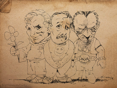 |
| Three Dudes by M Francis McCarthy |
Just one image today. This is a drawing I did back in 1985. It's purpose I think was to impress some girl. Not sure whether I gave it to her or not now, almost thirty years in the future. At the time I was proud of this drawing for the looseness and caricature of the characters.
I've a lot of respect for cartoonists. I don't consider myself one at all though. I've dabbled in "cartoon illustration" though and I'd file this image under that heading.
I can recall inking this with a triple zero rapidograph. Rapidographs gave you a constant, consistent ink line. The triple zero was the thinnest that was practical to use. I used rapidographs a lot. The challenge was to get "character" in a non varied line. Usually I'd attempt to vary the line by speeding up or slowing down the ink stroke.
I worked hard at being an inker for years and I will be posting lots more on inking and using ink medias like the pen, brush and even sticks or computers.
Digital Art 3
Since we we're discussing abstracts yesterday. I thought I'd throw up a few tonight and chat a bit about them and that era in my art adventure.
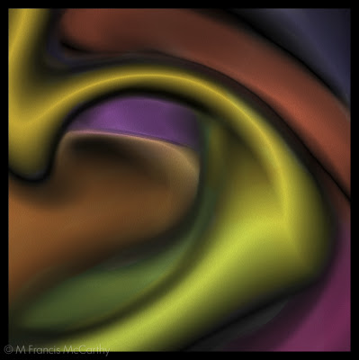 |
| Lodgio by M Francis McCarthy |
These images date from 1996. All of them we're created using my first PC, a 486 with 8 mb of ram. Actually in 1996 my friend David lent me 400 dollars to help me upgrade my machine to a 1 gig hard dive and 16 mb of ram. I owe David a lot and will always remember his kindness.
At the time, that ram upgrade was 300 dollars or so. In those days multitasking like we do now was limited. I was able to play a CD while working in my art programs though which was miraculous at the time.
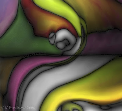 |
| Kope by M Francis McCarthy |
I know, It's a bit of a cliche now but at the time power was a big factor in what you could accomplish on a computer.
We spoke a bit about my digital technique in my last digital art post but the truth is most of this work is not repeatable. When creating abstract art digitally I followed the path of pure inspiration. Though I had some formulas that I would use consistently, the array of options available at every turn meant that no two pieces we're ever the same.
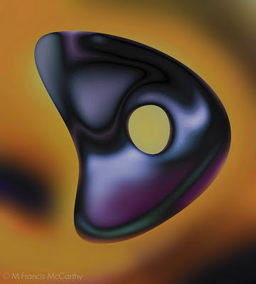 |
| Muin by M Francis McCarthy |
I always strove for organic expression in my digital abstracts. I wanted to develop each image in a natural way even though I was using unnatural means. I seldom would actually draw or paint them in a direct manner, preferring to manipulate digital media in more oblique ways.
I used all the distortion and blur filters combined with Kai's power tools like vortex distort. However, I do not like anything canned looking and seldom would I leave anything but a faint trace of a filter used. I've more digital pieces that have never been aired and I'm sure we'll revisit this topic in a future post.
Landscape Painting - Abstraction
I like abstract art. Not all of it, but a painting being abstract or not is not the thing that makes it good or bad in my view. I always look for a strong pattern of light, shadow and contrasts in all art.
It would be reasonable to ask why I do not paint abstracts now. I certainly have before in the digital realm. a place of strong contrasts and experimentation.
However abstract art for me these days is more limiting. I know it would seem to be the opposite but abstract art for me too closely reflects my inner reality. Without an outside idea or aspect to work against or toward I feel my art gets stale.
 |
| Coming Storm (8x12) by M Francis McCarthy |
That said I believe all art to be essentially abstract in nature. You really notice this in primitive art and cave paintings but abstraction is present in even the most photo realistic art. I like to hang my landscapes on a strong abstract foundation.
 |
| Twilight Cypress (sketch) by M Francis McCarthy |
Here's the sketch for Twilight Cypress. There are slashes of strokes in the sky and I've defined the shape of the tree with strong graphic edges that reinforce my composition.
 |
| Twilight Cypress (9x12) by M Francis McCarthy |
The final painting of Twilight Cypress is far softer than the sketch. The over all effect is realistic in that you tell it's a tree and a sky with some earth below. But the painting is still quite graphic in feel.
Another reason I paint Landscapes instead of abstracts is that I feel that the vehicle of landscape allows the viewer to ride into my paintings. They've no need to wait, stand there and ask what it is before getting on board. To their conscious mind the question of "what is it" has already been answered.
To the less conscious part of their mind however, abstractions and metaphors abound. Colors communicate feeling and composition directs and constrains the eyes towards it's own ends. This is far more interesting to me than abstraction outright.
Digital Landscape Paintings
From 1995 to 2005 I was creating 98% of my art on a computer. At first for my own edification then as a way to make a living. I explored most of the nooks and crannies of the digital art making process and I had attained a high level of mastery with the medium.
Sometime in 2006/07 I started painting landscapes in the computer working directly over photos with my Wacom tablet and stylus. I had developed several techniques that I used for animal illustrations that I wanted to try on landscapes
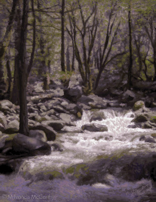 |
| Falls by M Francis McCarthy |
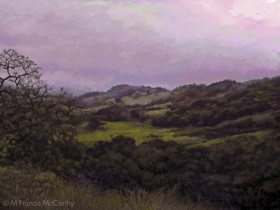
This was based on a photo I took while at Yosemite. I was somewhat pleased with the result but the painting had a stationary quality that I had not yet realized was due to it's method of creation.
 |
| View of Grant Parkby M Francis McCarthy |
One of my favorite attempts based on a very old digital photo I'd taken. I still like this but I feel the color doesn't move like it would in a real painting.
 |
| Forest Path by M Francis McCarthy |
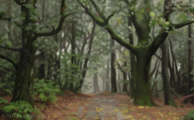
Another semi successful work. These three pieces represent the best efforts out of a good 15 paintings done inside my computer using Painter and Photoshop. At the time I was not as aware of the inherent limitations of photography and thus I feel all of these paintings have a quality of effected photographs even though I panted them stroke by stroke over my photo reference.
A few of the limitations and traps involved with directly painting on top of photos are as follows:
- Too much detail in the painting
- Composition issues in the photo are not resolved by in the painting
- Photos have a far more limited color range than most paintings require to be interesting
- You paint everything you see in the photo because it's so apparently there.
I've much to say about photography and it's use in conjunction with landscape painting. So I'll definitely be revisiting the topic in future posts.
Motifs and Repainting
Happy new year! Tonight I'm going to talk about motifs and revisiting them. Also, technique and it's progression in the attainment of an artists personal vision.
Starting in 2010 I went far more tonal and indirect in my approach to oil painting. I was inspired by a trip I took with my wife to the De Young Museum. At the end of the American collection they had several large rooms dedicated to American landscape painting.
I was especially intrigued by the work of George Inness but also Thomas Moran and Frederic Edwin Church. I loved the surfaces of these paintings and their soft glowing inner light.
 |
| November Light (6x9) by M Francis McCarthy |
This version of November Light was painted in July of 2010 and currently resides in the collection of a fan of my work. It was painted on a maple panel that I'd brought over from the states.
At that time I was painting only small pieces but putting full intention and finish into them. the inspiration for this painting came from my first trip to New Zealand in 2009 and it was one of the first I painted after moving here in 2010.
This is my 5x5 reworking of November Light, painted in 2011. After painting a series of Four 8x8 paintings that were for a show at Hangar Gallery, I was becoming interested in the square format and decided that I'd like to repaint November Light as a 12x12.
Here is the finished painting as a 12x12. It feels different from either of the other two paintings and I'm quite happy with the result. What I like best about this piece is the expressive sky and brush technique that does the job with out being too finicky.
I really like this composition and how it features water and an interesting tree but I felt the sky was lacking movement and drama.
At the time I was fascinated with proportion and was only painting in 6x9. The 6x9 format's 3:2 aspect ratio is the most similar to the golden ratio. Proprortion is a topic that I'd like to get into further in a later post.
At the time I was fascinated with proportion and was only painting in 6x9. The 6x9 format's 3:2 aspect ratio is the most similar to the golden ratio. Proprortion is a topic that I'd like to get into further in a later post.
 |
| November Light (5x5 by M Francis McCarthy |
This is my 5x5 reworking of November Light, painted in 2011. After painting a series of Four 8x8 paintings that were for a show at Hangar Gallery, I was becoming interested in the square format and decided that I'd like to repaint November Light as a 12x12.
It was at this time that I first started doing small oil studies prior to executing the larger pieces. I quite enjoy doing the small paintings and a nice side benefit is that it creates an affordable small painting for people that collect my work.
 |
| November Light (12x12)by M Francis McCarthy |
Here is the finished painting as a 12x12. It feels different from either of the other two paintings and I'm quite happy with the result. What I like best about this piece is the expressive sky and brush technique that does the job with out being too finicky.
I aspire to create each painting using as few brush strokes and successive layers as possible. That said, I'll keep painting until I get the scene across. I pick, jab, scratch and layer brush strokes, anything I have to do.
Animal Illustration
As an Illustrator working for Jack Nightingale Artworks I was called upon to execute many different styles for projects. A big account was San Diego Zoo. BTW all the illustrations in this post are copyrighted by Jack Nightingale Artworks. I just drew them and got paid. I show them here on my blog for purposes of review and education only.
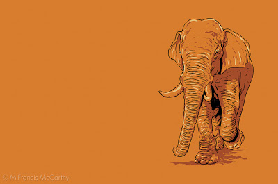
The style for this guy was taken from a image I saw of a elephant on the web. I simplified the color scheme and drew an Indian elephant in a quick line and shaded in Photoshop. What I liked about this illio was how it looked good on any color. Never got bought but looks like a winner to me still.
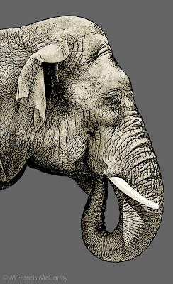
Ok, the Zoo was going to have a special Indian elephant exhibit and they needed a good image for a design. This image was definitely in consideration but not selected for the final design. Pity cause I really like the effect I got on this gal. This is a strong combination of photo shop and hand drawing. One day I would love to teach a class in this type of illustration.
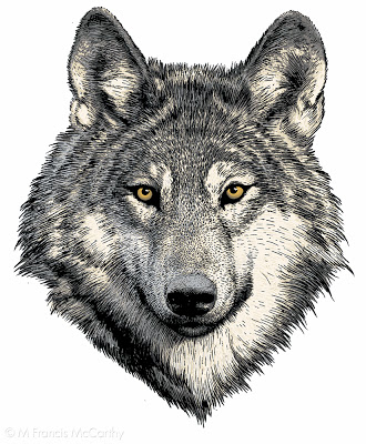
I've seen this wolf illustrated by others, the reference is available online. This is a pretty detailed brush and pen drawing that's been scanned into Photoshop and then colored. I always tried get a certain look in the eyes of the animals I illustrated and I really enjoyed the work for many years.
 |
| Indian Elephant by M Francis McCarthy |
The style for this guy was taken from a image I saw of a elephant on the web. I simplified the color scheme and drew an Indian elephant in a quick line and shaded in Photoshop. What I liked about this illio was how it looked good on any color. Never got bought but looks like a winner to me still.
In my Early days at Jack Nightingale Artworks I had lots of time to really detail my illustrations but as each successive year passed less and less time was available. I feel that this was true for any art department in the early to mid 2000's.
You can still get great results in less time if you keep your eye on the prize and have the right attitude. I know from first hand experience that spending hours on a piece of artwork will not guarantee a great work of art.
 |
| Indian Elephant by M Francis McCarthy |
Ok, the Zoo was going to have a special Indian elephant exhibit and they needed a good image for a design. This image was definitely in consideration but not selected for the final design. Pity cause I really like the effect I got on this gal. This is a strong combination of photo shop and hand drawing. One day I would love to teach a class in this type of illustration.
 |
| Wolf by M Francis McCarthy |
I've seen this wolf illustrated by others, the reference is available online. This is a pretty detailed brush and pen drawing that's been scanned into Photoshop and then colored. I always tried get a certain look in the eyes of the animals I illustrated and I really enjoyed the work for many years.
The Illustrator - Reference
Change up from Landscape painting today. We're going to revisit my early years as a hired gun illustrator. I've always enjoyed the phrase "hired gun" I must admit.
As an illustrator, I was hired to solve problems and make my employer look good. These images were created back in 98'. All of them have a screen print ready graphic look that I was into.
 |
| Mr Spock by M Francis McCarthy |
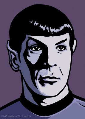
Just for the record "Mr Spock" is copyrighted by whomever owns his likeness. I did this as a portfolio piece never intending to sell the image. It was a real challenge to get the facial shadow right. I like my coloration and over all I was pretty happy with this illustration
 |
| Mr Meany by M Francis McCarthy |
I'm gonna call my place of employment "Jack Nightingale Artworks". A small art studio with Jack as chief designer and myself art directing. I also did many of the illustrations that we're used in our designs. For me it was a dream job and I was very happy working there for quite a few years. More on that phase of my art journey in future posts
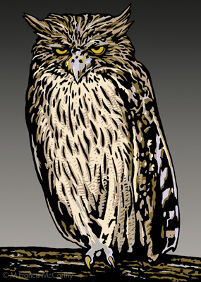
Mr Meanie is another portfolio piece. I did a lot of animals for Jack Nightingale Artworks so I thought I'd do an owl. Up to that point I'd mostly concentrated on figurative art or abstract digital art. Animals however sold well on tee shirts and so I illustrated many, many animals.
 |
| Bear Friendly by M Francis McCarthy |
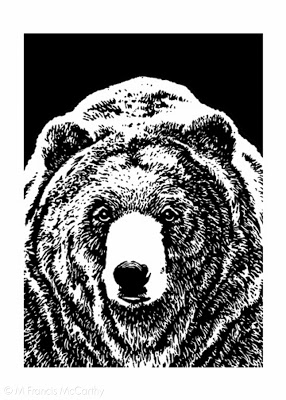
I'm proud of this illustration. Grizzly bears are fun to draw and this one owes a lot to the reference I found somewhere. All illustration relies on good reference. Don't let anyone tell you different. Back in those days we found reference at the library or in magazines.
Most illustrators had something called a morgue with all of their collected clippings. Reference was hard to come by in the pre Google image search era. Now you can find most anything with a few clicks but an illustrator should always be careful about using photography as reference without the permission of the photographer. Many artists can and do get sued.
These days I only work from my own reference and if possible I'd advise other artists to do the same. If it's not possible to get the shot you need be sure to contact the photographer. Just do it. Many will let you use things as reference for cheap or even free.
Landscape Painting - Color
More ruminations on landscape painting today, with a focus on color. I use a somewhat limited pallet as follows: Black, Cobalt Blue, Phthalo Blue, Dioxazine Purple, Viridian, Alizarin Crimson, Burnt Sienna, Transparent Earth Yellow, Yellow Ocher, Lemon Yellow (hue) and Lead White. I've also recently added Titanium White back into my Lead White for added body. I've arrived at this pallet through years of trying out different colors.
It's important to limit your pallet as much as possible, doing so creates better harmony in the painting. Some of the colors on my pallet are special effect colors like the Violet and the Phthalo Blue. I can get by without these easily.
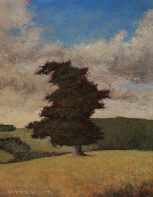 |
| Pastureland (11x14) by M Francis McCarthy |
It's important to limit your pallet as much as possible, doing so creates better harmony in the painting. Some of the colors on my pallet are special effect colors like the Violet and the Phthalo Blue. I can get by without these easily.
Others like Ivory Black are for knocking brightness off of a straight mix. Also black is great for making a warm rich green when mixed with yellow. When it comes to using black I almost never use it in an opaque manner. You must be careful with black as too much has a deadening effect. Also, it can be cool in an unforgiving way. I love black and would not want to be without it.
The lead white vs titanium debate is well known to any serious student of oil painting. I love lead white but I must import it to use in my paintings here in New Zealand as it's not freely available here.
I work on a color principle of warm vs cool colors on my pallet. In the reds Alizarin Crimson is a cool red while I use Burnt Sienna as a warm red. I prefer sienna to any cad reds as I like it's earthy quality. It is made with clay and one of the ancient pigments.
In the Blues: Cobalt is a warm blue and Phthalo Blue is cool. For the yellows: Yellow Ocher is warm and earthy while Lemon Yellow is cool and quite "green". Viridian I use mostly mixed with Alizarin to create my shadow/dark colors. I use it to modify greens and cut reds as well. As a green it is not really in most landscapes but it is vital as a modifier.
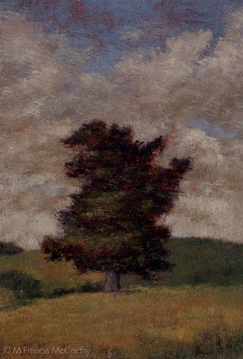 |
| Pastureland (5x7) by M Francis McCarthy |
The lead white vs titanium debate is well known to any serious student of oil painting. I love lead white but I must import it to use in my paintings here in New Zealand as it's not freely available here.
Lead white is far more transparent than Titanium and warmer as well. I use lead white exclusively except for when I teach. Recently though I'm mixing a bit of Titanium in with my Lead white. This is helps to lighten my paintings a bit. Also, it is a very permanent and light-fast color so contributes to their longevity.
Landscape Painting - Idea
This blog is going to be the first in a random assemblage of posts that I'm calling Landscape Painting. I intend to show the progression of a piece and ramble a bit about the painting or some aspect of the painting or landscape painting in general.
 |
| Morning Hillside (8x8) by M Francis McCarthy |
I am often asked in my studio at the Quarry Arts Center where a scene is. What place, country or region am I depicting? I often reply that the scene is imagined. As this is true to a large degree, though there may indeed be a specific place that inspired the painting.
I am not trying to be coy. The real truth is that I have created a Painting and though I may have used photos or drawings done from a site I feel no obligation and have no desire to depict an actual place. The photos and drawings are a prelude to the point of the painting which IS the Painting not the scene itself or the process that birthed it.
That said I will sometimes say "Oh yeah, that's over there on Choctaw ridge" or something to that effect. Because to say all I have to say about that simple query will exhaust the patience of a causal apprehender.
 |
| Morning Hillside (5x7) by M Francis McCarthy |
That said I will sometimes say "Oh yeah, that's over there on Choctaw ridge" or something to that effect. Because to say all I have to say about that simple query will exhaust the patience of a causal apprehender.
What I'm more interested in is connecting the viewer with a created space that's acting as a window or portal. The space is empty so that it can be filled, by the viewer. There are traces sometimes of others. Like a road or a path but they're are no others here just the view and the viewer.
I also intend to relax the viewer I want them to be in a mellow state with the painting. I like to think of the painting as a refuge for the weary. A place to spread a blanket and chill out. But even more to be in nature even if it's nature of their own creation.
I guess there's lot's of philosophy in this post but philosophy "is" painting in many ways. Some of the greatest philosophers painted and visa versa .
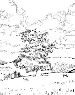
This sketch was done with my Wacom tablet in Photoshop. For me these type of sketches are just about planes (dividing the space) and composition. I make few efforts to treat them as real drawings. I will often project this type of image onto my wood panel and do a lot more creative drawing there, adding shadows and mass to the landscape. I usually wait till that stage to flesh out the drawing just to keep the process fresh at each stage of the paintings evolution.
 |
| Morning Hillside (sketch) by M Francis McCarthy |
This sketch was done with my Wacom tablet in Photoshop. For me these type of sketches are just about planes (dividing the space) and composition. I make few efforts to treat them as real drawings. I will often project this type of image onto my wood panel and do a lot more creative drawing there, adding shadows and mass to the landscape. I usually wait till that stage to flesh out the drawing just to keep the process fresh at each stage of the paintings evolution.
Ipad drawings
I did these last year on my wife's iPad. I used a program called LiveSketch HD. I really enjoy drawing the figure but it's awful hard on an iPad without a real stylus and especially difficult without pressure sensitivity.
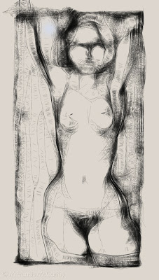 |
| Nude Figure by M Francis McCarthy |
I got my first Wacom tablet back in 1996. It was an an Artz 2 and used a serial port. I loved it so much. At the time I bought it I made a fairly low wage so I had to save like crazy to get one. I had a picture of the Artz 2 taped above my desk to help it manifest quicker.
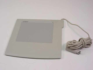 |
| Wacom 6x8 Artz 2 |
Drawing or painting with a mouse is like drawing with a 2x4. It's very difficult to control and fine detail is almost impossible. Thehe pressure sensitive tablet is a huge door to doing art on a computer.
Drawing on an iPad with your finger is easier than using a mouse on a computer but nowhere even close to a pressure sensitive tablet for control and expression. Of course, a real piece of paper and a pencil or pen has them both beat!
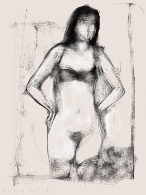 |
| Nude Figure by M Francis McCarthy |
Ok, back to the LiveSketch sketches. I kinda like these for what they are. Like any medium you have limitations. The key to working with most mediums is to use those limitations to your best advantage and create as fully as possible within the boundaries of each different medium whether it be a tablet or pastel or oil paints.
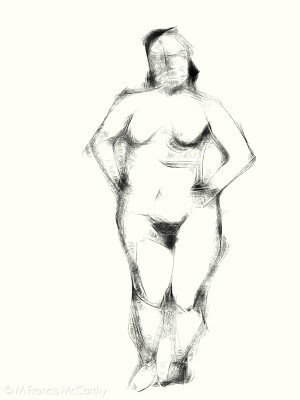 |
| Nude Figure by M Francis McCarthy |
LiveSketch uses an algorithm to sort of web the line of your drawing. Going slower is darker and thicker while going fast produces thinner lines. It's a neat effect but challenging to control. You can do color as well but I preferred to use it like a pencil.
I cannot wait for a real pressure sensitive tablet computer to come out. That's going to be awesome!
