Art Thoughts
What makes you unique as an artist?
That is a great thing to know about yourself and your work.
Sometimes when we see the great work of other artists we can begin to question our own ways of doing things.
While self appraisal is always valuable, it's more important to maybe take a bit here and there from the artists you admire. Rather than slavishly emulate their styles.
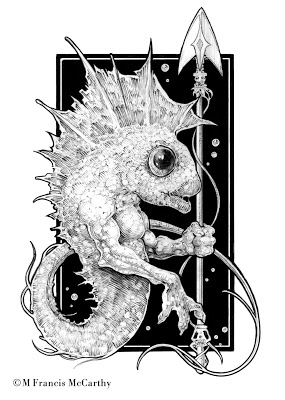 |
| Fisherman by M Francis McCarthy |
If you read yesterdays post; I wrote about creating art from your heart. I said that being a unique artist is your birthright as you express your deepest inner vision.
Hey, here's some home work for you. Draw or paint something today completely out of you imagination. You might be surprised at whats in there.
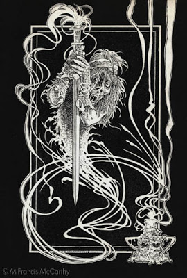
A bit about today's drawing. Not sure if I posted this drawing already, but if I did it was way lower rez than this. I did this back in 88 or so. I'm still super happy with it as it's got great contrast, style and a neat creature.
Cheers,
Drawing - Using Photography
As a young artist I liked both drawing from my imagination and also from photographs. I loved trying my best to delineate all the stuff in my photo reference.
I still love working from photos. What I like best is the control it gives you as an artist. Your reference being stationary you can draw as slow or quickly as you please. Also detail is frozen in photography. whereas in sketching from life most models will not sit happily for long enough for you to capture lots of detail.
Those are some of the pluses but there are negatives galore as well. So many that I'm going to break out a bulleted list of some of the downsides to working from photos:
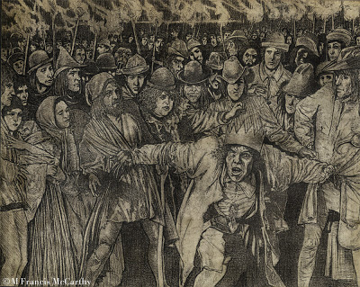 |
| "Quasimodo the King" by M Francis McCarthy |
Those are some of the pluses but there are negatives galore as well. So many that I'm going to break out a bulleted list of some of the downsides to working from photos:
- Much of the character of your drawing will come from the photo. This can be a real issue sometimes, especially if you are not the photographer.
- Forest for the trees syndrome; Here you get lost in all the details of the photo, losing sight of the simple forms and shapes.
- You draw from your reference unaware of the obvious distortions certain focal lengths introduce. This is more of a problem when using photos for illustrations of landscapes, distortions can be super obvious on buildings for example.
- Stiff, stiff, stiff art. Watch-out, as this can creep up on you and you may not see it for quite some time.
I think it's good to draw from life, your imagination and use photography. Mix it up and you get the best of all reference.
Nothing beats drawing from life to sharpen the eye and help you create natural looking pictures free of the types of distortions common in photography.
Personal note: I'm often guilty of the many sins outlined here. My excuse its that I'm very into working in my studio under controlled conditions. I do like sketching and painting from nature. However I'm not able to get the level of finish that suits my vision as an artist outdoors.
A bit about "Quasimodo" I think this is drawn circa 1991 or so. I was really into detail at the time as you can see. The was drawn on arches coldpress water color paper using a lead holder and range of leads from H to 3B.
Cheers,
Drawing - Trying, Failing, Trying Again
Drawing well's not easy. It's easier to trace photos, crib styles and manipulate images with digital media.
So, why do it?
Training you're eye and hand to cooperate also trains your brain to regard the world in front of your vision more critically. An awesome skill to have but in acquiring this skill, you will fail at it. I did and still do all the the time.
Some artists make it seem so easy. Nearly effortless.
It's not like that for me. I must try and fail and try again until I can at least walk away knowing I gave it my best shot. Still when you get it right or most of it right, it feels awesome.
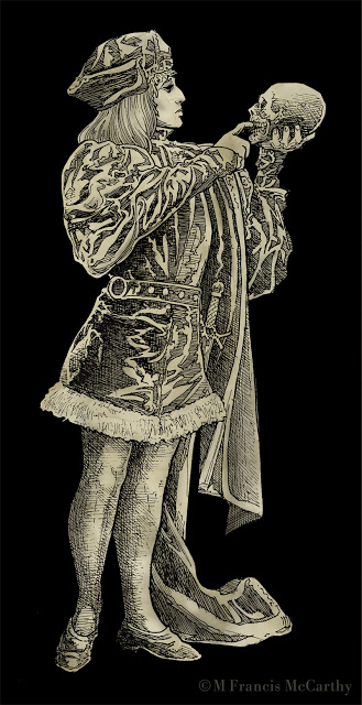 |
| "Hamlet" by M Francis McCarthy |
When I was young we had no choice if we wanted to make pictures. Even the Xerox copiers weren't that readily available till the late seventies. I love copiers by the way. Sure to be a post about them at some point.
I interject a lot of drawings on this blog that's mostly about painting because I feel drawing is the absolute best foundation for any artist. This blog is like my secret box I share of drawings, paintings and dreams. I like to write about and show pictures of stuff I love now or loved back in the day.
Also, I have progressed to a certain level as an artist and I enjoy teaching what I've learned and giving back something to a universe I'm grateful to be a part of with you.
If you're working at your art. Don't give up when it's gets difficult and don't be hard on yourself. Don't compare your work to other artists unfavorably either. Cut yourself some some slack there. You must work at it and never fear failure. If your not having some failures you can be sure your not doing it right or your not trying hard enough.
A word about "Hamlet". The reference for this illustration came out of an old book I acquired. He was drawn back in 1990. At that time I was really fixated in trying to replicate the feel of my pencil drawings in ink. His torso was distorted on purpose. Seems silly now in the age of easy Photoshop distortions. But back in 1990 I was into it. This was inked with a rapidograph or several rapidographs.
Cheers,
Drawing - Ink
Rendering your nice pencil drawing in ink has gotta be one of art's great challenges. Just hard unyielding lines to reproduce what was soft and subtle in penciled grays in two colors white and black.
That's right, two. You've got to think of white as a value not just black ink on white paper. These days doing ink work in the computer is a breeze. In Photoshop you just hit the X key to switch back and forth between the two.
In the real world all your white over black ink solutions are far more messy. I've used white ink (mostly sucks) white gouache (ok) and white out (so,so) at various times.
I'm sure they still sell scratch board too. Scratch board is coated with a white clay. After inking on it you can then scratch away your ink from the surface revealing the white clay below. Scratch board is messy too and requires tons of discipline. I'd say if your into that look, use a computer with a graphics tablet.
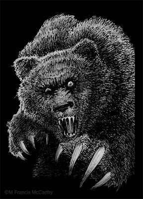 |
| "Mad Bear" by M Francis McCarthy |
This bear was done in back 1990 and used by Motobuilt for stickers and other stuff. Motobuilt was one of the earliest custom skateboard truck makers. They are gone so I'm not finding lots of good links for you, sorry.
The owner and I disagreed about the number of claws for this illustration I wanted four. He said "they actually have five". I said "I ain't changing it. take it or leave it."
Ah, the pre-hired gun days of artful independence. I changed plenty after I started slinging my art gun for good ol' Jack Nightingale.
Anyway back to Ink and Inking. This bear was done with rapidographs. I liked inking with those because you got a constant ink line that was waterproof India ink. Felt pens then and now gave iffy results. I always found their line quality lacking for anything except quick cartoons, sketching or doodles.
The biggest issue with rapidographs is that they produce a uniform line that can be boring if not used right. Also the effing things clog like crazy requiring you to take them apart and clean them. Hopefully without bending the delicate wires on the thinner pens like the .0, .00 and the .000.
BTW I couldn't help but do some subtle toning on this bear in Photoshop in a layer below my line-work. It's fun to freshen up some of these old drawings and share them. Hopefully you all are enjoying seeing this part of my artistic journey too.
Cheers,
Style - A Byproduct
At some point I think every artist becomes obsessed by artistic style.
My first awareness came as my interest in comics grew back in the 70's. One artist would have a realistic style like Neal Adams while another like Jack Kirby could verge on the abstract.
It's often too easy to get caught up in the surface aspects of style. It's easy to disregard strong draftsmanship and structure in an over fixation with style.
This becomes a real problem only if you're copying the style of only one artist. An attitude of exploration and learning on the other hand can pay big dividends.
Regarding developing your personal style in various mediums, I feel that it comes best as a natural result of doing tons of drawing. Piles of paintings and practicing both as often as possible.
The personal style that results from that kind of effort is far harder for other artists to replicate as it is based on a titanium foundation of hard work.
Today's drawings we're done with pencil on paper back in 1990 or so.
Boss Tweed and Jim Fisk were crooked politicians in New York back abound the turn of the 20th century. I enjoyed trying to capture their smug self satisfied expressions.
I've given the drawings vignetted borders to sort of help along the sad fact that these are scans of photo copies. You get a sense of the drawing at least. It will be great to scan the actual drawings in one day.
Cheers,
My first awareness came as my interest in comics grew back in the 70's. One artist would have a realistic style like Neal Adams while another like Jack Kirby could verge on the abstract.
It's often too easy to get caught up in the surface aspects of style. It's easy to disregard strong draftsmanship and structure in an over fixation with style.
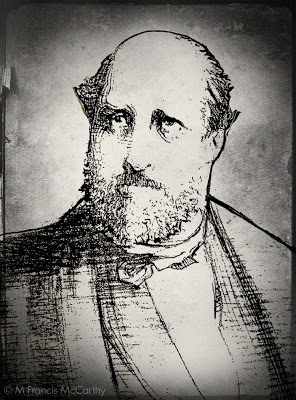 |
| Boss Tweed by M Francis McCarthy |
Ultimately, style should be and is naturally, a byproduct of who you are as an artist. It should not be worn like a suit of clothes that is put on, changed often then discarded for something else.
As a hired gun illustrator I was called on to mimic many different styles as part of my job. So many I can't count them all.
I'll admit I took pride in my ability to mimic the styles of others but such work can become tiring. It drains the soul and as a consequence a toll is taken for the wage earned.
Mimicking the style of an artist you admire for a drawing or two is something I recommend all beginning artists do at times. It can really open your eyes to the means of craft that artists you admire use to create their art. It can also become a terrible crutch, if the learners spirit is coming from the wrong place.
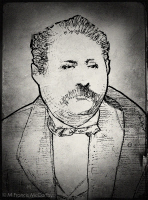 |
| Jim Fisk by M Francis McCarthy |
This becomes a real problem only if you're copying the style of only one artist. An attitude of exploration and learning on the other hand can pay big dividends.
Regarding developing your personal style in various mediums, I feel that it comes best as a natural result of doing tons of drawing. Piles of paintings and practicing both as often as possible.
The personal style that results from that kind of effort is far harder for other artists to replicate as it is based on a titanium foundation of hard work.
Today's drawings we're done with pencil on paper back in 1990 or so.
Boss Tweed and Jim Fisk were crooked politicians in New York back abound the turn of the 20th century. I enjoyed trying to capture their smug self satisfied expressions.
I've given the drawings vignetted borders to sort of help along the sad fact that these are scans of photo copies. You get a sense of the drawing at least. It will be great to scan the actual drawings in one day.
Cheers,
Drawing - Work at it
Putting up a few drawings today. These date from 1987 and were done on nice cold press illustration board with graphite in a lead holder. This was basically inking with a pencil and I used the range from HB to 6B leads.
I never could stand H leads with HB being the exception. H and higher is just too hard for me. For these drawings I used to 6B to fill in the blacks.
Now, the sad part is that these reproductions here are actually scans of copies not scans showing the range of grays.
It's difficult to draw well, at least at first. My draftsmanship is just ok and for me drawing correctly involves a lot of checking and rechecking as I was self taught and went down a few wrong paths. I don't regret my lack of academic training. I worked really hard at drawing anyway.
I never could stand H leads with HB being the exception. H and higher is just too hard for me. For these drawings I used to 6B to fill in the blacks.
Now, the sad part is that these reproductions here are actually scans of copies not scans showing the range of grays.
 |
| The Red Death by M Francis McCarthy |
One day I will have my suitcase full of art from the states and I'll definitely put these up again at that time as there is a real warm feeling you get with lead that just isn't showing here.
On to our topic: I think these drawings really show what working at a drawing is for me. There are things I see now that I'd change but I know at the time I did them that they were high water marks.
Especially The Red Death. Getting those folds right was a real challenge and required intense determination concentration and constant rechecking with the reference.
I've stated before that drawing is mostly just measuring. But, after you have those measurements right there's a world of different interpretations and styles that you can pursue.
The decisions you make in that area are a reflection of who you are, what you admire and your technical ability to realize your vision as an artist.
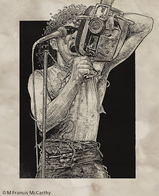 |
| Fee Waybill by M Francis McCarthy |
It's difficult to draw well, at least at first. My draftsmanship is just ok and for me drawing correctly involves a lot of checking and rechecking as I was self taught and went down a few wrong paths. I don't regret my lack of academic training. I worked really hard at drawing anyway.
Getting your drawing ability sorted is the number one key to painting well. Painting can be seen as no more than colored drawing if you think about it and most illustration also hinges on good drawing. The exception being of course, straight photo illustration.
There is lots of nice illustration work being done these days with just photo manipulation in Photoshop. However I feel the best guys at large do know how to draw even if they manipulate photos to get the work done.
Get your sketch book out and make a regular habit of drawing everything, anything, all the time. I doesn't matter what you draw, what matters is doing it often enough that your eye and hand learn how to work things out on paper.
There is no shortcut for drawing practice. You could read twenty blogs today even more informative than this one and it wouldn't equal even one solid drawing attempt.
Cheers,
Drawing - Measuring
Drawing is measuring and make no mistake it can be learned by anyone why applies themselves with a bit of disciplined effort. To draw anything you must relate one shape in an image to the next and the next and so on. The best way to learn how to do this is just by practicing and checking your work with a critical eye.
If your shapes are in the right place, detail is unnecessary to convey a good idea of what is being rendered. Conversely if your drawing's proportions/measurements are off no amount of detailed rendering will save your image.
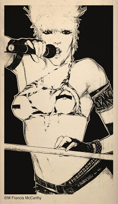 |
| Wendy O by M Francis McCarthy |
Correct drawing is still a challenge for me after 47 years of practice. Being self taught, I have some bad habits that are deeply ingrained. I have developed ways of compensating though One good one is to hold the drawing up to a light and look at it from behind. Another good idea I use all the time is to turn my drawing upside down and look at it critically that way.
I highly recommend blocking in your big shapes and double checking the measurements before you do any serious rendering. I'm really speaking from experience here as I've been guilty of not following this advise and sometimes end up wishing I'd measured twice and rendered once.
A great way to train your eye is to do lots of quick sketches directly with pen on paper. This gets you to focus because you know you cannot erase.
I've mentioned developing a critical eye a few times in this post. This has got to be the most important part of drawing well. At each juncture of your drawing you should be measuring, correcting and critiquing your work. Not in a way that's harsh with yourself but in a way that's honest and pulls no punches. This is the best way to improve and get ever better.
Today I'm putting up a drawing from 1985 of the now dearly departed Wendy O Williams. Can't say I ever dug Wendy's music but she was definitely a sexy rock and roll icon.
My main recollection now of doing this drawing was that it was done quite large on a nice piece of illustration board. I remember drawing this in my first solo apartment. It was done with pencil, a lead holder as I recall. Those were great for getting a super fine point.
Obligatory Disclaimer - This drawing was drawn strictly for fun and I show it here for review and portfolio purposes only.
Drawings 3
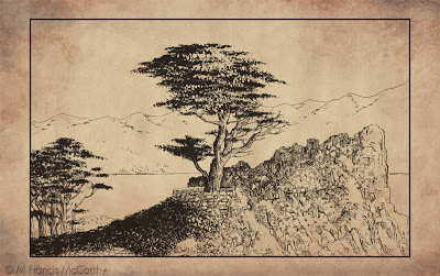
This image was illustrated by me for a company I worked for in the eighties and nineties I will call Jab Art Enterprises. I worked for a guy I'll call Jude. I started there in 1984 and worked for Jude till 1997. For a long while I thought I would never be able to leave that job. More on that in some other post, some another time.
Jude marketed this drawing and others to places like Montgomery Wards and J. C. Penney as part of a "California"series. The ink drawings were photocopied and then hand water colored. The Series featured points of interest in California
At Jab Art Enterprises we primarily did contract framing on a large scale. We also produced "graphics" for the hospitality industry. At the time I drew this we we're more into department stores. I'm not sure if any of them bought this.
The painter in me was coming out for the first time back then. You can see it for example in the way I knocked out the highlights from the cypress tree with white paint.
At that time I was taking painting lessons from Smitty, a customer of Jab Art Enterprises. Smitty taught oil painting to stressed out corporate types as a regular gig. He had a few companies that he would set up in after hours and their employees would come and learn how to paint. Smitty provided everything that was needed including frames that he purchased from Jab Art.
He practiced a form of the Bob Ross style, quick landscape painting that was easy to learn. For my part I always preferred to use actual landscape photos rather than copy the formula paintings from a book that Smitty provided as reference for his students.
I owe Smitty a lot as he not only taught me for free but he also provided the art materials and picked me up for class. A wonderful man I'll always remember with gratitude. He is one of the reasons I write this blog and share what I've learned about art freely.
Cheers, Smitty wherever you are now.
Cheers, Smitty wherever you are now.
Old Drawings 2
Putting up a an old drawings today. For years all I did was draw stuff in pencil and pen and ink. As I've stated in the past I believe good drawing to be the one irreplaceable element of any decent representational painting.
In this era of extreme photo manipulation, drawing could seem passe or even unnecessary. Ultimately those who can draw will produce stronger designs, illustrations or paintings. While those who cannot will spend a lot of their time finding ways around their lack of skill in this area.
In this era of extreme photo manipulation, drawing could seem passe or even unnecessary. Ultimately those who can draw will produce stronger designs, illustrations or paintings. While those who cannot will spend a lot of their time finding ways around their lack of skill in this area.
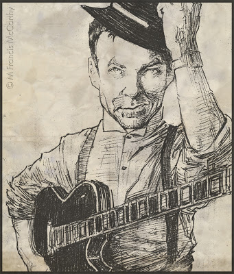 |
| Robert Fripp by M Francis McCarthy |
This is a pencil drawing of Robert Fripp, illustrated circa 1985.The drawing exhibits a hatching technique I had devised of alternating horizontal and vertical cross hatches or "jits" as I some times refer to them.
I think that style is super important to young artists but as you get older becomes much more an internalized part of how you draw. I definitely appropriated quite a lot of technique from my illustration heroes. People like Bernie Wrightson Neal Adams and John Byrne influenced me tremendously. Not to mention the king of them all Frank Frazetta.
The photo reference for this was a nice image already. Music and other popular magazines were a favorite source of drawing reference for me. My philosophy about drawing people at the time was to draw every type of person. I would often go though issues of TV guide and draw the various differnt people pictured in an effort to improve my drawing.
Drawing - Landscape
The drawing I'm featuring today was done way back in 1984.I can see much of what attracts me to landscape today in this drawing. At the time I was really into detail. A habit that persisted for quite a few years.
It was rare for me to do landscape art at the time. I was really more into drawing people. I think I had a snapshot I'd taken that I used as reference for this.
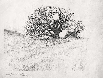 |
| Winter Oak by M Francis McCarthy |
It was rare for me to do landscape art at the time. I was really more into drawing people. I think I had a snapshot I'd taken that I used as reference for this.
This scene was rendered in pencil. One of my favorite mediums. Many artists love pencil because of it's subtle forgiving nature. Unlike a pen or brush pencils leave a faint trace yet can also produce strong black darks.
It's good to use both and many pen drawings start out in pencil. I advise students to jump in to ink along with their pencil work. The definiteness of an ink line is difficult to erase and for that reason has it's own type of integrity.
I feel it is good as an artist to be able to commit and move on. I've known a few that never really got past pencil because of their fear of "messing it up". Better to try and fail than never attempt your best inner vision.
Learn to Draw
I read that today. Learn to draw and create beauty even if no one cares. The quote is from a guy named Sal Bass. I still need to learn who he is and what he did. Regardless the quote stands on it's own as the best art advice I've heard and I aim to teach it to any of my students from here on out.
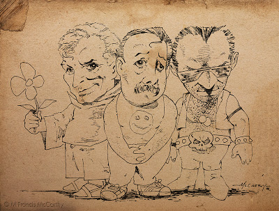 |
| Three Dudes by M Francis McCarthy |
Just one image today. This is a drawing I did back in 1985. It's purpose I think was to impress some girl. Not sure whether I gave it to her or not now, almost thirty years in the future. At the time I was proud of this drawing for the looseness and caricature of the characters.
I've a lot of respect for cartoonists. I don't consider myself one at all though. I've dabbled in "cartoon illustration" though and I'd file this image under that heading.
I can recall inking this with a triple zero rapidograph. Rapidographs gave you a constant, consistent ink line. The triple zero was the thinnest that was practical to use. I used rapidographs a lot. The challenge was to get "character" in a non varied line. Usually I'd attempt to vary the line by speeding up or slowing down the ink stroke.
I worked hard at being an inker for years and I will be posting lots more on inking and using ink medias like the pen, brush and even sticks or computers.
Ipad drawings
I did these last year on my wife's iPad. I used a program called LiveSketch HD. I really enjoy drawing the figure but it's awful hard on an iPad without a real stylus and especially difficult without pressure sensitivity.
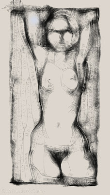 |
| Nude Figure by M Francis McCarthy |
I got my first Wacom tablet back in 1996. It was an an Artz 2 and used a serial port. I loved it so much. At the time I bought it I made a fairly low wage so I had to save like crazy to get one. I had a picture of the Artz 2 taped above my desk to help it manifest quicker.
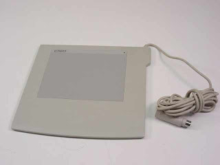 |
| Wacom 6x8 Artz 2 |
Drawing or painting with a mouse is like drawing with a 2x4. It's very difficult to control and fine detail is almost impossible. Thehe pressure sensitive tablet is a huge door to doing art on a computer.
Drawing on an iPad with your finger is easier than using a mouse on a computer but nowhere even close to a pressure sensitive tablet for control and expression. Of course, a real piece of paper and a pencil or pen has them both beat!
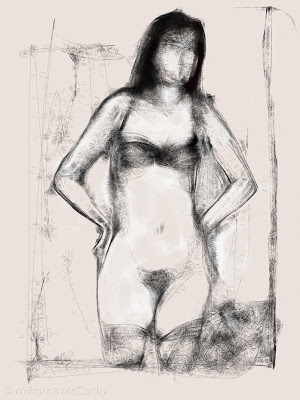 |
| Nude Figure by M Francis McCarthy |
Ok, back to the LiveSketch sketches. I kinda like these for what they are. Like any medium you have limitations. The key to working with most mediums is to use those limitations to your best advantage and create as fully as possible within the boundaries of each different medium whether it be a tablet or pastel or oil paints.
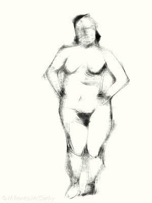 |
| Nude Figure by M Francis McCarthy |
LiveSketch uses an algorithm to sort of web the line of your drawing. Going slower is darker and thicker while going fast produces thinner lines. It's a neat effect but challenging to control. You can do color as well but I preferred to use it like a pencil.
I cannot wait for a real pressure sensitive tablet computer to come out. That's going to be awesome!
Old Drawings
Recently I returned from a trip to my home town in California. While there I grabbed an old portfolio full of xeroxs of many of my old drawings. The portfolio was put together in the early 90's but these drawings are from circa 1988. In 1988 I was 23 years old and living in downtown San Jose, California.
This was drawn in pencil. The model put on a lot of weight in later years but then again so have I since 1988!
Pencil again here but a bit later in the year. I was fond of using lead holders at the time with leads from HB to 4B pretty soft range. I really never liked any of the super hard leads. This guy was illustrated on Illustration board about 7 inches wide.
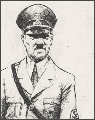
Another pencil sketch. I always enjoyed drawing historical figures. I remember being quiet pleased with the expression as I captured it in the sketch.
Unfortunately these are all copies of photo copies. I have a very heavy suitcase full off original art still at my folks place. One day I hope to get it and scan the entire contents at high resolution.
Meanwhile, it's fun to play with the images. These were all done in the days long before I was anywhere near a computer and the copiers I had access too, I really couldn't play with until around 1992 or so.
I will be posting more old works up as we progress as it seems like a fun thing to do.
