The work you do..
Hey all.
The identified self (often referred to as "ego) has a multitude of valuable uses for us as people. Without it we could not exist.
Been awhile since we've blogged together.
I've been painting my ass off and the insights and inspirations are coming on intensely these days. So I've not as much energy for blogging.
Fear not though as I will never completely cease this blog. As long as I am breathing anyway.
Onto todays topic.
The work you do as an artist is vital to the health and well being of our culture and the universe at large. It is more than a commodity of whatever value it is ascribed. It is an expression of the universe that must occur.
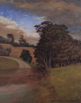 |
| "Along the Path" by M Francis McCarthy |
I'm aware that this may strike some as airy fairy but none of us has all the answers. This blog is one place you can find a few that I've gleaned and hopefully they'll resonate if not, no worries.
However the ego makes poor art.
And yet even poor art needs to be created. And destroyed as well. As cliche as it sounds both are equally accurate statements.
If thats true, why should we try to create "good" art?
We should because it feels like the right thing to do at a core level of our beings. If your attitude as an artist is in alignment with the will of the universe, great art will be the by product.
It is the individuated self that blocks this process in an attempt to do a job it was not created to do. That job is to CREATE and that is the work of the actual self not the ego.
We get in our own way.
Often we are our own worst critics as well. As we paint we kill the baby as it's being born in our attempt to control the result or conform to misguided internal expectations.
This is why I'm reminding you that your job as an artist is valuable and important work. Even if you must struggle to let the great art come out. Rest assured that it's important or at least connected to something important.
Cheers,
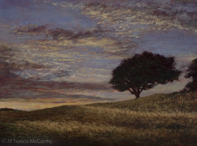
A bit about "Along the Path". This is one of the high points of my old way of working and actually the culmination of many years of perfecting my old painting method.
The reference was a photo I'd taken out here in Northland New Zealand. I've cleaved quite close to it too. There is a lot of imagination in the colors and fracture though and it's straddling my old and new way of working for that reason.
Lately I've been reworking canvas' from imagination. I'm freely improving or enhancing many paintings I've done that had issues usually related to using photo reference. I've blogged about this process and it's unfolding still as self imposed restrictions are abandoned in favor of Art.
"Along the Path has a few of those issues but I'm letting it be as it's a nice painting as is and also represents the end and the peak of an old way of working.
Painting - Holding the Brush
I was working with a student today and we were doing a painting together. She has a good eye and is good with color so her painting resembled mine except in one important way.
Her brush strokes were all swishy and going the same direction. I said to her " hey look at your strokes, they're boring".
Often this is the biggest giveaway that a painting is the work of an armature artist but it's easy to avoid.
For one don't paint like a robot, you're not a human inkjet printer, your a human being and you should paint the way you feel. Not mechanically.
Also, stop and hold that brush another way. Change it up. Don't lick at the painting with it like a kitty cleaning itself. Use every part of the brush to create strokes.
Cheers,
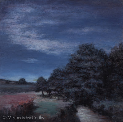
A bit about "Moonlit Meadow" I'm trying to do a "blue" painting here. Not sure I succeeded at my goal but I find this painting pleasant anyway. It went through a major revision although I've no photo of the original state.
It was blue also but the sky in the original was doing nothing special. This was another case of something that looked good in my reference photo but was too subtle and blah when painted.
And it was too subtle, as I'd resorted to rice grain like strokes in the sky in my effort to get the desired effect.
Also bothersome; the main bunch of trees was topped by a point, something that I found challenging visually. I was never happy with it and walked by day after day gritting my teeth a bit in displeasure.
Until one day it made it's way back onto my easel.
I'm actually fairly happy with this piece now. I redid the sky with one that had a hidden moon element that created strong light in the clouds and more contrast overall. I reconfigured the trees a bit and softened their edges. I also amped up the pink and aqua tones on the ground as well as pumping up the highlights on the stream.
"Moonlit Meadow" can be viewed live at my studio in the Quarry Arts Center in Whangarei New Zealand
Landscape Painting - Revisions 2
Keeping up with our recent theme of revising art today.
I've been writing a lot about this topic. One reason is that I feel it's vital information. Painting actually requires less technical knowledge than you would think. The truth is that "seeing itself" is the real thing with painting.
After a period of study it's fairly simple to apply paint to the canvas in the desired colors and areas. The real challenge is in what we putting on the canvas. If we cannot see it first in either nature, a photo or in our minds eye, it will be nearly impossible to paint a great picture.
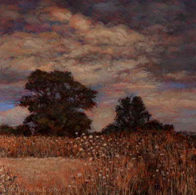
Onto today's painting "Autumn Twilight". I had a bad feeling about this one from the get go. Still, I believed that I could power through my inner misgivings and do something cool.
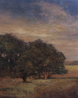 |
| "Autumn Twilight" Final (8x10) by M Francis McCarthy |
Onto today's painting "Autumn Twilight". I had a bad feeling about this one from the get go. Still, I believed that I could power through my inner misgivings and do something cool.
Well I tried, and failed horribly. So much so that I had this painting turned to the wall in my studio for awhile. I'm going to cover what exactly was wrong with it as I tell you what I did to revise the painting below.
First let me say that main thing wrong was my reference photo. Though I had adjusted it quite a lot in Photoshop. I had not really noticed the huge composition issues inherent in the scene itself.
BTW my subconscious did see those problems and tried to signal me through intuition that something was wrong, many times. As you can see below, I ignored my intuition and payed for it dearly.
The revised version is at the top of this post. It would have made sense to post the early version first and the correct down here but I could not bear to have it leading off a post so please just scroll up to check out what I've done.
Here's what I did:
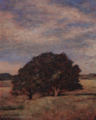 |
| "Autumn Twilight" Previous Version (8x10) by M Francis McCarthy |
The revised version is at the top of this post. It would have made sense to post the early version first and the correct down here but I could not bear to have it leading off a post so please just scroll up to check out what I've done.
Here's what I did:
- Closed off the left side so there was a clear focal area. As is the picture had a sort of two face composition, with each side of the painting fighting for the viewers attention. This was the biggest issue with the painting by far.
- Created a better sky that "payed" off. I've written before about payoff sky's here. Funny enough, I thought I'd set up a good sky but it suffers from "tube syndrome" and was not working at all.
- Reshaped and reformed the trees. I also lightened them where they meet the sky. The darkness against the light was too intense and this is something that is very common in photographs that made it into this painting.
- Lightened the grasses below the trees creating more interest there.
- Darkened the lower right hand corner. I'm still a vignette fan. I did it here to help steer the eye towards the main focal point (the field behind the trees).
- Lightened the area where the background foliage/hills meet the sky. This creates more atmosphere and also lessons the harshness of that distant edge.
That's about it. This was the second surgery I did on a recent painting and it payed off hugely. I'm really happy with the painting now. It's not perfect but it does have a nice feeling to it that I think rewards the viewer, whereas before there was only an almost good painting.
I'm going to be doing more posts along this line coming up.
I'm hopeful that seeing my struggles will help you to overcome obstacles to doing better paintings that you may be having.
Landscape painting is not easy to do well even for an experienced illustrator like myself but its great fun and a challenge that is welcome.
Cheers,
Landscape Painting - Revisions
Hey all. I know I've been a bit lax re the blog but never fear I am still here.
My minds been full of painting lately, I've been on a revision kick sparked by some keen insights regarding my use of photo reference, composition and interest.
I'll be writing quite a few posts about these revisions I've been doing in the near future. Today I'm going to talk about this painting "Twilight Ember".
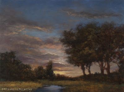 |
| "Twilight's Ember" (12x16) by M Francis McCarthy |
I'm quite pleased with this painting now. I completed it last week.
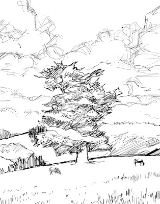
Below I'm showing the 5x7 sketch that is very similar to Twilight Ember's first color stage. After I painted the color layer on the 12x16 version, I was not as happy with my motif, the sky, the tightness of my tree drawing or the grassy field.
Many of these problem areas are only suggested by the 5x7 shown here.
At the small size I wasn't aware that I had any issues really. 12x16 is much bigger though and after my first color layer it was apparent that I was going to have a blah painting on my hands unless I made some changes.
Here's what I did:
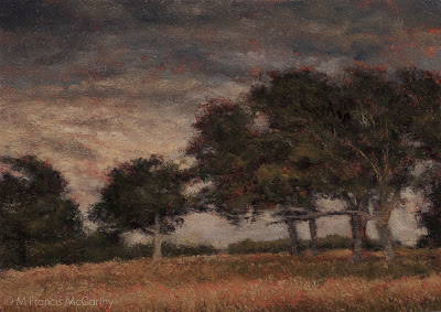 |
| Summer Pastuire (12x16) by M Francis McCarthy |
Here's what I did:
- The sky was a nice transition from grey to peachy, but it was what I call "tubey" meaning that the spaces between clouds were to regular and not varied enough. I repainted the sky with an interesting glowing sunset going all the way up into a deep dusky grey blue.
- I removed that tree in the middle so I could install a better focal point in the space created.
- I completely did a 180 on the view. previously the sun was on the trees, now it is behind.
- I painted in a little brook where before there were only grasses. I feel like the scene would benefit from a higher horizon but I kind of like the uniqueness of the viewpoint as is.
- I created dark foliage in front of the trees on the right. I did this to help direct the viewers eye and create more mystery.
All in all I'm happy. It's not perfect but I enjoy looking at it far more now and I feel that it's over all a satisfying painting.
I hope you are getting something from this breakdown and that it helps you to look at your own work with that important critical eye.
Don't be afraid to tear a painting down and rebuild it if there are apparent issues in it. You may utterly mess it up but there's no real limit to how many times you can rework it if you need to.
Cheers,
Painting - Expression
Expression is what fuels all art. Expression should be and is the purpose for even creating art at all.
Sometimes the intellect can cause us to choke a lot of the expression out of a painting. I'm speaking from lot's of direct experience...
Though I am an artistic type, I am also very rational and like to plan things out. I always say " I'm all for spontaneity... as long as it's planed."
That's my own struggle to work with as an artist. Yours may be different. You may be super expressive with your art but lazy in regards to craft or unmindful of other critical aspects of your work that are out of sync.
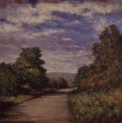 |
| "Headed Home" by M Francis McCarthy |
A challenge for many of us as artists is the attainment of skill and craft without the calcification that can sometimes be the result of applying too much craft.
Like every other aspect of our lives a balance must be struck between control and passion. Ultimately, passion/expression is the most critical of the two. Art without unique individual expression is boring as hell.
I feel that we must paint from our heart and that direction from the intellect should be at a subsurface type level for the most part.
To consistently create good work and still do this,"craft" must become ingrained deep into the psyche. The only way I know of to do this is to paint and draw a lot until those skills become second nature.
What else can we do to increase the expressive qualities of our paintings?
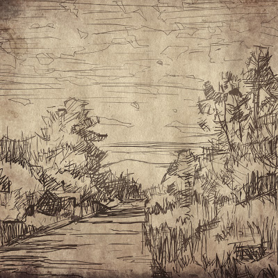 |
| "Headed Home" (sketch) by M Francis McCarthy |
What else can we do to increase the expressive qualities of our paintings?
Here's a short list:
- Do some random stuff to you painting now and again. Then, deal with it.
- If you start with a photo, put it away at some point and focus on the painting, as a painting.
- Paint slower, let it well up inside you then express the brush stroke fully.
- Remind yourself while your painting that expression is your main goal and measure each aspect of your work against this. This is very useful for instigating creative color decisions.
- Remember, you don't have to paint the sky blue and the grass green. In fact that's about the worst color combination I can think of in a landscape painting.
- Do not over delineate details. Leave something for the viewer to do. They are quite capable of creating meaning from even the daubiest daub.
Rember, paint from the herat and not the head. Train yourself to get those skills that you may then ignore.
A bit about today's painting "Heading Home" I' pretty happy with heading home but I see much I'd do differently now. I painted this about a year and a half ago after moving into my studio at the Quarry Art Center in Whangarei. I like the colors and loose-ish brush work.
These days I and transitioning from a more controlled drawing prior to painting into a more expressive and indicative mode in my execution. Stay tuned.
Cheers,
Painting - The Robot
Who is the robot?
The robot is that part of us that works mechanically. He performs many of our actions and responses that are automatic in that they need no conscious attention on our part to direct them.
And it's great! Great for driving, cooking onions and a multitude of other daily actions. Whats the robot not great for?
Painting.
Definitely, better to paint consciously. That's not to say every stroke should be directed by the intellect or the will. It means being conscious of our heart and deepest inner feelings and then focusing that on our work.
Funny enough, the robot loves to paint, too bad he doesn't do a very good job of it. He loves to paint as you plan your next "aware" brush stroke. Truth be told, your painting could be halfway or even two thirds painted by the robot.
What can be done to combat this great ally but bad painter?
Here's some strategies that I like to apply:
- When you lay a stroke down on the canvas do so with intention and an openness to possibilities inherent in the present moment.
- Paint a brush stroke and then step back. Leave the poor thing alone for a bit.
- Don't use a "licking" brush motion on your canvas. That's a tell tale sign that the robots there, undoing most of your conscious painting with those licking strokes as your parsing your next move.
- Change up the way you hold your brush. This is the best painting advise I've given on this blog. Changing up your brush handling resets your brain and keeps you present and the robot at bay.
There's plenty more great strategies, but that's a good start. Maybe you can dream up a few of your own now that the issues out in the open.
In closing since the robots been filling up many of your paintings with unnecessary unmindful brushstrokes. Just getting this monkey off your back alone will improve your work immensely.
Cheers,
Illustration - Challenges
As an illustrator hired to do whatever came into the art department, I was often faced with challenging subjects.
My personal approach was to gird my lions and concentrate on the essentials. Contrast, composition and style, these can be applied to any subject.
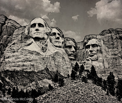 |
| Mt Rushmore illustrated by M Francis McCarthy Copyright Jack Nightingale Artworks |
Most of the art I did there was based on or supported with a strong black line drawing. This helps the printer as it covers over many registration issues with the end result being a crisper design on the tee shirt.
Creating art specifically for screen printing is a dying art as there are many "separation" programs like "fastfilms". They do have a learning curve but nowhere near as difficult as doing the art color by color for custom screen-printing.
Anyway, back to challenges, how to deal with them?
Well, for starters you can always take refuge in craft if inspiration is hard to find. Applying a fresh style or new perspective can take you to some great places as well.
I'd have to say that having a good attitude would be the greatest approach to any challenge. I always try to cultivate an attitude of fun and hard work with a positive outcome assured as the result.
Cheers,
Drawing - Using Photography
As a young artist I liked both drawing from my imagination and also from photographs. I loved trying my best to delineate all the stuff in my photo reference.
I still love working from photos. What I like best is the control it gives you as an artist. Your reference being stationary you can draw as slow or quickly as you please. Also detail is frozen in photography. whereas in sketching from life most models will not sit happily for long enough for you to capture lots of detail.
Those are some of the pluses but there are negatives galore as well. So many that I'm going to break out a bulleted list of some of the downsides to working from photos:
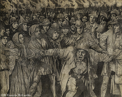 |
| "Quasimodo the King" by M Francis McCarthy |
Those are some of the pluses but there are negatives galore as well. So many that I'm going to break out a bulleted list of some of the downsides to working from photos:
- Much of the character of your drawing will come from the photo. This can be a real issue sometimes, especially if you are not the photographer.
- Forest for the trees syndrome; Here you get lost in all the details of the photo, losing sight of the simple forms and shapes.
- You draw from your reference unaware of the obvious distortions certain focal lengths introduce. This is more of a problem when using photos for illustrations of landscapes, distortions can be super obvious on buildings for example.
- Stiff, stiff, stiff art. Watch-out, as this can creep up on you and you may not see it for quite some time.
I think it's good to draw from life, your imagination and use photography. Mix it up and you get the best of all reference.
Nothing beats drawing from life to sharpen the eye and help you create natural looking pictures free of the types of distortions common in photography.
Personal note: I'm often guilty of the many sins outlined here. My excuse its that I'm very into working in my studio under controlled conditions. I do like sketching and painting from nature. However I'm not able to get the level of finish that suits my vision as an artist outdoors.
A bit about "Quasimodo" I think this is drawn circa 1991 or so. I was really into detail at the time as you can see. The was drawn on arches coldpress water color paper using a lead holder and range of leads from H to 3B.
Cheers,
Drawing - Trying, Failing, Trying Again
Drawing well's not easy. It's easier to trace photos, crib styles and manipulate images with digital media.
So, why do it?
Training you're eye and hand to cooperate also trains your brain to regard the world in front of your vision more critically. An awesome skill to have but in acquiring this skill, you will fail at it. I did and still do all the the time.
Some artists make it seem so easy. Nearly effortless.
It's not like that for me. I must try and fail and try again until I can at least walk away knowing I gave it my best shot. Still when you get it right or most of it right, it feels awesome.
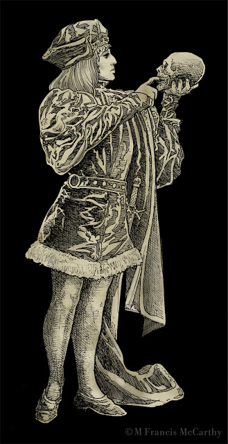 |
| "Hamlet" by M Francis McCarthy |
When I was young we had no choice if we wanted to make pictures. Even the Xerox copiers weren't that readily available till the late seventies. I love copiers by the way. Sure to be a post about them at some point.
I interject a lot of drawings on this blog that's mostly about painting because I feel drawing is the absolute best foundation for any artist. This blog is like my secret box I share of drawings, paintings and dreams. I like to write about and show pictures of stuff I love now or loved back in the day.
Also, I have progressed to a certain level as an artist and I enjoy teaching what I've learned and giving back something to a universe I'm grateful to be a part of with you.
If you're working at your art. Don't give up when it's gets difficult and don't be hard on yourself. Don't compare your work to other artists unfavorably either. Cut yourself some some slack there. You must work at it and never fear failure. If your not having some failures you can be sure your not doing it right or your not trying hard enough.
A word about "Hamlet". The reference for this illustration came out of an old book I acquired. He was drawn back in 1990. At that time I was really fixated in trying to replicate the feel of my pencil drawings in ink. His torso was distorted on purpose. Seems silly now in the age of easy Photoshop distortions. But back in 1990 I was into it. This was inked with a rapidograph or several rapidographs.
Cheers,
Style - A Byproduct
At some point I think every artist becomes obsessed by artistic style.
My first awareness came as my interest in comics grew back in the 70's. One artist would have a realistic style like Neal Adams while another like Jack Kirby could verge on the abstract.
It's often too easy to get caught up in the surface aspects of style. It's easy to disregard strong draftsmanship and structure in an over fixation with style.
This becomes a real problem only if you're copying the style of only one artist. An attitude of exploration and learning on the other hand can pay big dividends.
Regarding developing your personal style in various mediums, I feel that it comes best as a natural result of doing tons of drawing. Piles of paintings and practicing both as often as possible.
The personal style that results from that kind of effort is far harder for other artists to replicate as it is based on a titanium foundation of hard work.
Today's drawings we're done with pencil on paper back in 1990 or so.
Boss Tweed and Jim Fisk were crooked politicians in New York back abound the turn of the 20th century. I enjoyed trying to capture their smug self satisfied expressions.
I've given the drawings vignetted borders to sort of help along the sad fact that these are scans of photo copies. You get a sense of the drawing at least. It will be great to scan the actual drawings in one day.
Cheers,
My first awareness came as my interest in comics grew back in the 70's. One artist would have a realistic style like Neal Adams while another like Jack Kirby could verge on the abstract.
It's often too easy to get caught up in the surface aspects of style. It's easy to disregard strong draftsmanship and structure in an over fixation with style.
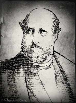 |
| Boss Tweed by M Francis McCarthy |
Ultimately, style should be and is naturally, a byproduct of who you are as an artist. It should not be worn like a suit of clothes that is put on, changed often then discarded for something else.
As a hired gun illustrator I was called on to mimic many different styles as part of my job. So many I can't count them all.
I'll admit I took pride in my ability to mimic the styles of others but such work can become tiring. It drains the soul and as a consequence a toll is taken for the wage earned.
Mimicking the style of an artist you admire for a drawing or two is something I recommend all beginning artists do at times. It can really open your eyes to the means of craft that artists you admire use to create their art. It can also become a terrible crutch, if the learners spirit is coming from the wrong place.
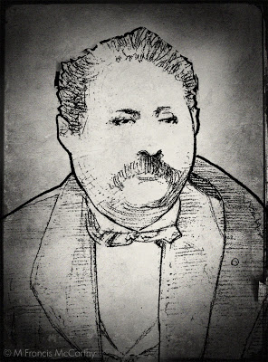 |
| Jim Fisk by M Francis McCarthy |
This becomes a real problem only if you're copying the style of only one artist. An attitude of exploration and learning on the other hand can pay big dividends.
Regarding developing your personal style in various mediums, I feel that it comes best as a natural result of doing tons of drawing. Piles of paintings and practicing both as often as possible.
The personal style that results from that kind of effort is far harder for other artists to replicate as it is based on a titanium foundation of hard work.
Today's drawings we're done with pencil on paper back in 1990 or so.
Boss Tweed and Jim Fisk were crooked politicians in New York back abound the turn of the 20th century. I enjoyed trying to capture their smug self satisfied expressions.
I've given the drawings vignetted borders to sort of help along the sad fact that these are scans of photo copies. You get a sense of the drawing at least. It will be great to scan the actual drawings in one day.
Cheers,
Drawing - Work at it
Putting up a few drawings today. These date from 1987 and were done on nice cold press illustration board with graphite in a lead holder. This was basically inking with a pencil and I used the range from HB to 6B leads.
I never could stand H leads with HB being the exception. H and higher is just too hard for me. For these drawings I used to 6B to fill in the blacks.
Now, the sad part is that these reproductions here are actually scans of copies not scans showing the range of grays.
It's difficult to draw well, at least at first. My draftsmanship is just ok and for me drawing correctly involves a lot of checking and rechecking as I was self taught and went down a few wrong paths. I don't regret my lack of academic training. I worked really hard at drawing anyway.
I never could stand H leads with HB being the exception. H and higher is just too hard for me. For these drawings I used to 6B to fill in the blacks.
Now, the sad part is that these reproductions here are actually scans of copies not scans showing the range of grays.
 |
| The Red Death by M Francis McCarthy |
One day I will have my suitcase full of art from the states and I'll definitely put these up again at that time as there is a real warm feeling you get with lead that just isn't showing here.
On to our topic: I think these drawings really show what working at a drawing is for me. There are things I see now that I'd change but I know at the time I did them that they were high water marks.
Especially The Red Death. Getting those folds right was a real challenge and required intense determination concentration and constant rechecking with the reference.
I've stated before that drawing is mostly just measuring. But, after you have those measurements right there's a world of different interpretations and styles that you can pursue.
The decisions you make in that area are a reflection of who you are, what you admire and your technical ability to realize your vision as an artist.
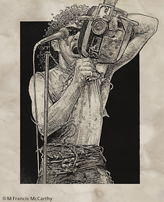 |
| Fee Waybill by M Francis McCarthy |
It's difficult to draw well, at least at first. My draftsmanship is just ok and for me drawing correctly involves a lot of checking and rechecking as I was self taught and went down a few wrong paths. I don't regret my lack of academic training. I worked really hard at drawing anyway.
Getting your drawing ability sorted is the number one key to painting well. Painting can be seen as no more than colored drawing if you think about it and most illustration also hinges on good drawing. The exception being of course, straight photo illustration.
There is lots of nice illustration work being done these days with just photo manipulation in Photoshop. However I feel the best guys at large do know how to draw even if they manipulate photos to get the work done.
Get your sketch book out and make a regular habit of drawing everything, anything, all the time. I doesn't matter what you draw, what matters is doing it often enough that your eye and hand learn how to work things out on paper.
There is no shortcut for drawing practice. You could read twenty blogs today even more informative than this one and it wouldn't equal even one solid drawing attempt.
Cheers,
Landscape Painting - How Much Detail?
As a young artist I always looked up to and admired other artists that put a lot of detail in their work. A kid into comics, I and my mates loved Neil Adams style because of the realistic detail in his art.
It wasn't until I grew older that I became more aware of the beauty gained by simplifying one's work so that it's best attributes were put forward.
As far as super detailed landscape painting goes the Hudson River guys were probably the most detailed school though I suppose most any type of painting can be highly detailed. Here's a piece by Frederic Edwin Church:
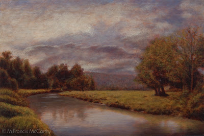 |
| Peaceful Sojourn by M Francis McCarthy |
As far as super detailed landscape painting goes the Hudson River guys were probably the most detailed school though I suppose most any type of painting can be highly detailed. Here's a piece by Frederic Edwin Church:
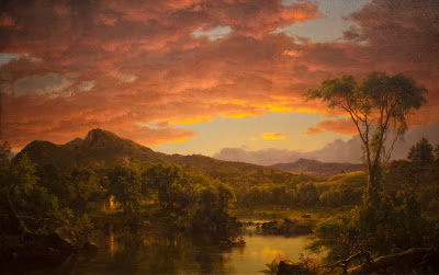 |
| Frederic Edwin Church - a Country Home |
This is fairly high rez so give it a click to see how Fred handled finish and detail. Granted this actual painting is huge but the level of finish detail is super high and in Fred's case it works quite well. I've seen Fred's work in person and it's awesome.
For me as an artist and landscape painter detail can be a straight jacket that locks up images. Like I said when I was younger I dug detail and drew plenty of detailed images. Now though I believe most every thing that's good in a picture, that's important, has nothing to do with detail.
If you work with photo reference as I often do, The fact that you can see all that detail in your reference can make it difficult not to render it all right into your painting. What you'l end up with is a box of detail more often than a cohesive painting, if you're not careful.
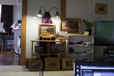 |
| View of my old living room with studio beyond |
I'm not a scientist but I've read a bit about how we as humans "see". We actually see only a small bit of anything in our field of vision in sharp focus. The reason we think we see all detail in a given scene at once is that our brains sew together a panoramic image for us to perceive.
If you observe your own viewing process right now, you might notice that only an area about eight inches wide at 1 foot or so is in focus. To see more than that clearly, you must move your eye's. This is called scanning.
I try with my work to avoid scanning as much as possible. My feeling is that the painter should do the scanning for the perceiver of his paintings and present an image that just flows into the brain of the viewer. People look at the world and photos much the same way. They scan them. Good landscape paintings avoid this and lead the eye in a pleasant manner.
There are so many ways to do this that I will expand upon later but for the purposes of this post I'll point out one of the best ways. That is this; eliminate distracting detail from your work and present only pertinent detail that pays off the viewers attention. Cheers
Landscape Painting - Work Small, at First
Lagging a bit on posting, I know. But, I do have an excuse. I've been working on my website and I'm sorting out some really nice portfolio pages. Still a work in progress but you're welcome to check em out if you like.
In addition to that I've been organizing many years worth of photos of paintings and other assorted tidbits, some of which will make it here on to my blog.
It's been my goal for awhile now to have an image archived on my site of every sold and unsold work that I've painted.
The California years are up now and I'm working on three New Zealand image galleries as well. Eventually, I will have all my years worth of drawings up too.
Behind the art department in Campbell where I worked there are these awesome percolation ponds and also Los Gatos Creek.
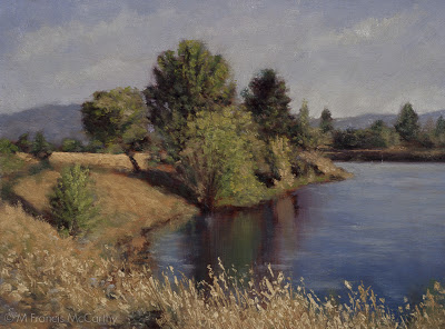 |
| Summer Reflections (6x9) by M Francis McCarthy |
Behind the art department in Campbell where I worked there are these awesome percolation ponds and also Los Gatos Creek.
I found many views there that inspired me and I did over thirty five or so paintings referenced from that area. "Summer reflections" is one of these. I'm still quite pleased with it and who knows, I may paint the theme again some time.
Now, my painting tip for today. If you're learning painting, work small. Two good reasons are: You'll have a lot more experience of painting different scenes in a far shorter period of time than if you do larger work and also, you'll also have far more paintings to keep, sell or give away.
The upside of having more paintings is that more of them are bound to be good. As far as the bad ones go, destroy them. Do it for yourself and also so the rest of us don't have to look at your crappy bad paintings either.
I've known far too many aspiring artists that spent all their time slogging on some large crappy paintings that they became invested in and thus felt obligated to keep around.
Working small means at least you can stick the bad ones in a drawer until you are able to release them to the trash can. Or, better yet burn em. So no one picks them out of the trash and hangs them up on their wall (not kidding, has happened to me).
I will say there's a downside to starting small that I personally found to be an issue. Only working small, can make painting larger a bit of a strain at first. I found it a bit of a strain at least. These days, I've no issues working up to 12x18. I'm going to be doing a 18x24 in a month or so and I expect that to go fine.
BTW, using bigger brushes for larger paintings is a good idea and makes transitioning from painting small sizes to larger much easier. Cheers...
Inspiration
I enjoy talking with the many artists that visit my studio at the Quarry Arts Center here in Whangarei. Today I was chatting with someone about Inspiration. Actually the topic of artist blocks came up but I prefer to couch this phenomenon in the positive context of Inspiration vs the negative attribute of "artists block".
There are many causes of artists block. Here's list off the top of my head:
- Not enough work being created
- Not enough time spent doing art
- Too much comparison with past work or the work of others
- Lack of desire to create art
- A bad attitude about one's art or abilities
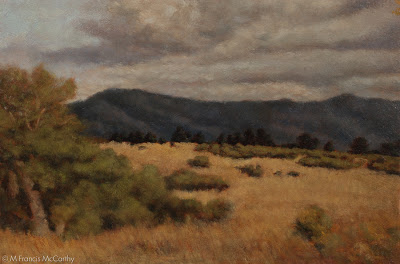 |
| California Hills (6x9) by M Francis McCarthy |
Now lets start reworking the bad attitude by rewording "artists block" to "seeking inspiration". One simple change like that can completely re-frame the issue. There is a lot more positive changes that can and will eliminate any artists block.
Here's some great ways to find inspiration:
- Work more, talk less. Inspiration shows up for those who are working and avoids those who prefer talking about working or work they've done in the past.
- Pick a style and master it before moving on. This is all about focus which I'll talk more about in a future post.
- Emulate the work of artists you admire. By this I mean teach yourself whats good about their work that touches you as an artist. I am not saying that you should ever try to assume the style and working methods of another artist as your own. What I am saying is that the best way to learn how to do something is to try to recreate that which moves you.
- Give yourself a break. If you're truly working hard at your art, your stuff cannot stay bad for long. Hard work always pays off. Always. So don't be too self critical while you're developing as an artist. That's not to say you shouldn't be critical of your work. You should be creating enough of a flow of art that no one piece is all that important anyway.
- Destroy you worst work. You don't need it around if it sucks. If you are really working as hard as you should be, you'd have so much art sitting around that you won't mind getting rid of the crap.
- Do more pieces that take less time. If you have to, work smaller. Smaller works take less time generally speaking and this allows you to cover more ground while mastering your craft.
A bit about today's painting California Hills. I painted this back in 2009. It's maybe my third or forth painting in a Tonalist vein.
I was working on textured panels at the time and I still do my 5x7s oil sketches on textured boards. These days I prefer to do my final paintings on a regular wood surface. The type of wood does matter and I really like hard woods. Here in New Zealand I use kauri which has a nice tight even wood grain.
Motifs and Repainting
Happy new year! Tonight I'm going to talk about motifs and revisiting them. Also, technique and it's progression in the attainment of an artists personal vision.
Starting in 2010 I went far more tonal and indirect in my approach to oil painting. I was inspired by a trip I took with my wife to the De Young Museum. At the end of the American collection they had several large rooms dedicated to American landscape painting.
I was especially intrigued by the work of George Inness but also Thomas Moran and Frederic Edwin Church. I loved the surfaces of these paintings and their soft glowing inner light.
 |
| November Light (6x9) by M Francis McCarthy |
This version of November Light was painted in July of 2010 and currently resides in the collection of a fan of my work. It was painted on a maple panel that I'd brought over from the states.
At that time I was painting only small pieces but putting full intention and finish into them. the inspiration for this painting came from my first trip to New Zealand in 2009 and it was one of the first I painted after moving here in 2010.
This is my 5x5 reworking of November Light, painted in 2011. After painting a series of Four 8x8 paintings that were for a show at Hangar Gallery, I was becoming interested in the square format and decided that I'd like to repaint November Light as a 12x12.
Here is the finished painting as a 12x12. It feels different from either of the other two paintings and I'm quite happy with the result. What I like best about this piece is the expressive sky and brush technique that does the job with out being too finicky.
I really like this composition and how it features water and an interesting tree but I felt the sky was lacking movement and drama.
At the time I was fascinated with proportion and was only painting in 6x9. The 6x9 format's 3:2 aspect ratio is the most similar to the golden ratio. Proprortion is a topic that I'd like to get into further in a later post.
At the time I was fascinated with proportion and was only painting in 6x9. The 6x9 format's 3:2 aspect ratio is the most similar to the golden ratio. Proprortion is a topic that I'd like to get into further in a later post.
 |
| November Light (5x5 by M Francis McCarthy |
This is my 5x5 reworking of November Light, painted in 2011. After painting a series of Four 8x8 paintings that were for a show at Hangar Gallery, I was becoming interested in the square format and decided that I'd like to repaint November Light as a 12x12.
It was at this time that I first started doing small oil studies prior to executing the larger pieces. I quite enjoy doing the small paintings and a nice side benefit is that it creates an affordable small painting for people that collect my work.
 |
| November Light (12x12)by M Francis McCarthy |
Here is the finished painting as a 12x12. It feels different from either of the other two paintings and I'm quite happy with the result. What I like best about this piece is the expressive sky and brush technique that does the job with out being too finicky.
I aspire to create each painting using as few brush strokes and successive layers as possible. That said, I'll keep painting until I get the scene across. I pick, jab, scratch and layer brush strokes, anything I have to do.
Landscape Painting - Color
More ruminations on landscape painting today, with a focus on color. I use a somewhat limited pallet as follows: Black, Cobalt Blue, Phthalo Blue, Dioxazine Purple, Viridian, Alizarin Crimson, Burnt Sienna, Transparent Earth Yellow, Yellow Ocher, Lemon Yellow (hue) and Lead White. I've also recently added Titanium White back into my Lead White for added body. I've arrived at this pallet through years of trying out different colors.
It's important to limit your pallet as much as possible, doing so creates better harmony in the painting. Some of the colors on my pallet are special effect colors like the Violet and the Phthalo Blue. I can get by without these easily.
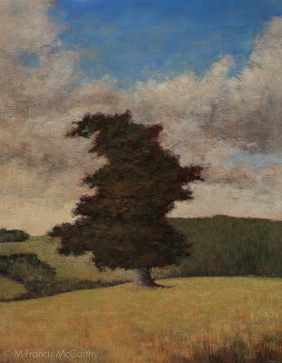 |
| Pastureland (11x14) by M Francis McCarthy |
It's important to limit your pallet as much as possible, doing so creates better harmony in the painting. Some of the colors on my pallet are special effect colors like the Violet and the Phthalo Blue. I can get by without these easily.
Others like Ivory Black are for knocking brightness off of a straight mix. Also black is great for making a warm rich green when mixed with yellow. When it comes to using black I almost never use it in an opaque manner. You must be careful with black as too much has a deadening effect. Also, it can be cool in an unforgiving way. I love black and would not want to be without it.
The lead white vs titanium debate is well known to any serious student of oil painting. I love lead white but I must import it to use in my paintings here in New Zealand as it's not freely available here.
I work on a color principle of warm vs cool colors on my pallet. In the reds Alizarin Crimson is a cool red while I use Burnt Sienna as a warm red. I prefer sienna to any cad reds as I like it's earthy quality. It is made with clay and one of the ancient pigments.
In the Blues: Cobalt is a warm blue and Phthalo Blue is cool. For the yellows: Yellow Ocher is warm and earthy while Lemon Yellow is cool and quite "green". Viridian I use mostly mixed with Alizarin to create my shadow/dark colors. I use it to modify greens and cut reds as well. As a green it is not really in most landscapes but it is vital as a modifier.
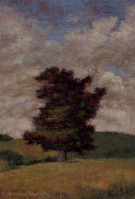 |
| Pastureland (5x7) by M Francis McCarthy |
The lead white vs titanium debate is well known to any serious student of oil painting. I love lead white but I must import it to use in my paintings here in New Zealand as it's not freely available here.
Lead white is far more transparent than Titanium and warmer as well. I use lead white exclusively except for when I teach. Recently though I'm mixing a bit of Titanium in with my Lead white. This is helps to lighten my paintings a bit. Also, it is a very permanent and light-fast color so contributes to their longevity.
Pay off skies
Monday here in New Zealand and another blog post.
This painting is called "Summer Storm" sized 8x10 and painted a few months ago.
I feel that every painting that I do should have what I call a "pay off sky". By that I mean the sky should contribute strongly to the emotion and impact of the painting, not just serve as a backdrop to the trees and other landscape elements.
I like lots of color in my skies as well and I've noticed that Hollywood does these days also. I've noted many movies that have almost exclusively used twilight light skies in their outdoor scenes. Movies like the Narnia Chronicles and Avengers come to mind but they're everywhere once you start paying attention.
One of the great, great things I love about New Zealand is the clean air and beautiful skies we have here. I never tire of looking up and noting the differentiated clouds and patterns of our southern skies.
This painting is in the 8x10 format. Until recently I eschewed these proportions but I've since embraced 8x10, 11x14, 9x12 as well as square formats. I will definitely write a post in the future about the different proportions and their relative impact. For now I'll say that different proportions really change the feel of a scene. Below is my 5x7 sketch for "Summer Storm"
This painting is called "Summer Storm" sized 8x10 and painted a few months ago.
I feel that every painting that I do should have what I call a "pay off sky". By that I mean the sky should contribute strongly to the emotion and impact of the painting, not just serve as a backdrop to the trees and other landscape elements.
I like lots of color in my skies as well and I've noticed that Hollywood does these days also. I've noted many movies that have almost exclusively used twilight light skies in their outdoor scenes. Movies like the Narnia Chronicles and Avengers come to mind but they're everywhere once you start paying attention.
One of the great, great things I love about New Zealand is the clean air and beautiful skies we have here. I never tire of looking up and noting the differentiated clouds and patterns of our southern skies.
 |
| Summer Storm M Francis McCarthy |
This painting is in the 8x10 format. Until recently I eschewed these proportions but I've since embraced 8x10, 11x14, 9x12 as well as square formats. I will definitely write a post in the future about the different proportions and their relative impact. For now I'll say that different proportions really change the feel of a scene. Below is my 5x7 sketch for "Summer Storm"
Study vs Finished Painting
I like to do a color study prior to painting my final version of the image. The study below is painted at 5x5 inches. I tend to prep my board with a textured clear gesso stained sepia. I then sketch on the board in charcoal. After that I complete the sketch using burnt sienna and black. finally I go in with color painted in fairly quickly and directly..
Here is the same motif painted at 8x8 inches. Though the size is still quite small you can see the image is far more refined in every way. the method use is much like my studies however more time and care is payed to the initial drawing. Also, there are more layers of transparent color and more time and repeated sessions are applied to the piece shown below.
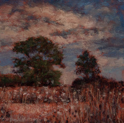 |
| Indian Summer (Study) M Francis McCarthy |
Here is the same motif painted at 8x8 inches. Though the size is still quite small you can see the image is far more refined in every way. the method use is much like my studies however more time and care is payed to the initial drawing. Also, there are more layers of transparent color and more time and repeated sessions are applied to the piece shown below.
