Landscape Painting - Color
More ruminations on landscape painting today, with a focus on color. I use a somewhat limited pallet as follows: Black, Cobalt Blue, Phthalo Blue, Dioxazine Purple, Viridian, Alizarin Crimson, Burnt Sienna, Transparent Earth Yellow, Yellow Ocher, Lemon Yellow (hue) and Lead White. I've also recently added Titanium White back into my Lead White for added body. I've arrived at this pallet through years of trying out different colors.
It's important to limit your pallet as much as possible, doing so creates better harmony in the painting. Some of the colors on my pallet are special effect colors like the Violet and the Phthalo Blue. I can get by without these easily.
 |
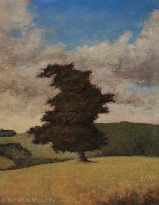
| Pastureland (11x14) by M Francis McCarthy |
It's important to limit your pallet as much as possible, doing so creates better harmony in the painting. Some of the colors on my pallet are special effect colors like the Violet and the Phthalo Blue. I can get by without these easily.
Others like Ivory Black are for knocking brightness off of a straight mix. Also black is great for making a warm rich green when mixed with yellow. When it comes to using black I almost never use it in an opaque manner. You must be careful with black as too much has a deadening effect. Also, it can be cool in an unforgiving way. I love black and would not want to be without it.
The lead white vs titanium debate is well known to any serious student of oil painting. I love lead white but I must import it to use in my paintings here in New Zealand as it's not freely available here.
I work on a color principle of warm vs cool colors on my pallet. In the reds Alizarin Crimson is a cool red while I use Burnt Sienna as a warm red. I prefer sienna to any cad reds as I like it's earthy quality. It is made with clay and one of the ancient pigments.
In the Blues: Cobalt is a warm blue and Phthalo Blue is cool. For the yellows: Yellow Ocher is warm and earthy while Lemon Yellow is cool and quite "green". Viridian I use mostly mixed with Alizarin to create my shadow/dark colors. I use it to modify greens and cut reds as well. As a green it is not really in most landscapes but it is vital as a modifier.
 |
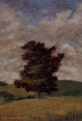
| Pastureland (5x7) by M Francis McCarthy |
The lead white vs titanium debate is well known to any serious student of oil painting. I love lead white but I must import it to use in my paintings here in New Zealand as it's not freely available here.
Lead white is far more transparent than Titanium and warmer as well. I use lead white exclusively except for when I teach. Recently though I'm mixing a bit of Titanium in with my Lead white. This is helps to lighten my paintings a bit. Also, it is a very permanent and light-fast color so contributes to their longevity.
