Landscape Painting - Beauty You Can't Fake It...
After yesterdays scary bear, I'm thinking we'll get into beauty today.
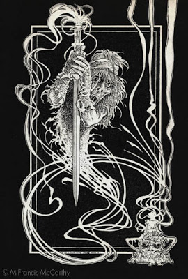
In 1990 when I did that bear, I was 25 years old and still occasionally buying comic books. As a young artist I was far more interested in clever, coolness than beauty.
As the years have passed, more and more I've been attracted to the beautiful in art.
As today's title states. You cannot fake beauty.
Something can be clever, cool, striking even but to be beautiful. It must be well crafted and work on sound artistic principles.
It may be true that beauty is in the eye of the beholder but it is also true that this truism is often invoked to defend second rate art or cleverness disguised as art.
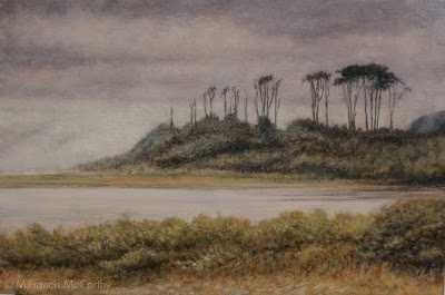 |
| "By the Shore" (6x9) by M Francis McCarthy |
It may be true that beauty is in the eye of the beholder but it is also true that this truism is often invoked to defend second rate art or cleverness disguised as art.
After years of being clever eventually, as an artist I had to decide was sort of art that I wanted to leave in this world.
I want to make pictures that bring folks some insight, rest and comfort. That's not all that's going on but it is definitely a big apart of what I'm after.This goal is strongly supported by trying to achieve beauty in my work.
A bit about today's painting. It was done after a trip my wife made to visit me in California before we were married.
The summer was scorching hot at that time in California except on the coast where were touring. There, it was blissfully foggy,nice and cool. That's reflected in the painting too I hope.
This painting exhibits a strong Tonalist pallet and was an early attempt at using a Tonalist vocabulary in my painting.
The 6x9 size is due to my fixation on the golden mean as a painting proportion. I stayed with that proportion well into my New Zealand painting career. We'll get more into proportions later. They are fascinating with the golden mean being especially so.
If you're a student, I recommend looking at and dissecting some work you consider beautiful. Create some yourself. It actually feels great to try.
If you're a student, I recommend looking at and dissecting some work you consider beautiful. Create some yourself. It actually feels great to try.
Cheers,
Digital Art 3
Since we we're discussing abstracts yesterday. I thought I'd throw up a few tonight and chat a bit about them and that era in my art adventure.
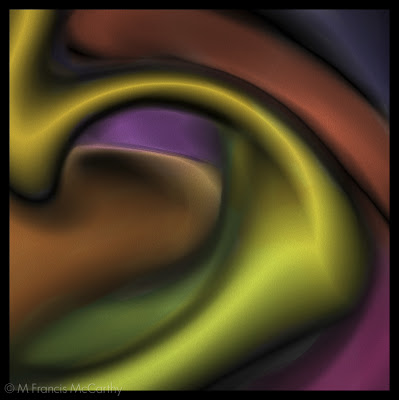 |
| Lodgio by M Francis McCarthy |
These images date from 1996. All of them we're created using my first PC, a 486 with 8 mb of ram. Actually in 1996 my friend David lent me 400 dollars to help me upgrade my machine to a 1 gig hard dive and 16 mb of ram. I owe David a lot and will always remember his kindness.
At the time, that ram upgrade was 300 dollars or so. In those days multitasking like we do now was limited. I was able to play a CD while working in my art programs though which was miraculous at the time.
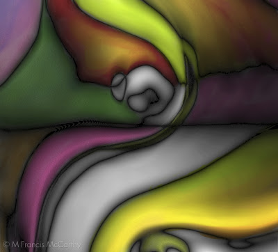 |
| Kope by M Francis McCarthy |
I know, It's a bit of a cliche now but at the time power was a big factor in what you could accomplish on a computer.
We spoke a bit about my digital technique in my last digital art post but the truth is most of this work is not repeatable. When creating abstract art digitally I followed the path of pure inspiration. Though I had some formulas that I would use consistently, the array of options available at every turn meant that no two pieces we're ever the same.
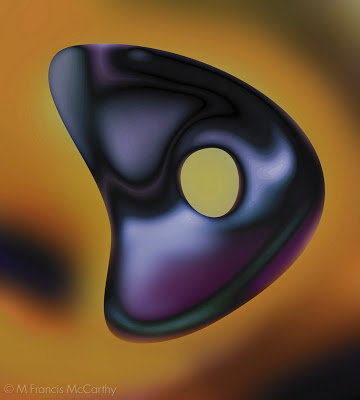 |
| Muin by M Francis McCarthy |
I always strove for organic expression in my digital abstracts. I wanted to develop each image in a natural way even though I was using unnatural means. I seldom would actually draw or paint them in a direct manner, preferring to manipulate digital media in more oblique ways.
I used all the distortion and blur filters combined with Kai's power tools like vortex distort. However, I do not like anything canned looking and seldom would I leave anything but a faint trace of a filter used. I've more digital pieces that have never been aired and I'm sure we'll revisit this topic in a future post.
Digital Landscape Paintings
From 1995 to 2005 I was creating 98% of my art on a computer. At first for my own edification then as a way to make a living. I explored most of the nooks and crannies of the digital art making process and I had attained a high level of mastery with the medium.
Sometime in 2006/07 I started painting landscapes in the computer working directly over photos with my Wacom tablet and stylus. I had developed several techniques that I used for animal illustrations that I wanted to try on landscapes
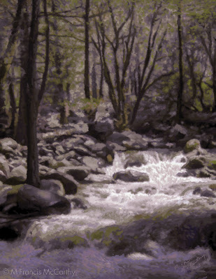 |
| Falls by M Francis McCarthy |
This was based on a photo I took while at Yosemite. I was somewhat pleased with the result but the painting had a stationary quality that I had not yet realized was due to it's method of creation.
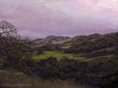 |
| View of Grant Parkby M Francis McCarthy |
One of my favorite attempts based on a very old digital photo I'd taken. I still like this but I feel the color doesn't move like it would in a real painting.
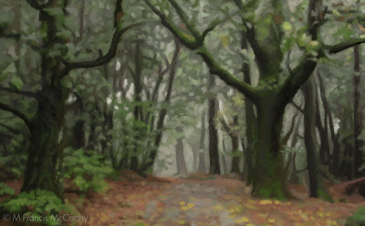 |
| Forest Path by M Francis McCarthy |
Another semi successful work. These three pieces represent the best efforts out of a good 15 paintings done inside my computer using Painter and Photoshop. At the time I was not as aware of the inherent limitations of photography and thus I feel all of these paintings have a quality of effected photographs even though I panted them stroke by stroke over my photo reference.
A few of the limitations and traps involved with directly painting on top of photos are as follows:
- Too much detail in the painting
- Composition issues in the photo are not resolved by in the painting
- Photos have a far more limited color range than most paintings require to be interesting
- You paint everything you see in the photo because it's so apparently there.
I've much to say about photography and it's use in conjunction with landscape painting. So I'll definitely be revisiting the topic in future posts.
The Illustrator - Reference
Change up from Landscape painting today. We're going to revisit my early years as a hired gun illustrator. I've always enjoyed the phrase "hired gun" I must admit.
As an illustrator, I was hired to solve problems and make my employer look good. These images were created back in 98'. All of them have a screen print ready graphic look that I was into.
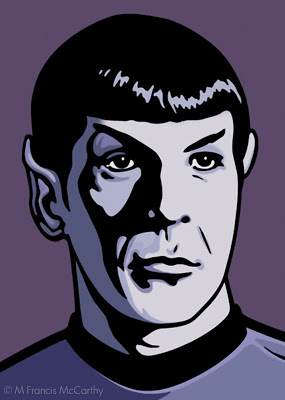 |
| Mr Spock by M Francis McCarthy |
Just for the record "Mr Spock" is copyrighted by whomever owns his likeness. I did this as a portfolio piece never intending to sell the image. It was a real challenge to get the facial shadow right. I like my coloration and over all I was pretty happy with this illustration
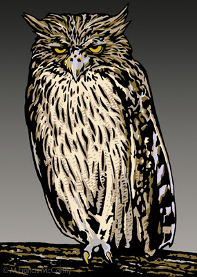 |
| Mr Meany by M Francis McCarthy |
I'm gonna call my place of employment "Jack Nightingale Artworks". A small art studio with Jack as chief designer and myself art directing. I also did many of the illustrations that we're used in our designs. For me it was a dream job and I was very happy working there for quite a few years. More on that phase of my art journey in future posts
Mr Meanie is another portfolio piece. I did a lot of animals for Jack Nightingale Artworks so I thought I'd do an owl. Up to that point I'd mostly concentrated on figurative art or abstract digital art. Animals however sold well on tee shirts and so I illustrated many, many animals.
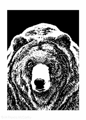 |
| Bear Friendly by M Francis McCarthy |
I'm proud of this illustration. Grizzly bears are fun to draw and this one owes a lot to the reference I found somewhere. All illustration relies on good reference. Don't let anyone tell you different. Back in those days we found reference at the library or in magazines.
Most illustrators had something called a morgue with all of their collected clippings. Reference was hard to come by in the pre Google image search era. Now you can find most anything with a few clicks but an illustrator should always be careful about using photography as reference without the permission of the photographer. Many artists can and do get sued.
These days I only work from my own reference and if possible I'd advise other artists to do the same. If it's not possible to get the shot you need be sure to contact the photographer. Just do it. Many will let you use things as reference for cheap or even free.
Digital Art 2
Christmas eve here in New Zealand and I thought I'd put up a few more digital art images.
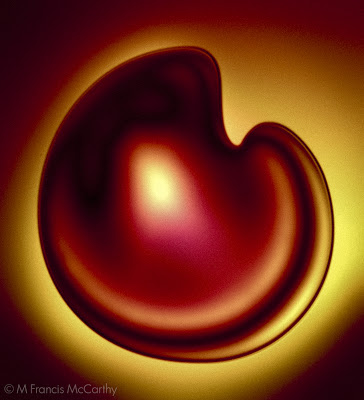 |
| Eog by M Francis McCarthy |
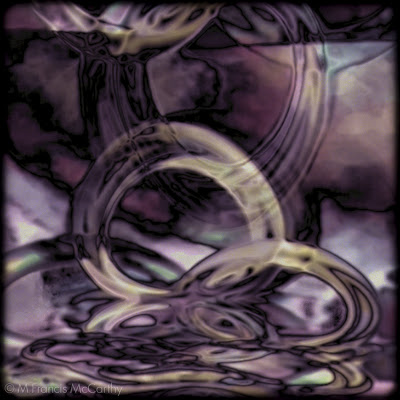 |
| Scrap by M Francis McCarthy |
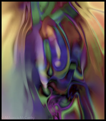 |
| Sopyu by M Francis McCarthy |
Sopyu was created in Corel's Photopaint. Photopaint came with the suite and was just a few steps behind Photoshop back in 1995/96. This was done after they got a better Gaussian type blur. They're original blur was super boxy.
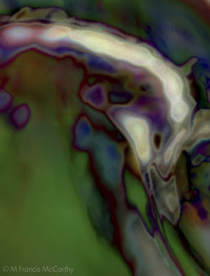 |
| Uyki by M Francis McCarthy |
Digital Art
I first became aware of computers in the 80's. Frankly I was leery of them and was sure they we're going to take over the world and enslave us all (Er. I guess this is a legitimate fear given humanity's adoration of the smartphone. present company included). I wanted nothing to do with them
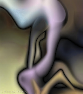 |
| Hoquea M Francis McCarthy |
Fast forward to 94. I see comics colored in glorious ways that I'd not imagined possible and on the film screens a new type of art was making it's presence felt. I've always followed my deepest intuitions and they we're leading me into this realm of color. At the time I made not a lot of money though I worked hard at the job I'd had for 9 years or so. My mother provided my door into computer land by secretly loaning me the money for my first computer (my dad never knew she did this).
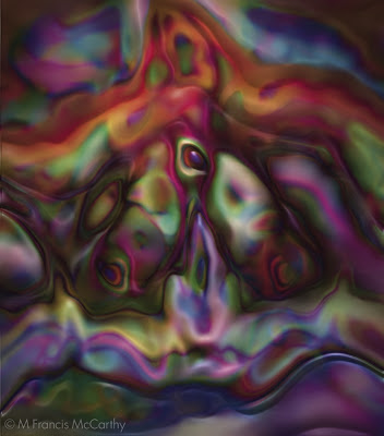 |
| Pokp M Francis McCarthy |
It was an AT&T 486 with a 500 mb hard drive and most excitingly a CD drive! Not a CD burner that was only an expensive and vague dream at that time. It took me awhile to wrap my head around the thing, this was 1994. I've no space here to delineate my complete progression of learning program by program but I started out with the CorelDraw 3 Suite and then progressed to Painter 3 finally I was able to get my hands on Photoshop.
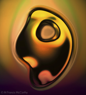 |
| Broken M Francis McCarthy |
My big goal at first was to color my pen and ink work and I did do a far bit of that but eventually I started getting really abstract with my art. The freedom of the virtual art studio was intoxicating and I ran wild in it. Creating whatever struck my fancy. I used to love starting with only a blank white file and using only noise I'd create a digital work of art filter by filter, manipulation by manipulation.
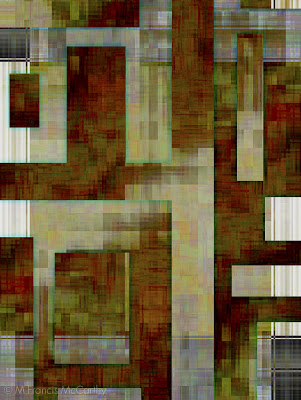 |
| Nu M Francis McCarthy |
These images I've posted today are just a small sampling of this exploratory period that lasted from 1994 to 1998. In 1998 I started working as a graphic artist and illustrator and was on a computer all day long working! How I got to landscape painter from there is one of the tales I plan to tell on this blog and I've more to share...
Illustration
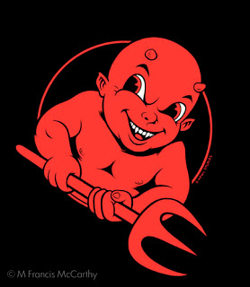
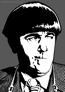
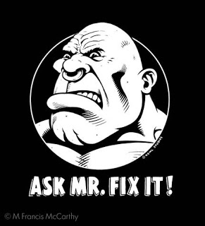
For 13 years I worked as an illustrator and art director for a company that produced apparel and other items that were sold in department stores, zoos, national parks and Starbucks coffee. Today I'm posting a few of my portfolio images from the early part of that era.
This image above is "Devil Boy" my attempt at capturing a skater type look back in 2000. I printed some of this design on tees for my own company "Kewl Studios" a story I will tell another time.
I created "Moe"as a portfolio piece intending to mail it out as a post card to solicit illustration work. At the time this was drawn, I was definitely entranced with graphic styles that would screen print print well.
Another Kewl Studios design that I printed. It was always interesting to see who purchased this shirt. I think it went over most peoples heads. Not sure really what I was saying with the design but I do think it looks cool and catches the eye.
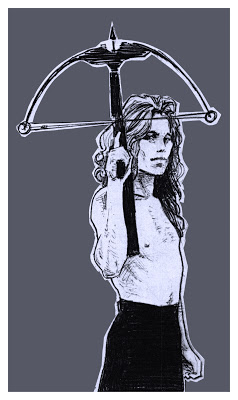
Speaking of catching the eye. I feel art must do this if it is to be successful on any level whether commercial or fine art. I strive to do this always, even with landscape painting. With landscape work however I scale the in your face aspect way back. Candy colored high contrast landscapes can grate on the viewers eye.
The three best was to catch the someones eye are color, contrast and composition. Follow that up with style, texture and scale/proportion and people will notice.
Old Drawings
Recently I returned from a trip to my home town in California. While there I grabbed an old portfolio full of xeroxs of many of my old drawings. The portfolio was put together in the early 90's but these drawings are from circa 1988. In 1988 I was 23 years old and living in downtown San Jose, California.
This was drawn in pencil. The model put on a lot of weight in later years but then again so have I since 1988!
Pencil again here but a bit later in the year. I was fond of using lead holders at the time with leads from HB to 4B pretty soft range. I really never liked any of the super hard leads. This guy was illustrated on Illustration board about 7 inches wide.
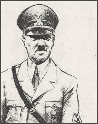
Another pencil sketch. I always enjoyed drawing historical figures. I remember being quiet pleased with the expression as I captured it in the sketch.
Unfortunately these are all copies of photo copies. I have a very heavy suitcase full off original art still at my folks place. One day I hope to get it and scan the entire contents at high resolution.
Meanwhile, it's fun to play with the images. These were all done in the days long before I was anywhere near a computer and the copiers I had access too, I really couldn't play with until around 1992 or so.
I will be posting more old works up as we progress as it seems like a fun thing to do.
My Studio
Here's a video of my studio taken a few days ago:
My studio is at the Quarry Arts Center in Whangarei, New Zealand. The Quarry was started by an artist named Yvonne Rust. She was an independent spirit and in many ways her spirit continues at the Quarry.
I've been a resident painter for over a year now and I really enjoy the beauty of the place and the good company of my fellow artists. I am there most week days so drop by if your in Whangarei.
