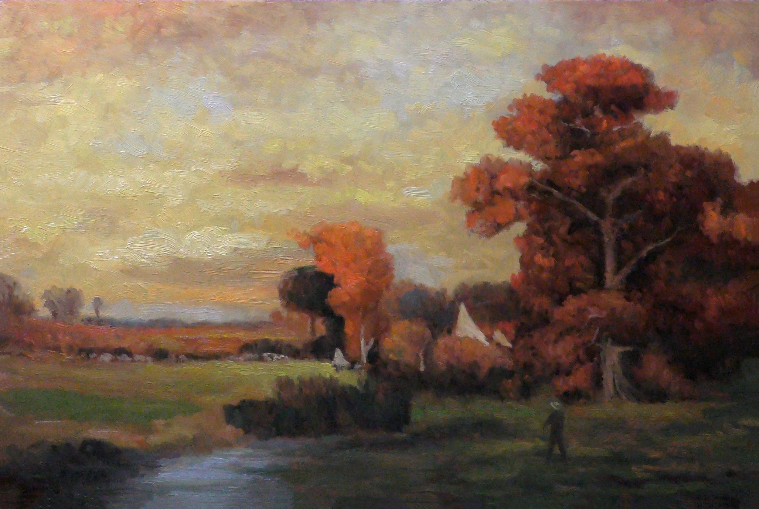
Riffing on John Francis Murphy 8x12
My painting loosely based on Sunday, October by John Francis Murphy. Check out the video.

Riffing on John Francis Murphy 8x12 $249
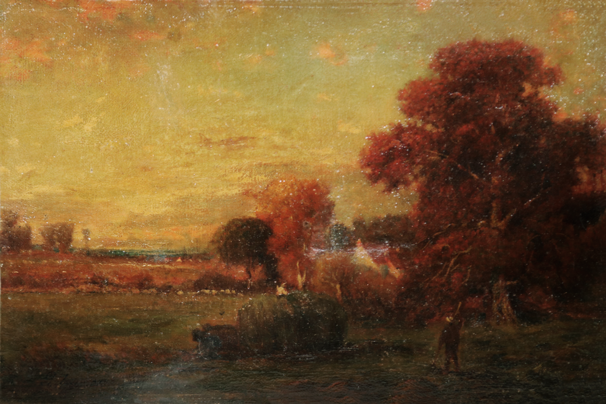
Study after a Stormy Day John Francis Murphy 8x12
One of my favorites by John. Check out the video.

Study after a Stormy Day John Francis Murphy 8x12 $349
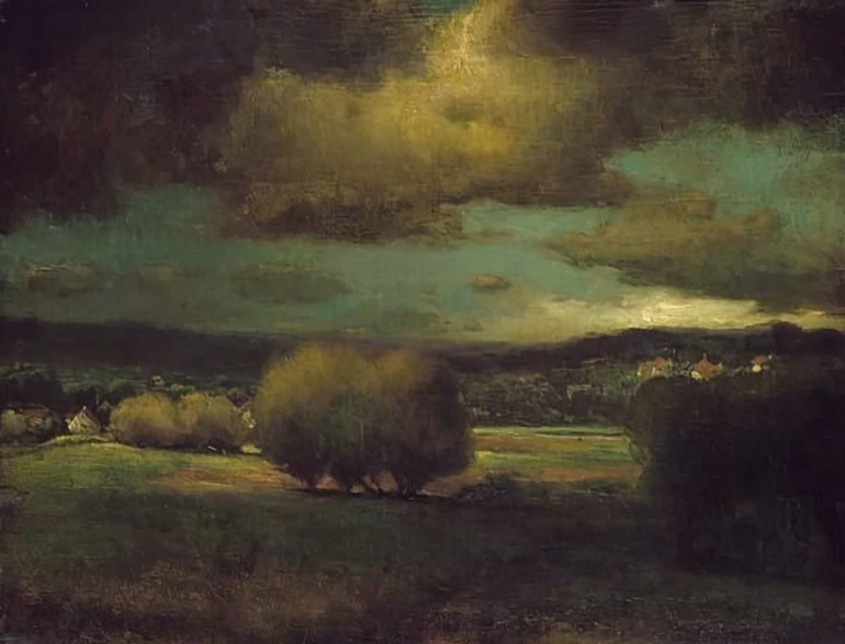
Just for fun. My version from 2017 below!
An even older take on his painting blow!
Day 17 Charles Warren Eaton - Winter Solitude 9x12
We take a small break from our Inness studies today to visit the work of another Tonalist Master Charles Warren Eaton. His painting ‘Winter Solitude’ was done in 1887. Check out the blog post for more information!

Study after Charles Warren Eaton - Winter Solitude 9x12 $349
My reference image below.
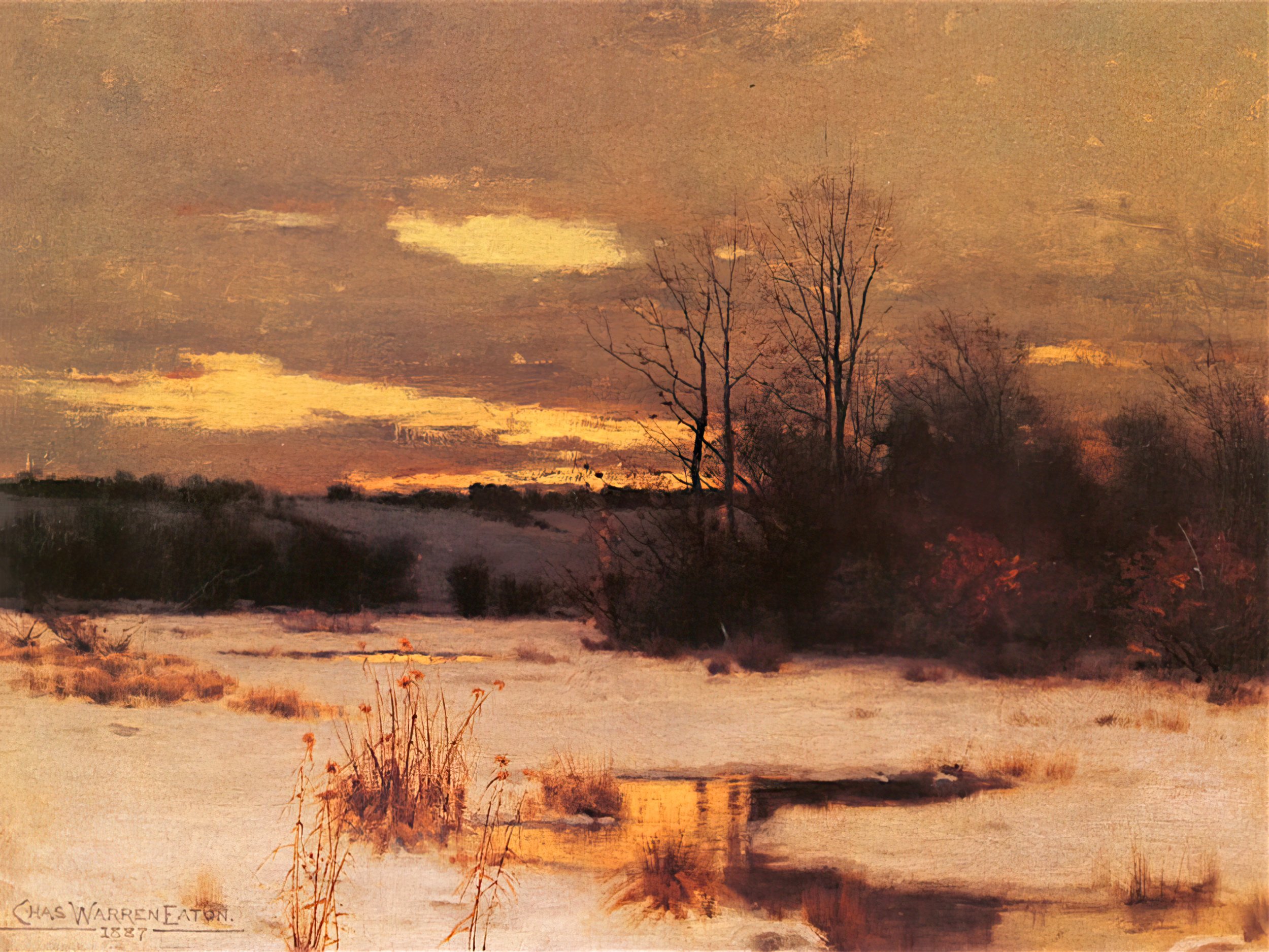
Charles Warren Eaton - Winter Solitude 9x12
Day 16 George Inness Sunset Harvest 8x12
I found this one on an auctioneer site the size of the original is 9x14. Sorry it’s not in the Catelog Raisonne. Check out the video for more info!
Study after Suinset Harvest 8x12 $299
George Inness Sunset Harvest 8x12
Day 15 George Inness - Figure in a Landscape at Dusk 8x10
On the Mutual art site this painting shows as ‘painted in the style of’ and so may not be an actual Inness. It’s looks good to me though so I proceeded with my planned study and I’m happy with how it turned out. Check out the video for more information!

Study after George Inness - Figure in a Landscape at Dusk 8x10 $249
My reference image below!

George Inness - Figure in a Landscape at Dusk 8x10
Day 14 George Inness Landscape with trees and Afterglow 9x12
This is an Inness that does not appear in the catalog raisonne. I found information about it on the Mutualart site. Original was sized 18x24 and painted in 1891. Check out the video for more information.

Study after - George Inness Landscape with trees and Afterglow 9x12 $349
Reference image below:

George Inness Landscape with trees and Afterglow
Day 13 George Inness After the Shower 8x12
I loved this painting when I first saw it in the catalog and started searching the internet for it. The only images I found were in sepia tone but high resolution. I’ve used PhotoShop to colorize the image and then used that as reference for my study. Watch the video for lot’s more information. Original painting size was 12x18” Cat # 554.

Study after George Inness After the Shower 8x12 $299
My reference image below and below that the original sepia image.

Image Colorized using Photoshop

Original Sepia of ‘After the Shower’ print from 1910
Day 12 Sunshine and Clouds 1883 - 8x12
Yes a real challenge. So may of George’s paintings are. There are deffo moments where I’m thinking ‘ugh, this is too hard!. Anyway watch the video for all the pertinent information! The original by Inness was 27.5x41.5 inches.

Study after George Inness - Sunshine and Clouds 1883 - 8x12 $299
My reference image below. A very tough image to find online!

George Inness - Sunshine and Clouds 1883
Day 11 George Inness 'The Old Farm' 8x14
This painting is quite loose and abstracted. Painted by George Inness in 1893 the size of his painting was 29x44 inches, Catalog # 1100. Check out the video below for more facts and info about my process in creating this painting

Study after ‘The Old Farm’ by George Inness $350
The reference image below:

‘The Old Farm’ by George Inness
Day 10 George Inness Sunset '1860' 10x14
Well, I know I always say it but this was quite a challenge to pull off especially the sky. The complementary color approach by Inness to the sunset is masterful and I learned a lot.

Study after George Inness Sunset 10x14 $450
Some details about Inness’ original painting; painted in 1860, Size 10x14. It’s just a coincidence that my study was done at the same size. It’s rare for George to paint such a finished work at such a small size. Cataloge #166

Sunset by George Inness 10x14
Day 9 George Inness Autumn Gold 8x12
The challenge here was edges in the time allotted. I’m happy with the color and my brush technique gets the overall Inness feel across I think. Check out the vid for more about this painting.

Study after George Inness Autumn Gold 8x12 $299
Below is a version I did back in 2015 in a smaller format. Looks very different color wise. It was day 86 of my 100 days of Tonalism series.
And here below is my reference image. Please not color differences between my study and this reference photo can be due to lots of different reasons like digital color profiles and in some cases I may decide to paint in a manner less ‘yellowed’ as in many cases I expect the painting original color to have mellowed due to varnish or being stored in a dark room etc.

George Inness Autumn Gold
Day 8 George Inness Landscape #13 8x10
This painting by Inness is quite hard to find online. I’ll soon be receiving a copy of George Inness’ Catalogue Raisonné! That will give me the ability to properly title the works and hope fully more general information as well.

Study after George Inness Landscape #13 $299

Landscape #13 by George Inness
Day 7 George Inness Autumn Pastoral Dusk 9x12
Lot’s of chroma in this one. As I stated in the video, I suspect this might have been painted by George Inness Jr though it’s just a feeling.

Study after George Inness Autumn Pastoral Dusk 9x12 $349
Check out the video for more insights and also a reading about George Inness’ history from the book A History of American Tonalism
Here is my reference image.

Original image of George Inness - Autumn Pastoral Dusk
Day 6 The Gloaming 8x14
A bit of a different approach to this study. I went in very thin and that seems to fit the bill. Check out the video for more information about my process and George Inness the Master.

Study after George Inness The Gloaming 8x14 $349
Below is the reference image of George’s painting.

The Gloaming by George Inness
Day 5: Approaching Storm 8x12
A rather odd composition by George that I painted once before in the 100 days of Tonalism project. I really like that sky. By the way, this is very difficult image to find online but I have identified Inness’ orignal painting size throu Mutual Art as 12 1/4 x 15 7/8 in.

Study after George Inness - Approaching Storm 8x12 $299
This is the same image that I’d used back in 2014. I’ve up sampled the low resolution original using Gigapixel. Note; the reference images are almost always more ‘yellowish’ and ‘darker’ than my paintings. This is a calculation on my part as I’m striving for the same sort of freshness that Inness would have have in his studio. Oil paintings will tend to darken when stored in dark environs and varnish layers also tend to go ‘yellow’.

Approaching Storm by George Inness
Here below is a slightly better image of Georges’ painting. It was still pretty low rez but more detail. I have up sampled and color adjusted.
Approaching Storm by George Inness
Just for fun, here’s my 2015 take on the same painting at a smaller size!
Cheers,
M Francis McCarthy
Day 4: An Autumn Afternoon 8x12

Study after George Inness An Autumn Afternoon 8x12 $299
Autumn afternoon was a bit of a challenge. The textured board added a lot but also made my job harder. Inness painted this scene in 1891 so it’s late period Inness.
In the video here, I read a section from David A Cleveland’s book ‘ American Tonalism 1870 to 1920

Original by George Inness An Autumn Afternoon

Super high rez version
And, just for fun, here’s a link to my 2015 version of this George Inness painting!
Day 3: 9 o'clock 8x12
9 o'clock 8x12
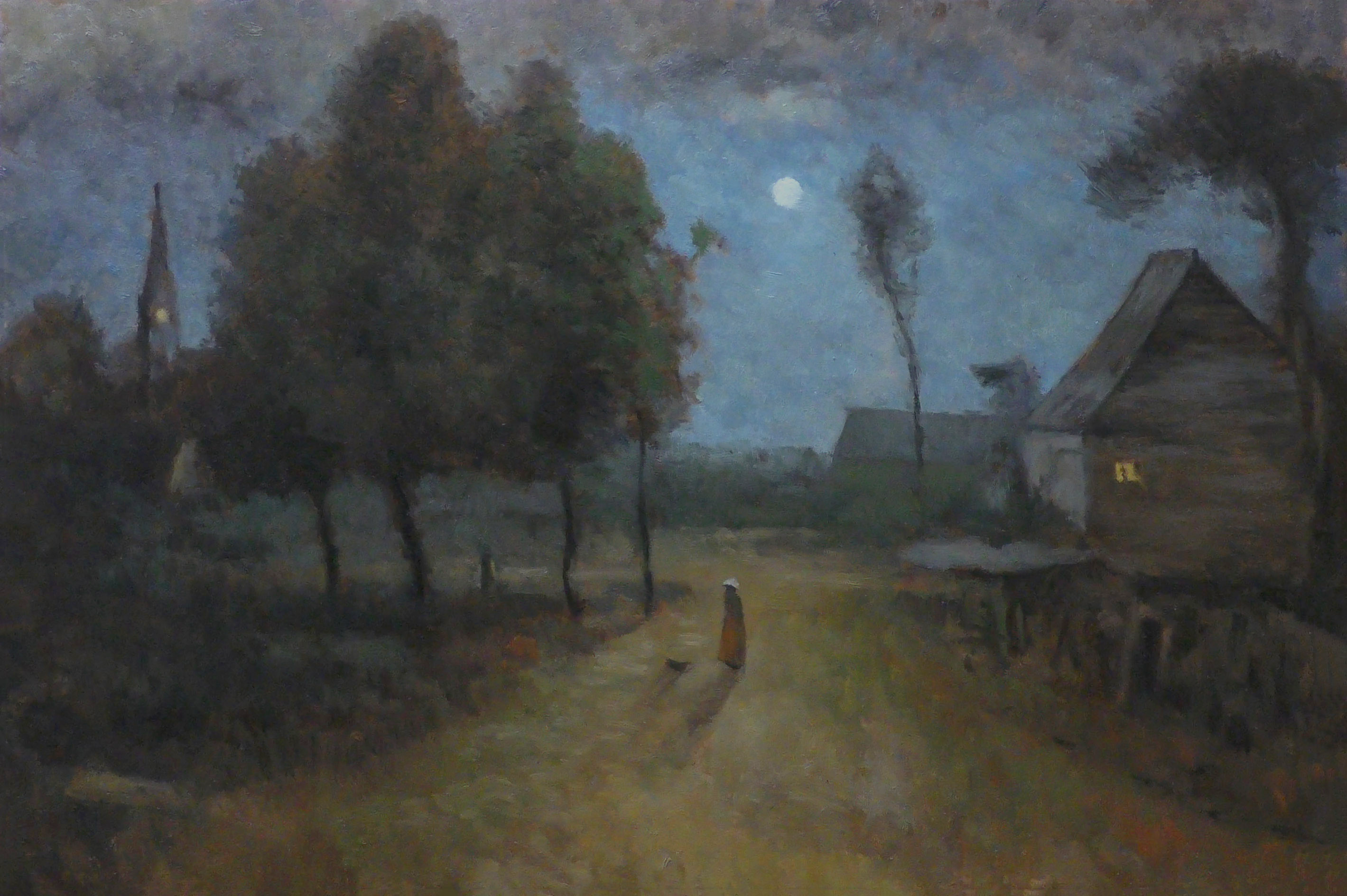
Study after 9 o'clock by George Inness 8x12 $299
This study was quite a challenge but I feel I pulled it off pretty well. If not for this project I probably would not have gone after a study of this painting. Generally I prefer to paint more organic scenery and I avoid things like houses, cottages, towns, things like that.
Still, I must say that his approach to these sorts of subjects is very much in line with what I would like to do. I definitely developed an appreciation for his approach to the landscape nocturne. Colors at night are very different and our perceptions are quite altered compared to daylight. Nocturne's are actually a pretty fascinating aspect of landscape painting that I don't know much about. I do know that when I am outside at night I am always thinking about painting and how I would paint night scenes.
I think it's interesting how light in value he made the blue in the sky. It looks good more so since it was clearly a full moon that night.
I'm trying to find out information about each of the paintings that I'm doing a study after in this series. 9 o'clock was painted in 1891 by George and the size of the original is 30 x 45" which is typically for George, a golden mean proportion.

Study after 9 o'clock by George Inness 8x12 (detail)
Many of the paintings in this series will be done on textured boards however I preferred in this case to create my own texture by dabbing the brushstrokes onto a smooth board. I was thinking I hadn't really done this before while I was doing the painting but sitting in my studio at home here in a moment ago I was looking at a study that I did a while back of my favorite George Inness painting 'Autumn in Montclair' and I see there that I did quite a lot of dabbing on that one, so dabbing is just something that George liked to do sometimes and so must die if I wish to make a good study after his work.

Original Painting - 9 o'clock by George Inness
For more information about my painting process please watch the video this blog post is designed to complement the video and there is some overlap in information but there is also information that is unique to each format so please enjoy both.
Cheers,
M Francis McCarthy
Day 2 Afterglow on the Meadow 8x10
Hello and welcome to Day Two! I’d never seen the painting of Georges before researching this project. That i the case for quite a few of the paintings we are going to make studies after. Initially I was collecting images thinking ‘ I’ll work this one in to my usual studio practice but after I’d collected 40 to 50 I’d not seen before, the idea for this ‘Mastering George Inness series’ started to gel.

Study after George Innes: Afterglow on the Meadow 8x10 $299
This particular scene from him is very loose. It might seem that looser paintings would be easier to do studies after but in fact the opposite is the case. They are more difficult. The difficulty lies in capturing a loose feel while trying to be faithful to Inness’ original. I’ve lot’s of strategies for my approach to this challenge.
For this scene I selected a board that had a strong texture applied to it. I also decided to apply my paint far heavier than usual this meant that I had to alter my approach to the paint stokes I used. I quite happy with the end result and I deffo learned a lot which at the end of the day is the primary reason for doing this series.

George Inness - Afterglow on the Meadow
Cheers, Mike
Day 1 A Glowing Sunset 8x12
Hello and welcome to the Mastering George Inness Series and Blog! I’m so pleased that you are here and I promise to work hard towards unpacking some of George’s secrets as we create roughly 130 studies after paintings from throughout his career.

Study after ‘A Glowing Sunset by George Inness’ 8x12
Todays entry ‘A Glowing Sunset’ is a difficult painting to find an image of online. My best guess is that i'’s an 1880’s period piece. As always I totally enjoyed working after the Master. This study was done on hardboard with a smooth surface. Colors used were lot’s of Burnt Umber, Black, Cad Orange, Cad Yellow, Yellow Ochre and raw Sienna, Also used but in minor roles are Phthalo Green, Alizarin Crimson and Permanent green Lt. It is for sale here.
Always daunting putting my study up with the Masters version but worth it to make the image from Inness widely available to those of you that want to make your own study.. One of the primary differences is that mine is lighter over all. I could get an even closer result with a glaze but I also feel that the image of Inness’ painti may be in need of a good cleaning and is likely gone darker than he originally painted it

George Inness A Glowing Sunset 8x12
Here below is a slightly better/different reference image.

George Inness A Glowing Sunset 8x12
So, that’s day one of our exciting journey. feel free to contact me if you have any comments, questions or requests. The struggle is real!
M Francis McCarthy