Assumptions
The art we create is the sum total of all of the assumptions that we have made our own.
This affects our work in positive and negative ways.
On the positive side, we need assumptions so that we are not forced to reinvent drawing or painting every time we sit down to work. We all have a collection of techniques, formulas and stuff we recall other artists saying that we bring to bear in our work all the time.
On the negative side, those assumptions often create blind spots that we are unaware of.
This affects our work in positive and negative ways.
On the positive side, we need assumptions so that we are not forced to reinvent drawing or painting every time we sit down to work. We all have a collection of techniques, formulas and stuff we recall other artists saying that we bring to bear in our work all the time.
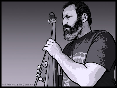 |
| "Baz on Bass" by M Francis McCarthy |
On the negative side, those assumptions often create blind spots that we are unaware of.
If you think you know something it's both natural and easy to ignore any information that might conflict with your assumption. This is a big part of being an artist as well as a human being.
Trying to create work that is more than formulaic rehashing of our old work and that of our influences is a real challenge. It requires questioning our core assumptions at the same time we are using them to support what we are doing.
Is there a way to see that which we cannot see?
One good way is to seek out a teacher that can point things out to us. If no teacher is available then I recommend studying a few books that go deeply into the type of art you want to do well.
Even if you've been doing your art a long time and have some mastery. Relearning your area of expertise or trying a different approach can definitely reveal blind spots in your way of seeing that you were not aware of.
Also we must have an attitude of humility and a reverence for the mastery of great artists that have fought the good fight before us as well as respecting and learning from fellow artists.
Every artist to improve and move forward has to actively engage with their own assumptions. Constantly be reevaluating them, and tossing out those that no longer serve, embracing better assumptions based on real insight and hard won experience.
Do this and watch your art prosper.
Cheers,
A bit about "Baz on Bass". This is an illustration I did recently of my friend Barry. I used a Wacom tablet to do the inkwork and manipulated the reference photo extensively to provide a framework for the tones.
This is fast and clean illustration and took me about 90 minutes to do. I like to keep my digital illustration chops sharp and I enjoy using the skills I developed after 13 years of illustrating in an art department everyday.
Illustration - Graphic Quality
For years in my art I pursued what I'll call a "Graphic Quality".
This quality is created by the placement of blacks and also very much by the type of hatching used to render the halftones.
I look at my work from a quarter century ago and I notice how carefully each stroke is placed. Back in the day I always worked in ink directly with a deep reverence for line.
I still have a respect for line and that graphic quality but after decades of doing art commercially and otherwise I'm not as precious with things now.
Is that a bad thing?
This quality is created by the placement of blacks and also very much by the type of hatching used to render the halftones.
I look at my work from a quarter century ago and I notice how carefully each stroke is placed. Back in the day I always worked in ink directly with a deep reverence for line.
I still have a respect for line and that graphic quality but after decades of doing art commercially and otherwise I'm not as precious with things now.
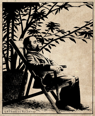 |
| "Henri de Toulouse-Lautrec" by M Francis McCarthy |
Is that a bad thing?
Sometimes I think so, but looking at my old work I can see the "try" in it. I see the effort to stretch my limitations.
These days I'm more comfortable with my artistic limitation. Being older and more aware that they exist helps. But also, I enjoy communicating with art directly, confident that my unique approach as an individual will more than suffice.
Are you enamored with the graphic quality of your art and that of other artists whom you admire?
If so, no worries but be aware that the best graphic style is the one that comes naturally as by product of you as a unique artist. As I've stated before and no doubt will again. Your time is best spent doing so much art that it becomes second nature. Then style, graphic or otherwise, will manifest brilliantly.
Cheers,
A bit about Mr Lautrec: I did this back in 1988. I had found a photo in a book that inspired this illustration. I inked this on vellum with a rapidograph.
Vellum sorta sucks as an inking substrate. For starters the ink dries slow so is easy to smear. Also the ink just kinda lays there and you have to will it about. Still in the pre computer age it was one way of preserving you're original pencil drawing and I did use it once in awhile.
Deadlines
I fist became acquainted with deadlines working as a manager for Jab Art Enterprises.
Every job we shipped had a tight deadline that could not be missed. Work crews would most often be at the destination site and scheduled to hang the art on a specific date.
Year in and out I hit those dates though many times I might be the last one there, loading a truck at 11:00 at night.
Later as the art director at Jack Nightingale Artworks I was responsible for scheduling our workload and getting the art out on time and also making sure it was good art.
The business JNA was in is competitive and there was always lots of good art for the buyers to choose from.
I never missed a deadline at JNA in the thirteen years I was there and we put out some great stuff on razor thin time margins.
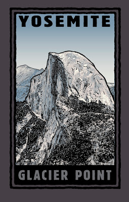 |
| Glacier Point Illustration by M Francis McCarthy Copyright Jack Nightingale Artworks |
I never missed a deadline at JNA in the thirteen years I was there and we put out some great stuff on razor thin time margins.
Deadlines can actually stimulate good work even though time is tight. I feel that this is because our subconscious mind becomes more fully engaged in an emergency situation and works double time to provide us with needed answers quickly.
The ability to access that part of our minds when it would help most is one thing that separates the winners from the losers in commercial art. Personally, I found it annoying when the other artist there Rico would tell me that I could receive art from him fast or I could have it good.
What utter bollocks and completely untrue.
I saw the work that other artists were doing in our field and I knew damn well from chatting with some of them at trade shows like Magic in Las Vegas, that their schedules were just as full and the times just as tight as in our art department.
I'll blog a bit about Magic some other time but for now I'll say that its the worlds largest apparel trade show and that I attended it every year from 2000 to 2009.
If your looking to produce more work and of an often higher quality, set yourself some deadlines and stick to them.
You'll be amazed at what you can accomplish.
Also if you, like Rico thinks it can be fast or good, hopefully I've disabused you of that misguided attitude and you can now start getting the art out a bit quicker and stop farting around.
Cheers,
A bit about "Glacier Point": This is illustration number 1001 I did of Yosemite's Half dome .. Just kidding, but I did illustrate half-dome at least 100 times in different ways, shapes and colors.
I was always fond of this design. I think the illustration is real nice and I also like what Jack did with the type here. Jack was and probably still is great with type. We could be a great team as he was strong with design and I was with illustration.
Unfortunately, sometimes he would lay some real stinky designs that I'd be forced to send out. He was the "Creative Director" after all, not to mention being one of the owners of the business.
I did my best to polish those turds...
Reworking
Lately I've been reworking a lot of paintings. Not my favorite way of working but as an artist I must follow my muse.
It's tempting to let something go that you can see flaws in.
Tempting yes, but ultimately it works against us as artists as it dilutes the over all quality of our oeuvre.
Why that matters is different to each of us. It does matter to me. I want my best stuff here representing myself and my work after I've exited this mortal coil. I don't want a bunch of also ran paintings sorted through the mix
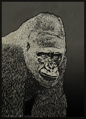 |
| Gorilla by M Francis McCarthy |
A while back I found that I could produce more good paintings by planning things out before painting.
That did indeed work for quite a while. However, there are limits to what planning can achieve. Especially when working in the studio from photos and drawings.
I've written about some of the pitfalls inherent in working from photographs here.
Even knowing what I do about all the pitfalls I've gotten zapped on about a dozen or so recent works.
As a consequence most need reworking to be brought up to the level I think they should be as landscape paintings. I've been reworking paintings for the last few weeks now and to a good effect in most cases.
Generally I've avoided reworking paintings in the past for a few reasons:
- Picking at paintings is a recipe for disaster and is too easy to do if you don't leave your work alone.
- Nothing is ever perfect. It's good realize this and let things be.
- Gotta keep moving. Better to produce many paintings, than spend too much time picking and scratching at a few.
I've recently hit a new plateau as a painter and because of that I'm "seeing" things I id not before. Since the paintings are recent and not in galleries or on display anywhere I'm free to try and bring them up to the level of my current vision. That's a good reason to repaint in my view.
I share this part of my painting journey in the hopes that it will help some of you that have also reached similar plateaus in your work.
Cheers,
A bit about "Gorilla" He is inked using pen and ink and also the computer. Many times I would print out photos and work directly on the image with pen or brush. Then scan in and finish the image.
I was always short on time at Jack Nightingale Artworks and this was one of my many coping strategies. Gorilla came out pretty well but using photos like this can be a seductive potential trap even for experienced illustrators. You have been warned...
Intuition vs Intellect
Intellect battles intuition and always wins unless you keep on your toes.
It's too easy to drown out that quiet inner voice. Too easy to think we know what we're doing even if what we're doing is at cross purposes with our true intentions as artists.
I've written before about intuition here.
There is a reason that intuitive types are compelled by the arts. All art requires almost countless decisions to be made. The intellect alone finds this process tiring while our subconscious mind can do the same work automatically and effortlessly.
"I'm convinced already! What can I do to tap into this intuition more?" you're saying.
It's too easy to drown out that quiet inner voice. Too easy to think we know what we're doing even if what we're doing is at cross purposes with our true intentions as artists.
I've written before about intuition here.
There is a reason that intuitive types are compelled by the arts. All art requires almost countless decisions to be made. The intellect alone finds this process tiring while our subconscious mind can do the same work automatically and effortlessly.
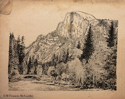 |
| " Halfdome" by M Francis McCarthy |
Both aspects of our mind are required to do art. The intuition must have a direction and intention to work it's magic upon. And it is magical as it can solve mountains of problems in a single bound and get us to the answers we need.
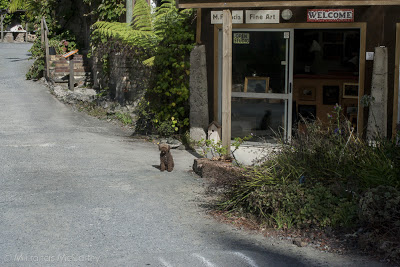 |
| My Studio at The Quarry Arts Center in Whangarei, New Zealand Also pictured is Denny the Poodle, My cohort at arms. |
"I'm convinced already! What can I do to tap into this intuition more?" you're saying.
Great question, you'll excuse me while I break out the bullets.
To access our intuitions more fully we can:
To access our intuitions more fully we can:
- Do that thing we just thought of doing. Don't put it off, act now.
- Take a stab with the brush loaded, at a spot on the painting that's bothering you. Then, deal with it...
- Don't lie to yourself when you see something wrong in your work. Intuition is always trying to point out those bad areas. BTW my personal tendency is to drown this voice out with lots of justifications.
- Pick up that book, find that bit of reference or ask that person to pose that you've been thinking about.
- Look for coincidence.
- Welcome the random into your work.
- Paint once, think twice.
- Use the biggest brush possible and turn that thing. Make it work.
You get the idea.
Cheers,
About today's illustration "Half-dome" this was done back in 2003 or so and was used as the basis for quite a few tee shirt designs. It was inked with a dip type pen and then scanned in and finished using a Wacom Tablet and Stylus. This Sucker is copyrighted by Jack Nightingale Artworks and reproduced here for portfolio, editorial and illustrative purposes only.
Art is for the Brave
To create art one must be brave. You can draw, paint or invest your time in art installations but to create Art with a capitol "A" you must be brave.
You must step out side of your comfort zone.
You need to do that thing you think might work instead of the thing that you know will serve but could be bettered.
Don't be afraid. Do that hard thing and don't look back.
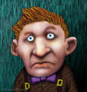 |
| "Look, who?" by M Francis McCarthy |
Don't be afraid. Do that hard thing and don't look back.
"What if it sucks" You say.
Ok, then it will and you'll feel bad. But if you keep at it you know you've at least tried to make Art instead of being happy with craft and kidding yourself that you don't know the difference.
Be brave. Make Art.
Really, the worlds got enough of everything, except real art that touches others at the core of who and what they are as people.
Cheers,
A bit about "Look, Who?" This guy was created over a span of 10 years. He originated as a doodle on my desktop calender pad at Jab-Art Enterprises in about 1992. I scanned him into my computer at some point and colored him in 1994. Years later I changed the background and tweaked him some. I've always liked the pan in the face look on this guy.
Learning to See
Developing our ability to "see" artistically is a lifetime effort that's never completely achieved.
Many laypersons and armature artists put way too much stock in technique and style. Nether of the two is even a fraction as important as seeing correctly and artistically.
By artistically I mean seeing with a highly developed sense of aesthetic appreciation for what is being perceived.
This sense in not just visual it taps into all the other senses as well and enfolds with feeling within us to create enhanced perception.
So, how can we better develop our ability to see?
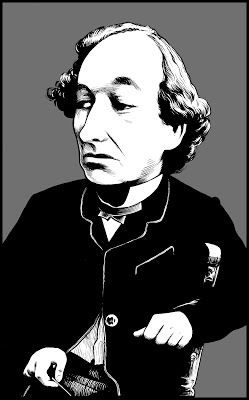 |
| "Benjamin Disraeli" by M Francis McCarthy |
So, how can we better develop our ability to see?
The best way is to draw a lot, paint a lot, look at other artists work and also be open within yourself to seeing better.
This last bit is absolutely critical. If you think you see everything already, how can you see anything that you're not seeing?
You cannot see what you cannot see, it's impossible, but there is a way around this apparent contradiction.
The solution to this Catch 22 is that we must remain open to visual truth while working as hard as possible at our craft. If you do this, one day you will look at something you did only a few months before that you thought was masterful and defects will begin to present themselves to you.
I know, bummer eh?
But, far better to know, far better to see, and having seen create anew in a better fashion until a new plateau of vision is accomplished and another and so on.
A bit about "Benjamin Disraeli" I did this as a portfolio piece back in 1994, I think. Not sure as to the date but it was in the nineties.
This illustration is inked with a Sable watercolor brush. Actually it was inked with a Winsor Newton Series Seven number two. I've been using that style of brush for thirty years. They are quite popular with many inkers because they hold their shape well and provide a nice snappy line quality.
I don't believe I've posted very much of my brush inking here so far. I use brush mostly for more comic book looking or graphic type work but it can be used in a more classical way as Benjamin shows.
For sure you'll be seeing more brush type illustrations on this blog as time moves us forward.
Cheers,
Illustration - Challenges
As an illustrator hired to do whatever came into the art department, I was often faced with challenging subjects.
My personal approach was to gird my lions and concentrate on the essentials. Contrast, composition and style, these can be applied to any subject.
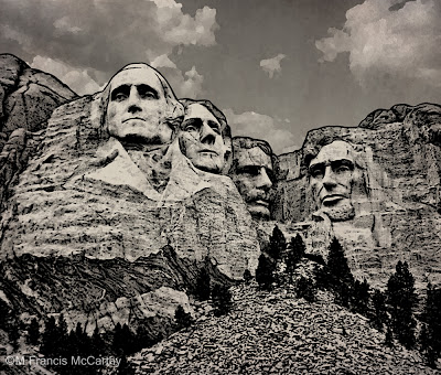 |
| Mt Rushmore illustrated by M Francis McCarthy Copyright Jack Nightingale Artworks |
Most of the art I did there was based on or supported with a strong black line drawing. This helps the printer as it covers over many registration issues with the end result being a crisper design on the tee shirt.
Creating art specifically for screen printing is a dying art as there are many "separation" programs like "fastfilms". They do have a learning curve but nowhere near as difficult as doing the art color by color for custom screen-printing.
Anyway, back to challenges, how to deal with them?
Well, for starters you can always take refuge in craft if inspiration is hard to find. Applying a fresh style or new perspective can take you to some great places as well.
I'd have to say that having a good attitude would be the greatest approach to any challenge. I always try to cultivate an attitude of fun and hard work with a positive outcome assured as the result.
Cheers,
What is a Hack?
A hack is an artist that will do poor quality art, very quickly that they do not care much about generally for money. They are artists whom abuse their gift as artists until they have no gift any longer.
I've know more than a few in my time and not all were artists. Most were though, because becoming a hack is actually the loss of something that was at one time precious.
 |
| Copyright Jack Nightingale Artworks |
A hack is somebody who used to care but does no longer. The reasons this happens are many but the biggest reason is taking an art job and doing too much art you don't want to, to quickly until eventually you become unable to even create worthwhile art just for the pleasure of doing it.
I know, I may come off a bit melodramatic, but my drama stems from real world experience of the graphic artist grind.
I did not go to university and my college is also limited. My actual qualifications as a graphic artist rested only on my proven ability to get the job done on time and with style.
As a young man it was my dream to make my living doing art full time. My job at Jab-Art Enterprises occasionally allowed me to paint some graphics or do other art related projects but predominately I was a manager there first and artist last.
 |
| Copyright Jack Nightingale Artworks |
It was great for a good while. My enthusiasm carried me through much of the disillusionment that I experienced.
Why did I become disillusioned?
Well for starers Jack was not in the art biz because of love. He liked money and him and his wife Deidre spent plenty of it. It's no sin to love money but for me the gratification of doing my art well is worth more than any cheap payoff.
Also, the buyers loved to kill good stuff by mucking with it, but even worse Jack himself would make stupid changes based on what he perceived as marketable. Stuff like taking some beautifully colored and rendered dinosaurs and just crapping all over the design by making us recolor them brown and flat.
So many times things liked this happened I could feel the grind wearing on me. But, I never gave in. I never sold out.
If you're in the commercial art business. I'm sure you need your living, but on every job you work on, you should ask yourself. Can I make this better? Is this good? Why is this good?
Never let them get to you and fight the power. I did, I fought every chance I could for us as an art department to produce great work we could be proud of.
And, if you're getting ground down to far. Ask yourself Is this worth the price I'm paying? Couldn't you make your living doing what you love or at least doing what you love on your own time and making your bread another way that doesn't compromise your soul as an artist?
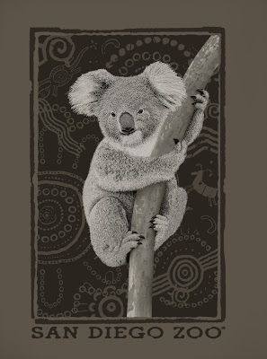
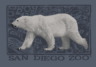
A bit about these illustrations. Both of these designs were purchased by the San Diego Zoo and printed on a bunch of tee shirts. I'm proud of both of these and they represent some of the good work that we did at Jack's. Both of them exhibit the hand stippling technique that I developed specifically with an eye towards printing on tees.
FAIR USE NOTICE
THIS BLOG CONTAINS COPYRIGHTED MATERIAL THE USE OF WHICH HAS NOT ALWAYS BEEN SPECIFICALLY AUTHORIZED BY THE COPYRIGHT OWNER. AS A JOURNALIST, I AM MAKING SUCH MATERIAL AVAILABLE IN MY EFFORTS TO ADVANCE UNDERSTANDING OF ARTISTIC, CULTURAL, HISTORIC, RELIGIOUS AND POLITICAL ISSUES. I BELIEVE THIS CONSTITUTES A 'FAIR USE' OF ANY SUCH COPYRIGHTED MATERIAL AS PROVIDED FOR IN SECTION 107 OF THE US COPYRIGHT LAW.
IN ACCORDANCE WITH TITLE 17 U.S.C. SECTION 107, THE MATERIAL ON THIS SITE IS DISTRIBUTED WITHOUT PROFIT TO THOSE WHO HAVE EXPRESSED A PRIOR INTEREST IN RECEIVING THE INCLUDED INFORMATION FOR RESEARCH AND EDUCATIONAL PURPOSES. COPYRIGHTED MATERIAL CAN BE REMOVED ON THE REQUEST OF THE OWNER.
Illustration - Digital Thoughts
Still deep into sorting my catalog of paintings. My computer muscles are getting a bit worn. So short blog post today.
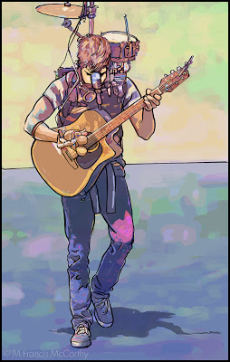 |
| Street Musician by M Francis McCarthy |
This illustration I did of a street musician was done soon after I'd arrived to live in New Zealand. It was drawn and inked and colored using a Wacom Stylus and tablet in Photoshop. The watercolor coloring was done by manipulating a photo using lots of filters and Photoshop mojo.
I'd been hatching this style in my brain for quite a while and it wasn't until getting to New Zealand and getting off the hamster wheel that I had time to figure it out.
I used photos extensively my entire career as a paid illustrator. These days its so easy to blur the boundary between photos and illustration it's not even funny. Frankly I've never been too hung up on it as for me art is largely about aesthetics and all the myriad decisions that go into creating a striking image.
It's fun to have a play and let your imagination, skill and talent take you where ever they may. Photoshop and other programs are great for that.
At the end of the day though I find the attraction of creating with a brush on wood panel to be far more satisfying. There's no undo but there is the tactile sensation of working a surface. Ultimately creating a unique object.
Illustration - Limited Pallets
Prior to my time working at Jack Nightingale Artworks I had done a lot of Black and white representational art and I'd also done a good amount of colorful abstracts using Photoshop What I had not done a lot of was colored illustration.
Today's illustration "Cougar" is a good example of a limited pallet image. His colors are: Black, brown, orange, tan,cool grey, warm grey, white. The astute reader might notice that makes seven colors.
The majority of the designs we did at Jack's we're for tee shirts. Lot's of Screen printers have 14 color machines, however many of the jobs we did were smaller runs with local printers. Most of these printers had 8 color machines. So, for many, many years I had to do complex illustrated designs with a very limited pallet.
 |
| Cougar by M Francis McCarthy |
Today's illustration "Cougar" is a good example of a limited pallet image. His colors are: Black, brown, orange, tan,cool grey, warm grey, white. The astute reader might notice that makes seven colors.
Often the eighth color had to be reserved for a white flash plate in case the design needs to be to be printed on dark colors. It was always a good idea to keep this in reserve as buyers tended to change things and without a bit of leeway the design could be radically altered by a color being taken away. Also other colors might be required by other elements in the design like type for example.
I now have unlimited colors at my disposal to paint with but my many years of working with restricted pallets have served me well. I always consider the tonal pallet for each painting that will be most harmonious. Too many colors thrown at the viewer creates disunity. That said it's so awesome to free of the eight color straight jacket that I worked under for so long.
Obligatory Disclaimer - This image was created for Jack Nightingale Artworks and they own the copyright. I show it here for review and portfolio purposes only. Cheers.
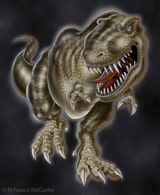
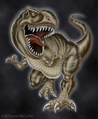
Dinosaurs
I executed a lot of dinosaurs while I was at Jack Nightingale Artworks. Most of them in collaboration with the other illustrator there who I'll call Rico out of respect for his privacy. Rico was a good artist and we we're buds for most of the time we worked together. We both worked on the dinos, passing them back and forth in an effort to make them better and better.
Quite often we'd base our dinosaurs on reference from Jacks extensive morgue files and later on we'd use images from good ol' Google. Unlike animal illustrations that you can find photo reference for, dino photos we're not available. There we're no cameras back when they ruled the earth.
Rico did the preliminary sketch for these dinos and I did all the rendering. Every year we'd have to try and top the last. We'd add features like scales that were printed in puff ink or we'd do special glow in the dark plates.
These guys pictured here we're done near the end of the dino days at Jack's. The new technique that was added to them was the reflected highlights. White on one side and taupe on the other in this case.
Doing dinos every year was fun for a while. I must say though that the printing of our designs often fell way short of the comps we produced. The reps that worked the dino account would often make "creative" contributions to the designs before the actually got printed. The additions or subtractions could be nightmarishly bad.
Another case of non artists expressing themselves at the expense of the artwork and the final product. I cannot say I miss viewing some of the train wreck tees produced from our painstaking renderings.
As a side note, these illustrations are copyrighted by Jack Nightingale Artworks and I show them strictly for review and portfolio purposes. BTW Jack didn't draw any dinos. He had a pretty good gig for many years adding type and background squiggles to the designs while taking credit and getting paid for the entire enterprise. Rico and I got a paycheck.
Hopefully, Jack is still receiving income from these dinos as I have seen reworked versions used on items like swim trunks and tees as recently as last year.
Illustration - Hired gun
Let's go back in time to Jack Nightingale Artworks in 2000. Actually a really great time for me there. Jack Nightingale Artworks was a division of a company I will call Sales Today. Sales Today mostly sold tee shirts.
All the art was done by myself and the other artists at Jack Nightingale Artworks. While the actual printing was contracted out to local screen printers. In 2000 things were doing well there. We were selling lots of tees at the national parks, the San Diego Zoo and also money was flowing in from our newest account Starbucks.
I had started as art director after my friend David had left the position to work in New York and I was busy but nowhere near the crushing kind of busy that was in my future. I'd recently bought a home and life was good. I was happy to be making a good living as an artist and I'm still thankful to the universe for granting my desire.
I was however a hired gun. In 2000 I was pretty content to just be that hired gun and shoot the hell out of whatever came up. I really put all my creativity and passion into my work and I always endeavored to make each illustration the best I was able.
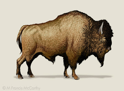
This bison was done for a Yellowstone tee shirt design. Yellowstone was a frustrating account as they always bought only a few designs but we did tons of art for those few.
This guy was never actually used in this format on a tee but was recycled for many designs over the years. I am proud of the hand stippling on this bison. I used to love to stipple the different colors on animal designs because it always printed well.
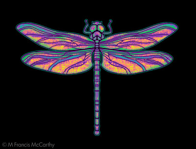
I'm happy with this dragonfly. I created it at my home studio. It was printed on a tee for The Nature Company. A now defunct chain of stores that sold scientific stuff, Cd's and Tees. I was so happy they choose it but unfortunately it was printed super tiny on the tee shirts.
A "creative" decision made by the buyer. Many buyers loved to put their stamp on others work. My theory is that many of them were frustrated artists. That said I've known some awesome buyers that were a joy to work with.
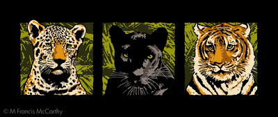
These cats represented a break through for me at Jack Nightingale Artworks back in 1998. The cats were never used with these colors on a tee. I did these illustrations while Jack was on a golfing trip in Hawaii. Something he did often in those days when Sales Today's business was good.
I had only been at Jacks for about 5 months and was still getting used to the compromises a professional hired gun has to put up with. By this I mean my art getting changed and quite often just so Jack could put his stamp on it.
He came back from his trip and loved my cats but decided to have me rework them in muted grays and tonal browns. The end result looked pretty good and sold great but I still feel these brighter cats have more appeal. Being the hired help though I could only cooperate in the dilution of my originally stronger idea.
Making a living with your art is great but it comes with a cost. Sometimes the cost is minimal, other times it's devastation to one's core passion as an artist. If this price is paid to frequently an artist runs the risk of losing their creative spark altogether. Like a horse thats been rode too hard for too long.
Animal Illustration
As an Illustrator working for Jack Nightingale Artworks I was called upon to execute many different styles for projects. A big account was San Diego Zoo. BTW all the illustrations in this post are copyrighted by Jack Nightingale Artworks. I just drew them and got paid. I show them here on my blog for purposes of review and education only.
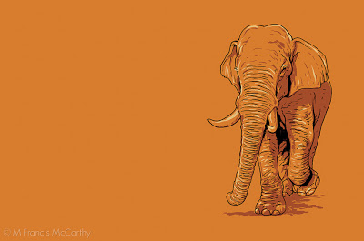
The style for this guy was taken from a image I saw of a elephant on the web. I simplified the color scheme and drew an Indian elephant in a quick line and shaded in Photoshop. What I liked about this illio was how it looked good on any color. Never got bought but looks like a winner to me still.
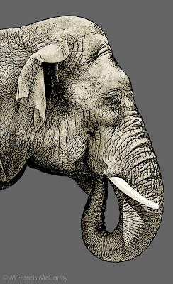
Ok, the Zoo was going to have a special Indian elephant exhibit and they needed a good image for a design. This image was definitely in consideration but not selected for the final design. Pity cause I really like the effect I got on this gal. This is a strong combination of photo shop and hand drawing. One day I would love to teach a class in this type of illustration.
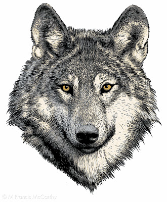
I've seen this wolf illustrated by others, the reference is available online. This is a pretty detailed brush and pen drawing that's been scanned into Photoshop and then colored. I always tried get a certain look in the eyes of the animals I illustrated and I really enjoyed the work for many years.
 |
| Indian Elephant by M Francis McCarthy |
The style for this guy was taken from a image I saw of a elephant on the web. I simplified the color scheme and drew an Indian elephant in a quick line and shaded in Photoshop. What I liked about this illio was how it looked good on any color. Never got bought but looks like a winner to me still.
In my Early days at Jack Nightingale Artworks I had lots of time to really detail my illustrations but as each successive year passed less and less time was available. I feel that this was true for any art department in the early to mid 2000's.
You can still get great results in less time if you keep your eye on the prize and have the right attitude. I know from first hand experience that spending hours on a piece of artwork will not guarantee a great work of art.
 |
| Indian Elephant by M Francis McCarthy |
Ok, the Zoo was going to have a special Indian elephant exhibit and they needed a good image for a design. This image was definitely in consideration but not selected for the final design. Pity cause I really like the effect I got on this gal. This is a strong combination of photo shop and hand drawing. One day I would love to teach a class in this type of illustration.
 |
| Wolf by M Francis McCarthy |
I've seen this wolf illustrated by others, the reference is available online. This is a pretty detailed brush and pen drawing that's been scanned into Photoshop and then colored. I always tried get a certain look in the eyes of the animals I illustrated and I really enjoyed the work for many years.
The Illustrator - Reference
Change up from Landscape painting today. We're going to revisit my early years as a hired gun illustrator. I've always enjoyed the phrase "hired gun" I must admit.
As an illustrator, I was hired to solve problems and make my employer look good. These images were created back in 98'. All of them have a screen print ready graphic look that I was into.
 |
| Mr Spock by M Francis McCarthy |
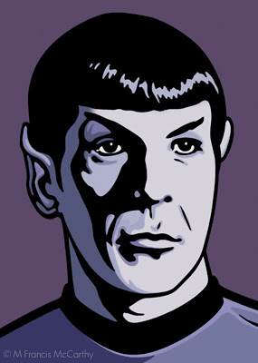
Just for the record "Mr Spock" is copyrighted by whomever owns his likeness. I did this as a portfolio piece never intending to sell the image. It was a real challenge to get the facial shadow right. I like my coloration and over all I was pretty happy with this illustration
 |
| Mr Meany by M Francis McCarthy |
I'm gonna call my place of employment "Jack Nightingale Artworks". A small art studio with Jack as chief designer and myself art directing. I also did many of the illustrations that we're used in our designs. For me it was a dream job and I was very happy working there for quite a few years. More on that phase of my art journey in future posts
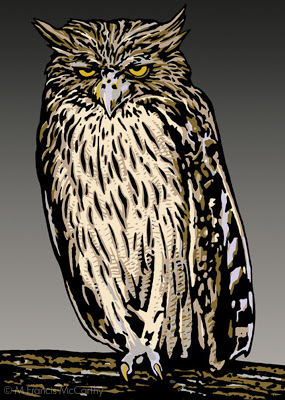
Mr Meanie is another portfolio piece. I did a lot of animals for Jack Nightingale Artworks so I thought I'd do an owl. Up to that point I'd mostly concentrated on figurative art or abstract digital art. Animals however sold well on tee shirts and so I illustrated many, many animals.
 |
| Bear Friendly by M Francis McCarthy |
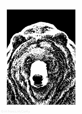
I'm proud of this illustration. Grizzly bears are fun to draw and this one owes a lot to the reference I found somewhere. All illustration relies on good reference. Don't let anyone tell you different. Back in those days we found reference at the library or in magazines.
Most illustrators had something called a morgue with all of their collected clippings. Reference was hard to come by in the pre Google image search era. Now you can find most anything with a few clicks but an illustrator should always be careful about using photography as reference without the permission of the photographer. Many artists can and do get sued.
These days I only work from my own reference and if possible I'd advise other artists to do the same. If it's not possible to get the shot you need be sure to contact the photographer. Just do it. Many will let you use things as reference for cheap or even free.
Illustration
For 13 years I worked as an illustrator and art director for a company that produced apparel and other items that were sold in department stores, zoos, national parks and Starbucks coffee. Today I'm posting a few of my portfolio images from the early part of that era.
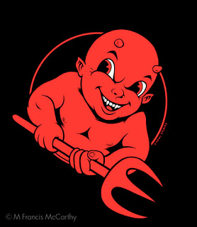
This image above is "Devil Boy" my attempt at capturing a skater type look back in 2000. I printed some of this design on tees for my own company "Kewl Studios" a story I will tell another time.
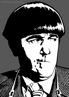
I created "Moe"as a portfolio piece intending to mail it out as a post card to solicit illustration work. At the time this was drawn, I was definitely entranced with graphic styles that would screen print print well.
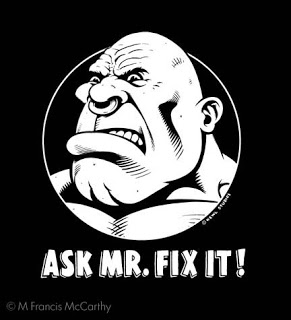
Another Kewl Studios design that I printed. It was always interesting to see who purchased this shirt. I think it went over most peoples heads. Not sure really what I was saying with the design but I do think it looks cool and catches the eye.
Speaking of catching the eye. I feel art must do this if it is to be successful on any level whether commercial or fine art. I strive to do this always, even with landscape painting. With landscape work however I scale the in your face aspect way back. Candy colored high contrast landscapes can grate on the viewers eye.
The three best was to catch the someones eye are color, contrast and composition. Follow that up with style, texture and scale/proportion and people will notice.
