Illustration - Graphic Quality
For years in my art I pursued what I'll call a "Graphic Quality".
This quality is created by the placement of blacks and also very much by the type of hatching used to render the halftones.
I look at my work from a quarter century ago and I notice how carefully each stroke is placed. Back in the day I always worked in ink directly with a deep reverence for line.
I still have a respect for line and that graphic quality but after decades of doing art commercially and otherwise I'm not as precious with things now.
Is that a bad thing?
This quality is created by the placement of blacks and also very much by the type of hatching used to render the halftones.
I look at my work from a quarter century ago and I notice how carefully each stroke is placed. Back in the day I always worked in ink directly with a deep reverence for line.
I still have a respect for line and that graphic quality but after decades of doing art commercially and otherwise I'm not as precious with things now.
 |
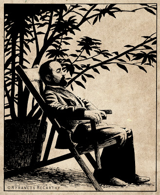
| "Henri de Toulouse-Lautrec" by M Francis McCarthy |
Is that a bad thing?
Sometimes I think so, but looking at my old work I can see the "try" in it. I see the effort to stretch my limitations.
These days I'm more comfortable with my artistic limitation. Being older and more aware that they exist helps. But also, I enjoy communicating with art directly, confident that my unique approach as an individual will more than suffice.
Are you enamored with the graphic quality of your art and that of other artists whom you admire?
If so, no worries but be aware that the best graphic style is the one that comes naturally as by product of you as a unique artist. As I've stated before and no doubt will again. Your time is best spent doing so much art that it becomes second nature. Then style, graphic or otherwise, will manifest brilliantly.
Cheers,
A bit about Mr Lautrec: I did this back in 1988. I had found a photo in a book that inspired this illustration. I inked this on vellum with a rapidograph.
Vellum sorta sucks as an inking substrate. For starters the ink dries slow so is easy to smear. Also the ink just kinda lays there and you have to will it about. Still in the pre computer age it was one way of preserving you're original pencil drawing and I did use it once in awhile.
Drawing - Ink
Rendering your nice pencil drawing in ink has gotta be one of art's great challenges. Just hard unyielding lines to reproduce what was soft and subtle in penciled grays in two colors white and black.
That's right, two. You've got to think of white as a value not just black ink on white paper. These days doing ink work in the computer is a breeze. In Photoshop you just hit the X key to switch back and forth between the two.
In the real world all your white over black ink solutions are far more messy. I've used white ink (mostly sucks) white gouache (ok) and white out (so,so) at various times.
I'm sure they still sell scratch board too. Scratch board is coated with a white clay. After inking on it you can then scratch away your ink from the surface revealing the white clay below. Scratch board is messy too and requires tons of discipline. I'd say if your into that look, use a computer with a graphics tablet.
 |
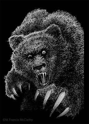
| "Mad Bear" by M Francis McCarthy |
This bear was done in back 1990 and used by Motobuilt for stickers and other stuff. Motobuilt was one of the earliest custom skateboard truck makers. They are gone so I'm not finding lots of good links for you, sorry.
The owner and I disagreed about the number of claws for this illustration I wanted four. He said "they actually have five". I said "I ain't changing it. take it or leave it."
Ah, the pre-hired gun days of artful independence. I changed plenty after I started slinging my art gun for good ol' Jack Nightingale.
Anyway back to Ink and Inking. This bear was done with rapidographs. I liked inking with those because you got a constant ink line that was waterproof India ink. Felt pens then and now gave iffy results. I always found their line quality lacking for anything except quick cartoons, sketching or doodles.
The biggest issue with rapidographs is that they produce a uniform line that can be boring if not used right. Also the effing things clog like crazy requiring you to take them apart and clean them. Hopefully without bending the delicate wires on the thinner pens like the .0, .00 and the .000.
BTW I couldn't help but do some subtle toning on this bear in Photoshop in a layer below my line-work. It's fun to freshen up some of these old drawings and share them. Hopefully you all are enjoying seeing this part of my artistic journey too.
Cheers,
Learn to Draw
I read that today. Learn to draw and create beauty even if no one cares. The quote is from a guy named Sal Bass. I still need to learn who he is and what he did. Regardless the quote stands on it's own as the best art advice I've heard and I aim to teach it to any of my students from here on out.
 |
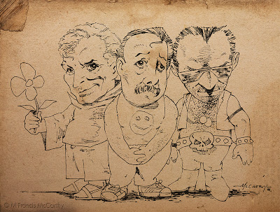
| Three Dudes by M Francis McCarthy |
Just one image today. This is a drawing I did back in 1985. It's purpose I think was to impress some girl. Not sure whether I gave it to her or not now, almost thirty years in the future. At the time I was proud of this drawing for the looseness and caricature of the characters.
I've a lot of respect for cartoonists. I don't consider myself one at all though. I've dabbled in "cartoon illustration" though and I'd file this image under that heading.
I can recall inking this with a triple zero rapidograph. Rapidographs gave you a constant, consistent ink line. The triple zero was the thinnest that was practical to use. I used rapidographs a lot. The challenge was to get "character" in a non varied line. Usually I'd attempt to vary the line by speeding up or slowing down the ink stroke.
I worked hard at being an inker for years and I will be posting lots more on inking and using ink medias like the pen, brush and even sticks or computers.