
Riff After John Francis Murphy’s “A Stormy Day
Large brushes, loose wrists, and the art of expressive restrain
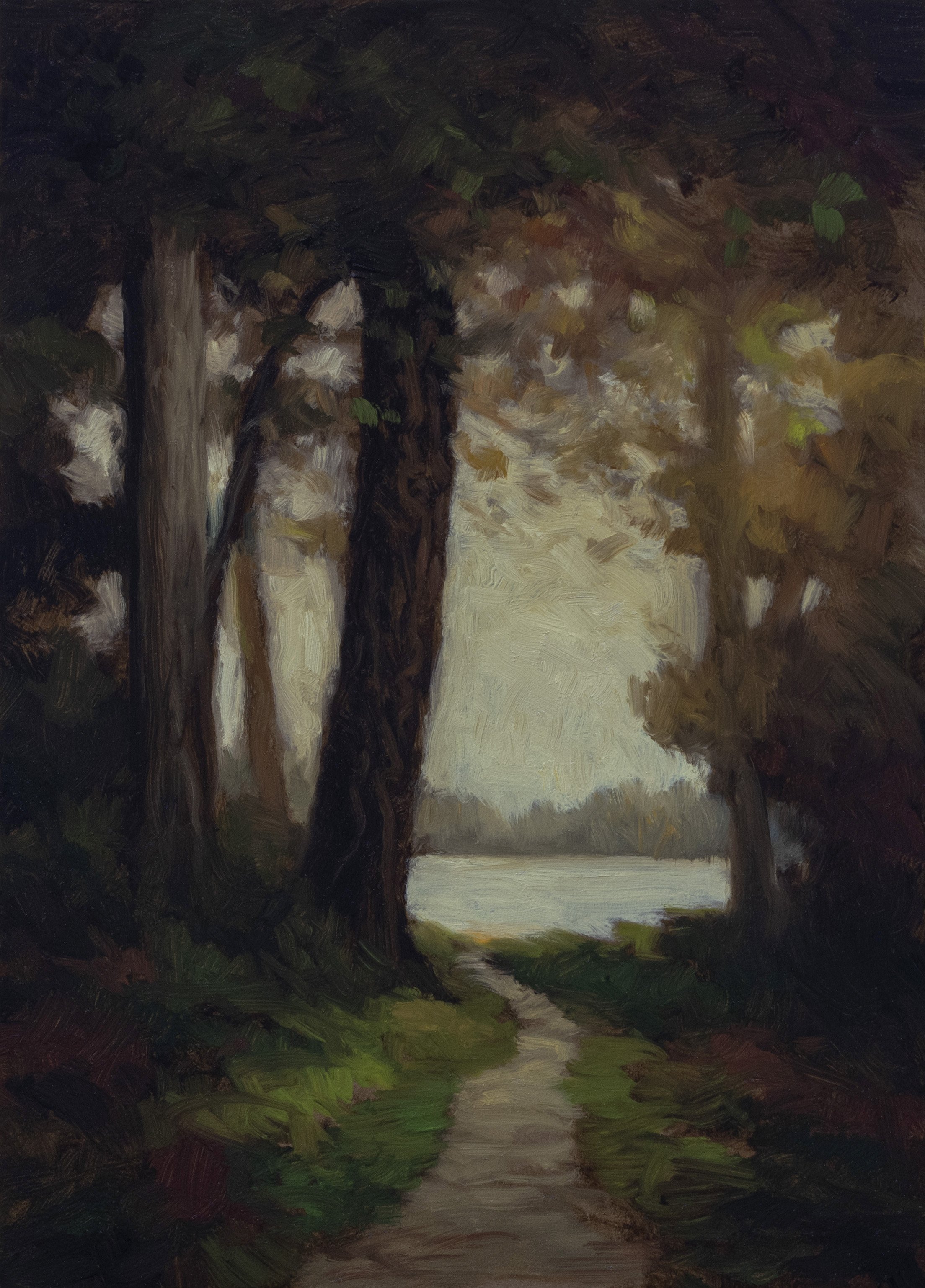
Riff After John Francis Murphy’s “A Stormy Day

Riff After John Francis Murphy’s “A Stormy Day
Reimagining Murphy
Today I’m bringing you something my interpretation of John Francis Murphy’s “A Stormy Day.” I’m really proud of how this one came together. When I was looking through my project folder, I did a double-take - wait, is that the reference or is that my painting? That’s a good sign when you can’t immediately tell the difference.
What excites me most about this piece is that I did it quickly and expressively Murphy was a master of atmosphere and textural effects, and tackling one of his compositions is always always humbling and inspiring.
Click here to read the full post and watch the video on Substack

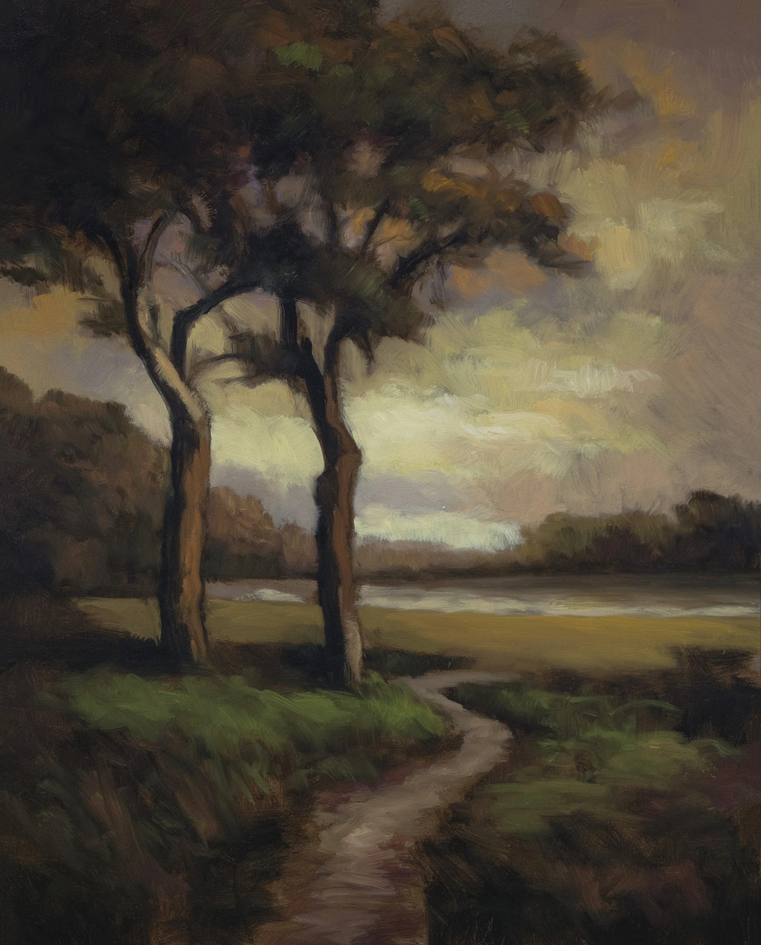
Forest Passage 8x14
Mastering Intervals and the Art of Leaving Things Alone

Forest Passage 8x14
The Challenge of Fogged Vision
I have to apologize right off the bat - you’re going to see the camera gradually fog over during the drawing portion of this painting. It’s winter here in New Zealand, so while you folks up north are enjoying warm weather, I’m dealing with temperature differentials that make my camera lens mist up. But you know what? We’re going to push through it, because this painting - “Forest Passage” - turned out beautifully, and there are some key lessons here I really want to share.
Understanding Intervals: The Music of Tree Placement
One of the most important concepts I want to discuss is what I call intervals - and I’m very pleased with how I handled them in this piece. Just like in music, you can’t have even spaces everywhere or it becomes incredibly boring.
When you’re dealing with vertical elements in your landscape - and verticals are always the most attention-getting things because we humans are naturally sensitive to them - you need to vary:
The width of the trunks (they can’t all be the same)
The spaces between them (avoid that evenly-spaced telephone pole look)
The angles (some diagonal, some straight)
I kept some trees from the reference, discarded others, and used the whole thing as inspiration rather than a rigid guide. That’s the key - let the reference inspire you, don’t let it imprison you.
My Brief: Big Brushes and Loose Definitions
Going into this painting, I had a clear brief for myself: use a good-sized brush and work on that tricky transition where foliage meets bright sky behind it. This is something I’ve been wrestling with for years. Because of my background as a drawer and illustrator, I’ve had a tendency to over-define these foliage shapes too early in the process. But here’s what I’ve learned: if you make those shapes too defined too soon, it becomes difficult to get air into the trees. My new approach? Leave things quite vague in the drawing stage. Let the definition come naturally as you build up the painting, rather than deciding from the start “this is going to be black or white, this is going to be on or off.” You can see this whole process blow-by-blow in the YouTube Members area, where I’ve got hundreds - maybe thousands - of live painting sessions available for just six bucks through Google.
The Trekell Brush
People in the members area always ask why I love the Treacle brushes so much. It’s all about that filbert shape with its versatility:
The little toe acts like one size brush
The beveled edge gives you another brush size
The flat end for broader strokes
Press down and the whole thing becomes a larger brush
You can see me leaning heavily on that beveled edge throughout this painting - it’s doing the bulk of the work.
Avoiding the “Smeary” Look
Now, when I talk about leaving things vague, I don’t mean the kind of vagueness that results from blending or smearing colors together. You’ve probably figured out that doesn’t look good - it doesn’t look professional. That’s some Bob Ross territory there, though even Bob wouldn’t do that everywhere. He’d smear his skies together with a big brush, sure, but then he’d work over that with a knife and give things actual edges. The problem comes when amateurs go over those same edges and start smearing them into the sky. That’s not a good look, and it’s very easy to do with oil paint. This is something I addressed extensively in my book, and actually in a newer book I’ve been working on - though I’m on a bit of a hiatus from editing because it’s a lot of work. There’s nothing quite like working hard on something, then reading it on another device and seeing that a word is missing from the middle of a sentence for no reason!
The Tonalist Way
Speaking of my book, it represents 12 to 13 years of learning how to do this Tonalist thing. I won’t say I’m the greatest of all time, because I’m not, but I’ve worked at it and I have insights to share if you want to take this approach. Some of the processes I’m employing in this painting make me quite proud because they represent real growth in my technique.
Bringing in the Darks
One of my goals was to bring in the darks but avoid getting too contrasty. I want softer transitions. Sometimes I think my awareness of how photography can compress blacks and create over-contrast has influenced me to seek more nuanced relationships in the actual paintings. The challenge with forest interior scenes is that natural contrast between bright sky and darker forest. I’ve painted this scenario many times - you’ll see painting after painting of it if you go through the channel - and while I’ve succeeded in different ways, you can always succeed better. That’s what the Masters made clear, didn’t they?
Don’t Worry About the AI
Let me address something that’s been on my mind lately. We’re in this era where AI produces amazing imagery, and before that, we had centuries of Masters creating jaw-dropping work that made us wonder “how could I ever hope to do anything like that?” Here’s the thing: before AI was better than you, there were plenty of humans better than you (and me - I’m speaking for myself too). But at the end of the day, only you can do the painting you’re going to do. When you approach your work, look for ways to better express yourself and what you think is cool. And the way to do that? Paint more, watch fewer videos (except make sure you tune in to Uncle Mike every week for the best tips out there!).
Start Small, Build Mastery
If something I’ve done inspires you to paint, then go do it - but don’t make it a huge production. Don’t pull out that 2×3 foot canvas you’ve been working on for ten years. Start with manageable sizes and build up your mastery there. I love smaller paintings because I love to get in and get out, like I did with this piece. This painting session didn’t take long, and it has a freshness to it. Everything that needs to be there is there.
The Subtle Art of Blending
In the final stages, you’ll see me doing some subtle blending with a thoroughly wiped brush that still has an affinity with paint - not completely dry, but clean. I’m taking little peaks off what I’ve done while maintaining respect for that initial impetus, that emotional and intellectual reaction to the reference. That’s what we did today - we made a painting with intention, emotion, and just enough technique to support the vision.
Technical Notes:
Size: 8×14 inches on panel
Brushes: Treacle filberts (various sizes)
Approach: Quick, loose, with emphasis on atmospheric transitions
Key Focus: Intervals, soft contrasts, and leaving things alone
Until next time, take good care and stay out of trouble!
Mike

The Quiet Path 5x7
This little 5×7 came out just great - I wish I’d painted it bigger! I’ve been doing a lot of 8×10s lately, and you know, you’ve got to sell the 8×10s for a bit more. That’s just reality - you’ve got to use something as criteria for why one painting costs more than another, whether that’s time, size, or both.
The Quiet Path 5x7
Riffing on George Inness
In essence, this is really a bit of a riff on an Inness painting. We got miles away from where George was in his original, but there’s a bit of the soul of his work in this. The two trees with the path - in George’s version, he had one big tree, some trees off to the side, and no path that I know of, maybe just a tiny path with no destination. That’s the thing I really like to have if I can - a bit of a place to go. I’m the king of the distant lake and the path, and I’m happy with that.
Embracing the Cliches
You could say I’m working the cliches, and obviously I am - but I’m doing it in the spirit of an artist who’s expressing themselves. There’s a reason why cliches are what they are: they’re powerful metaphors that you can use as part of your artistic language to express yourself. Don’t think you’re creating anything original - nobody has for quite a while. Painting was reinvented in the 1800s, then basically destroyed a bit, then built up again in the 20th century. There’s nothing new being done, nothing new about anything I’m doing here, except I wasn’t even painting in the 20th century. I didn’t start painting until this century, and it’s me painting - and that’s always going to be new, always going to be fresh and a bit of a revelation. Don’t let anything like a cliche stop you. I used to avoid painting things like paths or sunsets because I thought, “Oh god, there were so many horrible sunset paintings around when I came up.”
Technical Notes and Tips
Working on a nice bit of hardboard - very thin MDF actually, which I kind of favor in these smaller sizes. My tube of cadmium yellow just got very dry - all the oil seeped out ages ago, and it’s just so expensive. Pro Tip: What I’ve been doing is mixing it with a little bit of Hansa yellow (acrylic yellow), and that’s been working great. If you get a dry tube of paint, you can mix it with something that’s not as dry. Hansa yellow is kind of like cadmium yellow except it’s more transparent.
The Brief: Holding Back from Black
One of my briefs on this painting was to hold back from the blackest of the black. I know my paintings tend to go very dark, so I’m attempting to work a lot quicker. I don’t want to go over strokes as much - I want to just leave things. I’m more content to leave more of the board coming through, more of the darks coming into the drawing area. This painting was incredibly successful in that regard, if I don’t say so myself.
The Foliage Challenge
The real challenge with this kind of scene is the foliage over the sky. One of the big distinctions from what I’ve been doing in the past is I couldn’t help but try and define that transition, and I would try to define it artfully. But here I’m not actually defining much in that drawing stage. It starts getting somewhat defined when the sky comes in, then the rest when the foliage comes in - all of it fairly loose: the sky fairly loose, the foliage fairly loose, and the underpainting fairly loose. This is very much inspired by people like Camille Corot, who would keep his stuff loose, especially in the transition areas of foliage over sky - one of the toughest things to paint. It’s especially tough in this sort of circumstance where you’re in a kind of shadowy space and it’s light on the other side, so anything against that light tends to take on a bit of an edgy quality.
The Loose Approach Philosophy
It’s taken me years to get this adept at dealing with foliage transitions. I think I’m doing a way better job of it now since I’ve started taking this more loose approach where I’m trying not to over-define things at any point in the process. The definition should come about as a result of the painting process itself, rather than you saying “this is going to be black or white, this is going to be on or off.” You can hold off on that and just deal with it with the gradations of paint.
Brushwork Insights
As you’re painting along, you have several different things going on with the brush:
1. Shape of the Brush This is very much influenced by how much you clean your brushes. I’m using filberts on this - they’re great because they have a little toe at the end which is like one size brush, they have an almost beveled edge which is another size brush, you’ve got the flat end, and you can press down and the whole thing becomes kind of a larger brush.
2. Amount of Paint in the Brush And the relative viscosity of the paint - that’s where the medium comes in, and that’s something that’s always very strategic to me.
3. Brush Pressure This is directly related to your sense of how much paint is in the brush. That’s one reason why I’m always harping about getting a lot of experience as a painter - you’re learning what your brush will do with different amounts of paint.
4. Direction and Grip Sometimes I’m holding the end of the brush, sometimes the middle, sometimes somewhat like a pencil. Each one combined with the pressure, the direction, the shape of the brush, and the viscosity of the paint will determine the sorts of strokes that are coming down.
5. Frequency of Strokes How many strokes you’re putting down. One thing I’ve been trying to do here is leave things alone.
The Art of Leaving Things Alone
Leaving things alone has been an ongoing process for me for my whole painting career, and it’s just getting more and more extensive to the point where I may end up like George Inness doing these super loose, barely able to tell what it is kind of paintings because I’m so into the abstract quality of it all.
But I think for me, I want you to be able to see what it is, I want you to get the emotive quality, and things like using your brush in an appropriate way are all gonna help you express yourself.
For More In-Depth Content:
YouTube Members Area: Get access to reference images, palette layouts, and detailed transcriptions of each painting session
My Book: “Landscape Painting the Tonalist Way” contains 13 years of accumulated knowledge built up working in a tonalist manner
This loose, expressive approach to landscape painting shows how embracing traditional subjects with personal authenticity can create fresh, meaningful work that speaks to both the painter and the viewer.
Cheers,
Mike

Where Light Lingers 8x10
Working with a Looser Approach
You'll notice I'm not using a big brush here - that's a size four, though in the live session I think I called it a six. Sometimes I go even smaller, down to a two or even little stubbies, depending on what the painting calls for. The whole idea with this piece was about brush fracture and brush interaction - bringing things in with a loose and free manner. I've been experimenting with keeping my drawing and underpainting looser lately, giving myself more room to work during the actual painting session. There's something really appealing about that soft quality you get when it's just the brown over the board color. That look has a certain magic to it.
Where Light Lingers 8x10
The Reality of Personal Style
As the painting progressed, even though I was trying to keep everything very soft and loose, it took on more of a graphic sensibility. That's just a byproduct of how I approach things - that design aspect is something you'll find hard to escape. I often tell new students who come to me asking about finding their style: you'll know you have a good style when you can't escape it. It’s part of who you are as a painter.
Color Mixing on the Fly
All the color mixing in this painting was done as I worked - no pre-mixing this time. Sometimes that's the right approach, especially when the day is getting away from you and you want something to show for the week. While I do think pre-mixing has its place (it's great for filling time in the late morning when you're planning to paint in the afternoon), working directly can have its own energy.
The Tonalist Color Approach
This was Tonalist colors all the way - a dedicated homage to George Inness. The sky work involved some dioxazine purple, which gives you a quality that's hard to get any other way, but I had to really restrain it. What you're seeing is a subtle complementary purple-yellow riff that creates that atmospheric quality. The greens were extremely important but restrained. My whole brief was to be 100% tonal with the color approach, which means the restriction of the value structure is critical. You can bring in bright greens, but it's important that they have a restrained redness to them - that's definitely one of the hallmarks of Tonalism.
Mikes Book
This approach to ground color and tonal harmony is covered extensively in my book 'Landscape Painting the Tonalist Way' - one of those foundational concepts that affects every painting decision that follows.
A Quick Green Tip
If you're struggling with greens and wondering why they don't look good in your paintings, get yourself some burnt sienna or red iron oxide and add a little bit to your green mixture. You'll often think it's not changing much except maybe making it oddly saturated, but if it goes too far, just bring a little more of your green mixture back in. The green mixture I recommend is what I call Mike's Green - essentially arylide yellow (PY73 or 74) and ivory black. A lot of paints called "cad yellow hue" are actually arylide yellow and will work perfectly. When that yellow hits the black, you can see the true green property of the yellow come through, plus the bluish properties of the ivory black.
The Ground Color Foundation
I'm working on what I call "deep earth" - a clay-toned ground color that's wonderful for landscape painting because you can leave a lot of it peeking around. I've experimented with many different ground colors over the years (it's all documented on the channel), but this one works beautifully because what you're painting is, after all, the landscape.
Substack Members
This 15-minute demonstration captures the essence of the process, but for those wanting the complete experience, the full live painting session is available in the Substack paid community featuring the reference photo, color palette and readable transcription of the Live painting process
Bringing It All Together
The whole approach here was a loose block-in, but the block-in IS the painting. A lot of the underpainting is still coming through, and I think that's what gives it that unified quality. When I brought in the greens down below, I made sure to bring a little bit up into the trees too - it's good to spread things around and create that visual connection. This painting represents where I am right now in my tonal journey - loose, expressive, but still grounded in the principles that make Tonalism so compelling. It's about capturing not just what you see, but the feeling of where light lingers in the landscape.
Until next time, take good care of yourself, your family, and all your loved ones. Stay out of trouble!
Mike

Whangarei Heads: 14×28 Oil Painting
The painting I’m bringing you today is called “Whangarei Heads.” It’s a 14 by 28 that I painted last week, and I’m so proud and happy to share it with you. This was quite an ordeal getting it to the state where I can share it with you—the actual painting session took about eight hours total. That’s not including prep time, and a lot of my tech was just choking on that footage, but I figured it out, and here we are today.

Whangarei Head 14×28
The Extended M. Francis Grid
What you see me doing here first is introducing the extended M. Francis grid. It’s not just dividing the space in half each way—it’s dividing the space in half again each way, so we get 16 individual little rectangles. This allows us to get our bearings quite a bit easier. I don’t really worry much about changing things as I paint. It’s more that without that grid, all you have is the four edges of the board itself, so it’s a big advantage just for getting your bearings and finding out where you are.
The Perfect Panoramic Proportion
This painting represents the third in a series I’ve been doing, and this is the first one I’m sharing on YouTube. What’s interesting is this proportion—14 by 28—which I quite favor. It is two squares abutted together. The two squares together, for me, is like the perfect amount of panoramic. I picked up that proportion from Jules Dupre. If he was going to do a panoramic, those are the proportions he would use.
Finding the Right Composition
This scene had some real challenges. I live on the other side of this head—out there in the distance—and that was a view I was trying to paint. But it just compositionally wasn’t working, even though I’d taken it so far as to do an underpainting and throw everything I had at it. At the end of that day, I just said, “Forget it. It’s not working.” And I went back to the studio from my car, squeezed some oil on the board and wiped the underpainting off. Then the next day, I came in and was able to find a different view of Whangarei heads from the other side, which had everything I wanted: interesting water and rocks interspersed with green areas. That’s really my MO on this project. I want some waves, some rocks, some green—all working in the panoramic format.
Sky Work and Color Strategy
One criteria for this project is I’m not doing sunsets or twilight. They’re all basically blue-ish skies with a range of clouds. I seldom would paint just white, fluffy clouds. I try to get in a good amount of different tones from all the different darks and both warm and cool grays. There’s a lot of flexibility with regular everyday clouds. You might think it’s just clouds—mix up one gray, maybe an off-white and a couple blues and you’re off to the races—but you can inject a lot of other colors in there and really make it quite a bit more expressive.
The Challenge of the Greens
We’re getting into what I found to be one of the more challenging parts of the painting—those greens on the hillside. What a challenge that was! My approach was basically to break into fractured color. I was also working with varying amounts of opacity and moving the color from slightly cooler tone(using my Mike’s Green mixture—Acrylide yellow mixed with ivory black) and tinting that with perylene black/green, which is a much cooler, more intense green. Then also with orange and cadmium yellow, and all the way through I was putting in pretty good helpings of burnt sienna as well. Burnt sienna is a color that I always love to add into my greens because so many greens really need to be a lot redder. Also, when you’re working with the paint’s transparency, there are varying degrees of that reddish underpainting coming through. I have to say I was very satisfied with the result, despite really struggling. This type of landscape is a little bit out of my normal comfort zone in that—it’s not my favorite thing to paint actual real places. But I can do it.
Water Techniques with Prussian Blue
In the water section, everything is basically riffing off of Prussian blue. In the darkest areas I might be bringing in some black, in the lighter areas tones like cadmium yellow. We also adulterate the blue with colors like burnt or raw umber. Another thing I did was instead of bringing in just blues alone, I brought in a lot of Mike’s Gray. Mike’s Gray is made from titanium white mixed with ivory black—it just gives me the standard sort of gray that I have on my palette. It tends to be a little on the cool side. You don’t normally see shadows so much in the ocean, but there are subtle reflections of the darker colors. That’s why you see in that center bit a little more green, in the shadow area. The end result is that you get a feeling that the headland is placed there right over that water.
Process Philosophy: Impressions Over Details
One of the things I was running into with this scene was there’s a lot of little details in that landscape. I could hunker down and start working out and rendering everything as accurately as possible, but frankly I find that quite boring. If I was really going to go that direction, I would probably just use a projector. My approach instead was to work on impressions of it. Those light areas of the rocky outcrops—those are what really make it, along with the brighter yellowy green areas.
Book and Members Area
Book Update: We’ve been shipping out many books and I’m so gratified to send them all over the planet. The book is the result of 13 years of solid painting experience based on learning to teach myself how to paint in a tonal manner. There’s plenty of books out there that show you how to paint in an impressionist way, but not so many that will take you down this particular path.
Members Area Access: You want to check this painting session out in the members area—yes, it’s eight hours long, but you can play that on double or triple speed. There will be a full transcript linked from there, and I have to say some of the information in that transcript is absolute gold. Available in the YouTube members area.
Substack Integration: Also check out my Substack, which is the same cost. It doesn’t have as many videos—but I will be bringing in more special and deluxe content into Substack because what they give me there is the ability to have a transcript, the reference image, a picture of my palette with all the colors listed, and a lot of other stuff that could help you in your painting journey.
Final Thoughts
I’m thrilled to bring this one to you today. I’m really proud of the painting, and I really hope you got something from watching me put this together. Is this Tonalism? That’s debatable. I am cleaving to a certain tonal bias and a harmonic unity throughout the piece, but would I call it pure Tonalism? It’s more accurate to say it’s tonal. This piece challenged me in a lot of ways and I’m not normally challenged with the kind of things I normally go after, which are generally more subjective and intimate—not such a broad sort of vista. I got such a buzz off of this painting after I pulled it off.
Until I come back with another video and post, take good care, stay out of trouble.Mike
Full 8-hour painting session, complete transcript, reference materials, and detailed palette information available in the YouTube members area and Substack. Mike’s book “Landscape Painting the Tonalist Way” - 13 years of tonal painting knowledge, shipping worldwide.

First Light 6x8 Oil Painting
Hello, welcome to another tonal landscape oil painting demonstration. This is your painter in residence, M. Francis McCarthy, and the painting I’m bringing you today is called “First Light.” It’s a six-by-eight that I painted recently.

First Light 6×8
The Setup and Why This Painting
We’re starting with hardboard that’s been primed with two, maybe three good coats of house paint to give us a really nice color called “Deep Earth.” I think this supports us real well. You see me oil out the board there—the reason I do that first is so you can see I’ve got a more accurate representation of that color. A lot of that’s going to peek through bits of the painting where I didn’t cover things completely. What I’ve been doing lately is working on this project of big scenics from out here in New Zealand, the area where I live—designed to appeal to tourists. But we all know my heart is really more in the Tonalist camp. So as a little treat after I finished a very good painting earlier in the week, I did this one. Kind of a little reward for myself—a little six-by-eight. What I like about the six-by-eights is I was able to do this all in one day. I came in in the morning, did just what you see me doing here, and painted the underpainting with burnt umber on that board color.
Compositional Decisions
You see me lowering the horizon line a little bit there. That’s really actually very key, very critical to the whole landscape—where that falls. The problem I was having was you can see where that ridge of the slight hilly ridge underneath the trees was hitting. I needed to make sure that lake was down below that, and then I had that little ridge of distant hills that needs to be in the right spot too. We’re working into the grid—you guys see me do this all the time. I call this the M. Francis grid, although God knows I didn’t invent it. It’s a very simple grid where the board’s divided in half each way. I don’t get real exact about it, but it’s great to have a couple more places where you can kind of measure where things are in the scene. I have a corresponding grid on my reference image. Like I say, I will change, move, do whatever, but it’s just good to have those bearings early on.
The Sky Strategy
The sky that I used for this scene I’ve used a lot, and I really love it when I have a bunch of color in the sky—a bit of blue as well, some real light color clouds. For me, that’s just a big win. Though I’ve used that particular reference a lot of times, I flip it, move it—every sky comes off somewhat different. There is a sort of buildup over time where you go, “Well, that’s an M. Francis sky.” Why? Because you put clay tones in there, taupe, and in this one I put a little of that dioxazine purple up in the top. I was feeling bad because I had to scrape off some dioxazine purple off my palette that had gone dry—it’s an expensive pigment too. But fortunately it doesn’t dry that quickly, and it makes beautiful colors like that up there. It’d be very hard to make that any other way, I think. The reason it’s on my palette is because it 100% says “I’m purple.” It’s not one of these kind of half-hearted “you mix the blue and you mix the red, yeah okay I’m purple, I’ll do what you want.” No, it’s solidly purple. It’s as purple as a purple crayon.
The Great Blue Tack Disaster
You’ll see the painting fall during this session—I use blue tack to hold the paintings up on my board, and it’s been a long time since I had one fall. Well, you can see what happens when it goes wrong. A couple things about blue tack: First, you stretch it out prior when the board is dry—no painting on it. You stretch it out and you don’t over-handle it. Don’t use tiny pieces—you can see I used quite big pieces, and that could have been my problem here. Maybe a bit smaller than that and I probably wouldn’t have had as much problem. Then you apply pressure against the board to make it stick to the easel. You got to do that all in one go—you push and you hold, that’s it. If you keep pushing and releasing, that doesn’t work. The blue tack will give away. I’ve been using blue tack for years to hold up my boards. Give me enough blue tack, I can hold up almost anything. That’s where I think people have gone wrong with it—they try to use tiny pieces to hold up large things and it doesn’t work. I got very lucky here—I didn’t mess up much painting.
Digital Reference Work
This reference image was created digitally. It doesn’t have much of a photographic basis. It was based on some old painting and I ran that through some digital methods. Then it went into a folder and I just sat on it. Yesterday morning I was thinking, “I want to paint a six-by-eight and I want to make it a today painting because I’m just coming off this big major amount of work.” I came up with this, and it had some kind of water in the foreground. What I did was use some tools you can use in Adobe now to modify things—you can select an area and remove it, and it uses AI generation to do that. I use that a lot of times to add paths or streams. There was already kind of a stream there; I just sort of reinforced it. Honestly, what I ended up painting was quite a lot different. It’s not always amazing looking, but it gives you something to look at. Having a little something to look at which you can then finish and complete using your creativity and imagination—that’s a proper use of the digital tools if you ask me.
Process Philosophy
Just to recap: we do the sky, then we come in with the darks from the land, then we bring in the middle tones and the lights in the land and come up to meet the sky. It always works really well. But that doesn’t mean—that’s the same process I use for a good painting or a bad painting. What I’m trying to say is that the process helps me move through the painting in an efficient way that supports what I’m doing. But it’s no guarantee that the painting is going to turn out well. It’s just helping. Any little help you can give yourself—because painting, you know, if you’re tuned in here looking for education, painting’s not that easy to do and you need help.
Members Area Updates
The members area has the whole mixing session, full transcripts now—a readable transcript of the video painting session. You’re going to see the premix, the palette labeled, the reference image—it’s all there for you, all laid out. We’re moving into Substack now as well, and I’m really digging it. It’s just so neat to have a post where I can do the text, transcription, a summary—everything, every little insight that was discussed in that live painting session is there for you.
The Book Update
I’ve been shipping a lot of books lately—quite gratified for that actually. I think we hit number 180. Each book goes out signed and numbered in the back. It contains a good solid 12 years of knowledge of me trying to figure out how to paint in this tonal manner. I couldn’t find any real instructions, so I basically dug deep into the masters and stuff, and that’s all documented on my channel. The channel has been going gangbusters since 2015—this is basically our 10-year anniversary and we just hit 6,000 subscribers too. Maybe doesn’t sound like a lot, but it’s all based on me just sharing what I do. I’m pretty happy with that. It’d be one thing to build up your channel with a bunch of “super secret to doing this and that”—you see it all the time and I think we’re all getting tired of it. I’m into authenticity. That’s my game. That’s what I like to do—sharing what I do and helping people that want to paint as well. Real world painting beats the digital hands down, but you can use the digital to support that and help you create some inspiring reference. That’s the main thing I think it’s very good at—you can be very creative with it, and I’m really into it.
Thanks for joining me. We will be live this Friday—take care and stay out of trouble.
Mike
Full painting session, reference materials, and palette information available in the members area.

Evenings Embrace 8x10
Welcome to another exploration of tonal landscape painting. Today I’m sharing “Evening’s Embrace,” an 8x10 painting I completed just yesterday that I absolutely couldn’t wait to show you. I’m genuinely stoked with how this one turned out—it’s a beautiful example of modern Tonalism that demonstrates several key principles that I want to discuss.

Evening’s Embrace 8x10
Technical Note: You’ll notice some unusual visual effects in the early part of today’s video. I’ve been experimenting with ways to eliminate that harsh lighting line that sometimes appears at the top of paintings during filming. While we get some dark haze effect from my solution, you’re actually seeing much truer, more accurate colors this way—definitely an improvement overall.
This painting is on hardboard with several coats of house paint tinted to “Deep Earth”—a preparation that worked beautifully for this piece. What I did differently here was introduce Mars black into the mix during the drawing/underpainting stage, earlier than I typically would. My reasoning was simple: I wanted fairly dark shapes against that bright sky, so why not start establishing those darker values from the beginning This approach was actually inspired by YouTube’s algorithm suggesting one of my own videos from three years ago! There I was, doing my underpainting with black directly on the hardboard, and I remembered how much I used to love working that way. Instead of my usual straight underpainting, this one went quite dark right from the start thanks to that extra Mars black.
The Mars Black Discovery
Speaking of Mars black, I’ve been working with Gamblin Mars black until recently when I used up my entire tube. I had purchased what I think was Maimeri Classico (not sure of the exact pronunciation), but their Mars black was terrible—I simply couldn’t use it effectively. I ended up ordering Winsor & Newton Mars black, which works beautifully, and got myself a backup tube as well. You might wonder, “Black is black—what’s the difference?” Actually, there’s a huge difference. Ivory black is beautiful and more transparent, but sometimes that transparency works against me when I need solid coverage in dark areas. Mars black delivers that coverage. However, I still use both because ivory black tends to be much more attractive in mixtures, and of course, it’s fundamental to “Mike’s Gray,” which you see in this sky. In the finished painting, you’d swear that sky is blue, but it’s actually Mike’s Gray.
Members Area Updates
Before we dive deeper into the painting, a quick update for members: the Substack members area now provides the complete package—transcript, video, reference image, and palette setup. While you don’t get 4K resolution there, you get everything else in one organized post. YouTube Members don’t worry—there’s a corresponding blog post with all the same elements. I’m doing the double work to make sure everyone gets value.
About the Book
Good news about “Landscape Painting the Tonalist Way”—shipping costs haven’t increased as expected, so it remains $60 with international shipping included. It’s only available as a physical book, and I’ve had nothing but positive feedback. If you’re interested in my comprehensive approach to tonalist painting, everything is in there.
The Heart of the Painting: Orange Against Gray
What makes this painting so engaging—and why I was excited to share it—is that lovely contrast between the orange and the gray that reads as blue. These natural color relationships do occur in nature, though not constantly. Beautiful sunsets reveal these combinations. The reference image for this piece, which you’ll see in the blog post and members area, tells an important story. It’s quite artistic in its own right because it’s the result of extensive digital manipulation—probably a good hour of work using various techniques. I’ll throw everything including the kitchen sink at a reference if I can make it more stimulating, beautiful, and inspiring. The reference doesn’t need to function as art itself. For me, it’s simply part of the process leading to the painting. The final artwork goes through me—my mind, hand, and brush. It doesn’t really matter what sort of reference inspires that process.
Breaking Compositional Rules Thoughtfully
I broke a significant rule with this painting by placing the main focal tree mass dead center. You’re typically not supposed to do that, but my strategy was deliberate: first, that central mass links directly to the larger tree mass on the right, so when you consider the whole grouping, there’s substantial balance. I also added balance through the path placement, the overall tree weight, and the amount of light underneath. The coup de grâce is that beautiful little distant lake, which wasn’t in my original reference setup. It’s quite easy to add elements like this in Photoshop now. Honestly, the lake I installed didn’t look great, but that doesn’t matter—it’s just grist for the mill, there to inspire the painting process.
Expressive Work vs. Detailed Illustration
This painting represents a deliberate choice. I’ve been working on a series of very clearly painted scenes from New Zealand’s Northland coast—Poor Knights Island, Hole in the Rock, and currently a rendition of Whangarei Heads. While I enjoy those paintings, they remind me of clicking into illustration mode, which isn’t my favorite way to work. I prefer painting my emotional response to scenes rather than getting hung up on working things out. When I had the underpainting done for one of those more detailed pieces, I decided instead to create something tonal for the channel—and this is the result. I’m absolutely pleased with it.
Modern Tonalism Characteristics
Look at how I’ve handled those background hills and tree shapes—everything’s been stylized and is quite graphic. I was content to leave considerable abstraction in the scene, which is definitely a hallmark of many great tonalist paintings. Not all Tonalism needs to be abstract, and you can certainly work more realistically, but get too realistic and you tip over into Hudson River School territory. Even when I work in a more Hudson River-influenced approach, I don’t detail the entire painting from foreground to background—that’s not my thing. I prefer scenes like this that are largely imaginary, even though they’re based on references. This painting has all the tonalist hallmarks: large linked masses, minimal actual detail, rich color modulations, and deep shadows. While I haven’t seen many traditional tonal landscapes that came off quite like this, most people familiar with art history would recognize it as Tonalism—it’s simply a modern interpretation that’s more graphic and cleaner.
The Value of Restraint
Part of my brief for this painting was keeping the brushwork expressive. Once I had the painting covered, I wanted to leave it alone. There were little bits I could have tweaked and adjusted, but I often decide against that in favor of preserving what I constantly discuss on the channel: an honest, expressive interpretation of the reference that isn’t overworked is always more valuable than an amateurish pursuit of perfection. There are painters like Shishkin, the Russian master—incredible detail, amazing tonal quality, everything perfect. But that doesn’t interest me. What I do well is expressive brushwork that represents my interpretation, my impression of the scene. Every painting is an impression, even though the Impressionists were to ones lucky enough to claim that beautiful name for their movement.
Working Philosophy
This is one reason I work on colored grounds—I can leave areas of the board exposed if I want. I love to put down a stroke, leave it alone, move on, finish the painting, and then leave it alone. That’s exactly what I did here, and I’m thrilled to share it with you. I hope you got something from watching me put this together. Leave me a comment if you did—I really appreciate that, along with the likes and all your support. Check out the members area, join the mailing list for Substack updates, and look for that corresponding blog post.
Until I come back with another video & blogpost, take care of yourself, your family, and all your loved ones—and stay out of trouble!
Cheers, Mike

Summer Storm Over the Paddock
A 5x7 painting exploring atmospheric effects and the subtle art of color temperature
Today I’m sharing “Summer Storm Over the Paddock,” a 5x7 piece I completed just a couple of days ago that demonstrates some fundamental principles about color mixing and atmospheric perspective that might surprise you. This painting has an interesting backstory—it’s based on a photograph I took about 10 years ago, around 2015. I was immediately drawn to the tree and the natural path in the composition. Unlike many of my paintings where I composite paths into scenes, this one actually had the pathway already there. However, it also had quite a lot of other elements I didn’t like, so significant changes were made from the original reference.

Summer Storm Over the Paddock 5×7
Expanding the Members Experience
Before we dive into the painting techniques, I want to update you on some exciting developments for the members area. I’m working hard to bring much more value to that space, and if you’re a member who hasn’t been checking in regularly, here’s what’s coming: I’m introducing transcripts for all the live painting sessions. While I can’t embed these directly into YouTube’s description area, I’m creating a dedicated spot on my website just for members to access these transcripts in blog format. Additionally, I’m expanding onto Substack, which will function as its own version of the members area. What’s exciting about this platform is that I can combine the transcript, video, and reference image all in one post, along with additional notes and insights. You’ll find the subscription link below this video. I love YouTube and have no intention of leaving, but expanding to another platform gives us more flexibility and opportunities to organize this wealth of information more effectively.
The Heart of the Painting: Gray Against Orange
What I find most compelling about this piece is the relationship between the gray in the sky and the warm orange-yellow. This contrast drives the entire composition and demonstrates a technique I use extensively. You might look at that sky and think it’s clearly blue, but it’s not. It’s what I call “Mike’s Gray” - a mixture of ivory black and titanium white that is always onn my palette. This approach is actually the subject of a chapter in my new book: “Gray Instead of Blue.”
Understanding Mike’s Gray
The foundation of this technique lies in understanding that ivory black is technically in the blue family. The giveaway is when you add white to it—you get a distinctly bluish, cool gray. You have to work to make it warm by adding earth pigments. This method emulates what the old masters would do. Much of what appears as “blue” in very old paintings is actually achieved through mixtures of white and black, creating a blue feeling through the influence of surrounding colors. For the warmer cloud streaks in this painting, I added raw umber to the white, and possibly some yellow ochre. The transition from these cool grayish tones into the warm yellow grass was achieved using Mars Yellow as an intermediate step—a wonderful color that’s similar to raw sienna but more consistent and opaque.
Color Mixing and Palette Choices
Mars Yellow has become indispensable in my palette because it provides a reliable alternative to yellow ochre. While I use yellow ochre as well, it’s more transparent and has a tendency to shift toward green—something that can be problematic. I also rely on what I call “Mike’s Red,” though it’s actually Winton Cadmium Red Hue. Normally I avoid hue colors (which are less expensive impressions of more costly pigments like the true cadmiums), but this particular one works well for my purposes. A note about titanium white: most brands aren’t pure titanium white (PW6) but are adulterated with zinc white (PW4) to reduce the opacity that can make paintings chalky. Lead white (PW1) is excellent for figurative work due to its flexibility, though I don’t use it much anymore. The zinc addition gives titanium white more “give,” but be careful laying it on thickly, especially on canvas, as it can crack.
Landscape Painting the Tonalist Way
Speaking of materials and techniques, my book “Landscape Painting the Tonalist Way” covers these mixing principles and much more. It represents my comprehensive approach to tonal painting, developed over 13 years of working in this manner. At $60 with international shipping included, it’s designed to be a practical resource for anyone interested in this approach to landscape painting. I’ve been shipping books worldwide recently, and it’s gratifying to see them reaching painters who appreciate this style.
Compositional Flow and the Pac-Man Fix
The grass area in this painting demonstrates important principles about modulation—varying both value and hue rather than painting areas as flat, uniform color. Yes, the grass is quite saturated but even George Inness, firmly within the tonalist tradition, wasn’t afraid to use high chroma in his grass when it served the painting. I debated where to place the brightest section of grass and ultimately positioned it to create a more visual flow: the eye travels up the path, hits that bright grass area, returns to the main tree mass, then moves up to hover around the dramatic sky. This creates a circular visual movement that keeps viewers engaged with the composition. You might notice I mentioned fixing a “Pac-Man tree” - that’s my term for when a tree creates an unfortunate notch or gap that resembles the classic video game character. It’s a subtle issue but once you see it, you can’t unsee it. Fortunately, these problems are usually easy to correct when spotted.
Atmospheric Perspective and Breaking Rules
The trees function almost like a stage set, keeping our attention focused on the real subject: the dramatic sky and its contrast with the warm middle ground. Here, I prefered to keep my trees mostly dark—that feels right for the mood I’m trying to create with this scene. The background areas required careful consideration. The reference photo was “all over the show,” so I simplified those distant forms while maintaining some variety in texture and color. Interestingly, I kept those areas warm rather than cooling them down as traditional atmospheric perspective would dictate.This illustrates something important about Tonalism: it breaks conventional rules when necessary. You’ll read in book after book that distant objects should always be cooler, but Tonalism frequently ignores this rule to achieve specific scenic effects.
Looking Ahead
Don’t forget about our live AMA session this Thursday, June 12th, at 2 PM Eastern Time. It’s a great opportunity to ask questions about any aspect of painting, and I always enjoy these direct conversations with fellow painters.I’m also excited about the Substack expansion and the transcript project. Those live sessions contain so many valuable insights scattered throughout hours of real-time painting, and making them searchable and accessible will be a game-changer for serious students of this approach.
Thanks for joining me today. Check out the Substack subscription link below for bullet points of everything we’ve discussed here, and until I come back with another video, take care, stay out of trouble, and God bless you and your family.

Tranquil Cove 5 x 7
A December 2024 painting exploring the fundamentals of compositional design and color mixing
Welcome to another exploration of tonal landscape painting. Today I’m sharing “Triangle Cove,” a piece I completed back in December 2024 that demonstrates several key principles I rely on when transforming reference material into compelling paintings. You’ll notice I’m working on a more reddish board here - a departure from my usual deeper earth tones. This warmer ground creates interesting vibrations throughout the painting and requires some adjustments to my typical underpainting approach, which I’ll discuss as we go.

Tranquil Cove 5 x 7
Special Announcement: Live Session Available
I’m doing something different this week. Instead of our usual Thursday live AMA session (I’ll be traveling to Auckland), I’m making the complete live painting session of this piece available to everyone on the channel. This gives you a perfect opportunity to see what’s typically exclusive to the members area - real-time painting with insights, all in 4K resolution. The live session will be available Thursday, June 5th, and covers several important topics that every landscape painter should master.
The Foundation
One of the most important points from the live session involves a common mistake I see repeatedly: hiding tree trunks in compositions. In the original reference for this painting, much of the trunk was obscured. Here’s the thing — if you can’t see at least some trunk, your tree will always look like a bush, no matter how much you work on it. This seems like a small detail, but it makes an enormous difference in the believability and strength of your composition. Always design your painting to show some trunk. It’s one of those simple principles that immediately elevates your work.
Shape Variety and Compositional Strength
Another crucial element we explore in depth is shape variety. You cannot have all big, round, lumpy shapes in your landscape. Your compositions need interesting variety in their shapes to create visual engagement. This applies to everything from cloud formations to tree masses to land forms. The live session covers several central compositional principles that I’ve developed over years of painting. These aren’t arbitrary rules - they’re practical solutions to common problems that can make or break a painting.
Edges are something you truly get better at through constant practice, but there’s an advantage to watching painting demonstrations at a slower pace. In the live session, especially at 4K resolution, you can see exactly what I’m doing with the brush. This visual learning is invaluable for understanding how edges are actually created, not just talked about.
Landscape Painting the Tonalist Way
Speaking of learning resources, I’ve been shipping books worldwide recently - this past week one went to Finland! It’s exciting to think about Tonalist information reaching painters around the globe. My book represents my comprehensive effort to share everything I’ve taught myself about painting in a Tonalist manner. While there aren’t many resources on this approach (Birge Harrison’s book is excellent and available free through Google Books, though I’d recommend buying a printed reprint from Amazon), I believe mine offers a contemporary perspective with color illustrations that complement Harrison’s more text-based approach.
Underpainting on Reddish Grounds
For this painting’s underpainting, I used raw umber, but when working on redder boards like this one, I often enhance the raw umber with a touch of rose madder or alizarin crimson. Raw umber already has reddish tendencies, so pushing it slightly further creates beautiful resonance with the warm ground. This is where understanding your materials becomes crucial. Every color choice should work harmoniously with your surface preparation.
Color Mixing
You’ll see me using my pre-mixed colors - Mike’s Gray and Mike’s Green - throughout this painting. These are colors I mix myself rather than buying from tubes, and they’ve become fundamental to my palette. Mike’s Green deserves special attention. I create it from Hansa Yellow (PY 74) and Ivory Black. While you could use Cadmium Yellow if working with a limited palette, I prefer Hansa Yellow for this mixture because it’s less opaque and gives more flexibility. This base green appears on my palette for every painting session. The beauty of this particular green is its versatility - I can tilt it toward cool tones or push it into warmer, reddish territory. While there are tube colors that seem similar, none perform quite the same job. Recently, I’ve been incorporating Perylene Black/Green (specifically Winsor & Newton’s) into my green mixtures. A friend of the channel sent me a couple tubes, and it’s completely replaced Phthalo Green in my process. While Phthalo Green is wonderful - very cool and strong - it has so much tinting strength that it easily goes off the rails and requires constant adjustment. Payne’s Gray, on the other hand, I can simply add where needed and it does the job beautifully. If you struggle with Phthalo Green’s intensity, definitely look into Payne’s Gray.
Sky Work and Color Transitions
The sky in Tranquil Cove demonstrates another key technique: shifting blue into yellow tones. The secret is using gray as your mediator and moving that gray around to create smooth transitions. Yellow Ochre is particularly valuable for these sky transitions. It mixes beautifully with bluish colors, which is the main reason I keep it on my palette. While I use it throughout the landscape itself, it’s exceptionally handy for sky work. When moving into the lower portions of the sky, I’m working with white, yellow ochre, and my blue mixture (which already contains some white and is typically modified with raw umber or ivory black).
The Painting Process: Drawing vs. Painting
An important concept we explore in the live session is where drawing stops and painting begins. When you see me do the underpainting, I often refer to it as “underpainting slash drawing” because my intention is essentially to draw with one color - but since I’m using paint, technically it’s painting as well. The transition happens when you move into color work. At that point, you’re not drawing so much anymore. The danger is falling into what I call “rendering mode,” which I always caution against. It’s better to stay loose and think in terms of what I call “daubing” or “chunking” - you’ll hear me use these terms frequently in the members area.
Looking Ahead
The complete live session for Tranquil Cove will give you deep insight into all these concepts and more. I’m also working on developing better foundational documents for the members area, including detailed information about my exact palette setup. This painting represents the kind of work I’m constantly creating but don’t always have time to share on the channel. There’s so much more content than I can possibly upload, which is why these live sessions and the members area exist - to give you access to the complete learning experience. Whether you’re just beginning to explore tonal landscape painting or looking to refine your approach, I hope Tranquil Cove and its accompanying live session provide valuable insights for your own artistic journey.
I’ll see you Thursday for the live session, and remember - take care of yourself, stay out of trouble, and God bless you and your family. I really appreciate your support with likes and comments, and I’ll see you next week!
Mike

Evening Light on the River
In this post, I’ll walk you through my recent 8x12 painting “Evening Light on the River,” sharing insights about handling water reflections and exploring why certain compositional structures continue to interest me after all these years.

Evening Light on the River 8×12
This painting represents one of my favorite compositional motifs - what’s called a “steelyard composition.” You have a large tree mass on one side balanced by a smaller but strategically placed mass on the other. This creates both balance and dynamic interest while providing an excellent frame for the dramatic sky. This scene might look familiar if you’ve been following my channel, I’ve painted similar compositions many times. Originally inspired by another artist (though I can’t recall exactly who), this version of my reference was digitally manipulated quite a bit further from that original reference. It’s become a riff on a riff, which is something I love to do. Each iteration allows me to explore different aspects of light, color, and atmosphere within a proven compositional framework.
Returning to Tonalist Roots
The story behind this painting begins with my having just completed a major coastal scene - “Poor Knights Island” - which I’m making reproductions of and will discuss in detail when I share that piece. After finishing such an involved work, I felt the need to reset, and since Tonalism is my first love, I returned to this more intimate pond scene. While my coastal scenes do have tonal properties, they represent a different attitude. Much of what constitutes Tonalism lies in the subject matter itself, but also in a particular approach to shadows and masses. You don’t often see tonal paintings featuring the actual ocean, but you do see many featuring ponds and quiet water like this.
The Challenge of Painting Reflections
Reflections have always been a particular challenge for me, and I have great respect for artists who handle them superbly. I consider myself competent enough that they don’t distract from the elements I do handle well, but I’m always working to improve. If you know you struggle with painting water, here’s my key advice: start with a blocky, loose approach. Just block things in and creep up on the effect gradually. Cover the whole area first rather than trying to work out every tiny relationship from the reference. What you want to avoid at all costs is shifting into what I call “drafting mode” - where you start working out every minute detail and relationship between elements. This was a major part of my illustration work, but with painting, especially with reflections, this approach is deadly.
The problem with overworking reflections is that you lose the essential feeling of reflected light. The surface becomes stiff and unbelievable. Keep it loose and experimental. In this painting, you can see on the right side there are just two lightish lines at the bottom - that was essentially the only detail I added that specifically says “this is water.” You can use techniques like Bob Ross’s approach of adding a highlight against the shore, but you need to be careful with such effects. They work well for creating the illusion of water, but they can become clichéd if overused.
Understanding Proportion and Process
For those interested in seeing more of my complete process, including the struggles and solutions that don’t always make it into these edited videos, the members area features the real-time version of this painting session - about 3 hours in 4K with no ads. You’ll see the reference image at the beginning, hear about upcoming challenges, and watch a complete color mixing session. One technical note about working from references: I find it very helpful to match your painting proportions to your reference proportions. If your reference is square, make a square painting. If it’s a landscape format, use a landscape board. This makes the translation much easier.
This particular painting is 8x12, which follows what’s sometimes called the golden section or golden mean. Take your short side (8), divide it in half (4), and add that to the original dimension (8 + 4 = 12). George Inness loved this proportion and used it extensively, sometimes scaling it up dramatically to 24x36 inches. While I enjoy experimenting with various proportions, this ratio has proven itself repeatedly as harmonious and pleasing.
Landscape Painting the Tonalist Way
Speaking of artistic approaches, my book “Landscape Painting the Tonalist Way” represents 13 years of working in this manner and contains everything I could think of at the time about this approach. It’s designed as a how-to format, unlike the new book I’m currently writing, which takes a different approach. Both will complement each other, and the original remains available for $60 with international shipping included. ’m also excited to announce that I’m working on a new book that addresses a common problem with YouTube instruction - those moments when you remember a useful tip but can’t remember which video it was in. This new book is designed to be a thorough reference you can leaf through to find solutions to specific challenges.
Philosophy of Reference
One important point about working from references: I don’t consider my reference images to be art - my paintings are the art. Creating and digitally manipulating reference images is simply part of the process that culminates in the painting. I am the final arbiter of what goes into each painting, stroke by stroke, regardless of any digital work done on the source image. Don’t get too tight with your reference. Even if you have an amazing reference that you think would be “popping” if you could translate it perfectly, resist that urge for literal translation. Get your reference up, make your painting, and trust your artistic instincts to guide your interpretation.
Looking Ahead
For those interested in more direct interaction, I’m hosting live AMA (Ask Me Anything) sessions on Thursdays - 5 PM East Coast time, 2 PM West Coast, which is 9 AM my time here in New Zealand on my YouTube Channel. Last week we discussed color matching challenges, among other topics. If you have questions about any aspect of painting, these sessions provide an opportunity for direct dialogue.
Thanks for joining me today. I hope to see you on the live session, and I’ll be putting out another video mid-week since I have quite a few paintings to share with you. Until then, take good care of yourself and stay out of trouble.

Sandy Bay 7x14
There’s something captivating about panoramic coastal views. In this post, I’ll walk you through my process for my recent 7x14 painting called “Sandy Bay,” exploring techniques for creating depth in these broader compositions and sharing some insights about handling what I call “areas of nothing.”

Sandy Bay 7x14
As usual, I started with hardboard prepped with house paint, a color called “rich soil” - a wonderful earth tone that another artist who visited my studio recently admired. It’s fascinating how paint stores have evolved; rather than measuring with teaspoons, they now input numbers into a system that adds precise amounts of pigment to create custom colors. This earth-toned base supports my approach beautifully because it means I don’t have to cover every scrap of the board, I let some of that warm undertone show through strategically. For the underpainting, I used burnt umber, establishing the composition for this scene. The reference for this painting came from a low-resolution thumbnail image I found. While I haven’t personally visited Sandy Bay, I’d had some requests to paint that area, and I’m quite pleased with how this panoramic view turned out.
“Areas of Nothing”
One technique I want to highlight in this painting isn’t immediately obvious in the final result but was crucial to establishing depth. You’ll notice in the video that I introduced lines that indicate perspective in the foreground areas, what I sometimes call “areas of nothing”, those expanses of grass, dirt, weeds, or rocks that could otherwise be visually static. By adding these subtle perspective lines, I created “dynamicism” (perhaps that’s a word I just made up!) in these otherwise featureless areas. This approach is especially effective for vista-type compositions where you need to move the viewer’s eye through large open areas. I’ve been experimenting with this technique in several recent paintings, and it’s proving quite valuable.
Sky Technique
After completing the underpainting, I moved on to the sky, using my beloved Prussian blue. What a wonderful color! I recently completed another painting (which will be appearing on the channel soon) where I extensively used Prussian blue for water areas, combining it with a bit of Mike’s Gray (titanium white with black) and cadmium yellow in select sections. For this Sandy Bay painting, I love how the cadmium yellow combines with Prussian blue to create those aqua tones. Is this a strictly Tonalist piece? Not really, but it certainly has tonal qualities. The colors in the sky - the gray moving into coral tones and blue - share a tonal similarity. They work together harmoniously, with brightness increasing as we move lower in the sky. I was quite pleased with how the sky turned out. The reference was a composite image I created, and as I’ve mentioned in previous videos, I often recycle the same sky photographs, inserting them into different scenes, moving them around to capture different aspects, or flipping them for variety. I maintain a folder with thousands of sky references, but I tend to return to certain ones that have a beautiful movement of color without being too strident or overpowering. Actually, this painting relates to the sky series I created over a year ago, using similar proportions. The genesis of that series was that I had these spectacular sky references that were too dramatic to integrate into regular landscape scenes without overwhelming them. In those pieces, I essentially featured the sky with just a bit of land. While that’s a valid approach, my real preference is to achieve a balance between an impressive sky and compelling land elements, with everything working together to create a cohesive scene.
Landscape Painting the Tonalist Way
Speaking of Tonalism, my book “Landscape Painting the Tonalist Way” represents 13 years of attempting to paint in this style. I’ve sold almost 200 copies so far, and it’s still available for US $60 with international shipping included (though shipping costs are rising, so the price may need to increase slightly soon). I’ve received nothing but positive feedback from readers who have found it helpful in their own artistic journeys. For those interested in exploring Tonalist approaches in depth, this book offers comprehensive guidance drawn from my years of experience. I’m also working on another series of books that’s progressing well, though I won’t say too much about it yet since I’m in the middle of writing. And for those who caught my unexpected live session recently, I’ll be making that a regular Thursday event - an “Ask Me Anything” format where we can discuss topics like why I prefer Mars Yellow over Raw Sienna (a topic I’ll also be addressing in my upcoming book).
Modulation
Painting water was once a significant challenge for me (I was definitely “Mr. Interior Scene Guy” for a long time), but I’ve grown to love it. The key to painting convincing water is ensuring the horizon line isn’t one solid color across. When establishing that line with my T-square, I always make sure to have at least two colors mixed so I can pull it across as a gradient and then work into that. This relates to a concept I call “modulation” - something I discuss in my book and will likely expand upon in my new one. Look at the gray cloud in the top left corner of this painting - you can see how it transitions from a cooler tone to a slightly more taupey one. I apply this approach to everything in my paintings, always moving elements from one color spectrum to the next - making them cooler or warmer, changing the hue, shifting greens toward red or yellow tones. In the water of this painting, you can see modulation from our right side over toward the peninsula, and another modulation coming down from the top. This creates movement and visual interest without requiring excessive detail.
Approaching Detail
Many painters get fixated on rendering all the little details, but if you get your shapes approximately right in size and placement, and use a pleasant array of modulated colors within them, the detail becomes secondary - just “gravy,” really. For elements like the peninsula in this painting, it would be easy to get lost in excessive detail. While I was once the type of artist who would hunker down and meticulously figure out how every fold and contour worked, my approach to painting has evolved significantly. Now, I prefer to work with dabs of color, establishing a range of values from dark to light, and allowing the details to emerge naturally through the array of brushwork. I call this approach “daubing” or sometimes “chunking” - working your way through the masses with fractured strokes and varied colors. This creates a painting that’s expressive while still clearly representing the subject matter. An illustrative approach works well for some artists, but for the kind of painting I’m drawn to, this more direct, expressive method aligns better with my goals.
Creating Energy
You can see how I handle those “areas of nothing” we discussed earlier - while those one-point perspective strokes aren’t overtly apparent in the finished painting, they helped give that “zoom in” feel and contributed to the overall sense of depth. I strive to put dynamics into my paintings, giving everything a kind of “spring-loaded” feel, not in an aggressive way, but creating a sense of energy moving through the scene. This relates to how I think about composition and how viewers’ eyes will move through the painting. I don’t approach this in a calculated, formulaic way; it’s very much by feel, but that feeling has been developed through creating countless paintings. This intuitive approach contrasts with working everything out in a linear, pre-planned way. I feel my way through the process, applying techniques I know work based on having created many successful paintings - and perhaps more importantly, having created many unsuccessful ones.
Learning from Failures
Every artist experiences failures, and they always sting. It happens less frequently with experience because you learn what doesn’t work, but there are still times when you need to take chances. You can’t be afraid of failure if you want to be a good artist; you have to embrace it. That said, one tip I’ll leave you with: you don’t need to keep those failed paintings around. Take them out to the curb, stomp on them, and throw them away so they won’t be “stinking up your legacy”! For those interested in seeing more of my painting process in detail, including the struggles and insights that don’t always make it into these sped-up videos, consider joining the members area where I share complete painting sessions with reference images at the fore in 4K with no ads.
Until next time, take good care of yourself, your family, and all your loved ones—and as always, stay out of trouble.
Mike

Summer Road 5x7
The reference for this painting was inspired by a master work—I honestly can’t remember whose painting it was, but it was a really dark, interesting piece. I didn’t keep much from it except the dark, atmospheric attitude. The original might have even featured a twilight sky with stars, but I opted for a sunset approach. The focal point is clearly the main tree, which acts as a framing device for the dramatic sky. This creates what I call a “reverse L” composition—nothing fancy, but highly effective for showcasing both the tree and the atmospheric effects.

Summer Road 5x7
Compositional Challenges
The road in this painting presents a particular challenge. Roads that come straight back from the middle are actually my least favorite type—I generally prefer roads entering from one side or the other. Centered roads can act like big arrows pointing directly through the composition, especially if the sides are too straight. To counter this potential problem, I deliberately added bumps and dips along the edges of the road, creating a more natural, less rigid feel. I also incorporated a progression from dark to light as the road recedes, which helps draw the viewer into the scene without creating that “arrow” effect. Despite my hesitation about this road placement, it felt right for this particular painting. Sometimes you can control and change elements, but most paintings have their own kind of destiny that starts with the reference image. In this case, the road works because it complements the overall dramatic quality I was aiming for.
Drama in the Sky
The sky became a perfect canvas for creating drama and mystery. I went all-in on the atmospheric effects, incorporating oranges against blues and intense yellows to create visual tension and interest. This dramatic sky pairs perfectly with the dark, silhouetted tree. When painting trees against sunset skies, I’m careful about how I handle the light. It would look strange to have too many highlights on a tree at this time of day, but I rarely paint a tree entirely dark, especially if it’s the focal point. You want some light touching the tree, but you need to be careful not to create that unrealistic HDR effect that can look fake. This approach aligns with my understanding of Tonalism—it’s not a naturalistic movement but rather a poetic, expressive approach to landscape. I sometimes call paintings like this “confections” because I’ve dialed up every element: glows, rich colors, drama in the sky, deep mysterious shadows, and an inviting path. It’s a complete package of mood and atmosphere.
The Tonalist Approach
Speaking of tonalism, my book “Landscape Painting the Tonalist Way” offers a deep dive into this painting approach. It includes demonstrations, examples of things to watch for, and techniques to implement. I’ve shipped copies all over the world (just sent out two this week), and I’m happy to send it anywhere on the planet for $60 US with international shipping included. The shipping actually costs me more than the printing these days—such is life when you’re publishing from a remote location like New Zealand!
Technical Process
My process typically begins with the sky, which establishes the dramatic foundation for the rest of the painting. One thing you’ll never see me paint, though, are those diagonal rays of light that sometimes appear in reference photos. I find them too cliché and they create diagonals that can be distracting. That said, you can see implied diagonals in the sky I painted, with a nice progression from purplish grays into yellows. After establishing the sky, I move on to the dark areas using a mixture of Mars Black and burnt umber. This creates warm shadows, which I generally prefer. While some painters, particularly those with an Impressionist influence, insist that shadows should be cool, I find warm shadows more aligned with the Tonalist aesthetic. They feel more “groovy,” as I like to say. I aim for a more neutral warm tone. Adding burnt umber to the Mars Black mixture serves two purposes: it speeds up the drying time (ivory black is much slower to dry) and it warms up the shadows nicely.
Breaking and Keeping Rules
As I often remind my viewers, most painting “rules” are really just rules of thumb that can be broken. However, there are a few that I consider truly unbreakable:
You can’t have a poor composition and make a good painting. The masses need to have an arrangement and relationship that’s harmonious and balanced, even in a painting that aims to be jarring or unsettling.
You can’t put elements in your painting that don’t make sense or don’t contribute to the whole. As Stapleton Kearns would ask, “Would this painting be better if I put a flaming phone booth in there?” Everything needs to work toward a unified message.
Don’t take too long to make your painting. I’m not advocating rushing or carelessness—every stroke should be made with attention—but not with such stiffness that particular passages call undue attention to themselves. The goal is a cohesive whole, created with freshness and immediacy.
Color and Light
This painting features a lot of reds, which is pretty typical of my work. I rarely push everything in a completely green direction with trees or foliage. The reddish undertone from the underpainting supports this approach nicely. I also incorporated cadmium orange in areas where I wanted to suggest light filtering through the foliage. Instead of adding extra tree holes, I mixed the cadmium orange into the greens to create a glow that implies light hitting the other side of the tree and trying to make itself felt. The tree shape gave me some challenges initially, but I’m happy with the final result. I even tried pulling it all the way off the edge (which would have been a total M Francis move), but that didn’t work. Instead, I kept a little bit of sky on that side. Here’s a tip for those patient enough to read this far: if you have a small slice of sky on the side of your painting, don’t make it too bright. You can see that I have some chroma there, some brightness, but it’s notably less intense than the main brightness against the other side of the tree. In my approach, I like to have the most contrast where the sky meets the tree, generally in the lower to middle part of the tree rather than at the absolute bottom. The rich greens in this painting push toward what I call “chromatic tonalism”—not as bright or chromatic as landscape painting could go, but definitely venturing into more saturated territory. I credit George Inness for this approach; he really knew how to push color and chroma while maintaining a Tonalist sensibility.
For Those Interested
For those who want to see more of my painting process in detail, including the struggles and solutions that don’t always make it into these edited videos, consider checking out the members area where I share complete painting sessions.
Until next time, take good care of yourself, your family, and all your loved ones—and as always, stay out of trouble.

Woodland path 6 x 8
Creating an inviting woodland scene involves countless small decisions that collectively shape the viewer’s experience. In my recent 6x8 painting “Woodland Path,” I explored how subtle adjustments to composition and color can transform a simple scene into something that draws viewers along a journey. I’d like to share some insights into my process and the thinking behind these decisions.

Woodland path 6 x 8
Compositional Adjustments
In the reference image, the main tree was positioned a bit more toward the middle. I deliberately moved it over, being careful to pay attention to the intervals between trees. When these intervals are too regular, it creates an automatic compositional fail—something that can undermine a painting regardless of how well other elements are executed. One significant departure from the reference was the addition of a small lake in the distance. This wasn’t in the original scene; I installed it to create a brighter destination point for the path. This is one aspect I truly appreciate about modern digital tools—the ability to experiment with compositional elements before committing to paint.
The Creative Process
I’m increasingly working with digitally composed references. Just this morning, I was developing a scene for a 9x12 painting, starting with a photograph I’d taken that showed potential. It had two main trees with light hitting them in an interesting way, but I enhanced it by installing a path, a distant meadow, and various ground cover elements. With each adjustment, I’m appraising the image and deciding where I want it to go. This ability to envision improvements is something we develop through experience. While some may attribute it to innate talent, I believe it’s primarily a function of putting work into creating images over time. Through practice, you develop the ability to discern what makes a good image and how to improve your compositions. In that case, I wanted a path that led toward light rather than darkness. This mirrors what I did in “Woodland Path”—creating a visual journey that moves from shadow into light.
The Quality of Oil Paint
In today’s world, where impressive digital images can be generated with just a sentence prompt, the main reason to create art is the need for personal expression. I firmly believe oil painting offers one of the most flexible and therefore expressive mediums available. While you can certainly express yourself through acrylics, pastels, or watercolor—all valid approaches—oil paint provides a unique give-and-take. You can work immediately or rub things in subtly, as I did in portions of the sky. I deliberately left some brushwork visible, avoiding over-blending that can remove character from a painting. This approach has taken years to embrace. I used to think, “I could make that just a little smoother,” but eventually realized that after a certain point, too many such adjustments take something away rather than add value. Now I appreciate when my skies have brushwork in place with a certain amount of movement, that can be then left alone.
An Engaging Path
Paths are recurring elements in my work, and for good reason—they create a natural way to lead viewers into the painting. In this piece, I wanted variety in the path without attempting a heavily dappled effect. The key with paths is avoiding uniformity; they shouldn’t be one solid color, nor should they rely solely on gradual modulation. You need variety. I’m particularly happy with how this path turned out. I prefer to make paths slightly darker in the foreground, becoming lighter as they recede—this reinforces the sense of movement into the scene. The path serves as both a compositional device and a metaphorical invitation to explore.
Trees as Sentinels
The dark trees in this painting are characteristic of my style. While I could have rendered bark and other details, I often prefer my trees to function as dark sentinels in the landscape. Lately, I’ve been more drawn to the contrast between bright skies and darker trees—it creates a visual tension that I find compelling. When working with these trees, I found it helpful to establish a slightly less dark mass tone around the tree trunks. This approach helped me stay centered when I felt a bit lost with all the background trees in the scene. By focusing on making the masses and shapes look good, I then built outward from those foundational elements. For those interested in exploring foundational Tonalist approaches in depth, my book “Landscape Painting the Tonalist Way” captures my years of experience and techniques. It’s available for $60 US with international shipping included to anywhere on the planet—I was delighted to receive another order just this morning.
Compositional Strategies
You’ll notice a half-tree on the left side of the composition. This is a strategic choice—unlike a focal tree being cut in half (which rarely works), this partial element helps keep viewers moving into the scene by subtly blocking the “exit” on that side. Conversely, on the right side, I deliberately left some breathing room between the furthest tree and the edge of the picture. This is particularly important considering you’ll lose about a quarter inch to the rabbit of a frame. Nothing in your painting should feel crowded—the intervals between elements are the primary driving force of the composition.
Color Enhancement and Digital Tools
The background hills in this painting received some special attention. I wanted to avoid oversimplification by implying various elements with different colored brush strokes. The foliage, too, incorporates lighter greens and oranges that weren’t prominent in the reference. While the original reference image featured mostly silvery grays and greens, I wanted more richness and variety, including more reds throughout the scene. This is where digital tools proved valuable. Using Photoshop’s neural filters, I transferred colors from another reference image with more reds, creating a layer that helped push the palette beyond “boring old green and silver.” This approach to color enhancement is something I recommend even to those who aren’t technically inclined. Investing time in creating better-looking reference material is one of the most effective ways to improve your paintings. After all—the reference won’t be displayed next to your painting in a gallery; it’s simply a tool to help you create something beautiful.
Synthesis
I’m genuinely delighted with how “Woodland Path” turned out. The combination of compositional balance, varied color, and the inviting nature of the path creates exactly the sense of exploration I was hoping to achieve. Each element—from the dark trees to the distant lake—contributes to guiding viewers through this woodland journey. For those interested in seeing more of my process, including the struggles and solutions that don’t always make it into these edited videos, consider joining the members area where I share complete painting sessions in detail.
Until next time, take good care of yourself, your family, and all your loved ones—and as always, stay out of trouble.
Mike

Twilight’s Edge 5x7
There’s a delicate balance in Tonalist painting between expressive brushwork and careful precision. In this post, I’ll walk you through my process for a recent 5x7 painting called “Twilight’s Edge,” exploring the decisions that shaped this atmospheric landscape and sharing some insights that might help your own painting journey.

Twilight’s Edge 5x7
This scene is based on a photo I took about ten years ago in England, at a place called the High Downs. I’ve painted variations of this scene many times before, but this version includes a significant departure from the reference: the addition of a distant lake. In the original photo, we had foliage only on the left side where the distant hills are. While I initially worked with that arrangement in previous versions, in this instance I decided to install a distant lake and make it nice and bright, with a corresponding brightness in the sky. This decision really enhanced the composition, creating a focal point and adding depth to the scene.
Challenges in Small-Scale Paintings
Working at this 5x7 scale presents particular challenges, especially when finessing elements like the lake’s edge. One important lesson I’ve learned after making thousands of paintings is not to get too stressed about smaller aspects that might be giving you trouble. When you find part of your painting causing a headache, take a couple of passes at resolving it, but don’t become fixated. Excessive focus on a problematic area can actually work against you—as the viewer will naturally spend more time focused on areas where you’ve invested the most attention. Ironically, they might not have even noticed the issue if you hadn’t overworked it. As long as your composition is sound and your colors and value structure are good, most viewers will respond to the painting as a whole rather than scrutinizing specific areas.
Expression and Precision
My goal is to make a fresh, expressive artistic statement—not so immediate that it’s slapdash, but something that effectively communicates the scene and the emotional effect I’m after. For those interested in exploring this Tonalist approach in depth, my book “Landscape Painting the Tonalist Way” collects 13 years of painting experience and knowledge in one volume. When I first set out to paint in a Tonalist manner, I had limited resources—primarily Stapleton Kearns’ blog (though he’s not a Tonalist) and Birge Harrison’s book “Landscape Painting.” My book is designed as a modern extension of these resources, offering comprehensive guidance for contemporary painters interested in Tonalism. It’s available for $60 US with international shipping included to wherever you are on the planet.
Building from Darks to Lights
My process follows a consistent pattern: underpainting, sky, then pivoting directly into the darks of the landscape. For these dark areas, I use a mixture of Mars Black with a little bit of burnt umber. I place the darks in first because shadows typically lie underneath everything else in nature. Once the darks are in place, it feels like I’m 75-80% of the way there with the painting—all that remains is to paint the rest of the landscape to meet the sky. This approach allows me to work expressively while maintaining structure. I’m not interested in getting “in the weeds” by carefully delineating every bunch of foliage that constitutes a tree. While I have the technical ability to do that, I prefer expressing the shape and form of the tree in a looser manner that remains cohesive. The structure comes from working logically from shadow areas to middle tones and finally to highlights.
Color Choices and Materials
In this painting, the color palette leans toward rusty yellows and purplish grays, establishing an almost complementary relationship that works very effectively. These purplish grays offset the yellows in a balanced way that enhances the twilight mood. Regarding materials, I still use ivory black extensively, especially for color mixing when I want to mute a color. However, for establishing dark areas, I prefer Mars Black because of its opaque nature, which allows me to put those darks in with good transparency. Mars Black also makes it easier to add shadow bits into lighter areas, which can be a struggle with the more transparent ivory black. I encourage painters to try both blacks. For making what I call “Mike’s Green,” I use ivory black mixed with either cadmium yellow hue (PY73/PY74) or Gamblin’s Hansa Yellow.
The Artist’s Legacy
I’ve found myself reflecting on artistic legacy lately. I believe most artists would like to be remembered, and the best way to ensure that is to pursue mastery diligently. That’s why I occasionally destroy paintings that don’t meet my standards—probably 2-4 paintings each year. Just this morning, I destroyed a painting of a path through trees where the interaction of light and sky with the trees was bothering me. While it wasn’t the worst thing I’ve ever done, I work to make beautiful things with the intention that my paintings will survive me. What you don’t want is a subpar painting “stinking up your legacy.” I’ve seen bad paintings from painters I admire, and it definitely diminishes my overall impression of their work. So if you produce something that’s not up to your standards, don’t be afraid to let it go. For those interested in seeing more of my painting process, including the struggles and solutions that don’t always make it into these edited videos, consider joining my members area where I share complete painting sessions in detail in 4k with no ads.
Until next time, take good care of yourself, your family, all your loved ones—and stay out of trouble.
Mike

Matapori Bay 7x14
There’s something uniquely challenging about coastal landscapes—the interplay between solid landforms and flowing water creates a dynamic that demands careful consideration. In this post, I’ll walk you through my recent painting of Matapori Bay, a 7x14 inch work that represents another stepping stone in my journey toward mastering coastal scenes.

Matapori Bay 7x14
Working with Headlands
Matapori Bay is a beautiful location not far from where I live, known for its great diving spots and beautiful beaches. The main landscape feature—what we call “the heads” here in New Zealand—presents a particular challenge for painters.
Headlands are essentially wedge shapes, which can be somewhat stationary or stagnant compositionally. The diagonal element, as I mentioned in my previous video, is quite evident here, though it’s been softened by the step-down arrangement of the trees.
In this composition, I was fortunate to have a mass on the right side (I believe it’s an island) that creates a perfect balancing point. Additionally, the dark mass of rocks in the middle foreground provides another nice counterweight. These elements help counteract the potential stagnancy of the wedge-shaped headland.
Managing Foliage
One significant challenge when painting this type of coastal scene is handling the foliage on the headland. When you don’t have a lot of distinct trees, there’s a temptation to “get in the weeds” by working out individual trees—but that approach doesn’t align well with the expressive, immediate style of oil painting I prefer.
I’m much more interested in giving you the impression of foliage rather than rendering individual trees. This impressionistic approach maintains the sense of mass while allowing for a more fluid, expressive handling of paint.
Finding the Sky
The sky in this painting ended up being softer than I might have initially wanted—I might have preferred a bit more “chatter” and movement in the brushwork. However, every painting develops its own character as you work, and you have to respond to what the painting “wants to be.”
While you do have some latitude to adjust elements, you don’t have as much freedom as you might think to fundamentally change the painting’s direction once you’re underway. The alternative would be to put the painting back on the easel when dry and do another color pass—something I used to do frequently but now avoid.
For this piece, I painted the sky one day, let it dry, and then came back to do the landforms and water the next day. This approach worked well both for the painting itself and for recording the process, as the sky colors don’t shift too much when they dry.
Mastering Water
I’m particularly pleased with how I captured the water in this painting. Getting the shift from aqua in the distance to warmer, orangey tones as the water comes closer to shore is something I’ve been working toward for some time. One of the biggest challenges was handling that dark edge between the wet sand and the waves. It can’t be too sharp, but you can’t just smear it either. It also can’t be too consistent in thickness—it needs to vary naturally. While I’ve painted many seascapes that sold well, this is perhaps the first painting where I felt I truly mastered this particular element. The rolling waves also came together nicely, showing the light of the sand coming up through them. I’m especially happy with how I captured that sense of foamy water rolling in and that one long wave approaching the shore.
Lighting Adjustments
The reference photo for this scene had what appeared to be noon-type lighting, which wasn’t creating attractive shadows in certain areas. To improve the composition, I subtly shifted the lighting to come from the upper right-hand side, which allowed me to place shadows more effectively. This kind of adjustment comes with experience—knowing when to depart from your reference to create a more compelling painting. The shifted lighting also worked better with the dawn colors in the sky, creating a more congruent overall scene. (If you’re interested in seeing my reference image, it’s available in the members area as part of the full five-hour painting session in 4K.)
Finishing Touches
My painting process involves working each section to near completion before moving on. Rather than blocking in the entire painting and then adding additional features, I try to get each area as good as possible during each stage with later small additions. For the white water and waves, which I typically add last, I used a technique of placing wet paint on top of wet paint. The key to making this work is using oil—if the paint is too thick, you’ll just scrape the paint below as you try to paint on top. A helpful tip: after applying wet paint on top of wet paint, give it a little pat with a paper towel to help push it in. also, occasionally, I’ll take a clean brush and knock some of the tops of the edges off what I’ve painted. There are many techniques you can use to achieve similar results—picking at it with a palette knife or going over with your blackened brush can work well too.
Reflections
This painting represents significant progress in my journey to master coastal scenes. I had been considering putting together a book specifically on coastal painting, but honestly, I didn’t feel I had enough mastery yet. Now, with paintings like this one, I’m getting closer to that level of confidence. For those interested in exploring my approach to Tonalist painting in depth, my book captures my 10-12 year journey of studying the masters and developing techniques that convey that atmospheric, emotive quality. It’s available for $60 US with international shipping included to anywhere on the planet. If you’re interested in seeing more of my process, consider joining the members area where you can watch the full painting sessions, including the struggles and solutions that don’t always make it into the edited videos.
Until next time, take good care of yourself, stay out of trouble!
Cheers,
Mike

Ochre Bay 5x7
This weeks painting and video is "Ochre Bay" 5x7 - a nod to the great George Inness. This painting represents my ongoing exploration of Tonalist principles while maintaining my own contemporary sensibilities.

Ochre Bay 5x7
Materials and Preparation
I painted Ochre Bay on MDF board with three coats of house paint. The board color was redder than I initially wanted—I had envisioned something more ochre-toned—but I worked with what I had around the studio. This highlights something I frequently emphasize: always have plenty of prepped boards ready so when inspiration strikes, you don't lose momentum fussing with materials. Actually the reddish board actually worked out beautifully. Red makes an excellent foundation for Tonalist work, providing warmth and depth. While I typically prefer a more earthy umber-reddish tone these days, this base created an interesting painting.
Inspiration
George Inness provided the initial spark for this painting, though my interpretation diverged significantly from his work. The composition and color palette share some similarities, but Ochre Bay features elements not present in his piece—the distant bay, different tree formations, and my own approach to the landscape. This relationship between inspiration and creation raises interesting questions about artistic legacy. Each painting we create has its own journey ahead through time. I hope Ochre Bay will hang on someone's wall, then move to another home, continuing its journey long after I'm gone. Maybe someday people will look at it and say, "I don't know who painted this, but I like it."
That's the curious nature of art—we create with a certain vanity, hoping our expression will resonate with others, yet ultimately the work itself travels through time independently of us. The paintings become the offspring of the artist, each with its own life.
Breaking Compositional Rules
One interesting aspect of this painting is the tree positioned near the center—typically considered a compositional no-no. However, I connected the masses in a way that creates balance and movement throughout the piece. This illustrates an important principle: as you gain experience, you learn which rules can be bent or broken to serve your artistic vision. During the painting process, I questioned whether certain elements were "too weird," yet looking at the finished piece, everything feels harmonious. Often what seems strange during creation resolves itself in the completed work.
Water and Detail
The water area demonstrates a Tonalist principle—the intentional simplification of detail. Rather than getting "in the weeds" with minute reflections, I created a gauzy, hazy feel that complements the distant land and creates atmosphere. This approach of subsuming extraneous details is quintessentially Tonalist. The most challenging aspects were the intersections—where water meets land, where trees meet sky. These junctures require careful handling. Having a solid underpainting with well-established shapes provided the roadmap for these transitions.
Technical Challenges
My palette for this piece was deliberately limited, embracing the Tonalist mode for harmony over variety. I worked with Mars Black mixed with Rembrandt Sepia (a hybrid color combining black with brown), for the darkest darks creating a rich, dark foundation. The sepia proved extremely transparent, which presented some challenges with coverage. To address this, I incorporated Cadmium Orange for opacity along with the far more transparent Burnt Sienna. Later, I carefully introduced some Cadmium Red, being mindful not to let its vibrancy overpower the subdued Tonalist mood I was establishing.
This limited color range is something I borrowed from Inness, though I allowed myself slightly more chromatic variety than he used. It's worth noting that many historical paintings appear more yellow now than when first created, due to varnish aging. I choose not to varnish my work for this reason, trusting that modern environments (free from gas lamps and indoor smoking) will preserve the colors as intended.
Traditional Inspiration, Contemporary Expression
While drawing inspiration from 19th-century Tonalist masters, my approach to landforms and shape design reflects a modern sensibility. I don't consider myself a "traditional" artist really—I've opened up spaces, rearranged elements, and created a composition that differs significantly from my reference and has a more modern sensibility My reference image itself was a hybrid creation, with shapes and elements positioned differently than in the final painting. Trees, bushes, and ground forms were reimagined to create the composition you see. This freedom to interpret rather than replicate is central to my artistic process. You can see the reference image in my YouTube members area.
Emotional Balance
Painting is a blend of intellectual and emotional expression—a perfect marriage of right and left brain thinking. This balance is what makes the process so rewarding and the results so meaningful. When we create, we're engaging both our analytical faculties and our intuitive sensibilities.
I believe this balance is what gives Tonalist work its distinctive power. The technical aspects of value relationships, limited palette, and compositional choices serve the emotional qualities of mood, atmosphere, and poetic sensibility. The result is Ochre Bay.
Cheers,
Mike

Morning by the Sea 4x6
Creating a successful coastal landscape involves more than just depicting trees and water—it's about finding that perfect compositional balance that invites viewers into your world. In this post, I'll walk you through my process for a recent 4x6 painting called "Morning by the Sea," exploring how compositional choices create emotional resonance in Tonalist landscapes.

Morning by the Sea 4x6
Preparing the Surface
I started with an MDF board that had been prepped with three coats of house paint applied with a foam roller. This gives a fairly smooth result, though it does build up some texture, especially in the corners. I sand this down twhich creates a milky feel on the boards surface. Before painting, I oiled out the board for two important reasons: to see the true color of the surface and to enable me to erase easily during the painting process. This preparation step might seem minor, but it significantly impacts how the paint behaves and how easily you can make adjustments.
Finding Inspiration
This scene began as a very loose riff on a Charles Warren Eaton composition. Eaton would often paint these sort of pine scenes, but I made significant departures from his approach. Where he had placed a tall pine tree right in the middle of the composition, I removed that element entirely and installed a road instead and kept making adjustments until something unique emerged.
This illustrates an important principle in my work: I don't worry about creating completely "original" compositions. Instead, I approach each scene fresh, asking myself how I can convey an emotional quality and move the viewer's eye through the painting.
Compositional Adjustments
During the underpainting session, I made several critical adjustments:
Lowered the horizon line from where I initially placed it
Varied the intervals between the trees to avoid monotonous spacing
Evaluated whether to add elements on the left side to stop the eye
Adjusted the width between vertical elements to create more interesting negative spaces
These might seem like subtle changes, but they're absolutely crucial. While viewers might forgive slightly off values or flat colors, compositional issues can make a painting fundamentally unsuccessful, compositional fails are very hard to overcome.
Develop Your Compositional Sense
One of the reasons I constantly stress painting more often is that experience is really the only way to develop your compositional sense. You need enough paintings under your belt to recognize what works and what doesn't. While the possible arrangements in landscape painting might seem infinite, at a macro level, they're not. The pleasing arrangements of trees, skies, paths, and seas fall into recognizable patterns.
This painting uses a reverse L-shaped composition. For a long time, younger me would have worried about leaving everything open on one side—the water and sky are open, the land's open, nothing stopping the eye. But it actually works beautifully because the edge of the picture offset against the horizon itself stops the eye and pulls you back, while the path powerfully draws you into the scene.
The Path
I have a real addiction to including paths in my paintings, and for good reason—they're incredibly effective. Paths serve multiple purposes:
They resolve what could be a stagnant foreground area
They move the viewer through the foreground and deeper into the scene
They invite the viewer to mentally step into the painting
In this particular painting, the path creates that invitation while also balancing the stronger elements on the right side of the composition.
Challenging Areas
The foreground presented a challenge—the reference showed just a bunch of grass with big lumpy piles. Rather than simply copying this, I employed one of my favorite strategies for "areas of nothing": I started placing big amounts of red in shapes that could be ground, weeds or other elements. This approach creates much more interest than a simple gradation of green from dark to light. While I typically like to include more rock and sand in these coastal scenes, the suggestion of being on a hill overlooking the ocean worked perfectly for the emotional quality I wanted to convey.
The Sea: Embracing the Challenge
Painting the sea always gives me that feeling in my gut—what am I doing? How is this going to work out? Yet when I review the finished painting later, it invariably looks just fine. The addition of white water really made this scene come together, creating that perfect balance between the solid elements of the land and the fluid movement of the water.
This balance between stability and movement, between defined and undefined edges, is what gives Tonalist seascapes their emotional power. It's not about rendering every wave with photographic precision, but about capturing the feeling of being by the sea in the early morning light.
If you're interested in seeing more of my process, check out the members area where I share real-time recordings of painting sessions, or explore the freely available videos in the playlist section of my channel.
Cheers,
Mike

Woodland Path 8x14
I finished Woodland Path recently. While I completed the bulk of it a week or two ago, I had to wait for it to dry before making some final touches. This is one of those rare occasions where I've put a painting on the easel for a second pass—something I don't often do these days, and a process worth discussing.

Woodland Path 8x14
The Foundation
We're working on hardboard with two or three coats of house paint, sanded between coats with a nice final sand afterward. I've oiled out the board prior to painting, for two reasons: it allows for erasing during the drawing stage, and that also gives a true representation of the board's color.
This type of woodland scene can be incredibly complex to paint. It definitely took me a while to become proficient at handling this kind of subject. Before I forget, I should mention that in the members area of my channel, I've been sharing the reference images for the past several months. You get a really great look at the reference image before the video begins. All the members area videos are real-time, 4K, and ad-free, so check them out if you want to see the process unfold naturally with plenty of information being shared throughout.
Managing Complexity
When tackling complex scenes, look for patterns, simplify, and don't get too hung up on any one element. In the video you can see me bringing in the paper towel after establishing the basic structure with a smallish brush. I'm using it to block in some of the larger masses, which not only speeds up the process but helps me get darker tones in without becoming too "rendery" (I'm sure spell check would argue that's not a word, but you know what I mean).
The Alla Prima Approach
I've been working alla prima for a long time now, meaning I try to complete the whole painting in one session. Technically, I'm not exactly alla prima since I do an underpainting session first, often letting that dry before the color pass. But the point is that I aim to complete the color work in one go. For the first four or five years of my painting career, it was a given that I would do a first color pass, let it dry, apply a coat of Liquin, and then do a second color pass. In my earliest work, we might be talking about third, fourth, or even fifth color passes.
You might ask, "What's wrong with that? That's how I like to work." Well, when I started video recording my process around 2014-2015, it became educational in unexpected ways. Often, I'd watch the videos later and think, "Oh no, the painting looks really good there—stop!" But I didn't stop; I kept going. This means I did a lot of overworked stuff, for years!
My Book on Tonalism
Speaking of resources, my book is available for $60 with international shipping included. We've been shipping books steadily, and I know people are finding value in it. Get yours today!
The Risks of a Second Pass
Looking at the painting in my hands, I really liked it just as it was, but comparing it to the reference, I felt certain elements needed attention. You'll see the last two minutes of this video show that second session. In the members area, you'll hear me say, "We're only going to spend 15-20 minutes on this." I ended up spending about half an hour, and while I accomplished what I needed to, I could feel that risk of turning everything into a mass of small, fussy brushstrokes—one of the main reasons I don't like doing second passes.
Most of the time these days, I make the decision that a painting is fine as is. The kinds of changes I typically want to make are making certain areas brighter or more saturated, but the issue is working with small strokes over already-painted areas. There is a technique I use—a fairly small brush with offhand strokes—but it's generally best avoided. I prefer keeping things fresh and alla prima, in this case, I don't regret the second pass.
Color Considerations
This painting had an interesting mix of colors. Here's a secret: the original reference image was all bright greens. One big problem with greens, especially in photography, is that most photos can only capture about eight or nine different green values, while humans can see hundreds or thousands of different shades. That said, I didn't want to create a painting that was just "green, green, green"—that's not my preference at all. It's very challenging to pull off, though some masters like George Inness have done it beautifully (you can see my attempt at his style in the Past Masters Series, Volume Two).
The Second Pass in Action
Towards the end of the video for the second color pass, you can see what I'm after—brighter highlights in certain areas. The challenge is that when you mix a color, it's hard to gauge on the palette. Nine times out of ten, it's a little too bright or saturated when actually painted, which is why you see me using the paper towel to tamp it down. This is a definite reason for applying Liquin between passes—once you make a mark on a dry, uncoated surface, it's very hard to remove if it's not right. With Liquin, I can tamp down with a paper towel or, if necessary, use a little spirits to remove it completely. The final touches included adding color to the middle foliage, bringing some life to the grass, scumbling on the distant ridge, and adding a bit of light to the path. And then, as they say, Bob's your uncle—we were done!
Until next time, take good care of yourself, and stay out of trouble.
Mike

Riffing on Granville Redmond 9x12
The Painting Process
"Riffing on Granville Redmond." It's another scale-up project, similar to what I shared recently. I've done versions of this Granville scene many times, including a straight study of his original, some minis, and a 6x8 riff about two months ago. I was really stoked with that smaller riff. It sat on my studio wall until I traded it with a friend for one of his sculptures. Soon I found myself missing my painting. Since I had this extra board already prepped with a date on it, I figured I might as well create a new version.

Riffing on Granville Redmond 9x12
Composition Considerations
One key change was moving the main tree trunk over a bit. In the last version, it was closer to the edge, and I felt it needed more room to breathe. I like to line things up on the rule of thirds, which is what I've done here. The rule of thirds might seem hackneyed, but there's a reason it's pre-installed in pretty much every camera. If you follow that one rule, your compositions will always be better. When the panel is divided into three even spaces each way, placing your main elements near those divisions creates a more harmonious composition.
I've been writing about composition lately. A friend mentioned that you don't want to use formulas to me recently, but I had to disagree because I use formulas all the time without my work becoming stale. It's about how you approach these principles. You could say that doing a burnt umber underpainting on Masonite is a formula, but that doesn't help much with the actual creative process. The challenge of creating each scene is always unique. Here, I wanted to capture the good elements from the previous painting while maintaining freshness and immediacy.
Scaling Up and Reference Materials
When scaling up, I found myself mostly looking at my previous painting because there were specific elements I wanted to recreate—like that patch of yellow with white underneath it, and the blue areas. If you look at the reference images in the members area at the beginning of each video, you can see both my reference and Granville Redmond's original painting. It's quite educational. Often I'll go on intuition when selecting scenes. If I'm trying to make something work, and it's not working well, then another image as I'm scrolling by might jump out at me. That was the case with this one—I missed my 6x8 painting and wanted it back in my life.
A Book on Tonalism
We've been sending out books steadily since I released it. If you're interested in painting in this mode, it gives you everything you need to know. A lot of this information is on the channel, but the book presents it in a linear, organized fashion. It's $60 with international shipping included, and I'll get it to you anywhere on the planet.
Evolution of the Painting
This version came out quite a bit different than it’s smaller sibling, especially because I moved the tree's position. I also changed the branch configuration—where I now have a second branch coming up, in the last iteration that was an entirely separate tree in the back. It doesn't look much like the original Granville painting, but I'm still giving him credit because I've essentially lifted his composition with the trees and the path. One thing he had in his original was a very long, skinny tree coming up through the top of the main tree masses. That work well to me—it's hard to reconcile something like that and make it work.
Critical Compositional Elements
One of the things I'm most sensitive about is the distance between the top of the tree and the edge of the panel. This is critical—if it's too much, the balance feels off. This element gives you a feeling of depth while balancing all the compositional elements. If you blur your vision, we have a big tree mass with an irregular edge, a path, another mass in the back, and the mass of the sky. Look at how the tree interacts with the sky—it's almost like a yin-yang, with those two masses balanced against each other. Most beginning painters would see only the positive mass (the trees) and treat the sky as just something to fill in behind. Every painting is different, always look for these large masses and how they work together—the space between elements, the relationship between the top of the tree and the top of the painting. Where the horizon line sits is another crucial element.
Values and Feeling in Painting
Tonalism is more about values than color. What people notice is the color, but every color you lay down also includes a value component. The harmonious integration of these values with the relationships of the large masses creates feeling in the painting. For me, the feeling is what the painting's about. I use trees, landscapes, paths, and skies as vehicles for emotion. It's not obvious or in-your-face—it's quiet, a feeling of repose—but you know it when you feel it. That's what I'm predominantly interested in communicating.
Tips for Painters
The underpainting session is the place to critically examine what you're doing. Look at the masses and always consider negative shapes as they relate to positive shapes. Notice the balance between elements. One of the best ways to improve is to do quick studies. Get a canvas pad or paper pad with transparent gesso, and make quick little oil paintings using one color. Do a bunch for whatever scenes you feel like painting, and you'll quickly learn which ones resonate more than others.
Until next time, take good care of yourself and stay out of trouble.
Mike

Path to the Meadow 10x13
The painting I'm bringing you today is called "Path to the Meadow." It's 10x13, and I finished it recently. I want to share my process for scaling up a smaller study to a larger format today—something many artists struggle with.
Path to the Meadow 10x13
I'm working on hardboard prepped with three coats of house paint tinted to "Deep Earth"—a slightly reddish tone that's perfect for my approach. For the underpainting, I'm using burnt umber, which is my standard when working with this base color. You can easily prep boards this way yourself. Just visit a paint store and get a tester pot in a color you like—no need to commit to gallons until you're sure!
The Scaling Challenge
I painted this scene about a month ago as a smaller study, and now I'm scaling it up for an upcoming project. I also found a beautiful antique oak frame at a thrift store, that was perfect for this size. One of the biggest challenges when scaling up is maintaining the freshness and spontaneity of the original while avoiding a stiff, cartoonish result. My solution is to use an "alternating reference technique." I started with my photo reference for the initial underpainting, then briefly consulted my smaller painting to guide certain compositional elements. After blocking in the main shapes, I returned to the photo reference for the color pass then finished by looking at the smaller painting again.
The principle I follow is "don't serve two masters." I primarily work from the photo but strategically reference my smaller painting when needed. It’s best to refer to one or the other while painting. Looking at both might end up confusing the creation process. You deffo want the new painting to become its own unique creation while maintaining the spirit of the original. Always a challenge!
If you want to see this process in real-time, check out the "Master's Area"—the members section on my YouTube channel. There, you'll find the full 3-hour studio session of this painting with plenty of tips and knowledge imparted while I paint. Also, I've also condensed 13-14 years of painting information into my book about the Tonalist painting process . When I first discovered Tonalism, there was almost nothing out there on the subject, so I had to teach myself. All that knowledge is now available for $60 US with international shipping included.
Building the Painting
After the sky, my process always includes laying in the darks first, using Mars black (which I prefer over Ivory black for its opacity) mixed with burnt umber. These darks serve as the foundation for everything else in the landscape. I don't worry about reinventing the wheel with my process. It's perfectly fine to use the same approach repeatedly—each scenes and its unique challenges provide plenty of variety.
What I really wanted to avoid was over-detailing, which often happens when scaling up. There was a feeling in the original study that I wanted to preserve, and I'm happy to say I succeeded. The larger version isn't identical—I made several improvements, like adding a second tree on the right—but it maintains the fresh, spontaneous quality I was after.
Both paintings only vaguely resemble the original photo reference because I always let the painting take me where it wants to go. That's easier to do with smaller paintings, but with larger ones, there's a tendency to overwork and stiffen up. Some artists use grid methods for scaling up, like Kevin McPherson's technique of drawing grid lines on plastic over the smaller painting. That's valid, but for me, it can become too mechanical. My alternating reference approach keeps things fresh while maintaining the essence of the original.
BTW, you maybe have noticed that the quality of my videos has improved dramatically—you'll deffo notice it in 4K resolution if you're in the members area. My new process also helps me capture excellent photos of my paintings while they're still fresh, rather than stacking them up to photograph later or like never!
Until next time, take care of yourself and stay out of trouble!
Cheers,
Mike