Drawing - Ink
Rendering your nice pencil drawing in ink has gotta be one of art's great challenges. Just hard unyielding lines to reproduce what was soft and subtle in penciled grays in two colors white and black.
That's right, two. You've got to think of white as a value not just black ink on white paper. These days doing ink work in the computer is a breeze. In Photoshop you just hit the X key to switch back and forth between the two.
In the real world all your white over black ink solutions are far more messy. I've used white ink (mostly sucks) white gouache (ok) and white out (so,so) at various times.
I'm sure they still sell scratch board too. Scratch board is coated with a white clay. After inking on it you can then scratch away your ink from the surface revealing the white clay below. Scratch board is messy too and requires tons of discipline. I'd say if your into that look, use a computer with a graphics tablet.
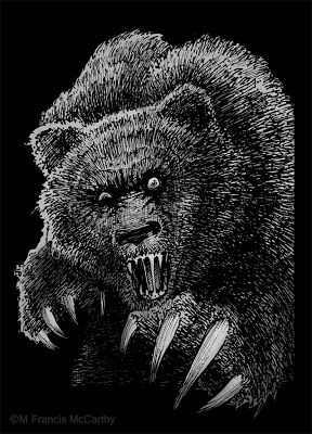 |
| "Mad Bear" by M Francis McCarthy |
This bear was done in back 1990 and used by Motobuilt for stickers and other stuff. Motobuilt was one of the earliest custom skateboard truck makers. They are gone so I'm not finding lots of good links for you, sorry.
The owner and I disagreed about the number of claws for this illustration I wanted four. He said "they actually have five". I said "I ain't changing it. take it or leave it."
Ah, the pre-hired gun days of artful independence. I changed plenty after I started slinging my art gun for good ol' Jack Nightingale.
Anyway back to Ink and Inking. This bear was done with rapidographs. I liked inking with those because you got a constant ink line that was waterproof India ink. Felt pens then and now gave iffy results. I always found their line quality lacking for anything except quick cartoons, sketching or doodles.
The biggest issue with rapidographs is that they produce a uniform line that can be boring if not used right. Also the effing things clog like crazy requiring you to take them apart and clean them. Hopefully without bending the delicate wires on the thinner pens like the .0, .00 and the .000.
BTW I couldn't help but do some subtle toning on this bear in Photoshop in a layer below my line-work. It's fun to freshen up some of these old drawings and share them. Hopefully you all are enjoying seeing this part of my artistic journey too.
Cheers,
Landscape Painting - One Brush
Hey, lets get back to some technique after yesterdays philosophical discussion.
The cheapies are more trouble than you save from the cost difference from just getting good brushes. Cheapies shed hairs in your painting, have uneven sides and edges, don't last and basically make painting a drag because the brush will not respond to your hand very well.
I tend to use one or two brushes for 70 to 100% of each paintings passages. I know that many painters like to change up their bushes during a session but I tend to start with a big brush, say up in the sky and I'll do the whole sky with it.
For the sizes I work these days I favor #8 to #2 Flats and I will spend the extra dosh for good quality brushes. I've been using Robert Simmons Signet Bristle Brushes because they're good and I can get them out here in New Zealand. I really like Silver Brush Grand Prix Super Brushes also. Try those out if you're in the states they are top notch.
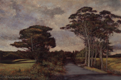 |
| Homeward Bound (12x18) by M Francis McCarthy |
The cheapies are more trouble than you save from the cost difference from just getting good brushes. Cheapies shed hairs in your painting, have uneven sides and edges, don't last and basically make painting a drag because the brush will not respond to your hand very well.
I'll stick with that first flat for an entire passage unless I've a great reason to grab another brush. I'll get deeper into my process as the blog progresses but for now: I use that brush's edges and corner to get the paint down in varied ways.
I do wipe my brush off occasionally with a paper towel and if necessary I'll use some lavender oil to temporarily clean the brush.
For cleaning at the end of a session I now use kerosene. Kerosene leaves a nice oil on the brushes that conditions them. In my experience it keeps the brushes fresher for longer.
Be careful the brush is dry though before using it to paint again, kerosene that gets into your painting will keep the painting from drying!
Turpentine can give me a headache as does "odorless" mineral spirits. I've found some great alternatives like lavender oil. More on Lavender oil later.
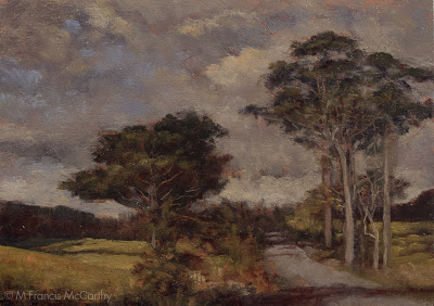 |
| Homeward Bound (5x7) by M Francis McCarthy |
When I move out of the sky I often will lay in my dark's with a #2, #3 or #4 flat depending on the shapes involved and the size of the passage. I like to get back into a #4 or #6 for the rest of the medium color areas for the same reasons that I use the #8 in the sky. Namely:
Bigger strokes just look better and the bigger the brush, the bigger the strokes. I find that being forced to use a corner of the brush for accents keeps the painting fresher. In my earlier days as a painter I liked getting the small sable rounds out and going to town on the details. I now feel this locks up the image and that's contrary to my artistic agenda of creating a loose relaxing space for the viewer to enjoy and contemplate.
Another good reason to mostly work with one brush for a passage is that it keeps a bit of the tone from each element mixed in each color. I like my color defined but definitely harmonic. Note: the main brush switch up that I do is when I go in with the dark's Having lot's of muck in your brush isn't a great plan for dark's but like I said can be an asset in your middle tones and lighter passages.
Obviously, brushes, brush technique and technology is a vast topic so we'll talk more about it down the road.
Cheers.
Drawing - Measuring
Drawing is measuring and make no mistake it can be learned by anyone why applies themselves with a bit of disciplined effort. To draw anything you must relate one shape in an image to the next and the next and so on. The best way to learn how to do this is just by practicing and checking your work with a critical eye.
If your shapes are in the right place, detail is unnecessary to convey a good idea of what is being rendered. Conversely if your drawing's proportions/measurements are off no amount of detailed rendering will save your image.
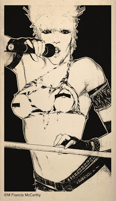 |
| Wendy O by M Francis McCarthy |
Correct drawing is still a challenge for me after 47 years of practice. Being self taught, I have some bad habits that are deeply ingrained. I have developed ways of compensating though One good one is to hold the drawing up to a light and look at it from behind. Another good idea I use all the time is to turn my drawing upside down and look at it critically that way.
I highly recommend blocking in your big shapes and double checking the measurements before you do any serious rendering. I'm really speaking from experience here as I've been guilty of not following this advise and sometimes end up wishing I'd measured twice and rendered once.
A great way to train your eye is to do lots of quick sketches directly with pen on paper. This gets you to focus because you know you cannot erase.
I've mentioned developing a critical eye a few times in this post. This has got to be the most important part of drawing well. At each juncture of your drawing you should be measuring, correcting and critiquing your work. Not in a way that's harsh with yourself but in a way that's honest and pulls no punches. This is the best way to improve and get ever better.
Today I'm putting up a drawing from 1985 of the now dearly departed Wendy O Williams. Can't say I ever dug Wendy's music but she was definitely a sexy rock and roll icon.
My main recollection now of doing this drawing was that it was done quite large on a nice piece of illustration board. I remember drawing this in my first solo apartment. It was done with pencil, a lead holder as I recall. Those were great for getting a super fine point.
Obligatory Disclaimer - This drawing was drawn strictly for fun and I show it here for review and portfolio purposes only.
landscape Painting - Liquin
I love Liquin. There I said it.
This is from the Windsor Newton site:
Liquin is a general purpose semi gloss medium which speeds drying, improves flow and reduces brush stroke retention. It halves the drying time of conventional oil color (touch dry in 1-6 days depending on color & film thickness) and resists yellowing.
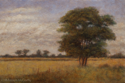 |
| Dawn Breaks (8x12) by M Francis McCarthy |
Liquin cuts your drying time way, way down and if you use lead white (as I do) paintings are dry to the touch the next day if painted thinly. I usually dunk my brush in it before dipping into any colors. I also periodically add it to my mixes as I'm painting.
I've used straight up linseed oil as a medium in the past and it's slow drying. Many artists use quick drying mediums like sun thickened walnut oil or Gamblin Galkyd medium. I've tried the Galkyd and found it too glossy for my taste.
I love the satin finish of Liquin and after I discovered it I never looked back.
Many oil painters like to get into medium composition debates like it somehow enhances one's talent. A good artist can create good work with the barest minimum of materials. I utilize Liquin in my painting to the fullest extent possible and I'd miss is badly if I had to make do without it.
BTW Liquin isn't cheap but it's worth the cost. Don't buy more than you think you'll use in a six month period. It has a limited shelf life. Also, they've now changed over to a nasty plastic bottle. I decant mine from a big bottle into the smaller original glass bottle and it's never far from my pallet.
Today's painting "Dawn Breaks" was painted soon after my move to New Zealand.. At the time I painted it I was feeling pretty challenged. I'd still not completely got my technique and materials to conform to my inner vision.
Dawn Breaks was painted on a pine panel. I don't usually care for pine as a surface because it's too flat with not much grain. In this case, the board was textured with gesso before painting.
I'd experimented with textured boards a lot while painting in California but ultimately I prefer to use textured boards only for my 5x7 oil sketches and hardwoods like Kauri for the larger pieces. I'm actually pretty fond of this painting now and it is housed in the M Francis McCarthy Foundation for the Arts permanent collection.
Learn to Draw
I read that today. Learn to draw and create beauty even if no one cares. The quote is from a guy named Sal Bass. I still need to learn who he is and what he did. Regardless the quote stands on it's own as the best art advice I've heard and I aim to teach it to any of my students from here on out.
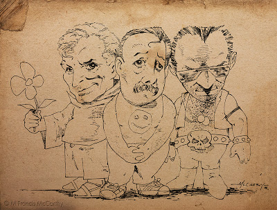 |
| Three Dudes by M Francis McCarthy |
Just one image today. This is a drawing I did back in 1985. It's purpose I think was to impress some girl. Not sure whether I gave it to her or not now, almost thirty years in the future. At the time I was proud of this drawing for the looseness and caricature of the characters.
I've a lot of respect for cartoonists. I don't consider myself one at all though. I've dabbled in "cartoon illustration" though and I'd file this image under that heading.
I can recall inking this with a triple zero rapidograph. Rapidographs gave you a constant, consistent ink line. The triple zero was the thinnest that was practical to use. I used rapidographs a lot. The challenge was to get "character" in a non varied line. Usually I'd attempt to vary the line by speeding up or slowing down the ink stroke.
I worked hard at being an inker for years and I will be posting lots more on inking and using ink medias like the pen, brush and even sticks or computers.
Ipad drawings
I did these last year on my wife's iPad. I used a program called LiveSketch HD. I really enjoy drawing the figure but it's awful hard on an iPad without a real stylus and especially difficult without pressure sensitivity.
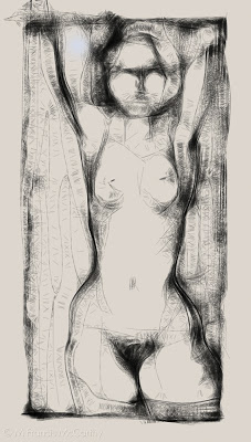 |
| Nude Figure by M Francis McCarthy |
I got my first Wacom tablet back in 1996. It was an an Artz 2 and used a serial port. I loved it so much. At the time I bought it I made a fairly low wage so I had to save like crazy to get one. I had a picture of the Artz 2 taped above my desk to help it manifest quicker.
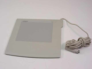 |
| Wacom 6x8 Artz 2 |
Drawing or painting with a mouse is like drawing with a 2x4. It's very difficult to control and fine detail is almost impossible. Thehe pressure sensitive tablet is a huge door to doing art on a computer.
Drawing on an iPad with your finger is easier than using a mouse on a computer but nowhere even close to a pressure sensitive tablet for control and expression. Of course, a real piece of paper and a pencil or pen has them both beat!
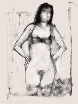 |
| Nude Figure by M Francis McCarthy |
Ok, back to the LiveSketch sketches. I kinda like these for what they are. Like any medium you have limitations. The key to working with most mediums is to use those limitations to your best advantage and create as fully as possible within the boundaries of each different medium whether it be a tablet or pastel or oil paints.
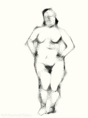 |
| Nude Figure by M Francis McCarthy |
LiveSketch uses an algorithm to sort of web the line of your drawing. Going slower is darker and thicker while going fast produces thinner lines. It's a neat effect but challenging to control. You can do color as well but I preferred to use it like a pencil.
I cannot wait for a real pressure sensitive tablet computer to come out. That's going to be awesome!
