Deadlines
I fist became acquainted with deadlines working as a manager for Jab Art Enterprises.
Every job we shipped had a tight deadline that could not be missed. Work crews would most often be at the destination site and scheduled to hang the art on a specific date.
Year in and out I hit those dates though many times I might be the last one there, loading a truck at 11:00 at night.
Later as the art director at Jack Nightingale Artworks I was responsible for scheduling our workload and getting the art out on time and also making sure it was good art.
The business JNA was in is competitive and there was always lots of good art for the buyers to choose from.
I never missed a deadline at JNA in the thirteen years I was there and we put out some great stuff on razor thin time margins.
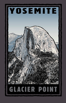 |
| Glacier Point Illustration by M Francis McCarthy Copyright Jack Nightingale Artworks |
I never missed a deadline at JNA in the thirteen years I was there and we put out some great stuff on razor thin time margins.
Deadlines can actually stimulate good work even though time is tight. I feel that this is because our subconscious mind becomes more fully engaged in an emergency situation and works double time to provide us with needed answers quickly.
The ability to access that part of our minds when it would help most is one thing that separates the winners from the losers in commercial art. Personally, I found it annoying when the other artist there Rico would tell me that I could receive art from him fast or I could have it good.
What utter bollocks and completely untrue.
I saw the work that other artists were doing in our field and I knew damn well from chatting with some of them at trade shows like Magic in Las Vegas, that their schedules were just as full and the times just as tight as in our art department.
I'll blog a bit about Magic some other time but for now I'll say that its the worlds largest apparel trade show and that I attended it every year from 2000 to 2009.
If your looking to produce more work and of an often higher quality, set yourself some deadlines and stick to them.
You'll be amazed at what you can accomplish.
Also if you, like Rico thinks it can be fast or good, hopefully I've disabused you of that misguided attitude and you can now start getting the art out a bit quicker and stop farting around.
Cheers,
A bit about "Glacier Point": This is illustration number 1001 I did of Yosemite's Half dome .. Just kidding, but I did illustrate half-dome at least 100 times in different ways, shapes and colors.
I was always fond of this design. I think the illustration is real nice and I also like what Jack did with the type here. Jack was and probably still is great with type. We could be a great team as he was strong with design and I was with illustration.
Unfortunately, sometimes he would lay some real stinky designs that I'd be forced to send out. He was the "Creative Director" after all, not to mention being one of the owners of the business.
I did my best to polish those turds...
Painting - Composition
As artists, we are responsible for moving the viewer through the picture. Failure to do this well will always result in mediocre pictures.
The brain filters out huge chunks of the data coming in through our visual sense A critical job of the artist is to do this filtering action for his viewer, presenting them with a predetermined journey through the painting.
That "journey" is what is primarily created when we correctly use composition in our pictures.
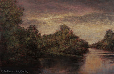 |
| "Riverside Reflections" (8x12) by M Francis McCarthy |
That "journey" is what is primarily created when we correctly use composition in our pictures.
Much of what we do as artists in this regard is intuitive. We just know when it feels right. Much also can be learned by studying the paintings of artists you admire. Far less is graspable when you read about the subject in books.
There are some great books on composition one I love is by Edgar Payne Composition of Landscape Painting. Another I've been trying to read is Composing Pictures by Donald Graham, I just scanned a review of this on Amazon an that review wasn't feeling it either.
From my experience the best way to learn about good composition is to do a lot of paintings. As you do these paintings try to remember that a path must be mapped by you through each work you create.
I'm going to mention using photography as a major area of potential concern at it pertains to composition.
Speaking from experience, though you can utilize composition skills when shooting your reference material, you are still just flattening raw nature.
A painting must be composed. mimicry and rote copying of nature results in paintings, but many times they will be hit or miss unless the reference photo has been re invented. To do this the limitations of the photo must be overcome by direct intervention from the imagination of the artist.
Cheers,
A bit about "Riverside Reflections". This is a recent painting thats made it through my recent repainting cull without being reworked. There is much I love about "Riverside Reflections" and somethings I'd rethink when revisiting this motif.
Over all, the painting has the quiet feeling of twilight that I was after and exhibits a nice luminescent quality. It's currently hanging at the Yvonne Rust Gallery located at the Quarry Arts Center in Whangarei California.
Reworking
Lately I've been reworking a lot of paintings. Not my favorite way of working but as an artist I must follow my muse.
It's tempting to let something go that you can see flaws in.
Tempting yes, but ultimately it works against us as artists as it dilutes the over all quality of our oeuvre.
Why that matters is different to each of us. It does matter to me. I want my best stuff here representing myself and my work after I've exited this mortal coil. I don't want a bunch of also ran paintings sorted through the mix
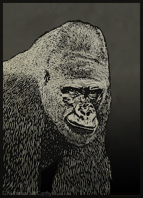 |
| Gorilla by M Francis McCarthy |
A while back I found that I could produce more good paintings by planning things out before painting.
That did indeed work for quite a while. However, there are limits to what planning can achieve. Especially when working in the studio from photos and drawings.
I've written about some of the pitfalls inherent in working from photographs here.
Even knowing what I do about all the pitfalls I've gotten zapped on about a dozen or so recent works.
As a consequence most need reworking to be brought up to the level I think they should be as landscape paintings. I've been reworking paintings for the last few weeks now and to a good effect in most cases.
Generally I've avoided reworking paintings in the past for a few reasons:
- Picking at paintings is a recipe for disaster and is too easy to do if you don't leave your work alone.
- Nothing is ever perfect. It's good realize this and let things be.
- Gotta keep moving. Better to produce many paintings, than spend too much time picking and scratching at a few.
I've recently hit a new plateau as a painter and because of that I'm "seeing" things I id not before. Since the paintings are recent and not in galleries or on display anywhere I'm free to try and bring them up to the level of my current vision. That's a good reason to repaint in my view.
I share this part of my painting journey in the hopes that it will help some of you that have also reached similar plateaus in your work.
Cheers,
A bit about "Gorilla" He is inked using pen and ink and also the computer. Many times I would print out photos and work directly on the image with pen or brush. Then scan in and finish the image.
I was always short on time at Jack Nightingale Artworks and this was one of my many coping strategies. Gorilla came out pretty well but using photos like this can be a seductive potential trap even for experienced illustrators. You have been warned...
Intuition vs Intellect
Intellect battles intuition and always wins unless you keep on your toes.
It's too easy to drown out that quiet inner voice. Too easy to think we know what we're doing even if what we're doing is at cross purposes with our true intentions as artists.
I've written before about intuition here.
There is a reason that intuitive types are compelled by the arts. All art requires almost countless decisions to be made. The intellect alone finds this process tiring while our subconscious mind can do the same work automatically and effortlessly.
"I'm convinced already! What can I do to tap into this intuition more?" you're saying.
It's too easy to drown out that quiet inner voice. Too easy to think we know what we're doing even if what we're doing is at cross purposes with our true intentions as artists.
I've written before about intuition here.
There is a reason that intuitive types are compelled by the arts. All art requires almost countless decisions to be made. The intellect alone finds this process tiring while our subconscious mind can do the same work automatically and effortlessly.
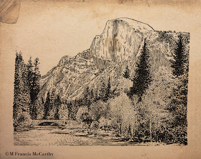 |
| " Halfdome" by M Francis McCarthy |
Both aspects of our mind are required to do art. The intuition must have a direction and intention to work it's magic upon. And it is magical as it can solve mountains of problems in a single bound and get us to the answers we need.
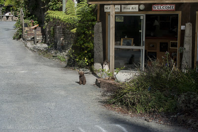 |
| My Studio at The Quarry Arts Center in Whangarei, New Zealand Also pictured is Denny the Poodle, My cohort at arms. |
"I'm convinced already! What can I do to tap into this intuition more?" you're saying.
Great question, you'll excuse me while I break out the bullets.
To access our intuitions more fully we can:
To access our intuitions more fully we can:
- Do that thing we just thought of doing. Don't put it off, act now.
- Take a stab with the brush loaded, at a spot on the painting that's bothering you. Then, deal with it...
- Don't lie to yourself when you see something wrong in your work. Intuition is always trying to point out those bad areas. BTW my personal tendency is to drown this voice out with lots of justifications.
- Pick up that book, find that bit of reference or ask that person to pose that you've been thinking about.
- Look for coincidence.
- Welcome the random into your work.
- Paint once, think twice.
- Use the biggest brush possible and turn that thing. Make it work.
You get the idea.
Cheers,
About today's illustration "Half-dome" this was done back in 2003 or so and was used as the basis for quite a few tee shirt designs. It was inked with a dip type pen and then scanned in and finished using a Wacom Tablet and Stylus. This Sucker is copyrighted by Jack Nightingale Artworks and reproduced here for portfolio, editorial and illustrative purposes only.
Art is for the Brave
To create art one must be brave. You can draw, paint or invest your time in art installations but to create Art with a capitol "A" you must be brave.
You must step out side of your comfort zone.
You need to do that thing you think might work instead of the thing that you know will serve but could be bettered.
Don't be afraid. Do that hard thing and don't look back.
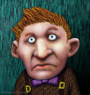 |
| "Look, who?" by M Francis McCarthy |
Don't be afraid. Do that hard thing and don't look back.
"What if it sucks" You say.
Ok, then it will and you'll feel bad. But if you keep at it you know you've at least tried to make Art instead of being happy with craft and kidding yourself that you don't know the difference.
Be brave. Make Art.
Really, the worlds got enough of everything, except real art that touches others at the core of who and what they are as people.
Cheers,
A bit about "Look, Who?" This guy was created over a span of 10 years. He originated as a doodle on my desktop calender pad at Jab-Art Enterprises in about 1992. I scanned him into my computer at some point and colored him in 1994. Years later I changed the background and tweaked him some. I've always liked the pan in the face look on this guy.
Know When to Change
Knowing when to change course in big or little ways is a big key to having a successful career as an artist and life as a person..
I guess this blogs taken a philosophical bent as of late and there are several reasons, the foremost being that I tend to be very philosophical about life and art and the other reason being that my art is changing a bit these days.
It's not the first time I've made changes. My whole life I've always been consistent. Consistent that is until the time was ripe for change.
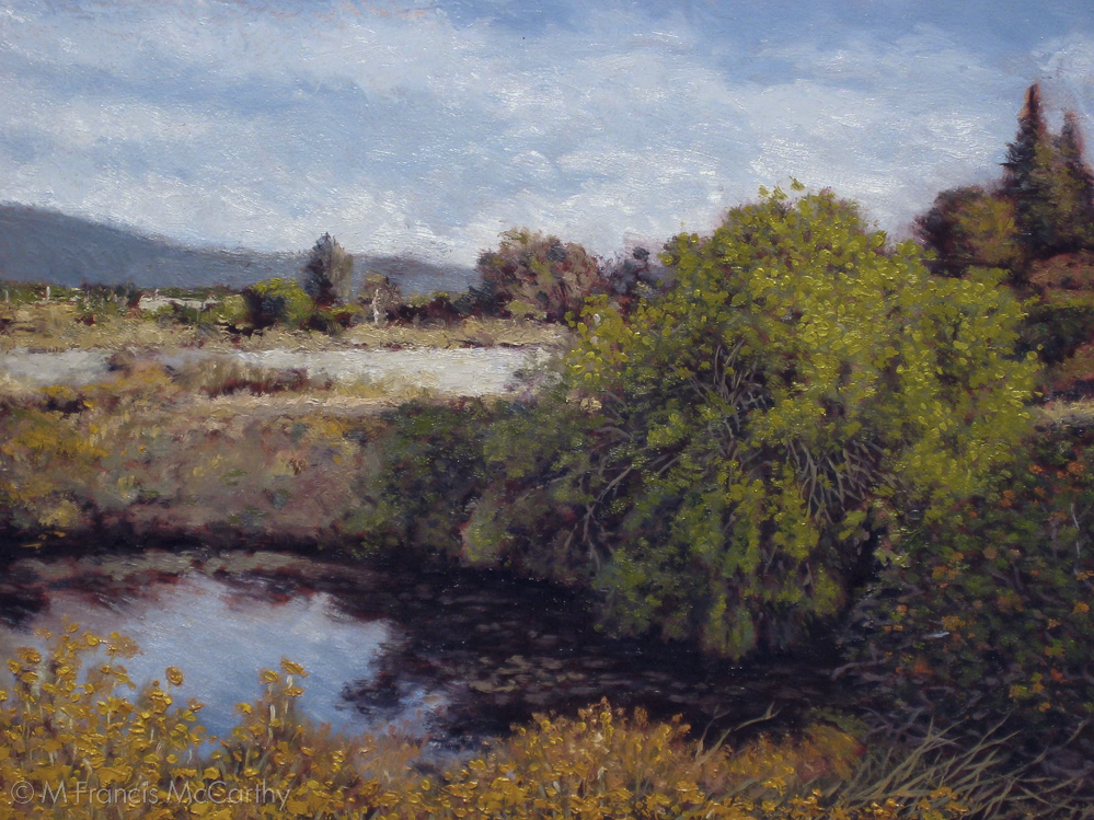 |
| " Los Gatos Trail - Pond" by M Francis McCarthy |
What's changing in my painting?
I'm getting more into inserting imagination into my work. I've been striving to overtake photography's influence on my work for years.
Just recently I've started studying with Dennis Sheehan online. He is a very good painter and I've mentioned him on this blog as being a modern Tonalist that I admire.
While researching him for this blog I discovered that he offers a monthly subscription to his teaching videos and I have to say I'm getting a lot from his approach.
I started this blog to teach some of what I know but I'm also aware that I must always keep learning and adapting.
BTW, I'll post some of my recent painting here soon. Truth is they look much like my older paintings but whats changed is that they're looking like my best work instead of the ify ones that were stuck in a stasis of mediocrity.
I've been evaluating and repainting parts of many recent works that I had given up on. I'm using my imagination and applying other reference in some cases to good effect.
I'm pretty excited about whats going on in my studio these days and I owe a lot to Dennis for sharing some of his thirty years of painting knowledge.
If your facing similar challenges I recommend seeking out change in whatever form is appropriate for you, be it a blog like mine or a local teacher in your area or online.
Cheers,
A bit about today's painting; "Los Gatos Trail - Pond". This was done back in 2009. At the time I was teaching myself painting by photographing the ponds and creek behind where I worked in Campbell California and then painting them at my home studio.
I did about fifty or so paintings of the pond area. Working small I covered a lot of ground quickly as I learned to use my brush and paint.
I like the colors in this painting and it's got potential as a motif. I do think I too slavishly copied the photo reference. It's been a long process of learning how to get some good inspiration from a photo but also knowing what to leave out and add to make a great design.
It is very seldom that a natural scene will be a perfect composition with out some modification large or small. I'm going to be talking about this more in future posts.
Learning to See
Developing our ability to "see" artistically is a lifetime effort that's never completely achieved.
Many laypersons and armature artists put way too much stock in technique and style. Nether of the two is even a fraction as important as seeing correctly and artistically.
By artistically I mean seeing with a highly developed sense of aesthetic appreciation for what is being perceived.
This sense in not just visual it taps into all the other senses as well and enfolds with feeling within us to create enhanced perception.
So, how can we better develop our ability to see?
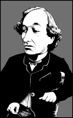 |
| "Benjamin Disraeli" by M Francis McCarthy |
So, how can we better develop our ability to see?
The best way is to draw a lot, paint a lot, look at other artists work and also be open within yourself to seeing better.
This last bit is absolutely critical. If you think you see everything already, how can you see anything that you're not seeing?
You cannot see what you cannot see, it's impossible, but there is a way around this apparent contradiction.
The solution to this Catch 22 is that we must remain open to visual truth while working as hard as possible at our craft. If you do this, one day you will look at something you did only a few months before that you thought was masterful and defects will begin to present themselves to you.
I know, bummer eh?
But, far better to know, far better to see, and having seen create anew in a better fashion until a new plateau of vision is accomplished and another and so on.
A bit about "Benjamin Disraeli" I did this as a portfolio piece back in 1994, I think. Not sure as to the date but it was in the nineties.
This illustration is inked with a Sable watercolor brush. Actually it was inked with a Winsor Newton Series Seven number two. I've been using that style of brush for thirty years. They are quite popular with many inkers because they hold their shape well and provide a nice snappy line quality.
I don't believe I've posted very much of my brush inking here so far. I use brush mostly for more comic book looking or graphic type work but it can be used in a more classical way as Benjamin shows.
For sure you'll be seeing more brush type illustrations on this blog as time moves us forward.
Cheers,
Art Thoughts
What makes you unique as an artist?
That is a great thing to know about yourself and your work.
Sometimes when we see the great work of other artists we can begin to question our own ways of doing things.
While self appraisal is always valuable, it's more important to maybe take a bit here and there from the artists you admire. Rather than slavishly emulate their styles.
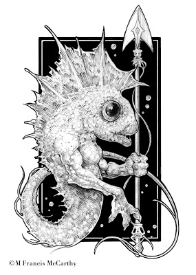 |
| Fisherman by M Francis McCarthy |
If you read yesterdays post; I wrote about creating art from your heart. I said that being a unique artist is your birthright as you express your deepest inner vision.
Hey, here's some home work for you. Draw or paint something today completely out of you imagination. You might be surprised at whats in there.
A bit about today's drawing. Not sure if I posted this drawing already, but if I did it was way lower rez than this. I did this back in 88 or so. I'm still super happy with it as it's got great contrast, style and a neat creature.
Cheers,
Painting - Expression
Expression is what fuels all art. Expression should be and is the purpose for even creating art at all.
Sometimes the intellect can cause us to choke a lot of the expression out of a painting. I'm speaking from lot's of direct experience...
Though I am an artistic type, I am also very rational and like to plan things out. I always say " I'm all for spontaneity... as long as it's planed."
That's my own struggle to work with as an artist. Yours may be different. You may be super expressive with your art but lazy in regards to craft or unmindful of other critical aspects of your work that are out of sync.
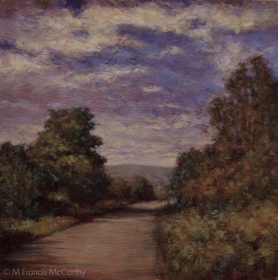 |
| "Headed Home" by M Francis McCarthy |
A challenge for many of us as artists is the attainment of skill and craft without the calcification that can sometimes be the result of applying too much craft.
Like every other aspect of our lives a balance must be struck between control and passion. Ultimately, passion/expression is the most critical of the two. Art without unique individual expression is boring as hell.
I feel that we must paint from our heart and that direction from the intellect should be at a subsurface type level for the most part.
To consistently create good work and still do this,"craft" must become ingrained deep into the psyche. The only way I know of to do this is to paint and draw a lot until those skills become second nature.
What else can we do to increase the expressive qualities of our paintings?
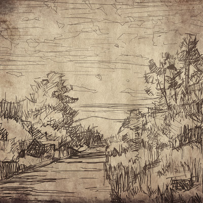 |
| "Headed Home" (sketch) by M Francis McCarthy |
What else can we do to increase the expressive qualities of our paintings?
Here's a short list:
- Do some random stuff to you painting now and again. Then, deal with it.
- If you start with a photo, put it away at some point and focus on the painting, as a painting.
- Paint slower, let it well up inside you then express the brush stroke fully.
- Remind yourself while your painting that expression is your main goal and measure each aspect of your work against this. This is very useful for instigating creative color decisions.
- Remember, you don't have to paint the sky blue and the grass green. In fact that's about the worst color combination I can think of in a landscape painting.
- Do not over delineate details. Leave something for the viewer to do. They are quite capable of creating meaning from even the daubiest daub.
Rember, paint from the herat and not the head. Train yourself to get those skills that you may then ignore.
A bit about today's painting "Heading Home" I' pretty happy with heading home but I see much I'd do differently now. I painted this about a year and a half ago after moving into my studio at the Quarry Art Center in Whangarei. I like the colors and loose-ish brush work.
These days I and transitioning from a more controlled drawing prior to painting into a more expressive and indicative mode in my execution. Stay tuned.
Cheers,
Painting - The Robot
Who is the robot?
The robot is that part of us that works mechanically. He performs many of our actions and responses that are automatic in that they need no conscious attention on our part to direct them.
And it's great! Great for driving, cooking onions and a multitude of other daily actions. Whats the robot not great for?
Painting.
Definitely, better to paint consciously. That's not to say every stroke should be directed by the intellect or the will. It means being conscious of our heart and deepest inner feelings and then focusing that on our work.
Funny enough, the robot loves to paint, too bad he doesn't do a very good job of it. He loves to paint as you plan your next "aware" brush stroke. Truth be told, your painting could be halfway or even two thirds painted by the robot.
What can be done to combat this great ally but bad painter?
Here's some strategies that I like to apply:
- When you lay a stroke down on the canvas do so with intention and an openness to possibilities inherent in the present moment.
- Paint a brush stroke and then step back. Leave the poor thing alone for a bit.
- Don't use a "licking" brush motion on your canvas. That's a tell tale sign that the robots there, undoing most of your conscious painting with those licking strokes as your parsing your next move.
- Change up the way you hold your brush. This is the best painting advise I've given on this blog. Changing up your brush handling resets your brain and keeps you present and the robot at bay.
There's plenty more great strategies, but that's a good start. Maybe you can dream up a few of your own now that the issues out in the open.
In closing since the robots been filling up many of your paintings with unnecessary unmindful brushstrokes. Just getting this monkey off your back alone will improve your work immensely.
Cheers,
Illustration - Challenges
As an illustrator hired to do whatever came into the art department, I was often faced with challenging subjects.
My personal approach was to gird my lions and concentrate on the essentials. Contrast, composition and style, these can be applied to any subject.
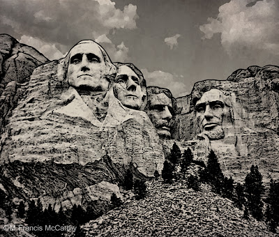 |
| Mt Rushmore illustrated by M Francis McCarthy Copyright Jack Nightingale Artworks |
Most of the art I did there was based on or supported with a strong black line drawing. This helps the printer as it covers over many registration issues with the end result being a crisper design on the tee shirt.
Creating art specifically for screen printing is a dying art as there are many "separation" programs like "fastfilms". They do have a learning curve but nowhere near as difficult as doing the art color by color for custom screen-printing.
Anyway, back to challenges, how to deal with them?
Well, for starters you can always take refuge in craft if inspiration is hard to find. Applying a fresh style or new perspective can take you to some great places as well.
I'd have to say that having a good attitude would be the greatest approach to any challenge. I always try to cultivate an attitude of fun and hard work with a positive outcome assured as the result.
Cheers,
Drawing - Using Photography
As a young artist I liked both drawing from my imagination and also from photographs. I loved trying my best to delineate all the stuff in my photo reference.
I still love working from photos. What I like best is the control it gives you as an artist. Your reference being stationary you can draw as slow or quickly as you please. Also detail is frozen in photography. whereas in sketching from life most models will not sit happily for long enough for you to capture lots of detail.
Those are some of the pluses but there are negatives galore as well. So many that I'm going to break out a bulleted list of some of the downsides to working from photos:
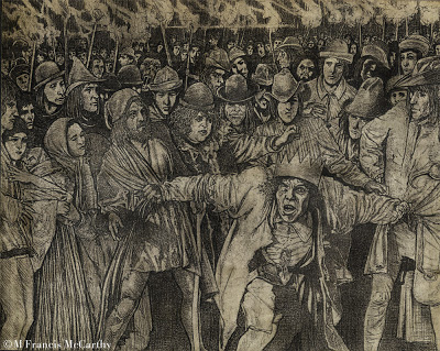 |
| "Quasimodo the King" by M Francis McCarthy |
Those are some of the pluses but there are negatives galore as well. So many that I'm going to break out a bulleted list of some of the downsides to working from photos:
- Much of the character of your drawing will come from the photo. This can be a real issue sometimes, especially if you are not the photographer.
- Forest for the trees syndrome; Here you get lost in all the details of the photo, losing sight of the simple forms and shapes.
- You draw from your reference unaware of the obvious distortions certain focal lengths introduce. This is more of a problem when using photos for illustrations of landscapes, distortions can be super obvious on buildings for example.
- Stiff, stiff, stiff art. Watch-out, as this can creep up on you and you may not see it for quite some time.
I think it's good to draw from life, your imagination and use photography. Mix it up and you get the best of all reference.
Nothing beats drawing from life to sharpen the eye and help you create natural looking pictures free of the types of distortions common in photography.
Personal note: I'm often guilty of the many sins outlined here. My excuse its that I'm very into working in my studio under controlled conditions. I do like sketching and painting from nature. However I'm not able to get the level of finish that suits my vision as an artist outdoors.
A bit about "Quasimodo" I think this is drawn circa 1991 or so. I was really into detail at the time as you can see. The was drawn on arches coldpress water color paper using a lead holder and range of leads from H to 3B.
Cheers,
Dark Night of the Soul
It happens to all of us as we journey deep into the realms of art or spirituality at some point. Heck it could happen on a daily basis for some.
What is a dark night of the soul?
It is when you feel lost in the dark. When you think you may not be going the right way with your art or life. It is a lapse in faith and a questioning of judgement. In short, it sucks, it's a bad time.
It happens to me. As a young man I'd say it happened a few times that lasted for months on end. These days it happens to me in sporadic bursts that I have to ride out.
Is it just depression?
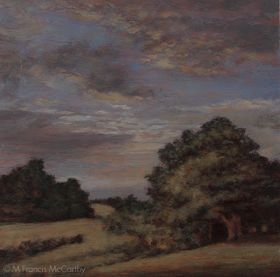 |
| "Clearing Up" (8x8) by M Francis McCarthy |
Is it just depression?
Maybe, but it's probably much more than that.
It's a necessary readjustment of the self at a core level. All things change as they progress from their beginnings to their end. We must change when it's time as well.
Not one thing in this universe is stationary for very long. Even seemingly permanent rocks when viewed through an electron microscope are hives of energy disguised as solid mass.
What can you do when you feel lost and unsure of your path through the darkness?
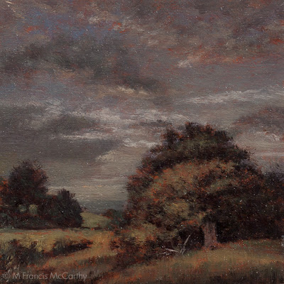 |
| "Clearing Up" (5x5) by M Francis McCarthy |
What can you do when you feel lost and unsure of your path through the darkness?
I believe it's best to stay your current course in those tough times while absorbing and contemplating the shock of being unsure.
All the meaning that's felt by you in this life has been created within yourself, by you. Others may feel as you do about any perceived meaningful thing, but you cannot appreciate the meaning in anything without first opening your heart and mind to it and accepting that it may indeed be meaningful.
How does this bear on our topic today?
Simple, You have picked an apparently meaningful occupation and you have given it your attention. If you're despairing because things have gotten a bit sticky now, it's probably best to just see the hard time to it's natural conclusion.
If you jump ship in a search for something else while experiencing the dark night, most likely you will fail in your next endeavour also.
Better to keep your head down and keep working until the light starts to break on the horizon and you come into a new day filled with the light of understanding.
A bit about today's painting: "Clearing Up". Really, another sky painting. I never tire of painting clouds. I've considered doing paintings with nothing but clouds and no landscape but somehow I can't see it working.
"Clearing Up" was painted last year and is part of the series I embarked on early in 2012. I'm closing in on finishing that series in the next few months. It's been a lot of work and I've certainly had a bit of a dark night of late as it seems to be dragging on and I have other paintings I want to do. No worries though I'll persevere...
Cheer,
What is a Hack?
A hack is an artist that will do poor quality art, very quickly that they do not care much about generally for money. They are artists whom abuse their gift as artists until they have no gift any longer.
I've know more than a few in my time and not all were artists. Most were though, because becoming a hack is actually the loss of something that was at one time precious.
 |
| Copyright Jack Nightingale Artworks |
A hack is somebody who used to care but does no longer. The reasons this happens are many but the biggest reason is taking an art job and doing too much art you don't want to, to quickly until eventually you become unable to even create worthwhile art just for the pleasure of doing it.
I know, I may come off a bit melodramatic, but my drama stems from real world experience of the graphic artist grind.
I did not go to university and my college is also limited. My actual qualifications as a graphic artist rested only on my proven ability to get the job done on time and with style.
As a young man it was my dream to make my living doing art full time. My job at Jab-Art Enterprises occasionally allowed me to paint some graphics or do other art related projects but predominately I was a manager there first and artist last.
 |
| Copyright Jack Nightingale Artworks |
It was great for a good while. My enthusiasm carried me through much of the disillusionment that I experienced.
Why did I become disillusioned?
Well for starers Jack was not in the art biz because of love. He liked money and him and his wife Deidre spent plenty of it. It's no sin to love money but for me the gratification of doing my art well is worth more than any cheap payoff.
Also, the buyers loved to kill good stuff by mucking with it, but even worse Jack himself would make stupid changes based on what he perceived as marketable. Stuff like taking some beautifully colored and rendered dinosaurs and just crapping all over the design by making us recolor them brown and flat.
So many times things liked this happened I could feel the grind wearing on me. But, I never gave in. I never sold out.
If you're in the commercial art business. I'm sure you need your living, but on every job you work on, you should ask yourself. Can I make this better? Is this good? Why is this good?
Never let them get to you and fight the power. I did, I fought every chance I could for us as an art department to produce great work we could be proud of.
And, if you're getting ground down to far. Ask yourself Is this worth the price I'm paying? Couldn't you make your living doing what you love or at least doing what you love on your own time and making your bread another way that doesn't compromise your soul as an artist?
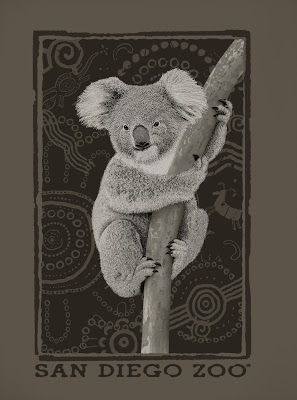
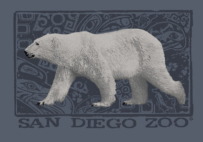
A bit about these illustrations. Both of these designs were purchased by the San Diego Zoo and printed on a bunch of tee shirts. I'm proud of both of these and they represent some of the good work that we did at Jack's. Both of them exhibit the hand stippling technique that I developed specifically with an eye towards printing on tees.
FAIR USE NOTICE
THIS BLOG CONTAINS COPYRIGHTED MATERIAL THE USE OF WHICH HAS NOT ALWAYS BEEN SPECIFICALLY AUTHORIZED BY THE COPYRIGHT OWNER. AS A JOURNALIST, I AM MAKING SUCH MATERIAL AVAILABLE IN MY EFFORTS TO ADVANCE UNDERSTANDING OF ARTISTIC, CULTURAL, HISTORIC, RELIGIOUS AND POLITICAL ISSUES. I BELIEVE THIS CONSTITUTES A 'FAIR USE' OF ANY SUCH COPYRIGHTED MATERIAL AS PROVIDED FOR IN SECTION 107 OF THE US COPYRIGHT LAW.
IN ACCORDANCE WITH TITLE 17 U.S.C. SECTION 107, THE MATERIAL ON THIS SITE IS DISTRIBUTED WITHOUT PROFIT TO THOSE WHO HAVE EXPRESSED A PRIOR INTEREST IN RECEIVING THE INCLUDED INFORMATION FOR RESEARCH AND EDUCATIONAL PURPOSES. COPYRIGHTED MATERIAL CAN BE REMOVED ON THE REQUEST OF THE OWNER.
Landscape Painting - Craft
Oil painting is a craft. Like carving , clay working, writing a sonnet or any other activity one has to work at mastering. One of the reasons I write this blog is to support and further the craft of Painting.
Does this mean that painting isn't one of the highest of arts?
Definitely not. Only movies and music have an equal power to move us to great emotion. A painting can grab you and before you know it you're ensconced in it's reality, transported to another space, way of being, or seeing.
 |
| "Passing Storm" (8x10) by M Francis McCarthy |
For an artist to achieve even a fraction of the potential natively inherent in the form of painting, requires true diligence. Hours of work and study must be expended. The only fuel that can sustain an effort of this magnitude is passion.
Minimal effort will yield shallow results at best. You may be a hobbyist or perhaps just an art explorer. No worries mate, that's fine. If painting is anything it's fun. Or should be. Not every thing we do in our lives has to be considered work.
Oil painting is my work though and I do it every day for 4 to 6 hours. By that I mean actual brush on board painting. I cannot say I've always approached my painting so consistently. When I first got to New Zealand I was coming off 27 years of full-time labor. I needed a break and I had a great time. Now I'm hitting it hard as..
 |
| "Passing Storm" (5x7) by M Francis McCarthy |
Oil painting is my work though and I do it every day for 4 to 6 hours. By that I mean actual brush on board painting. I cannot say I've always approached my painting so consistently. When I first got to New Zealand I was coming off 27 years of full-time labor. I needed a break and I had a great time. Now I'm hitting it hard as..
Examples of the great craft and art of Landscape Painting are easy to find. As are tutorials and instruction geared towards the nuts and bolts craft of creating oil paintings on canvas or board.
You tube alone is a vast resource. Seeing painting as a craft is a great way to improve and also keeps you from falling in to the amateur/layperson trap of thinking any old crap can equal art.
BTW Even good abstract work exhibits craft so don't think of abstract art as an escape route (for the lazy though, many do think that way).
Look at your work. Does it stand up as something solid? Will it support the weight of repeated viewing by the interested and disinterested? Even if you are a hobbyist working on your stuff only part time, you can bring the pride of doing something well, to what you do.
It might mean watching one less TV show or spending more on art supplies than you'd rather. Ultimately this world only pays back if some effort has been extended.
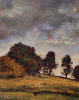
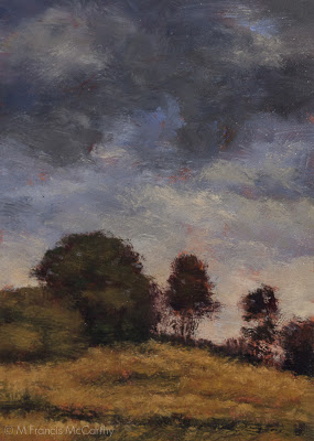
About today's painting "Passing Storm": I painted this last year and though I've sold the 5x7 I still have the larger painting in my studio.
This ones all about the sky and I enjoyed painting the clouds in freely in both paintings. Also I wanted to contrast the cool grayish sky against the warm rusts and golds of late summer grass.
Cheers,
Drawing - Trying, Failing, Trying Again
Drawing well's not easy. It's easier to trace photos, crib styles and manipulate images with digital media.
So, why do it?
Training you're eye and hand to cooperate also trains your brain to regard the world in front of your vision more critically. An awesome skill to have but in acquiring this skill, you will fail at it. I did and still do all the the time.
Some artists make it seem so easy. Nearly effortless.
It's not like that for me. I must try and fail and try again until I can at least walk away knowing I gave it my best shot. Still when you get it right or most of it right, it feels awesome.
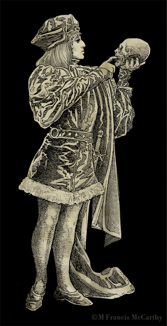 |
| "Hamlet" by M Francis McCarthy |
When I was young we had no choice if we wanted to make pictures. Even the Xerox copiers weren't that readily available till the late seventies. I love copiers by the way. Sure to be a post about them at some point.
I interject a lot of drawings on this blog that's mostly about painting because I feel drawing is the absolute best foundation for any artist. This blog is like my secret box I share of drawings, paintings and dreams. I like to write about and show pictures of stuff I love now or loved back in the day.
Also, I have progressed to a certain level as an artist and I enjoy teaching what I've learned and giving back something to a universe I'm grateful to be a part of with you.
If you're working at your art. Don't give up when it's gets difficult and don't be hard on yourself. Don't compare your work to other artists unfavorably either. Cut yourself some some slack there. You must work at it and never fear failure. If your not having some failures you can be sure your not doing it right or your not trying hard enough.
A word about "Hamlet". The reference for this illustration came out of an old book I acquired. He was drawn back in 1990. At that time I was really fixated in trying to replicate the feel of my pencil drawings in ink. His torso was distorted on purpose. Seems silly now in the age of easy Photoshop distortions. But back in 1990 I was into it. This was inked with a rapidograph or several rapidographs.
Cheers,
Landscape Painting - Mystery
We need mystery in a good landscape painting. What could be less interesting than a painting of a sunny day with birds and a big sun in the sky?
How to go about it?
That's a great question. Certainly less is more as a way of painting would be a good start.Less detail, less rendering and simplified color.
Often creating a good landscape painting or any work of art can be more of a process of removal more than addition. Getting lost, then found.
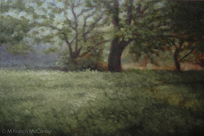 |
| "Early Morning Field" (6x9) by M Francis McCarthy |
I try to use a minimal amount of strokes in my paintings. Lately I've been becoming more aware of the presence of the illustrator in my work.
Illustrating mystery into a painting is more difficult that just painting in a less controlled way.It seems that implication not illustration is the name of the game.
If mystery in painting gets your juices flowing. Tonalism is the way to go.
Tonalism is all about that mysterious time of quiet twilight, when the air is still and all you hear are the crickets. The sky is golden light and in the shadows you can just make out the lush greens of life.
To achieve more mystery in your work: darken your pallet down a key or as I'm rediscovering you can actually tone your paintings with an oil glaze after they are dry to get some awesome effects. Also you can simplify your brushwork by using a larger brush and less brush strokes.
To achieve more mystery in your work: darken your pallet down a key or as I'm rediscovering you can actually tone your paintings with an oil glaze after they are dry to get some awesome effects. Also you can simplify your brushwork by using a larger brush and less brush strokes.
Landscape Painting - Beauty You Can't Fake It...
After yesterdays scary bear, I'm thinking we'll get into beauty today.
In 1990 when I did that bear, I was 25 years old and still occasionally buying comic books. As a young artist I was far more interested in clever, coolness than beauty.
As the years have passed, more and more I've been attracted to the beautiful in art.
As today's title states. You cannot fake beauty.
Something can be clever, cool, striking even but to be beautiful. It must be well crafted and work on sound artistic principles.
It may be true that beauty is in the eye of the beholder but it is also true that this truism is often invoked to defend second rate art or cleverness disguised as art.
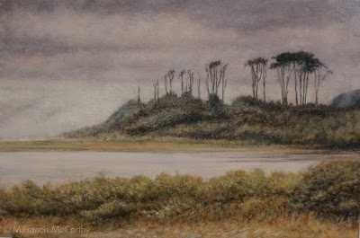 |
| "By the Shore" (6x9) by M Francis McCarthy |
It may be true that beauty is in the eye of the beholder but it is also true that this truism is often invoked to defend second rate art or cleverness disguised as art.
After years of being clever eventually, as an artist I had to decide was sort of art that I wanted to leave in this world.
I want to make pictures that bring folks some insight, rest and comfort. That's not all that's going on but it is definitely a big apart of what I'm after.This goal is strongly supported by trying to achieve beauty in my work.
A bit about today's painting. It was done after a trip my wife made to visit me in California before we were married.
The summer was scorching hot at that time in California except on the coast where were touring. There, it was blissfully foggy,nice and cool. That's reflected in the painting too I hope.
This painting exhibits a strong Tonalist pallet and was an early attempt at using a Tonalist vocabulary in my painting.
The 6x9 size is due to my fixation on the golden mean as a painting proportion. I stayed with that proportion well into my New Zealand painting career. We'll get more into proportions later. They are fascinating with the golden mean being especially so.
If you're a student, I recommend looking at and dissecting some work you consider beautiful. Create some yourself. It actually feels great to try.
If you're a student, I recommend looking at and dissecting some work you consider beautiful. Create some yourself. It actually feels great to try.
Cheers,
Drawing - Ink
Rendering your nice pencil drawing in ink has gotta be one of art's great challenges. Just hard unyielding lines to reproduce what was soft and subtle in penciled grays in two colors white and black.
That's right, two. You've got to think of white as a value not just black ink on white paper. These days doing ink work in the computer is a breeze. In Photoshop you just hit the X key to switch back and forth between the two.
In the real world all your white over black ink solutions are far more messy. I've used white ink (mostly sucks) white gouache (ok) and white out (so,so) at various times.
I'm sure they still sell scratch board too. Scratch board is coated with a white clay. After inking on it you can then scratch away your ink from the surface revealing the white clay below. Scratch board is messy too and requires tons of discipline. I'd say if your into that look, use a computer with a graphics tablet.
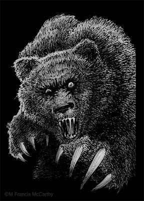 |
| "Mad Bear" by M Francis McCarthy |
This bear was done in back 1990 and used by Motobuilt for stickers and other stuff. Motobuilt was one of the earliest custom skateboard truck makers. They are gone so I'm not finding lots of good links for you, sorry.
The owner and I disagreed about the number of claws for this illustration I wanted four. He said "they actually have five". I said "I ain't changing it. take it or leave it."
Ah, the pre-hired gun days of artful independence. I changed plenty after I started slinging my art gun for good ol' Jack Nightingale.
Anyway back to Ink and Inking. This bear was done with rapidographs. I liked inking with those because you got a constant ink line that was waterproof India ink. Felt pens then and now gave iffy results. I always found their line quality lacking for anything except quick cartoons, sketching or doodles.
The biggest issue with rapidographs is that they produce a uniform line that can be boring if not used right. Also the effing things clog like crazy requiring you to take them apart and clean them. Hopefully without bending the delicate wires on the thinner pens like the .0, .00 and the .000.
BTW I couldn't help but do some subtle toning on this bear in Photoshop in a layer below my line-work. It's fun to freshen up some of these old drawings and share them. Hopefully you all are enjoying seeing this part of my artistic journey too.
Cheers,
Landscape Painting - Don't Over Paint
Here is one I have to tell myself all the time.
Don't over paint.
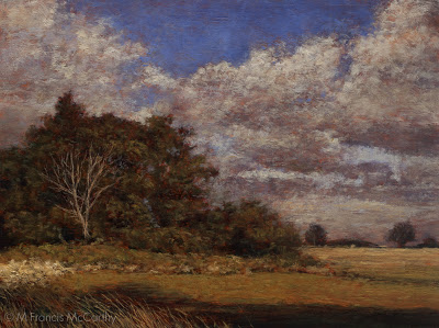
I like to plan out my paintings. I take pictures, do drawings and paint a small color sketch.
Then I project my drawing up onto my board and trace it with charcoal. After that I finish that drawing with a brush and sienna and black. This functions as my under painting.
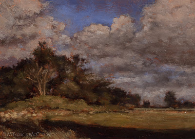
The process is the same for the 5x7's and their larger brothers. One difference between them is that I draw the scene with charcoal directly unto the 5x7 board while I project unto the larger. Also I do only one color layer on the 5x7's and up to three or more on the large version of the painting.
We all have our crosses to bear as individual artists.
Don't over paint.
I like to plan out my paintings. I take pictures, do drawings and paint a small color sketch.
Then I project my drawing up onto my board and trace it with charcoal. After that I finish that drawing with a brush and sienna and black. This functions as my under painting.
The process is the same for the 5x7's and their larger brothers. One difference between them is that I draw the scene with charcoal directly unto the 5x7 board while I project unto the larger. Also I do only one color layer on the 5x7's and up to three or more on the large version of the painting.
 |
| Day's End (9x12) by M Francis McCarthy |
Once in a while. I like my 5x7's better than their larger brothers. I enjoy their simpler forms and open brushwork
I sometimes have a tendency going back to my earliest drawing days, to over render forms and over delineate the details. I call this activity being "the robot". I'm a better painter than a robot so I watch for it.
 |
| Day's End (5x7) by M Francis McCarthy |
We all have our crosses to bear as individual artists.
How do I address mine?
The only way I know how, by painting a lot and looking, painting and criticizing. Always trying for better.
I also study the work of artists I admire and try to absorb some of their practice into mine where it's relevant and possible.
Every artist has their own way to their unique vision.
Sometimes it's good to strike a balance between what you know and what you should know. Question your assumptions a bit once in awhile. If you were right about everything you though was good in your art, all the time...
Wouldn't it be better?
Cheers,
