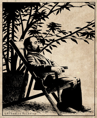
Illustration - Graphic Quality
For years in my art I pursued what I'll call a "Graphic Quality".
This quality is created by the placement of blacks and also very much by the type of hatching used to render the halftones.
I look at my work from a quarter century ago and I notice how carefully each stroke is placed. Back in the day I always worked in ink directly with a deep reverence for line.
I still have a respect for line and that graphic quality but after decades of doing art commercially and otherwise I'm not as precious with things now.
Is that a bad thing?
This quality is created by the placement of blacks and also very much by the type of hatching used to render the halftones.
I look at my work from a quarter century ago and I notice how carefully each stroke is placed. Back in the day I always worked in ink directly with a deep reverence for line.
I still have a respect for line and that graphic quality but after decades of doing art commercially and otherwise I'm not as precious with things now.
 |
| "Henri de Toulouse-Lautrec" by M Francis McCarthy |
Is that a bad thing?
Sometimes I think so, but looking at my old work I can see the "try" in it. I see the effort to stretch my limitations.
These days I'm more comfortable with my artistic limitation. Being older and more aware that they exist helps. But also, I enjoy communicating with art directly, confident that my unique approach as an individual will more than suffice.
Are you enamored with the graphic quality of your art and that of other artists whom you admire?
If so, no worries but be aware that the best graphic style is the one that comes naturally as by product of you as a unique artist. As I've stated before and no doubt will again. Your time is best spent doing so much art that it becomes second nature. Then style, graphic or otherwise, will manifest brilliantly.
Cheers,
A bit about Mr Lautrec: I did this back in 1988. I had found a photo in a book that inspired this illustration. I inked this on vellum with a rapidograph.
Vellum sorta sucks as an inking substrate. For starters the ink dries slow so is easy to smear. Also the ink just kinda lays there and you have to will it about. Still in the pre computer age it was one way of preserving you're original pencil drawing and I did use it once in awhile.