Illustration
For 13 years I worked as an illustrator and art director for a company that produced apparel and other items that were sold in department stores, zoos, national parks and Starbucks coffee. Today I'm posting a few of my portfolio images from the early part of that era.
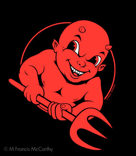
This image above is "Devil Boy" my attempt at capturing a skater type look back in 2000. I printed some of this design on tees for my own company "Kewl Studios" a story I will tell another time.
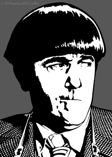
I created "Moe"as a portfolio piece intending to mail it out as a post card to solicit illustration work. At the time this was drawn, I was definitely entranced with graphic styles that would screen print print well.
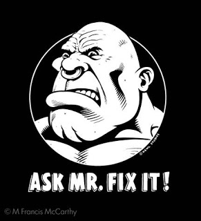
Another Kewl Studios design that I printed. It was always interesting to see who purchased this shirt. I think it went over most peoples heads. Not sure really what I was saying with the design but I do think it looks cool and catches the eye.
Speaking of catching the eye. I feel art must do this if it is to be successful on any level whether commercial or fine art. I strive to do this always, even with landscape painting. With landscape work however I scale the in your face aspect way back. Candy colored high contrast landscapes can grate on the viewers eye.
The three best was to catch the someones eye are color, contrast and composition. Follow that up with style, texture and scale/proportion and people will notice.


