Landscape Painting - Revisions 2
Keeping up with our recent theme of revising art today.
I've been writing a lot about this topic. One reason is that I feel it's vital information. Painting actually requires less technical knowledge than you would think. The truth is that "seeing itself" is the real thing with painting.
After a period of study it's fairly simple to apply paint to the canvas in the desired colors and areas. The real challenge is in what we putting on the canvas. If we cannot see it first in either nature, a photo or in our minds eye, it will be nearly impossible to paint a great picture.
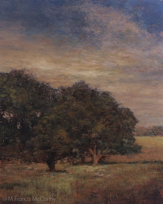
Onto today's painting "Autumn Twilight". I had a bad feeling about this one from the get go. Still, I believed that I could power through my inner misgivings and do something cool.
 |
| "Autumn Twilight" Final (8x10) by M Francis McCarthy |
Onto today's painting "Autumn Twilight". I had a bad feeling about this one from the get go. Still, I believed that I could power through my inner misgivings and do something cool.
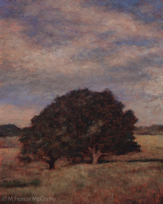
Well I tried, and failed horribly. So much so that I had this painting turned to the wall in my studio for awhile. I'm going to cover what exactly was wrong with it as I tell you what I did to revise the painting below.
First let me say that main thing wrong was my reference photo. Though I had adjusted it quite a lot in Photoshop. I had not really noticed the huge composition issues inherent in the scene itself.
BTW my subconscious did see those problems and tried to signal me through intuition that something was wrong, many times. As you can see below, I ignored my intuition and payed for it dearly.
The revised version is at the top of this post. It would have made sense to post the early version first and the correct down here but I could not bear to have it leading off a post so please just scroll up to check out what I've done.
Here's what I did:
 |
| "Autumn Twilight" Previous Version (8x10) by M Francis McCarthy |
The revised version is at the top of this post. It would have made sense to post the early version first and the correct down here but I could not bear to have it leading off a post so please just scroll up to check out what I've done.
Here's what I did:
- Closed off the left side so there was a clear focal area. As is the picture had a sort of two face composition, with each side of the painting fighting for the viewers attention. This was the biggest issue with the painting by far.
- Created a better sky that "payed" off. I've written before about payoff sky's here. Funny enough, I thought I'd set up a good sky but it suffers from "tube syndrome" and was not working at all.
- Reshaped and reformed the trees. I also lightened them where they meet the sky. The darkness against the light was too intense and this is something that is very common in photographs that made it into this painting.
- Lightened the grasses below the trees creating more interest there.
- Darkened the lower right hand corner. I'm still a vignette fan. I did it here to help steer the eye towards the main focal point (the field behind the trees).
- Lightened the area where the background foliage/hills meet the sky. This creates more atmosphere and also lessons the harshness of that distant edge.
That's about it. This was the second surgery I did on a recent painting and it payed off hugely. I'm really happy with the painting now. It's not perfect but it does have a nice feeling to it that I think rewards the viewer, whereas before there was only an almost good painting.
I'm going to be doing more posts along this line coming up.
I'm hopeful that seeing my struggles will help you to overcome obstacles to doing better paintings that you may be having.
Landscape painting is not easy to do well even for an experienced illustrator like myself but its great fun and a challenge that is welcome.
Cheers,