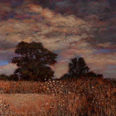
landscape Painting - Liquin
I love Liquin. There I said it.
This is from the Windsor Newton site:
Liquin is a general purpose semi gloss medium which speeds drying, improves flow and reduces brush stroke retention. It halves the drying time of conventional oil color (touch dry in 1-6 days depending on color & film thickness) and resists yellowing.
 |
| Dawn Breaks (8x12) by M Francis McCarthy |
Liquin cuts your drying time way, way down and if you use lead white (as I do) paintings are dry to the touch the next day if painted thinly. I usually dunk my brush in it before dipping into any colors. I also periodically add it to my mixes as I'm painting.
I've used straight up linseed oil as a medium in the past and it's slow drying. Many artists use quick drying mediums like sun thickened walnut oil or Gamblin Galkyd medium. I've tried the Galkyd and found it too glossy for my taste.
I love the satin finish of Liquin and after I discovered it I never looked back.
Many oil painters like to get into medium composition debates like it somehow enhances one's talent. A good artist can create good work with the barest minimum of materials. I utilize Liquin in my painting to the fullest extent possible and I'd miss is badly if I had to make do without it.
BTW Liquin isn't cheap but it's worth the cost. Don't buy more than you think you'll use in a six month period. It has a limited shelf life. Also, they've now changed over to a nasty plastic bottle. I decant mine from a big bottle into the smaller original glass bottle and it's never far from my pallet.
Today's painting "Dawn Breaks" was painted soon after my move to New Zealand.. At the time I painted it I was feeling pretty challenged. I'd still not completely got my technique and materials to conform to my inner vision.
Dawn Breaks was painted on a pine panel. I don't usually care for pine as a surface because it's too flat with not much grain. In this case, the board was textured with gesso before painting.
I'd experimented with textured boards a lot while painting in California but ultimately I prefer to use textured boards only for my 5x7 oil sketches and hardwoods like Kauri for the larger pieces. I'm actually pretty fond of this painting now and it is housed in the M Francis McCarthy Foundation for the Arts permanent collection.
Landscape Painting - Brush Technique 2
Yesterday, I talked a bit about brush technique. Today I'd like to go a bit further.
The brush is my preferred way of applying paint to my panels. I also use a pallet knife, but I use the pallet knife in a subtractive way. Mostly to scrape away surface dimples or sometimes to scratch away paint or even to blend passages.
Seldom do I apply paint directly with a knife. Many painters that I consider personal teachers such as Richard Schmid or Bob Rohm do paint with the knife. They both use it very well as do some other landscape painters out there.
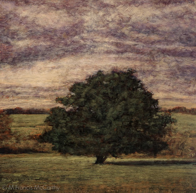 |
| Morning Glow by M Francis McCarthy |
I guess my biggest issue with pallet knife painting is that it can so easily feel contrived. Students of painting should give it a try though as it can be perfected as a painting implement. It's best used in moderation should you care to use it at all. If you're older like me you will recall the awful overdone impasto paintings that we're so common in the sixties and seventies.
When you're painting you have a nearly infinite number of approaches to your brush handling. You can go with chiseled strokes that are long or short. Or, completely blend out all indication of separate marks.
I like to show a bit of the strokes but I also like my strokes to interweave like a lattice. Diffusion is always an important aspect of my paintings but diffusion that breaks into contrasting edges here and there.
Here's a detail of Morning Glow that illustrates what I mean. I aim for my brush work to be expressive while also getting the image across. A good way to look at the brushwork in a painting is that it should look great from afar but also pay off for the viewer that gets up really close. I try to make my marks with character and sensitivity without being overly direct or contrived.
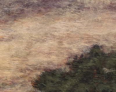 |
| Morning Glow Detail |
Here's a detail of Morning Glow that illustrates what I mean. I aim for my brush work to be expressive while also getting the image across. A good way to look at the brushwork in a painting is that it should look great from afar but also pay off for the viewer that gets up really close. I try to make my marks with character and sensitivity without being overly direct or contrived.
Another good tip I have for aspiring painters is to change-up how they are holding their brush. I like to use every angle of my brushes whether the edge, flat or especially the side.
I apply paint fairly thinly building up my paint in layers of successive brush strokes. I try to always leave a bit of life in the painting. By that I mean I try not to choke out the layers that went before. I leave a bit of them showing.
When my paintings are most successful in my view they are articulated with an economy of strokes. Many times I will have to apply multiple layers of smaller strokes to a painting to get my desired vision across but it's magical when I can do it in one pass of color over my initial under-painting/drawing.
Landscape Painting - Brush Technique
Everything I write and teach on this blog is strictly my opinion. I hope that it is evident by the blog's title "M Francis McCarthy" but just for the record. Everything I write here is just my opinion. Other professional artists may have contradictory advice that works for them. I can only speak and teach from my own experience.
I was once guilty of making the same error but after constant reappraisal of the work I was doing I gradually ceased using those tiny brushes. I think it's far better to imply detail with glancing indicative strokes rather than try to impersonate a camera with a dinky little brush. Every stroke needs to have it's own beauty and also serve to build a whole image at the same time
I'm no fan of precious, over detailed brush strokes in landscape paintings. There is a landscape painting show currently running in my town by a decent painter. While her color and composition are good, I feel she's only decent because of her tendency to use lots of tiny strokes made with a small round brush. This to me is a sure sign of a beginning or amateur painter.
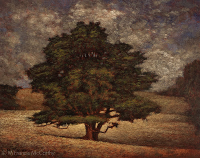 |
| A Welcome Friend by M Francis McCarthy |
I was once guilty of making the same error but after constant reappraisal of the work I was doing I gradually ceased using those tiny brushes. I think it's far better to imply detail with glancing indicative strokes rather than try to impersonate a camera with a dinky little brush. Every stroke needs to have it's own beauty and also serve to build a whole image at the same time
This piece "A Welcome Friend is a good example of my technique. There are many small strokes. In fact maybe more than I would have preferred. My approach to painting is to always use a slightly larger brush than is comfortable to execute a given passage. This is one way to combat tiny brush syndrome.
Another way is to paint with your glasses off so you concentrate on the overall more than the specific. Note: if you have great vision you can semi close your eyes so that your vision becomes blurred and periodicity paint that way for the same result.
With a larger brush, the painter is forced to produce bolder, more painterly strokes. This is a good thing. The smallest brush I ever use even for my 5x7s is a #2 flat and more often than not I use that only for certain shadow passages.
Brush technique is a vast topic and I'm going to touch on it again in a future post. For now though just remember to use the biggest brush you possibly can. Your work will benefit immensely, immediately.
Landscape - Tone
Tonight I thought it would be nice to expand upon tone. I like the word tone as is is a open word with interesting connotations. Quite an ambiguous term when you ponder it, as we are going to now.
I use Tone to mean resonance/value. Also implied in the word tone is color harmony. I will often tilt the colors in a painting towards a unified tone. Yellows of all stripes are a favorite but I will use just about any hue as a unifying tone with the general exception of green as greens are such a present color already in most landscapes.
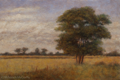
The unifying hue here in "Tranquil Field" is a warm yellow tone. There is also a strong resonance of sienna from the paintings foundation. If you read yesterdays post about Tonalist limitation of values, you can see that the whitest parts of the clouds are far short of an actual white.
I use Tone to mean resonance/value. Also implied in the word tone is color harmony. I will often tilt the colors in a painting towards a unified tone. Yellows of all stripes are a favorite but I will use just about any hue as a unifying tone with the general exception of green as greens are such a present color already in most landscapes.
 |
| Tranquil Field (11x15) by M Francis McCarthy |
The unifying hue here in "Tranquil Field" is a warm yellow tone. There is also a strong resonance of sienna from the paintings foundation. If you read yesterdays post about Tonalist limitation of values, you can see that the whitest parts of the clouds are far short of an actual white.
The lightest parts of a painting reveal it's unifying tone the most because it's harder to perceive color in shadow areas. The dark's can definitely be tilted towards warm or cool in any painting though.
There are times that I will glaze a very light wash of color over an entire painting but more often I set up my colors in advance to harmonize. Glazing an entire painting tends to darken it and you've got to be really restrained if you try it or there's a good chance of ruining your painting.
Here's the oil sketch for "Tranquil Field". I've been posting my oil sketches with there larger brothers regularly because I feel it's illuminating. Also, I like to give my little paintings some attention. There have been times that I liked my small 5x7 better than it's larger brother but usually I think they're both good for different reasons.
 |
| Tranquil Field (5x7) by M Francis McCarthy |
Here's the oil sketch for "Tranquil Field". I've been posting my oil sketches with there larger brothers regularly because I feel it's illuminating. Also, I like to give my little paintings some attention. There have been times that I liked my small 5x7 better than it's larger brother but usually I think they're both good for different reasons.
My approach to the small paintings is very direct and immediate. At the same time I'm looking towards the harmonies that will resonate through the larger version of the scene.
Today's picture "Tranquil Field" can currently be viewed in my studio at the Quarry arts center, Whangarei.
Using just some of the notes...
A gentleman came into my studio today and we we're discussing painting and art in general. He remarked that he liked my work and that it had a pleasant "old time" feel.
I responded that my art was greatly influenced by a painting movement called Tonalism. Tonalism ran concurrent with Impressionism and was popular from the late 1800's to early 20th century. I believe most landscape painters these days to be of an impressionist bent whether they are aware of it or not.
One distinction between the two styles is that Tonalism uses fewer notes than impressionism. By that I mean that if you look at the value scale here below:
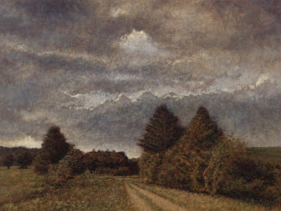
Today's picture "Country Road" is good example of the ideas in today's post. The 12x12 can be viewed at my studio at the Quarry arts centre in Whangarei. the 5x5 oil sketch is in a private collection now.
I responded that my art was greatly influenced by a painting movement called Tonalism. Tonalism ran concurrent with Impressionism and was popular from the late 1800's to early 20th century. I believe most landscape painters these days to be of an impressionist bent whether they are aware of it or not.
 |
| Country Road (12x12) by M Francis McCarthy |
You see the entire range of values from white to black as 10 divisions. You could also see these as notes, like piano keys on a piano.
Many paintings done in an impressionist way utilize the entire value scale from brightest to darkest values. A Tonalist approach usually holds way back. In my paintings I generally eliminate the brightest values from the ten step scale. and I often use even less of the available values.
This is what I mean by "using just some of the notes". The benefit in doing this is a more cohesive and harmonic painting that creates a unified "tone". There are drawbacks too, and the greatest one is creating paintings that are too dark for brighter spaces. The benefit though is a greater conveyance of feeling and a generally more meditative quality
 |
| Country Road (5x5) by M Francis McCarthy |
Today's picture "Country Road" is good example of the ideas in today's post. The 12x12 can be viewed at my studio at the Quarry arts centre in Whangarei. the 5x5 oil sketch is in a private collection now.
Drawing - Landscape
The drawing I'm featuring today was done way back in 1984.I can see much of what attracts me to landscape today in this drawing. At the time I was really into detail. A habit that persisted for quite a few years.
It was rare for me to do landscape art at the time. I was really more into drawing people. I think I had a snapshot I'd taken that I used as reference for this.
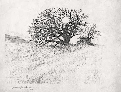 |
| Winter Oak by M Francis McCarthy |
It was rare for me to do landscape art at the time. I was really more into drawing people. I think I had a snapshot I'd taken that I used as reference for this.
This scene was rendered in pencil. One of my favorite mediums. Many artists love pencil because of it's subtle forgiving nature. Unlike a pen or brush pencils leave a faint trace yet can also produce strong black darks.
It's good to use both and many pen drawings start out in pencil. I advise students to jump in to ink along with their pencil work. The definiteness of an ink line is difficult to erase and for that reason has it's own type of integrity.
I feel it is good as an artist to be able to commit and move on. I've known a few that never really got past pencil because of their fear of "messing it up". Better to try and fail than never attempt your best inner vision.
Landscape Painting - Abstraction
I like abstract art. Not all of it, but a painting being abstract or not is not the thing that makes it good or bad in my view. I always look for a strong pattern of light, shadow and contrasts in all art.
It would be reasonable to ask why I do not paint abstracts now. I certainly have before in the digital realm. a place of strong contrasts and experimentation.
However abstract art for me these days is more limiting. I know it would seem to be the opposite but abstract art for me too closely reflects my inner reality. Without an outside idea or aspect to work against or toward I feel my art gets stale.
 |
| Coming Storm (8x12) by M Francis McCarthy |
That said I believe all art to be essentially abstract in nature. You really notice this in primitive art and cave paintings but abstraction is present in even the most photo realistic art. I like to hang my landscapes on a strong abstract foundation.
 |
| Twilight Cypress (sketch) by M Francis McCarthy |
Here's the sketch for Twilight Cypress. There are slashes of strokes in the sky and I've defined the shape of the tree with strong graphic edges that reinforce my composition.
 |
| Twilight Cypress (9x12) by M Francis McCarthy |
The final painting of Twilight Cypress is far softer than the sketch. The over all effect is realistic in that you tell it's a tree and a sky with some earth below. But the painting is still quite graphic in feel.
Another reason I paint Landscapes instead of abstracts is that I feel that the vehicle of landscape allows the viewer to ride into my paintings. They've no need to wait, stand there and ask what it is before getting on board. To their conscious mind the question of "what is it" has already been answered.
To the less conscious part of their mind however, abstractions and metaphors abound. Colors communicate feeling and composition directs and constrains the eyes towards it's own ends. This is far more interesting to me than abstraction outright.
Motifs and Repainting
Happy new year! Tonight I'm going to talk about motifs and revisiting them. Also, technique and it's progression in the attainment of an artists personal vision.
Starting in 2010 I went far more tonal and indirect in my approach to oil painting. I was inspired by a trip I took with my wife to the De Young Museum. At the end of the American collection they had several large rooms dedicated to American landscape painting.
I was especially intrigued by the work of George Inness but also Thomas Moran and Frederic Edwin Church. I loved the surfaces of these paintings and their soft glowing inner light.
 |
| November Light (6x9) by M Francis McCarthy |
This version of November Light was painted in July of 2010 and currently resides in the collection of a fan of my work. It was painted on a maple panel that I'd brought over from the states.
At that time I was painting only small pieces but putting full intention and finish into them. the inspiration for this painting came from my first trip to New Zealand in 2009 and it was one of the first I painted after moving here in 2010.
This is my 5x5 reworking of November Light, painted in 2011. After painting a series of Four 8x8 paintings that were for a show at Hangar Gallery, I was becoming interested in the square format and decided that I'd like to repaint November Light as a 12x12.
Here is the finished painting as a 12x12. It feels different from either of the other two paintings and I'm quite happy with the result. What I like best about this piece is the expressive sky and brush technique that does the job with out being too finicky.
I really like this composition and how it features water and an interesting tree but I felt the sky was lacking movement and drama.
At the time I was fascinated with proportion and was only painting in 6x9. The 6x9 format's 3:2 aspect ratio is the most similar to the golden ratio. Proprortion is a topic that I'd like to get into further in a later post.
At the time I was fascinated with proportion and was only painting in 6x9. The 6x9 format's 3:2 aspect ratio is the most similar to the golden ratio. Proprortion is a topic that I'd like to get into further in a later post.
 |
| November Light (5x5 by M Francis McCarthy |
This is my 5x5 reworking of November Light, painted in 2011. After painting a series of Four 8x8 paintings that were for a show at Hangar Gallery, I was becoming interested in the square format and decided that I'd like to repaint November Light as a 12x12.
It was at this time that I first started doing small oil studies prior to executing the larger pieces. I quite enjoy doing the small paintings and a nice side benefit is that it creates an affordable small painting for people that collect my work.
 |
| November Light (12x12)by M Francis McCarthy |
Here is the finished painting as a 12x12. It feels different from either of the other two paintings and I'm quite happy with the result. What I like best about this piece is the expressive sky and brush technique that does the job with out being too finicky.
I aspire to create each painting using as few brush strokes and successive layers as possible. That said, I'll keep painting until I get the scene across. I pick, jab, scratch and layer brush strokes, anything I have to do.
Landscape Painting - Color
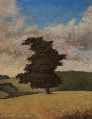
More ruminations on landscape painting today, with a focus on color. I use a somewhat limited pallet as follows: Black, Cobalt Blue, Phthalo Blue, Dioxazine Purple, Viridian, Alizarin Crimson, Burnt Sienna, Transparent Earth Yellow, Yellow Ocher, Lemon Yellow (hue) and Lead White. I've also recently added Titanium White back into my Lead White for added body. I've arrived at this pallet through years of trying out different colors.
It's important to limit your pallet as much as possible, doing so creates better harmony in the painting. Some of the colors on my pallet are special effect colors like the Violet and the Phthalo Blue. I can get by without these easily.
 |
| Pastureland (11x14) by M Francis McCarthy |
It's important to limit your pallet as much as possible, doing so creates better harmony in the painting. Some of the colors on my pallet are special effect colors like the Violet and the Phthalo Blue. I can get by without these easily.
Others like Ivory Black are for knocking brightness off of a straight mix. Also black is great for making a warm rich green when mixed with yellow. When it comes to using black I almost never use it in an opaque manner. You must be careful with black as too much has a deadening effect. Also, it can be cool in an unforgiving way. I love black and would not want to be without it.
The lead white vs titanium debate is well known to any serious student of oil painting. I love lead white but I must import it to use in my paintings here in New Zealand as it's not freely available here.
I work on a color principle of warm vs cool colors on my pallet. In the reds Alizarin Crimson is a cool red while I use Burnt Sienna as a warm red. I prefer sienna to any cad reds as I like it's earthy quality. It is made with clay and one of the ancient pigments.
In the Blues: Cobalt is a warm blue and Phthalo Blue is cool. For the yellows: Yellow Ocher is warm and earthy while Lemon Yellow is cool and quite "green". Viridian I use mostly mixed with Alizarin to create my shadow/dark colors. I use it to modify greens and cut reds as well. As a green it is not really in most landscapes but it is vital as a modifier.
 |
| Pastureland (5x7) by M Francis McCarthy |
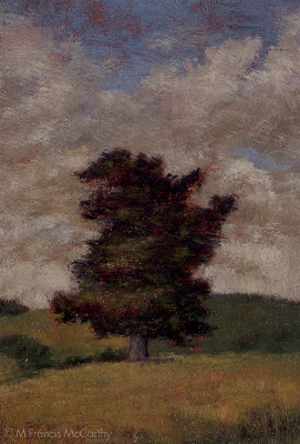
The lead white vs titanium debate is well known to any serious student of oil painting. I love lead white but I must import it to use in my paintings here in New Zealand as it's not freely available here.
Lead white is far more transparent than Titanium and warmer as well. I use lead white exclusively except for when I teach. Recently though I'm mixing a bit of Titanium in with my Lead white. This is helps to lighten my paintings a bit. Also, it is a very permanent and light-fast color so contributes to their longevity.
Landscape Painting - Idea
This blog is going to be the first in a random assemblage of posts that I'm calling Landscape Painting. I intend to show the progression of a piece and ramble a bit about the painting or some aspect of the painting or landscape painting in general.
 |
| Morning Hillside (8x8) by M Francis McCarthy |
I am often asked in my studio at the Quarry Arts Center where a scene is. What place, country or region am I depicting? I often reply that the scene is imagined. As this is true to a large degree, though there may indeed be a specific place that inspired the painting.
I am not trying to be coy. The real truth is that I have created a Painting and though I may have used photos or drawings done from a site I feel no obligation and have no desire to depict an actual place. The photos and drawings are a prelude to the point of the painting which IS the Painting not the scene itself or the process that birthed it.
That said I will sometimes say "Oh yeah, that's over there on Choctaw ridge" or something to that effect. Because to say all I have to say about that simple query will exhaust the patience of a causal apprehender.
 |
| Morning Hillside (5x7) by M Francis McCarthy |
That said I will sometimes say "Oh yeah, that's over there on Choctaw ridge" or something to that effect. Because to say all I have to say about that simple query will exhaust the patience of a causal apprehender.
What I'm more interested in is connecting the viewer with a created space that's acting as a window or portal. The space is empty so that it can be filled, by the viewer. There are traces sometimes of others. Like a road or a path but they're are no others here just the view and the viewer.
I also intend to relax the viewer I want them to be in a mellow state with the painting. I like to think of the painting as a refuge for the weary. A place to spread a blanket and chill out. But even more to be in nature even if it's nature of their own creation.
I guess there's lot's of philosophy in this post but philosophy "is" painting in many ways. Some of the greatest philosophers painted and visa versa .
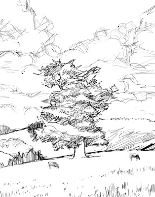
This sketch was done with my Wacom tablet in Photoshop. For me these type of sketches are just about planes (dividing the space) and composition. I make few efforts to treat them as real drawings. I will often project this type of image onto my wood panel and do a lot more creative drawing there, adding shadows and mass to the landscape. I usually wait till that stage to flesh out the drawing just to keep the process fresh at each stage of the paintings evolution.
 |
| Morning Hillside (sketch) by M Francis McCarthy |
This sketch was done with my Wacom tablet in Photoshop. For me these type of sketches are just about planes (dividing the space) and composition. I make few efforts to treat them as real drawings. I will often project this type of image onto my wood panel and do a lot more creative drawing there, adding shadows and mass to the landscape. I usually wait till that stage to flesh out the drawing just to keep the process fresh at each stage of the paintings evolution.
Landscape Painting Edges
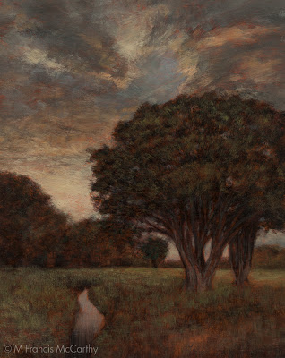
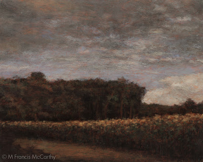
Well, as the end of the worlds been postponed I guess it's incumbent on me to keep up this blog. Today I want to write about edges in painting. I'm posting a couple of recent paintings just for illustration. I could have posted just about any landscape painting that I've done as I very consistently pursue a certain edge quality in my work.
 |
| Clearing Storm 8x10 M Francis McCarthy |
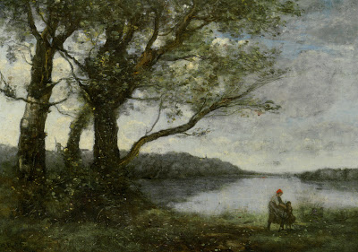
That quality is all about getting the edges right. I cannot say that I always achieve the effect I want but that is one reason painting still fascinates me after doing it for a while now. Many great artists have mastered edges and deserve close study. Some that come to mind are George Inness and the French painter Corot. How a painter handles edges is one of the greatest determiners of what their style is.
 |
| Fleeting Light 8x10 M Francis McCarthy |
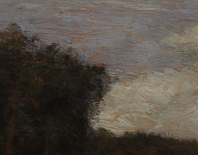
Below is a detail of "Fleeting Light" that shows a bit of my particular way of handling edges. Every painting is full of different edges and all must be approached in the appropriate manner for what is being rendered and the of the painting itself.
 |
| Fleeting Light (Detail) M Francis McCarthy |
I'm focusing on the sky/tree edge challenge here because frankly it's the greatest challenge for me in any painting. This is because the sky is the brightest part of most landscape paintings and the vertical trees against it are generally the darkest part. Because of this inherent contrast difference the transition from light to dark has to done with care or the painter runs the risk of creating a cutout appearance in his scenes.
 |
| Camille Corot Three Trees with a View of the Lake |
Above is a painting by Camille Corot. In my opinion Corot is one of the greatest edge painters ever!I saw many of his original works on my trip to the Louvre in Paris. Corot took a sort of flecky approach to his edges. They appear to be built up in many layers and there is always a feeling of air and silvery light in his work. He is a great guy to study. Any painter who's doing edges in a way you admire is good to study I reckon. I may revisit this topic in a later blog as it's absolutely crucial to creating a good landscape painting.
Pay off skies
Monday here in New Zealand and another blog post.
This painting is called "Summer Storm" sized 8x10 and painted a few months ago.
I feel that every painting that I do should have what I call a "pay off sky". By that I mean the sky should contribute strongly to the emotion and impact of the painting, not just serve as a backdrop to the trees and other landscape elements.
I like lots of color in my skies as well and I've noticed that Hollywood does these days also. I've noted many movies that have almost exclusively used twilight light skies in their outdoor scenes. Movies like the Narnia Chronicles and Avengers come to mind but they're everywhere once you start paying attention.
One of the great, great things I love about New Zealand is the clean air and beautiful skies we have here. I never tire of looking up and noting the differentiated clouds and patterns of our southern skies.
This painting is in the 8x10 format. Until recently I eschewed these proportions but I've since embraced 8x10, 11x14, 9x12 as well as square formats. I will definitely write a post in the future about the different proportions and their relative impact. For now I'll say that different proportions really change the feel of a scene. Below is my 5x7 sketch for "Summer Storm"
This painting is called "Summer Storm" sized 8x10 and painted a few months ago.
I feel that every painting that I do should have what I call a "pay off sky". By that I mean the sky should contribute strongly to the emotion and impact of the painting, not just serve as a backdrop to the trees and other landscape elements.
I like lots of color in my skies as well and I've noticed that Hollywood does these days also. I've noted many movies that have almost exclusively used twilight light skies in their outdoor scenes. Movies like the Narnia Chronicles and Avengers come to mind but they're everywhere once you start paying attention.
One of the great, great things I love about New Zealand is the clean air and beautiful skies we have here. I never tire of looking up and noting the differentiated clouds and patterns of our southern skies.
 |
| Summer Storm M Francis McCarthy |
This painting is in the 8x10 format. Until recently I eschewed these proportions but I've since embraced 8x10, 11x14, 9x12 as well as square formats. I will definitely write a post in the future about the different proportions and their relative impact. For now I'll say that different proportions really change the feel of a scene. Below is my 5x7 sketch for "Summer Storm"
Study vs Finished Painting
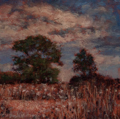
I like to do a color study prior to painting my final version of the image. The study below is painted at 5x5 inches. I tend to prep my board with a textured clear gesso stained sepia. I then sketch on the board in charcoal. After that I complete the sketch using burnt sienna and black. finally I go in with color painted in fairly quickly and directly..
Here is the same motif painted at 8x8 inches. Though the size is still quite small you can see the image is far more refined in every way. the method use is much like my studies however more time and care is payed to the initial drawing. Also, there are more layers of transparent color and more time and repeated sessions are applied to the piece shown below.
 |
| Indian Summer (Study) M Francis McCarthy |
Here is the same motif painted at 8x8 inches. Though the size is still quite small you can see the image is far more refined in every way. the method use is much like my studies however more time and care is payed to the initial drawing. Also, there are more layers of transparent color and more time and repeated sessions are applied to the piece shown below.
Painting Thoughts
Hey there, another day, another blog!
I cannot promise substance every day (though I'll try) but I'm determined to get this thing up in the air so off we go...
Here's a painting I did about a year ago, it is a pretty typical New Zealand view. Several things about this painting are unique. First off it has conical pines in it. I try to avoid conical pines as they present many composition issues. Beautiful as they are I find they often make me feel cornered in my skies.
Another feature of this painting is the dirt road. Many people ask me why I don't paint moire things like fences and houses in my work. The reason is that I prefer the landscape to speak for it self. It seems that any man made feature steals the show focusing the apprehenders attention in ways that I as the paintings creator do not like. The huge exception to this is paths or roads. In my view they fold right in to the landscape as well as direct to eye in pleasant ways.
Speaking of pleasant., I enjoy creating pleasant images that sooth the viewer. I'm certainly not saying that that's the only type of image that anyone should paint, but for me it's the best use of my time and talent. Just for the record I've been employed to create images like this...
I know, hard to believe it's the same artist eh? Anyway just making a point that at this time I feel the world needs soothing reflective art so that is what I enjoy painting. I did enjoy rendering the dino above also but really that's far more of a technical expression. Btw some of you may have seen this dinosaur on a tee shirt if you knew a kid and went shopping at JC pennies or the like about six years ago...


