Unify, Simplify, Amplify
Greetings again from the land of Zed.
Yesterday I said I'd talk about the other note on my easel in my studio.
That Note says: "Unify, Simplify, Amplify" I borrow the term from Ken Carbone over at
Co Design He uses it for marketing advice but I think it applies very well to landscape painting also.
When we create a landscape painting it has no reason to exist other than it pleases the eye of the beholder. If it does not accomplish this there is nothing else that it can be used for other than to possibly re-use the canvas for another painting.
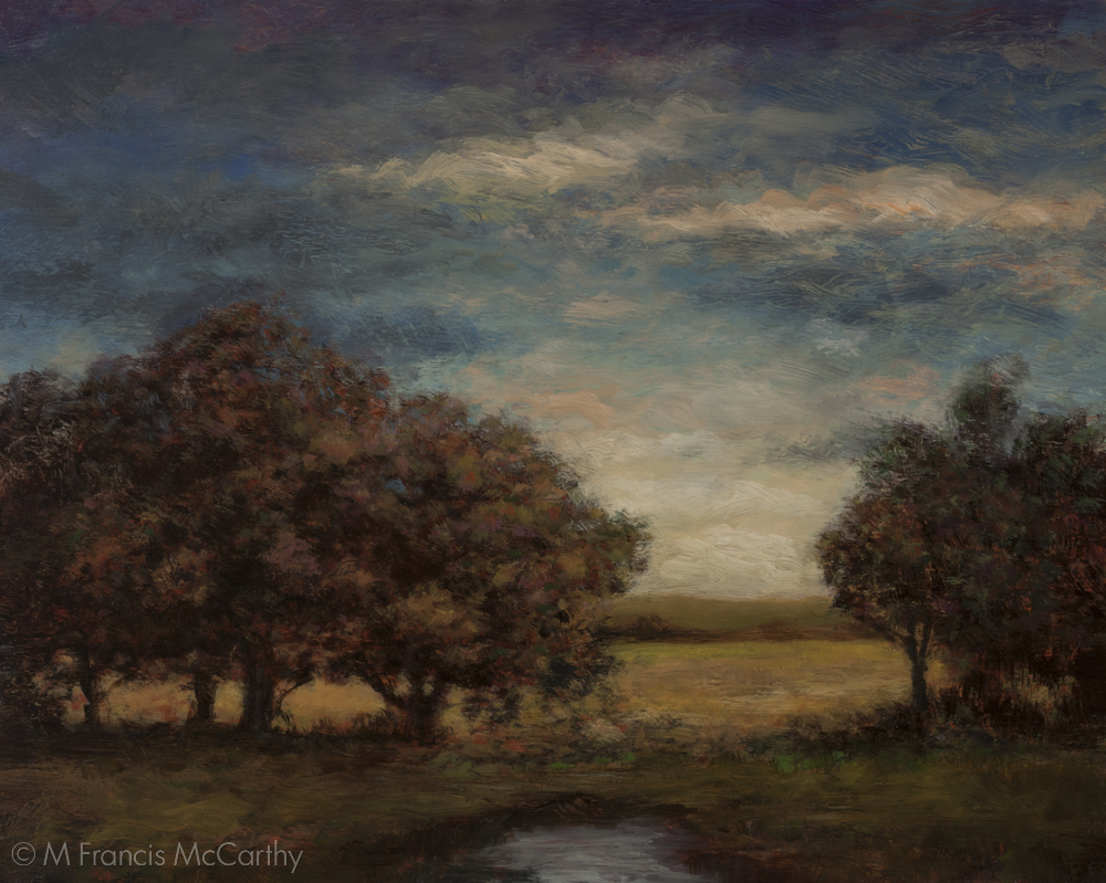
"Spring Light" (Final) 8x10 by M Francis McCarthy
So how does this motto this help us create beautiful pictures that deserve to be beheld?
Let's beak it down with some bullets:
- Unify - This mean that every part of the painting should work with every other part. Some aspects dominant while others supportive but all parts must reflect and coordinate with each other to create a unified whole.
- Simplify - This directs us to look for and represent in our painting a simplified pattern of pleasing large shapes subdivided by smaller pleasing shapes. Simplifying the scene is vital to create unity and amplification. It is difficult to create unity from immense amounts of detail all vying for the eyes attention.
- Amplify - Much of what I said yesterday about "More Light, More Dark, More Color", falls into this area. Adding contrast and amping up the color create more interest and attraction for the viewer. However to sucessfully amplify a picture it must be clear before it is amplified. Otherwise you just get a loud mess.
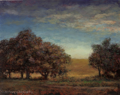
"Spring Light" (First Revision) 8x10 by M Francis McCarthy
Together these three ideas add up to better paintings. It's taken me awhile to apply these concepts to my landscape painting. But I always tried for a similar result when I worked as an illustrator.
It's only recently that I've become aware of the core differences between illustrating and landscape painting. I will expound on this more in a future post as it's definitely something I thought I knew all about. In reality I had it Wrong with a capital "W".
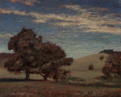
"Spring Light" (Original Painting) 8x10 by M Francis McCarthy
Okay, Lets talk about what I did to "Spring Light".
This painting has actually been revised twice. The original was painted last year and I repainted it around February.
I had the original up on my studio wall for quite awhile and though I liked the atmospheric quality I was bothered by elements of the picture. Heres how I addressed those bothersome areas.
First revision:
- Removed the hill from the background. This was creating an unpleasant downward arrow where the tree and hill met.
- Softened the diagonal band of clouds in the sky.
- Simplified the background and the sky.
- In the foreground I painted in a path or river coming in from the right. This only sorta was an improvement. Still, I was happy to be abandoning my photo reference and be creating with just imagination.
- Added a clump of trees to the right side where the previous hill had crested.
- Closed off the left side clump of trees. This helps direct the viewer's eye in a more pleasing manner and creates intimacy in the scene as well.
The revised "Spring Path" sat on my wall for another few months. I was happier but still not satisfied. Heres what I did to reach the final version.
Second Revision:
- Lowered the hills and indicated the horizon with a streak of distant foliage.
- Reworked the sky losing the diagonal completely.
- Increased the lightness at the base of the sky.
- Painted away my previous path from the left adding a pool or puddle of water in the center instead.
- Made the meadow behind the trees brighter.
- Softened the tops of the trees in the clump on the right.
All in all I am pleased with the result. I feel that "Spring Light" now has a feeling of intimacy, space and a peaceful quality that rewards the viewer.
"Spring Light" is currently on display at my studio in the Quarry Arts Center' Whangarei, New Zealand. Feel free to come and check it out.
Cheers,


