More Light, More Dark, More Color
Howdy folks,
Back from my extended stay in the studio, amongst other worthwhile pursuits.
I'm still busily reworking paintings I've done over the last year. Not all of them but far more than I thought I would when I began this revision process a few months ago.
Generally speaking for most of my artistic life, I've been hesitant to revise my work.
However since I made a quantum leap in my understanding of painting a few months back. What painting is. What it can be and what I want it to be for me as an artist. I've had to change my way of working in light of this greater capacity to see and address the shortcomings of my paintings.
One of the major insights I gained from my of my leap in understanding painting, was realizing that I can change anything I see that rings as false or that fails to create unity in my work, at any time and to whatever degree is necessary to bring the painting into a harmonious and unified state. Regardless of time already spent on the painting or it's fealty to to source material.
Cheers,
Back from my extended stay in the studio, amongst other worthwhile pursuits.
I'm still busily reworking paintings I've done over the last year. Not all of them but far more than I thought I would when I began this revision process a few months ago.
Generally speaking for most of my artistic life, I've been hesitant to revise my work.
However since I made a quantum leap in my understanding of painting a few months back. What painting is. What it can be and what I want it to be for me as an artist. I've had to change my way of working in light of this greater capacity to see and address the shortcomings of my paintings.
 |
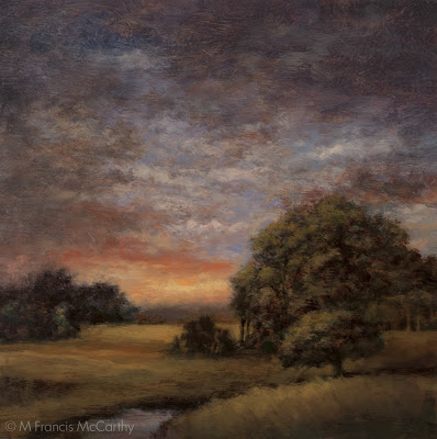
| "Clearing Up Revised" 8x8 by M Francis McCarthy |
One of the major insights I gained from my of my leap in understanding painting, was realizing that I can change anything I see that rings as false or that fails to create unity in my work, at any time and to whatever degree is necessary to bring the painting into a harmonious and unified state. Regardless of time already spent on the painting or it's fealty to to source material.
A painting must be a painting not just a reproduction of a scene in nature or referenced from a photo.
Todays image " Clearing up" was revised considerably by me just recently.
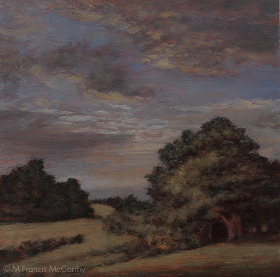
I'm showing the previous version here below and the revised version at the top. I have used this image before on my blog and also had it up in a gallery here in New Zealand.
The previous version isn't really that bad but there were things that bothered me like the tree trunk in the foreground and the mass of trees to the left felt too solid. Also, I liked the atmosphere of the sky but the strong diagonals there bothered me.
So, given these misgivings, why did I proudly display the image here and in a gallery?
I did it because I felt at the time I'd "finished" the piece that there was nothing else I could do to it. The reasons for this attitude are too extensive for the blog format. Suffice it to say I'm a believer in finishing things and then moving on.
This leads onto todays topic More Light, More Dark, More Color.
I have this statement taped to the easel in my studio. It is one of two mottos taped there. The other will be explored in another blog post later.
More Light, More Dark, More Color means that a painting can be dark even very dark and succeed as long as there is strong light as well. In fact there must be one to have the other and I want those strong contrasts in my work as they create stronger feeling in the painting.
More color means just that. I'm not afraid to ramp those colors up to extreme levels of saturation if necessary. No longer will I hold back that aspect in my work, for the same reason as kicking up the lights and darks. More color combined with stronger darks and brighter lights equals even more feeling and emotive content.
Here's what I did to "Clearing Up":
- Painted another foreground tree to cover that annoying trunk from the previous version.
- Created a sloping arc for the foreground hill, softening the previous slashing diagonal there.
- Established the horizon more clearly with less clutter.
- In the sky I went with a strong twilight coloration.
- Broke up the strong diagonals there and introduced more contrast.
In the lower left portion of the painting
- I placed a brook that followed the same compositional diagonal that was in the previous version .
- Opened up the distant field and simplified it also amping up the color to a golden grass color.
- The clump of trees on the left I made smaller.
- Softened the harsh edges against the sky for all the trees breaking the horizon line.
Note: I used a revised painting of the original 5x5 oil sketch as an aid in repainting the larger 8x8. I did not refer to any photo reference. I'm learning more and more that working in this way creates far more depth in my paintings as well as creatinbg a sort of magical quality that I'm very happy with.
Cheers,
