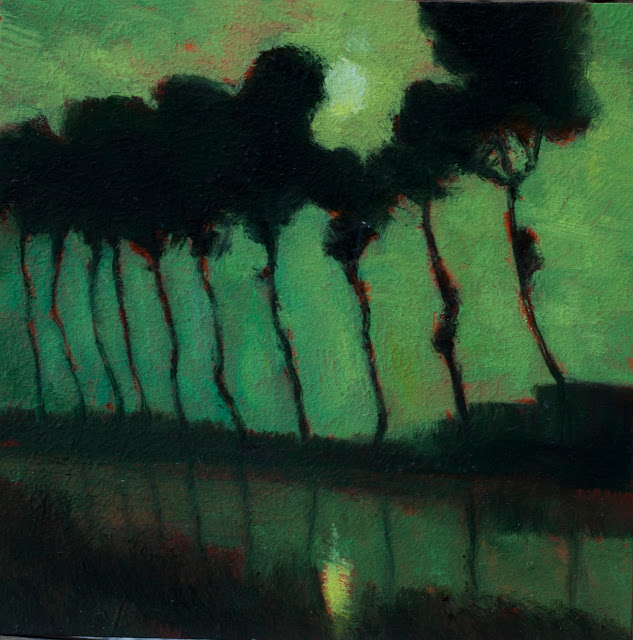
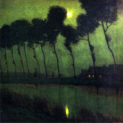
Day Eighty Five: Bruges Moonlight by Charles Warren Eaton
Hello and welcome to Day 85 of 100 days of Tonalism.
Today's study is 'Bruges Moonlight' by Charles Warren Eaton.
Most of you following this blog will be aware of Charles Warren Eaton by now. He's in the top three Tonalists that have ever painted. I've been reading from the book a history of American Tonalism by David Cleveland for our last several Eaton studies, and I will continue on with that today in the video narration, so please check that out.
Continuing on with our conversation about my history as a landscape painter; yesterday we were talking about my initial exposure to Tonalism and some of the ways that I was trying to move my art into this mode of expression. As I said yesterday, the discovery of lead white was major as far as achieving some of the buttery tones and effects of the Tonalist Masters. Another thing that I noticed especially in the work of George Inness was a clever use of proportion in their paintings.
It's very easy to take something like the proportions of a rectangle that a painting is done with for granted. It's easy to do this because we often bypass the actual shape of the painting and just perceive the landscape within. The proportions that a painter uses has a very great effect on the art. Different proportions will give different results perceptually. After having discovered this, I began to work with a proportion that is essentially the golden ratio. Since I was painting quite small, the size that I was working with was 6x9. Previous to that I'd been working with 6x8 as a predominant size for the paintings that I was doing.
6x8 is far more standard than 6x9. You can purchase ready-made frames in the size of 6x8 whereas that is impossible with a 6x9, it's not until you get up to larger sizes like 24x36 that you actually have any sort of ready-made frames in the golden ratio proportion. The golden ratio proportion is quite panoramic and I noticed a change in my art immediately. I was quite enamored with this proportion to the point where that's the only proportion I was painting with. When I moved to New Zealand in 2010 I decided that I needed to start working larger so I began doing paintings in a size of 8x12. Which is not really a standard size although it is possible at times to find ready-made frames in this proportion.
The reason I keep bringing up framing is that it is far cheaper if you can find an attractive ready-made frame to put on your painting than to do custom framing. For that reason I eventually abandoned 8x12, but not before I produced many paintings in that size, as well as12x18 (also golden ratio). Most of the paintings I did for my first one-man show were these two sizes plus a few 12x12's which is a square format.
I got into the square format after doing some paintings for a group show here in New Zealand. I had asked the owner of the gallery what sizes they were looking for and they had given me a piece of mat board that was cut approximately 8x8. If it had not been for this I don't know if I ever would've stumbled upon working in the square proportion. As it stands, I do about one third of my paintings these days in a square format.
What I enjoy about the square format is how it allows me to put more of an emphasis on the sky. Another size that I do a lot of these days is 8x10. 8x10 is not one of my favorite proportions to work with but it seems to be such a standard for frames that for a time I was doing only 8x10 and 8x8 paintings. I believe 8x10 is so popular because it was a standard photographic paper size for a long time. It took me a while to wrap my head around working in this proportion, a lot of times I just sort of treat it as an elongated square and that seems to help.
Cheers,
M Francis McCarthy
Landscapepainter.co.nz
A bit about 'Bruges Moonlight' by Charles Warren Eaton; this painting is super famous and is one that comes up readily in any search of Eaton's paintings. I really enjoyed doing the study. I did feel somewhat constrained by the small size in this particular instance.
His painting is so simplified and designed that I feel a lot of its success relies upon a certain finessing of various angles of the trees. I did my best and I am relatively happy with the way my study turned out. I could see at some point in the future getting my own painting to a level of simplification and design that is in evidence in 'Bruges Moonlight'.
To see more of my work, visit my site here
 |
| Painted after - Bruges Moonlight by Charles Warren Eaton, Study by M Francis McCarthy - Size 5x5, Oil on wood panel |
Most of you following this blog will be aware of Charles Warren Eaton by now. He's in the top three Tonalists that have ever painted. I've been reading from the book a history of American Tonalism by David Cleveland for our last several Eaton studies, and I will continue on with that today in the video narration, so please check that out.
Continuing on with our conversation about my history as a landscape painter; yesterday we were talking about my initial exposure to Tonalism and some of the ways that I was trying to move my art into this mode of expression. As I said yesterday, the discovery of lead white was major as far as achieving some of the buttery tones and effects of the Tonalist Masters. Another thing that I noticed especially in the work of George Inness was a clever use of proportion in their paintings.
It's very easy to take something like the proportions of a rectangle that a painting is done with for granted. It's easy to do this because we often bypass the actual shape of the painting and just perceive the landscape within. The proportions that a painter uses has a very great effect on the art. Different proportions will give different results perceptually. After having discovered this, I began to work with a proportion that is essentially the golden ratio. Since I was painting quite small, the size that I was working with was 6x9. Previous to that I'd been working with 6x8 as a predominant size for the paintings that I was doing.
6x8 is far more standard than 6x9. You can purchase ready-made frames in the size of 6x8 whereas that is impossible with a 6x9, it's not until you get up to larger sizes like 24x36 that you actually have any sort of ready-made frames in the golden ratio proportion. The golden ratio proportion is quite panoramic and I noticed a change in my art immediately. I was quite enamored with this proportion to the point where that's the only proportion I was painting with. When I moved to New Zealand in 2010 I decided that I needed to start working larger so I began doing paintings in a size of 8x12. Which is not really a standard size although it is possible at times to find ready-made frames in this proportion.
The reason I keep bringing up framing is that it is far cheaper if you can find an attractive ready-made frame to put on your painting than to do custom framing. For that reason I eventually abandoned 8x12, but not before I produced many paintings in that size, as well as12x18 (also golden ratio). Most of the paintings I did for my first one-man show were these two sizes plus a few 12x12's which is a square format.
I got into the square format after doing some paintings for a group show here in New Zealand. I had asked the owner of the gallery what sizes they were looking for and they had given me a piece of mat board that was cut approximately 8x8. If it had not been for this I don't know if I ever would've stumbled upon working in the square proportion. As it stands, I do about one third of my paintings these days in a square format.
What I enjoy about the square format is how it allows me to put more of an emphasis on the sky. Another size that I do a lot of these days is 8x10. 8x10 is not one of my favorite proportions to work with but it seems to be such a standard for frames that for a time I was doing only 8x10 and 8x8 paintings. I believe 8x10 is so popular because it was a standard photographic paper size for a long time. It took me a while to wrap my head around working in this proportion, a lot of times I just sort of treat it as an elongated square and that seems to help.
Cheers,
M Francis McCarthy
Landscapepainter.co.nz
A bit about 'Bruges Moonlight' by Charles Warren Eaton; this painting is super famous and is one that comes up readily in any search of Eaton's paintings. I really enjoyed doing the study. I did feel somewhat constrained by the small size in this particular instance.
His painting is so simplified and designed that I feel a lot of its success relies upon a certain finessing of various angles of the trees. I did my best and I am relatively happy with the way my study turned out. I could see at some point in the future getting my own painting to a level of simplification and design that is in evidence in 'Bruges Moonlight'.
To see more of my work, visit my site here
 |
| Original painting, Bruges Moonlight by Charles Warren Eaton |