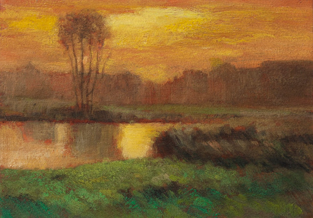
#25 Sunset Glow by Charles Warren Eaton - 25 Days of Tonalism Vol 2
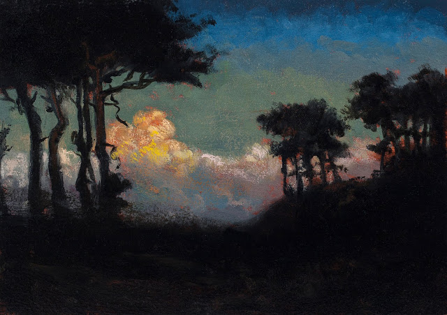 |
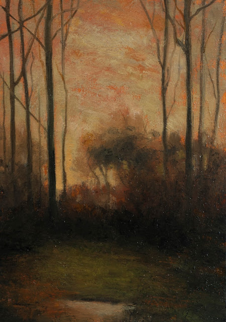
| Painted after - 'Sunset Glow ' by Charles Warren Eaton Study by M Francis McCarthy - Size 5x7, Oil on wood panel |
Our video features the progression of this painting from its early underpainting stages up through the final finishing brushwork. Also, watch the video for extended insight and commentary. BTW I now have a store on my site. Check it out and buy an original painting today!
M Francis McCarthy
Landscapepainter.co.nz
Facebook Page
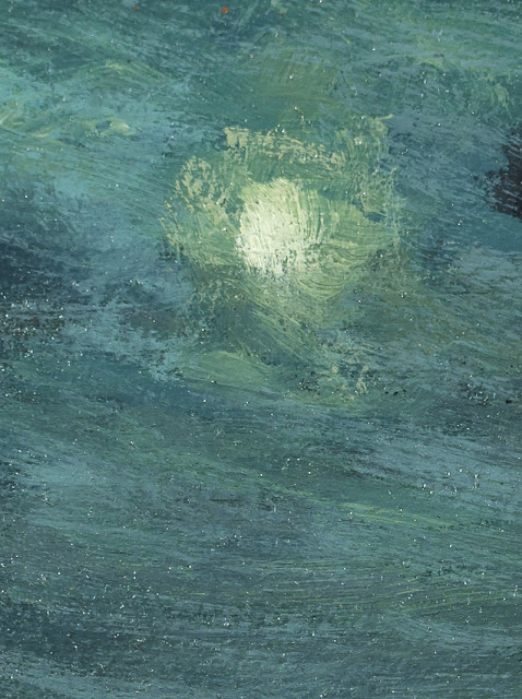
A bit about my study painted study painted after 'Sunset Glow' by Charles Warren Eaton; one of the all-time great Tonalists. I love doing studies after George and I always get a lot illumination from the exercise.
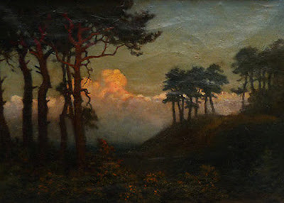 |
| Original painting 'Sunset Glow ' by Charles Warren Eaton |
 |
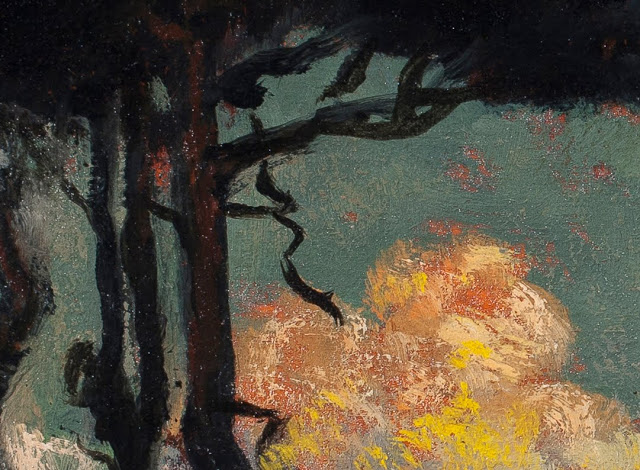
| Painted after - 'Sunset Glow ' by Charles Warren Eaton (Detail) |
 |
| Painted after - 'Sunset Glow ' by Charles Warren Eaton (Detail 2) |
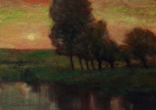
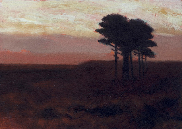
#23 Moonlit Landscape by Charles Warren Eaton - 25 Days of Tonalism Vol 2
 |
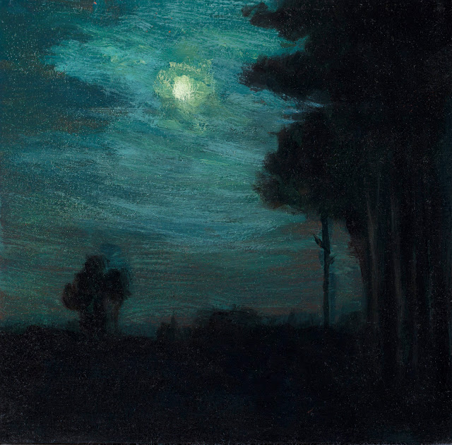
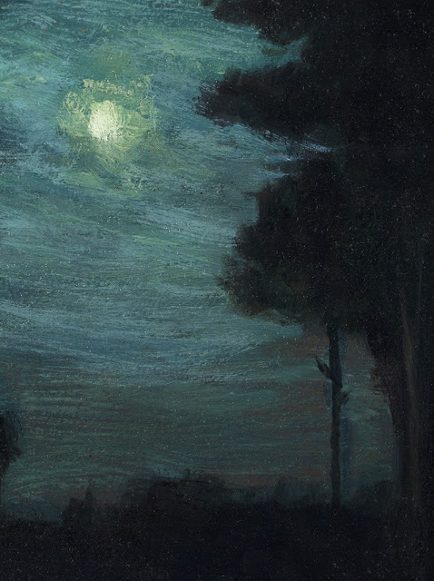
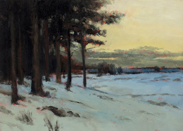
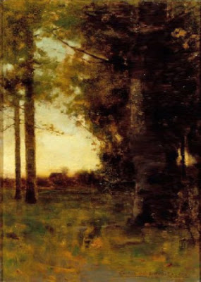
| Painted after - 'Moonlit Landscape' by Charles Warren Eaton Study by M Francis McCarthy - Size 5x7, Oil on wood panel |
Today's painting is a study painted after 'Moonlit Landscape' by Charles Warren Eaton. Note: This post is day twenty-three of 25 Days of Tonalism Vol 2.
Our video features the progression of this painting from its early underpainting stages on up through the final finishing brushwork. Also, watch the video for extended insight and commentary. BTW I now have a store on my site. Check it out and buy an original painting today!
M Francis McCarthy
Landscapepainter.co.nz
Facebook Page
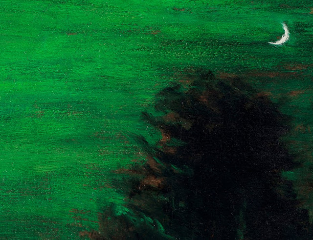
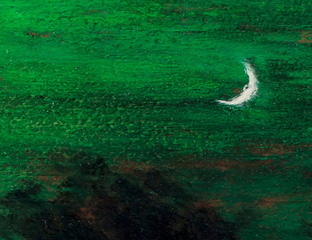
A bit about my study painted study painted after 'Moonlit Landscape' by Charles Warren Eaton; one of the all-time great Tonalists. I love doing studies after Chuck and I always get a lot illumination from the exercise.
 |
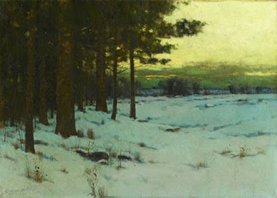
| Original painting 'Moonlit Landscape' by Charles Warren Eaton |
 |
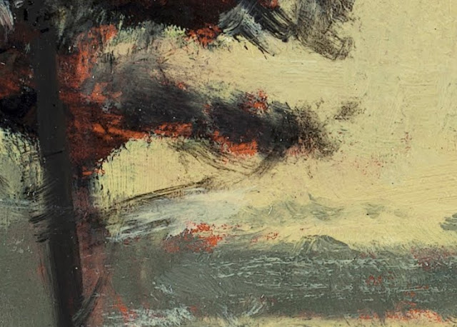
| Painted after - 'Moonlit Landscape' by Charles Warren Eaton (Detail) |
 |
| Painted after - 'Moonlit Landscape' by Charles Warren Eaton (Detail) |
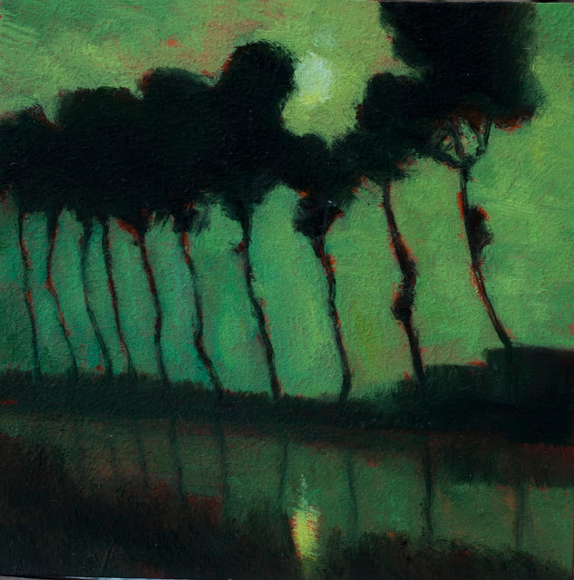
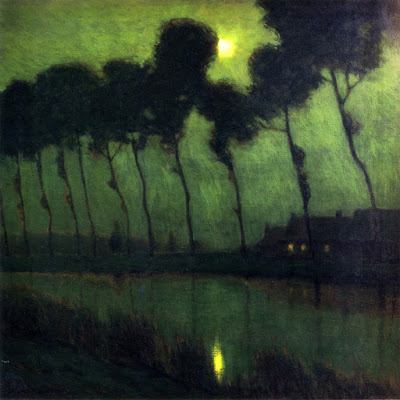
#20 Moonlit Forest by Charles Warren Eaton - 25 Days of Tonalism Vol 2
 |
| Painted after - 'Moonlit Forest' by Charles Warren Eaton Study by M Francis McCarthy - Size 5x7, Oil on wood panel |
Our video features the progression of this painting from its early underpainting stages on up through the final finishing brushwork. Also, watch the video for extended insight and commentary.
M Francis McCarthy
Landscapepainter.co.nz
Facebook Page
A bit about my study painted study painted after 'Moonlit Forest' by Charles Warren Eaton; one of the all-time great Tonalists. I love doing studies after Charles and I always get a lot illumination from the exercise.
 |
| Original painting 'Moonlit Forest' by Charles Warren Eaton |
 |
| Painted after - 'Moonlit Forest' by Charles Warren Eaton (Detail) |
 |
| Painted after - 'Moonlit Forest' by Charles Warren Eaton (Detail 2) |
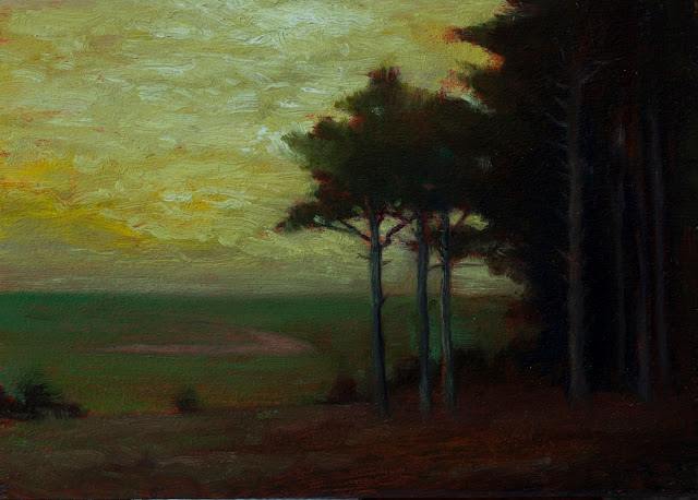
#12 - Lennox Woods by Charles Warren Eaton - 25 Days of Tonalism Vol 2
 |
| Painted after - 'Lennox Woods' by Charles Warren Eaton Study by M Francis McCarthy - Size 5x7, Oil on wood panel |
Our video features the progression of this painting from its early underpainting stages on up through the final finishing brushwork. Also, watch the video for extended insight and commentary.
M Francis McCarthy
Landscapepainter.co.nz
A bit about my study painted study painted after 'Lennox Woods' by Charles Warren Eaton; Charles was one of the top Tonalist painters ever. He was well known for painting white pines like the ones in this painting.
To see more of my work, visit my site here.
 |
| Original painting 'Lennox Woods' by Charles Warren Eaton |
 |
| Painted after - 'Lennox Woods' by Charles Warren Eaton (Detail) |
 |
| Painted after - 'Lennox Woods' by Charles Warren Eaton (Detail2) |
Day Ninety Eight: Sunset by Charles Warren Eaton
 |
| Painted after - Sunset by Charles Warren Eaton, Study by M Francis McCarthy - Size 5x7, Oil on wood panel |
We've done a lot of Eaton's in the series and this is the last one. As I mentioned in our previous Eaton post I recently received a book by David A Cleveland called Intimate Landscapes Charles Warren Eaton and the Tonalist movement in American art 1880 to 1920. This book was written before Davids seminal work A History of American Tonalism 1880 to 1920 and is currently out of print. The book was not cheap and I recommend it only for only the most fanatical fans of Tonalism out there (which would include myself). I will be reading from this book today in the video narration so please check that out.
Yesterday I was writing about how there is nothing new in art. I'm afraid my post devolved into yet another rant against a Modern art. I'd like to qualify my views on Modern art a little more extensively today, as this is a topic with a lot of grays and my post yesterday made it seem like my views are black and white.
I am not arguing (as some do) that there should never have been a shift in painting towards, what is now termed Modern art. The reality is that there are many Modern artists whose work I admire and find moving. A short list off the top of my head would include Rothko, Gerhard Richter, Franz Klein, Picasso, Gauguin, late period Willem de Kooning and others that I'm sure just are not coming to mind at the moment. I'm also fan of much of the surrealist work done by Salvador Dali.
I am not an art historian, I am an artist. For that reason I feel absolutely no need to be objective about Modern art or the reasons why it came into existence. I do think that it was probably a good thing that Modern art came along to shake things up. Although, truth be told, things were changing prior to abstracted work taking over, starting with the Barbizon School, moving to Impressionism and post-impressionism and of course Tonalism. Prior to Modern art, some of the classic representational art was becoming staid, over polished and plastic in quality. It's clear that something needed to change.
Even though art needed to shift, much of value was lost in the process, to the point where we're facing an extreme devolution of art now that needs to be remedied. I don't want to list the names of offending Modern artists but I will say that a majority of modern art that I am exposed to, I find to be loathsome and highly offensive. The story that always comes to mind is the Emperor's new clothes. As in that story, something that did not exist and was not worth admiring was regarded highly and lies were put forward as truth while everyone clapped along.
I will always find this offensive. I do not blame artists that are enmeshed in the Modern art hyperbole. Well, I don't blame them much. The fact that some non-representational modern art is actually moving and worth looking at just complicates matters.
In most things, I think you can apply the 80/20 rule but when it comes to much of contemporary modern art, I think it's probably more accurate to apply the 98% versus 2% rule. In other words, 98% of contemporary modern art is dreck and does not deserve to exist, much less be promulgated as anything worth paying attention to let alone paid for.
Sorry, (ahem) it's so easy for me to rant about this topic because I feel very strongly about it. I do try to be fair though, and since that was the initial purpose of this blog post, let me just end todays post here by saying that some Modern art is absolutely wonderful and some Modern artists are really fantastic. Although I often tar the entire movement of contemporary Modern art with the same brush, it deserves to be stated that some of this stuff is okay and a very small percentage is better than okay, it's great.
It's up to each of us as artists or appreciators of art, in the contemporary milieu, to set upon a course whereby we are separating the wheat from the chaff of Modern art, at least for ourselves.
Cheers,
M Francis McCarthy
Landscapepainter.co.nz
A bit about 'Sunset' by Charles Warren Eaton; this is a later period Eaton and I've seen it online quite a few times. In the painting by Eaton you can make out that the background has houses in it. I didn't bother to put that in preferring to keep it somewhat oblique. I enjoyed painting this study and I like the way that the gold and ochre tones contrasts against the green in the foreground.
To see more of my work, visit my site here
 |
| Original painting,Sunset by Charles Warren Eaton |
Day Ninety Three: November Landscape by Charles Warren Eaton
 |
| Painted after - November Landscape by Charles Warren Eaton, Study by M Francis McCarthy - Size 5x5, Oil on wood panel |
We've done a lot of studies after Eaton in this series. Today study is very representative of his later period, when he was doing a lot of white pines, often silhouetted against sunset or twilight skies. I will be reading some information about Charles Warren Eaton from the book Intimate Landscapes: Charles Warren Eaton by David a Cleveland (which I have just received in the mail), on today's video narration so please check that out.
Today, I'd like to talk about capturing feeling in art. In yesterday's video narration I was speaking about how there are so many feelings that we have, that words cannot describe easily. When you actually think about it, we have a very limited palette with which to render our feelings. We have words like happy, sad, angry or depressed. These words capture only the most extroverted and dense feelings.
For expressing the subtler feelings we have poetry and we have painting. Both of these arts are difficult to master. It is all too easy to make bad paintings and to write bad poetry. For these mediums to appropriately convey the more subtle feelings, the artist or poet must work at their craft for a good while and even then there is no guarantee that they will be able to express anything that actually moves other people.
I was attracted to Tonalism because of the visceral emotive power of this mode of expression. It has taken me many years to get to a point where I feel that I'm doing work that is accurately conveying emotion. When people ask me why I do landscapes and not portraiture or still life, the reason that I give them is that I feel that landscape has the greatest ability to impart emotion, better than any other subject matter. The reason for this is that the landscape is essentially neutral, we all come to it as individuals.
If I were to make a painting of an emotional person it would not have the same ability to move someone especially in the subtle ways that a landscape painting can. If you've ever been outside during a sunset or twilight, you know that special magical feeling that we can all experience. This is a time of enchanting, luminescent light.
Using art to convey emotion is one of the highest accomplishments that any artists can achieve. And by emotion I mean the most profound and ephemeral feelings we have. It's no secret that art can be used to portray the coarser emotions as well, but I see no point in that other than the pursuit of some sort of cleverness.
Cheers,
M Francis McCarthy
Landscapepainter.co.nz
A bit about 'November Landscape' by Charles Warren Eaton; I enjoyed doing this study although I felt a bit constrained by the very small size of the panel and, also by the fact that my reference image is a bit blown out.
Like most of Eaton's paintings of white pines so much of the painting's success relies on the contours of the trees against the brighter sky.
To see more of my work, visit my site here
 |
| Original painting, November Landscape by Charles Warren Eaton |
Day Eighty Eight: The Golden Hour by Charles Warren Eaton
 |
| Painted after - The Golden Hour by Charles Warren Eaton, Study by M Francis McCarthy - Size 5x7, Oil on wood panel |
I seem to have exhausted most of my sources of biographical information for Charles Warren Eaton. It's too bad that I haven't received the book by David A Cleveland I just ordered. I'm really excited to be getting this book as it is out of print, it is an exhaustive study of Eaton's body of work and history, I'm very much looking forward to reading it. Today's video features a track from my album, The Lost Horizon, so please check it out.
Over the last several weeks we've been talking about my history as an artist and my progression to becoming a landscape painter and then a Tonalist landscape painter. As promised in yesterday's post, today I'm going to talk a bit about the evolution of my understanding of color, especially as it pertains to Tonalism.
My first exposure to working with color was at the job that I held at a picture frame manufacturing company that provided custom art and framing to the hospitality industry. This was back in the 80's and 90's. Very often hotels would provide us with swatches of their carpets and drapes and other fixtures. The reason for this was so that we could do our best to match these colors with map board and in the case of moldings we would do custom stains and finishes. This, at times, could be an exceedingly difficult task because the colors had to match very closely and the boss that I worked for was a perfectionist. Ultimately though, it was good experience and good exposure to mixing and matching colors. Experience that I use everyday in my own work.
When I first started doing landscape painting I would do my best to match the colors in my photographic reference using my limited palette of pigments. If something in my photographic reference was bright, I would paint it bright and when something was muted I would paint it that way. I have a good color sense and so my paintings were always balanced, but I was not as focused in the early stages of my painting career as I am today on using color to evoke an emotive response.
This is something that Tonalism excels at, I can think of no other school of painting that uses color so powerfully to evoke emotions in the viewer. This is one of the major divergences that it made from Impressionism. Whereas Impressionism is focused on duplicating certain light effects that are found in nature using primary and secondary colors, Tonalism is more concerned with achieving tonal harmony and vibrance through manipulation of color.
In my initial attempts at Tonalist painting, I would start off by limiting the amount of highlights in my work so that whole painting moved into a lower key, as if the painting had been exposed to smoke. Sometimes I would do this with glazing, but mostly I just kept myself from pushing my highlights too far. As I continued to practice this mode of painting, it became apparent to me that stronger value contrasts would make my work more effective.
I experimented with adding a certain amount of the same color to each of my mixtures, this is a technique that quite a few Tonalist painters would use, primarily Whistler. For example, I might mix a little bit of burnt sienna into all of my green colors and allow it to peek through the blues of the sky or the grays, this would give everything a tonal vibration of sienna. You could do this with any color though. I soon abandoned this approach, it was unsatisfactory as it was too contrived.
These days I achieve tonal harmony in my work because I know my palette intimately and I know how to run my colors. It's very much a state of mind in my case, and though I follow some of the techniques I listed above, Mostly I just mix my colors intuitively and get harmony that way. I believe it also helps to work on a gray pallet. My palette is made out of metal and is quite neutral.
Another way that I achieve tonal harmony in my work is through the use of glazing, either by glazing with earth yellow or black, this has a way of subduing more intense colors although I will go into the light areas and generally paint them a few shades lighter and brighter after I've done my glazing.
Tomorrow will talk about values and contrasts so stay tuned for that.
Cheers,
M Francis McCarthy
Landscapepainter.co.nz
A bit about 'The Golden Hour' by Charles Warren Eaton; this is another one of Eaton's later, more simplified paintings. It is very tonal in approach and the predominant tone would be yellow. I enjoyed painting this and I got some nice textual effects in my study, especially in the sky.
To see more of my work, visit my site here
 |
| Original painting, The Golden Hour by Charles Warren Eaton |
Day Eighty Five: Bruges Moonlight by Charles Warren Eaton
 |
| Painted after - Bruges Moonlight by Charles Warren Eaton, Study by M Francis McCarthy - Size 5x5, Oil on wood panel |
Most of you following this blog will be aware of Charles Warren Eaton by now. He's in the top three Tonalists that have ever painted. I've been reading from the book a history of American Tonalism by David Cleveland for our last several Eaton studies, and I will continue on with that today in the video narration, so please check that out.
Continuing on with our conversation about my history as a landscape painter; yesterday we were talking about my initial exposure to Tonalism and some of the ways that I was trying to move my art into this mode of expression. As I said yesterday, the discovery of lead white was major as far as achieving some of the buttery tones and effects of the Tonalist Masters. Another thing that I noticed especially in the work of George Inness was a clever use of proportion in their paintings.
It's very easy to take something like the proportions of a rectangle that a painting is done with for granted. It's easy to do this because we often bypass the actual shape of the painting and just perceive the landscape within. The proportions that a painter uses has a very great effect on the art. Different proportions will give different results perceptually. After having discovered this, I began to work with a proportion that is essentially the golden ratio. Since I was painting quite small, the size that I was working with was 6x9. Previous to that I'd been working with 6x8 as a predominant size for the paintings that I was doing.
6x8 is far more standard than 6x9. You can purchase ready-made frames in the size of 6x8 whereas that is impossible with a 6x9, it's not until you get up to larger sizes like 24x36 that you actually have any sort of ready-made frames in the golden ratio proportion. The golden ratio proportion is quite panoramic and I noticed a change in my art immediately. I was quite enamored with this proportion to the point where that's the only proportion I was painting with. When I moved to New Zealand in 2010 I decided that I needed to start working larger so I began doing paintings in a size of 8x12. Which is not really a standard size although it is possible at times to find ready-made frames in this proportion.
The reason I keep bringing up framing is that it is far cheaper if you can find an attractive ready-made frame to put on your painting than to do custom framing. For that reason I eventually abandoned 8x12, but not before I produced many paintings in that size, as well as12x18 (also golden ratio). Most of the paintings I did for my first one-man show were these two sizes plus a few 12x12's which is a square format.
I got into the square format after doing some paintings for a group show here in New Zealand. I had asked the owner of the gallery what sizes they were looking for and they had given me a piece of mat board that was cut approximately 8x8. If it had not been for this I don't know if I ever would've stumbled upon working in the square proportion. As it stands, I do about one third of my paintings these days in a square format.
What I enjoy about the square format is how it allows me to put more of an emphasis on the sky. Another size that I do a lot of these days is 8x10. 8x10 is not one of my favorite proportions to work with but it seems to be such a standard for frames that for a time I was doing only 8x10 and 8x8 paintings. I believe 8x10 is so popular because it was a standard photographic paper size for a long time. It took me a while to wrap my head around working in this proportion, a lot of times I just sort of treat it as an elongated square and that seems to help.
Cheers,
M Francis McCarthy
Landscapepainter.co.nz
A bit about 'Bruges Moonlight' by Charles Warren Eaton; this painting is super famous and is one that comes up readily in any search of Eaton's paintings. I really enjoyed doing the study. I did feel somewhat constrained by the small size in this particular instance.
His painting is so simplified and designed that I feel a lot of its success relies upon a certain finessing of various angles of the trees. I did my best and I am relatively happy with the way my study turned out. I could see at some point in the future getting my own painting to a level of simplification and design that is in evidence in 'Bruges Moonlight'.
To see more of my work, visit my site here
 |
| Original painting, Bruges Moonlight by Charles Warren Eaton |
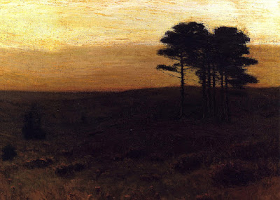
Day Seventy Six: Golden Sunrise by Charles Warren Eaton
 |
| Painted after - Golden Sunrise by Charles Warren Eaton Study by M Francis McCarthy - Size 5x7, Oil on wood panel |
Charles Warren Eaton was one of the better-known Tonalist painters, and we have been covering his work fairly extensively on this blog. On today's video narration I will be reading from the book a History of American Tonalism by David Cleveland so please check that out.
On today's blog post I would like to discuss the value of painting to me and my journey to doing it. By painting I mean painting with actual paints on an actual surface and not the digital equivalent.
Some of you may be aware that I worked as a commercial artist and illustrator for 13 years. In that time I worked almost exclusively in digital media. I would do drawings in pencil or India ink and then scan, colorize and paint them in the computer using my Wacom tablet and Photoshop.
I first got into doing art with the computer back in 1994. Prior to that time I had a straight up aversion to computers and prefered to work with pencil and pen and ink. I would occasionally use watercolor as well. but prior to my learning how to use a computer I worked predominantly in black and white.
The computer unleashed a world of creativity and color that I could scarcely believe. I'd been inspired to get a computer and make art with it by the cool 3-D art I saw in movies and the computer based coloring I was seeing in comic books. I thought it would be a great way to color my pen and ink work.
It took me a while but I eventually gained mastery over the medium of digital art creation. I used programs like Painter, Photo Paint and Photoshop, teaching myself as I went along. In 1997 that hard work paid off and that I was able to get a graphics job on the basis of my portfolio and also because I had a good friend who worked at the company. This company was in the business of printing T-shirts and I was engaged in creating illustrations that were plugged into designs generated by my employer.
I worked there for a long time and I created a lot of illustrations and a few designs of my own. The sort of things that I would illustrate were animals, dinosaurs, monster trucks, national parks scenes and lots of spot illustrations of all sorts of different items.
It was a fun job especially at first. And with each year there I gained greater and greater mastery over my craft. I enjoyed using my skills and being able to produce artwork that was commercially viable and generated sales. Being a commercial artist has a way of pushing you into completing work and it must be salable if you are to keep getting paid.
Somewhere in my 20s I got the idea that at some point I would like to be a landscape painter. I'm not sure really where this idea came from. I think in many ways it was a lot like the initial reason I went into art in the first place, in that I felt it would be an occupation that was compatible with my personality and life goals. I can't say I was that much into landscape painting at that time but I had this idea in my mind and it stayed there.
I will continue talking about my history and eventual decision to become a landscape painter in tomorrow's blog post, so stay tuned.
Cheers,
M Francis McCarthy
Landscapepainter.co.nz
A bit about 'Golden Sunrise' by Charles Warren Eaton; this is typical of Eaton's type of painting in that it features the white pines that he made famous. At the time he was painting these trees they were becoming somewhat scarce. After his paintings became popular and captured the imagination of the American public, these trees have made a big resurgence and are no longer hard to find.
I enjoyed painting this nearly duo toned scene and especially appreciate Charles Warren Eaton's approach to composition in this painting, it is very simple and yet very effective
To see more of my work, visit my site here
 |
| Original painting, Golden Sunrise by Charles Warren Eaton |
Day Seventy Three: Winter Solitude by Charles Warren Eaton
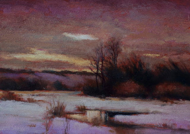 |
| Painted after - Winter Solitude by Charles Warren Eaton Study by M Francis McCarthy - Size 5x7, Oil on wood panel |
Of all the paintings that I've done for this series, 100 days of Tonalism. I would have to say that this is the one that has had the most favorable interest. It is the also only one in the series that I have painted three times. The first version that I painted I sold off my easel to a gentleman that came into my studio. The second was acquired by my wife, and the third is the one that I am showing you today.
I've read some biographical information about Charles Warren Eaton from the book 'A History of American Tonalism' by David A. Cleveland in today's video narration, so check that out.
Continuing on with our current essay regarding my Tonalist painting process; we've been discussing my second color pass. There's a lot that I do with my brush after doing the glazing. Unlike my first color pass where I tend to work in a methodical way from back to front, when I'm doing my second color pass I move my brush all over the panel.
Since I've usually had the first color pass sitting around for a while, I have a pretty good idea of things I want to address in the painting by the time I get into the second color pass. Sometimes there are areas in the painting that I decided I would complete in my second color pass. Also, unlike the first color pass I do not have any colors premixed on my pallet. When painting my second color pass I mix all needed colors as I go along.
This is the time in the painting process where I will make my light areas lighter and my dark areas darker. I work very hard to try to keep the freshness of the first color pass while accentuating and enhancing what is there, as well as correcting that which needs to be addressed.
It's very important in painting not to overdo it. Many amateurs make the mistake of overworking their paintings thinking that more detail and rendering is going to make the painting better. In reality, nothing could be farther from the truth.
There is a fine balance that needs to be struck at this juncture with the painting. Even more so for me these days as I've been getting into dry brushing quite a lot, using the textures of the painting to accentuate areas using the side of my brush. This gives me an effect very much like a stipple. So far I have succeeded in keeping the freshness going in my painting but it pays to be ever vigilant.
Cheers,
M Francis McCarthy
Landscapepainter.co.nz
A bit about 'Winter Solitude' by Charles Warren Eaton; as I stated above, I've painted this painting three times now. I really love the fact that it even though it is a winter scene is such a warm and inviting painting.
His use of complementary coloration in this scene is masterful to say the least and I learned quite a lot from making several studies of it.
To see more of my work, visit my site here
 |
| Original painting, Winter Solitude by Charles Warren Eaton |
Day Sixty Six: Evening in Connecticut by Charles Warren Eaton
 |
| Painted after - Evening Connecticut by Charles Warren Eaton , Study by M Francis McCarthy - Size 5x7, Oil on wood panel |
Today study is 'Evening in Connecticut' by Charles Warren Eaton.
This painting is very representative of quite a lot of Charles' work. He was famous for painting white pines and was also famous for painting sunsets and twilight scenes. A nice audio track on todays video, it is called 'Indeep'. This is a track I did in 2004 and never put on a record, so sorry no link.
On with our current assay regarding my Tonalist painting process; today I would like to continue on with our discussion of my first color pass. Yesterday we discussed how I approach painting the sky. Today we will talk about trees. Trees are one of the most challenging things to paint well. I've been at it eight years or so, and though it's gotten easier there are always challenges.
I heard on the radio the other day that there were over 3 trillion trees on this planet. That's a lot of trees! In a landscape painting, trees act as the figures. Because of their vertical emphasis (in what is otherwise a horizontal space), they tend to call more attention to themselves than most other elements of the painting.
As I stated in previous blogs I start with a drawing that is going to be underneath my first color pass. I've already started wrangling with the tree forms and the values in my drawing by the time I'm ready to come in with color. My approach is to to paint the sky first and then when I'm ready,do my trees I will go in with my darkest tree colors. My logic being, that dark recedes while light comes forward. Note: this applies to the ground plane, it does not apply to the sky, since the sky is generally the brightest part of any painting.
I like to do the dark colors in my tree shapes with a mixture of Alizarin Crimson and Phthalo Green. This creates a very dark color that is still transparent. This color also has a bit of a purplish characteristic which is very advantageous, in that most shadows on the ground in nature tend to have a purplish cast to them.
I've never painted my darkest areas with just ivory black. The reason for this is that ivory black is a very cold color. It's lacking in life and since I'm painting things that are alive it's far better to work with the chromatic black that I am mixing from Alizarin Crimson and Phthalo Green.
One thing I've learned to do after several years of experiences is to keep the dark colors in my vertical forms much darker than the dark colors in the horizontal forms. For example, you might have a clump of dark trees behind the main trees you are painting. It's almost always a good idea to make the darkest color (especially of more distant objects) less dark than any of your main vertical areas.
After placing my darks in I will then work with the variety of green and brown tones that are next darkest in value to my darkest color. This essentially gives us a bit of an overlap process and is logical in that we've progressed from dark to light.
After that, I will go in with my medium green tones or russet type colors and lastly, I will paint the lightest brown, green and tan areas. I generally hold off from doing the very lightest colors that will be in my painting until I come in later to do more work in my second color pass.I need to leave some room in the value scale for the stuff that is coming.
Tomorrow we will continue with discussing painting the ground plane in the first colour pass.
Cheers,
M Francis McCarthy
Landscapepainter.co.nz
A bit about 'Evening in Connecticut' by Charles Warren Eaton; this painting is very simple, almost abstract in its approach. It is also quite dark.
I enjoyed painting the yellows and ochres in the sky and the study went pretty quickly due to the great amount of simplification that Charles has done already in his painting.
To see more of my work, visit my site here
 |
| Original painting, Evening in Connecticut by Charles Warren Eaton |
Day Fifty Seven: Woodland Landscape by Charles Warren Eaton
 |
| Painted after - Woodland Landscape by Charles Warren Eaton, Study by M Francis McCarthy - Size 5x7, Oil on wood panel |
Charles Warren Eaton has been steadily gaining popularity. Many books about him have been written recently calling attention to his excellent paintings. Today's video ended up shorter due to technical difficulties while filming the first color stage. so just a bit of a chat in the narration today.
Continuing on with our assay regarding my Tonalist painting process; today I will give you a list of the paints I currently use in the order that they are arranged on my pallet from left to right. I could try to give you the list based on relative value of the colors or chroma but, I think the actual way that I lay them on the palate will probably be most useful for people interested in my process.
When I first started learning oil painting, I was influenced by several painters to start with a minimal palette of colors. My first color palette was Titanium White, Cadmium Yellow, Alizarin Crimson and Ultramarine Blue. Now I use approximately 17 colors.
There are some colors in this list that I could probably get by without as they are easily mixed. However for ease of painting, I keep them on my pallet. Here is the list as follows from left to right:
- Torrit Gray
- Ivory Black
- Phthalo Blue
- Cobalt Blue
- Cerulean Blue
- Cobalt Violet (Hue)
- Permanent Green Light
- Phthalo Green
- Alizarin Crimson
- Burnt Sienna
- Cadmium Red (Hue)
- Cadmium Orange (Hue)
- Green Gold
- Raw Umber
- Transparent Earth Yellow
- Yellow Ocher
- Cadmium Yellow
- White (50/50 Lead and Titanium)
At some point in our progression on this blog I will discuss more of these colors and their various uses in my process. Today, I will just cover a few key colors.
In my previous blog I wrote about my pallet at that time and my love of the color Lead White. These days I use a 50-50 mix of lead white and titanium white. I find that this gives me the most flexibility for the types of paintings I like to do. Lead White is a very warm and semi-transparent color while titanium white is cool and extremely opaque. I like to add the titanium white to my lead white to take advantage of that opaque quality. When I use just Lead White alone, I find that I have to use quite a lot more paint to get good coverage.
I should note at this juncture; that's the reason I use (Hue) versions of the cadmium red, orange and yellow are due to cadmiums incompatibility with lead white. All of the true cadmium colors are modern pigments and when mixed with lead white (an ancient pigment) they can produce some nasty oxidation over time. Something good to be aware of if you are interested in using lead white.
Another color on the list is the Torrit Grey. This is a color that is put out by Gamblin and is different every year. Basically it is all the pigments that comes from their filtration system and they mix it into paint. The Torrit Gray that I've been using is very close to a 50% gray. This is a color I can easily mix or do without altogether, but I found this color that is very useful to have handy. It's a color on my pallet that can be easily modified in whatever direction I need quickly.
As I stated above in our progression up to day 100, I will take a few blog posts to discuss other pigment colors, so stay tuned. Also, I will discuss tomorrow about why my colors are laid out the way they are and a bit about the history of the additions of various colors to my pallet.
Cheers,
M Francis McCarthy
Landscapepainter.co.nz
A bit about 'Woodland Landscape' by Charles Warren Eaton; this is a painting that I've done twice. The first version I traded with a local artist here in Northland New Zealand, for some of their work. I have since done a second version and that is the one we are discussing today.
This painting is quite similar to the last Charles Warren Eaton painting that we did a study of. It is a very simple woodland scene. I'm attempting in my current series of Tonalist paintings to do a woodland scene that has been somewhat inspired by his approach.
To see more of my work, visit my site here
 |
| Original Painting, Woodland Landscape by Charles Warren Eaton |
Day Fifty Five: Towards a Clearing Dusk by Charles Warren Eaton
 |
| Painted after - Clearing Dusk by Charles Warren Eaton, Study by M Francis McCarthy - Size 5x7, Oil on wood panel |
This is the sort of scene that Charles makes look quite nice even though it is so simple. I draw some inspiration from the several paintings like this of Charles Warren Eaton that I have done in this series. In my latest series of my own Tonalist paintings I've taken on a few Woodland scenes. I've covered Eaton at length so today I'm using a song from my album Love and Death instead of narration.
Continuing on with our assay regarding my Tonalist painting process; today I would like to discuss weeding out the dud paintings. One of the reasons that I like to do a 5x7 study prior to painting a motif larger, is that the study will enable me quickly to see how well my photographic reference translates into an actual painting.
You would be surprised to learn that of 14 scenes/motifs that I've selected for a series that I am painting, usually at least two or three do not make it into larger paintings and I have to make substitutions for those scenes. This number seems to go higher with each year that I paint. I am learning more all the time what will work for me as a painter and what will not.
In many cases I can spot the duds after doing my initial drawing on a 5x7 panel. One of my hallmarks as an artist is my inner belief that I can conquer any subject or motif if only I apply myself diligently and repeatedly. The actual truth is that this is just not always possible. Some scenes just will not make good paintings no matter how hard you work on them or how great your belief that you can make a silk purse from a sow's ear.
This is all part of the self editing process that any mature artist must go through with their work. In many ways writers have it easier in that, their field of endeavor allows them to use editors. When you're a landscape painter you must be your own editor. There is a fine line between confidence and foolhardiness. I think as artists, it is often times more easy to deceive yourself than you might believe. It's important to always be on guard against self-deception and be working for quality in every aspect of your art at all times.
There are times that I do not end up deciding against a given scene until I have completed the 5x7 color study. Usually I have spent some time looking at the study prior to stating a larger version. This is one reason I like to work on a series of paintings, bringing them all along through each stage. It gives me time to see, think, and visualize the larger paintings.
There are occasions that some scenes work well small but will not scale up, or will not be worth the effort of doing larger. Many times I will give these paintings as gifts to friends. They can be quite nice as studies even though they didn't make it for use in a larger context.
This leads us to the topic of conscious versus unconscious working methods and the use of intuition in regards to creating landscape paintings. I believe I will talk a bit more about this aspect of my painting process tomorrow. Come back if you are interested in hearing about it.
Cheers,
M Francis McCarthy
Landscapepainter.co.nz
A bit about 'Towards a Clearing Dusk' by Charles Warren Eaton; Eaton was quite good at this type of landscape painting and I feel that his painting here is remarkable in its simplicity. As I stated above I have taken his lead and am producing a few paintings in this sort of vein in my recent own work.
I enjoyed doing this study after Eaton. One of the things I like best about it is the almost duotone nature of this painting or perhaps, it would be more accurate to call it tritone, in that it is essentially just yellow, green, and red with a range in values from very dark to somewhat light.
To see more of my work, visit my site here
 |
| Original painting, Clearing Dusk by Charles Warren Eaton |
Day Forty Seven: Moonlight by Charles Warren Eaton
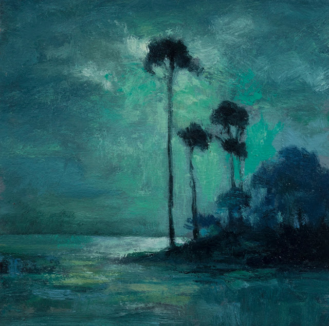 |
| Painted after - Moonlight by Charles Warren Eaton, Study by M Francis McCarthy - Size 5x5, Oil on wood panel |
Today's study is 'Moonlight' by Charles Warren Eaton.
We have covered Charles Warren Eaton a fair amount in this series and there are quite a few more coming. Charles Warren Eaton was a very important Tonalist painter, I would rate him second only after George Inness. Please watch today's video for some biographical information about Charles in the narration.
I'm going to start detailing my painting process for you in this blog. I've written about my process on my previous blog here but that is been a while ago now, and since we have another 53 days together some of you might be interested in me delving more deeply and extensively into my process. I will try to do the blog posts in the same order as the steps I use to accomplish my landscape paintings, however, there may be some deviations from this if I think of points that I may have missed at any stage.
Today I'd like to talk about photography. I like to work with photos to help me formulate and create my landscape paintings. If you've ever read any of my blog posts about photography you'll know that I've spoken extensively in the past about the myriad dangers that using photography in your work can entail. This blog of course will be no exception to that because there are a lot of potential problems with using photos as reference for landscape paintings. I will be making that the overarching theme my process, but I will be touching on some other points as we go.
I like to go out reference hunting with my wife (note she's driving), and as I see scenes that resonate with me or that I feel will make interesting compositions, I'll get out and shoot a series of photographs of the subject in front of me. Over the years one of the major ways that I feel I have evolved as a painter, is in my ability to not only perceive interesting paintings in nature around me, but more importantly knowing what sorts of scenes and compositions will not work for me.
The sorts of things that I'm talking about that do not work for me may be a scene where you are on a hill looking down into a valley. Another good rule of thumb to avoid is tree shapes not breaking the horizon line, they definitely need to break through any mountains or hills behind them. There have been many interesting trees that I have passed on because there was nothing but a wall of hills behind them and thus no real contrast between the sky and the tree.
I've learned the hard way that it is better to start with something that is very close to what will be in the painting as opposed to the idea that I can change or manipulate the scene extensively in Photoshop and still have it work.
I will usually make a point of turning around and looking behind me while photographing on the off chance that there might be an interesting composition in that direction. The best time of day for doing photography is early in the morning or later in the day towards evening. The reason for this is that trees are lit from the side as are other formations in the landscape and this creates far more interest. Occasionally I will do some photography on rainy days and often that lighting will be quite indistinct due to the overcast sky.
On these photography scouting missions we try to take as many photos as we can, because I know that later on when I am looking for reference for a new series of paintings, I will be wanting as many different types of scenes to paint as possible. It's been a while since my wife and I have gone traveling extensively outside of New Zealand and for that reason, I would say the majority of paintings done for the last few years have been of New Zealand. Though in true Tonalist fashion I'm always most interested in generalized types of scenes.
Cheers,
M Francis McCarthy
Landscapepainter.co.nz
A bit about 'Moonlight' by Charles Warren Eaton, this is one of the studies in the series that I painted twice, having sold the first version.
I quite enjoyed doing a study of a completely teal landscape and for the second study that I did, I painted my wood panel a nice teal green that corresponded to the middle tone of the scene. Charles' composition is very simple and yet quite effective so I kept my study simple as well.
To see more of my work, visit my site here
 |
| Original painting, Moonlight by Charles Warren Eaton |
Day Five: River Landscape by Charles Warren Eaton
Welcome to day five of 100 days of tonalism.

Painted after - River Landscape by Charles Warren Eaton, Study by M Francis McCarthy - Size 5x7, Oil on wood panel
Today's study is 'River Landscape' by Charles Warren Eaton,
Ah, a green and pleasant land indeed. I'm not sure where Charles saw this scene, there is not much information on it and it's not typical of what he's famous for. I liked it though and it was fun to paint.
Charles Warren Eaton was an important tonalist from 1880 or so, to 1910. he was quite popular in his day and was well regarded as a painter. One of the few painters that George Inness admired. Charles shared a studio space with George Inness in New York for a time in the 1880's.
Heres a link to a good overview of Eaton's work and heres a link to the page where I found the original image that I created a study of.
Todays video has a slightly better audio commentary. Unfortunately, my video editor won't let me play the video while recording audio. Something to do with the visuals being sped up by 12 times I'll wager. No great loss really as 5 minutes goes by fast as
Cheers,
M Francis McCarthy
A bit about River Landscape by Charles Warren Eaton.
This was fun to do and fell together quickly. I did a second color pass on this that increased the contrast and chroma. I utilized a fairly thin wash of a mixed green over my sienna under painting and then went over that with some bolder greens. This is a pretty cool technique that I developed while painting this series; one of the techniques that I've brought to my own work recently.
Like I have in the previous studies, I stripped out a lot of yellow tinting that was in the reference image. I modulated a bit of blue at the top too using my trusty artistic licence.
To see more of my work, visit my site

Original painting - River landscape by Charles Warren Eaton